
Supernova is a smart air conditioning startup, driven to improve the usability of their products through mobile and wearable devices.
They requested a logo + visual identity and a full-flow UX prototype for Apple Watch / wearable device app. The main idea of the app is to control your air conditioner and set up smart routines that can be turned on/off depending on the time and day of the week. The main problem was, from the get go, to add all of the actions in a wearable device layout in an intuitive and user-friendly manner. From a series of testing, I found which actions were the most important from the users' point of view, and rearranged the priorities of the control center layout. From that point, I divided the app in three main sections: homepage, application, and editing. As an example, here is how the user would set up and edit a routine:
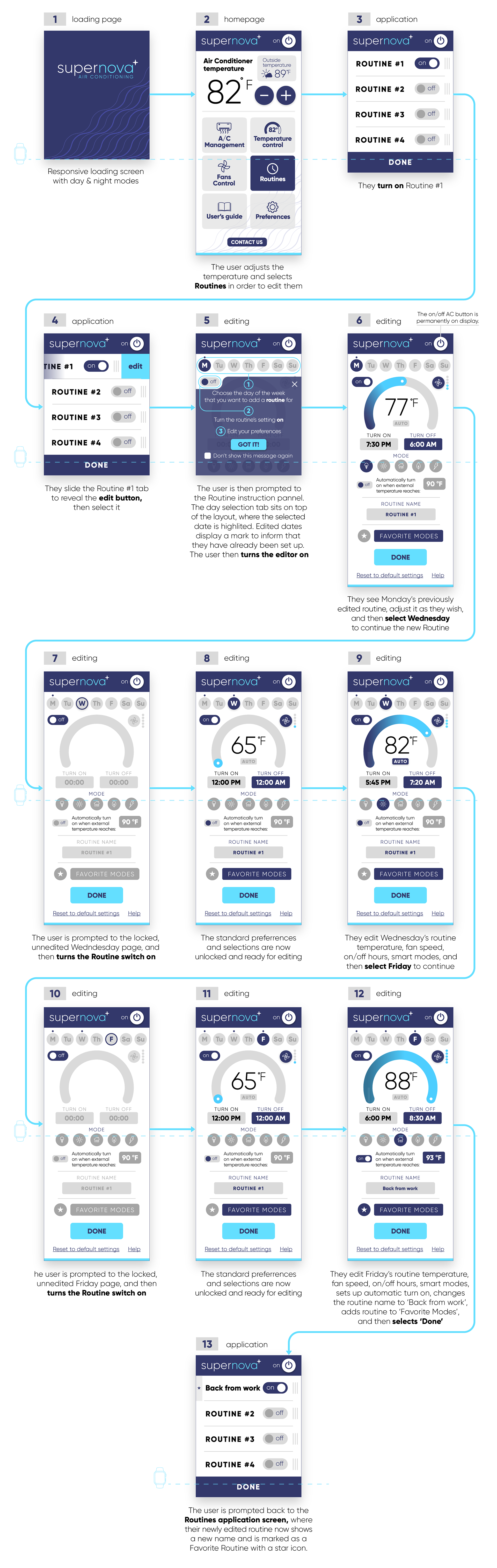
My main effort with the wireframes was to show in a natural way that the editing page layout continued through the scrolling line, and to add all of the information/actions needed without the use of multiple swipes or screen changes — and the placement of the visual objects as they are was pivotal in achieving that continuity. Designing an app for a wearable device is definitely more complex than designing for a mobile one, but it also makes it that much easier to transpose the format to a larger screen once it's finished.
I designed a minimalistic visual identity to fit the simple and modern approach of the company. 3 colors, 1 font, and 2 styles. The icon is a direct representation of the company's name in a literal form, and works very well for the app icon and favicon.
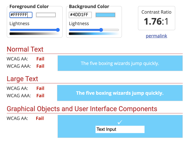
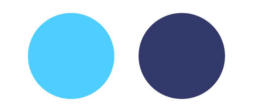
I went through a couple of concepts with the color application for the app — the first one used the light blue version as it's official application. I was very conscious about the screen size and how it could aggravate readability issues, so I tested every single application of copy over background and color overlap on a WCAG checker for accessibility. The lighter version did not pass, unfortunately. So I played with different analogous options and found a darker tone that was completely readable in a small device and still carried the right message — it even played better with the 'supernova' thematic as a dark sky behind the star.