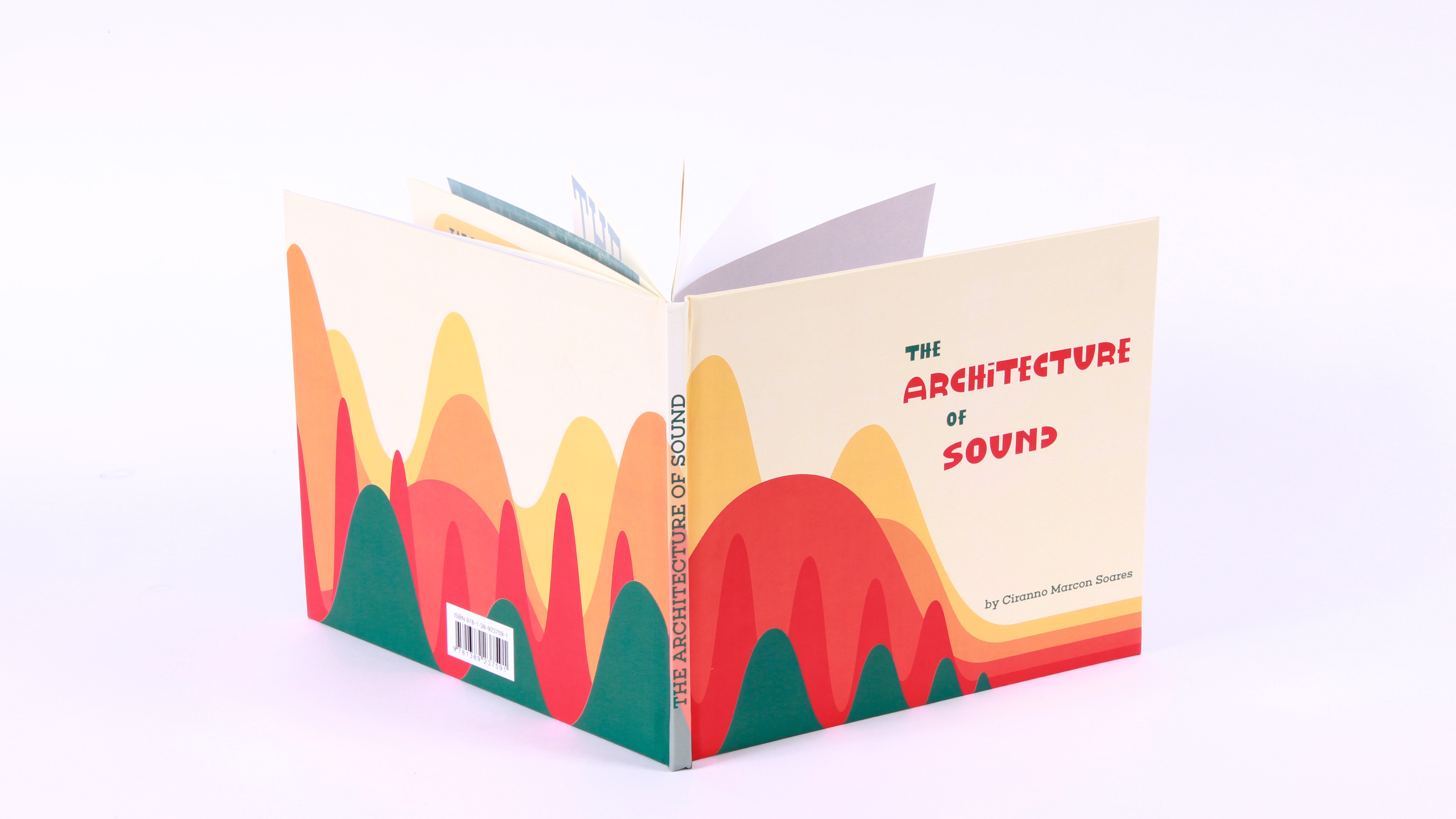
In the Fall of 2018, Cultural Ink Publishing recruited a group of diverse designers to work on a very exciting project for the revamping of a given classic literature piece. We were given a list of 40 book names and had to choose one to create a complete design makeover that could potentially interest new readers. I picked 'For Whom the Bell Tolls' because of my admiration of Ernest Hemingway and love for the Metallica song that honors this piece in particular.
The project should present a completely original illustration (no pre-existing vectors) and have either original typography or advanced type editing.
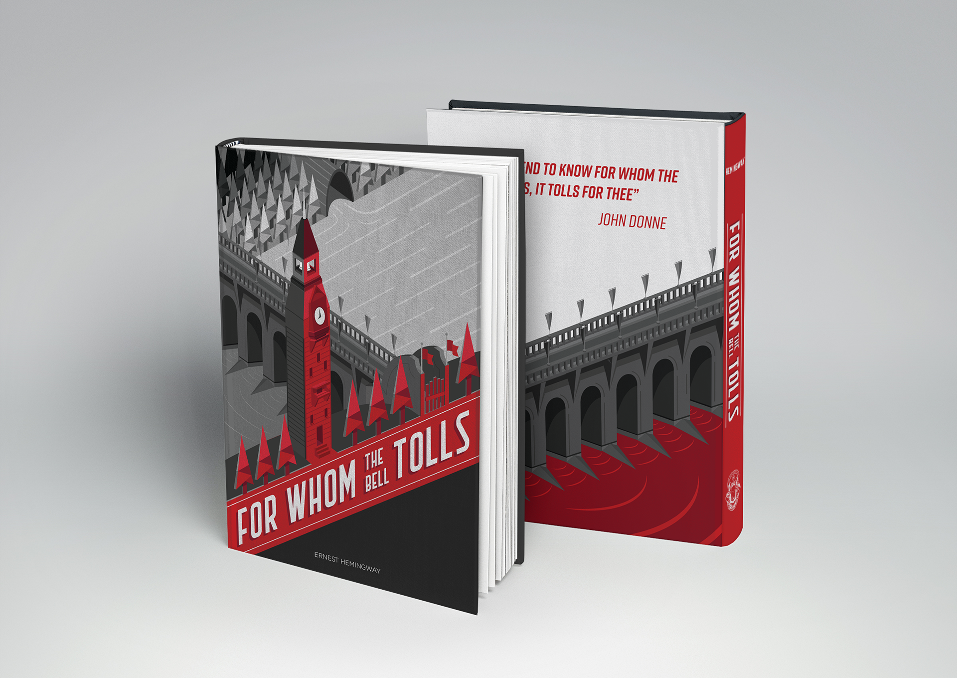
We were asked to design 2 versions for the book cover, so for the second one I focused on the John Donne quote that inspired Ernest Hemingway to write this book:
"Never send to know for whom the bell tolls, it tolls for thee".
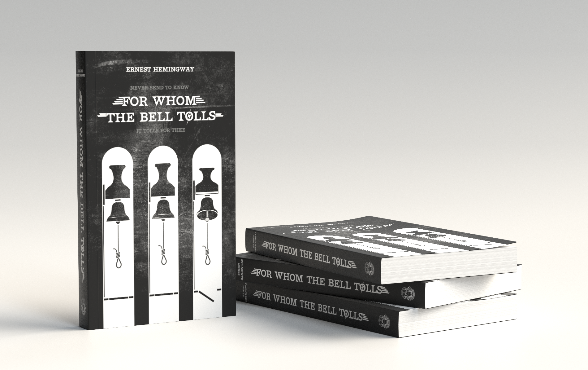
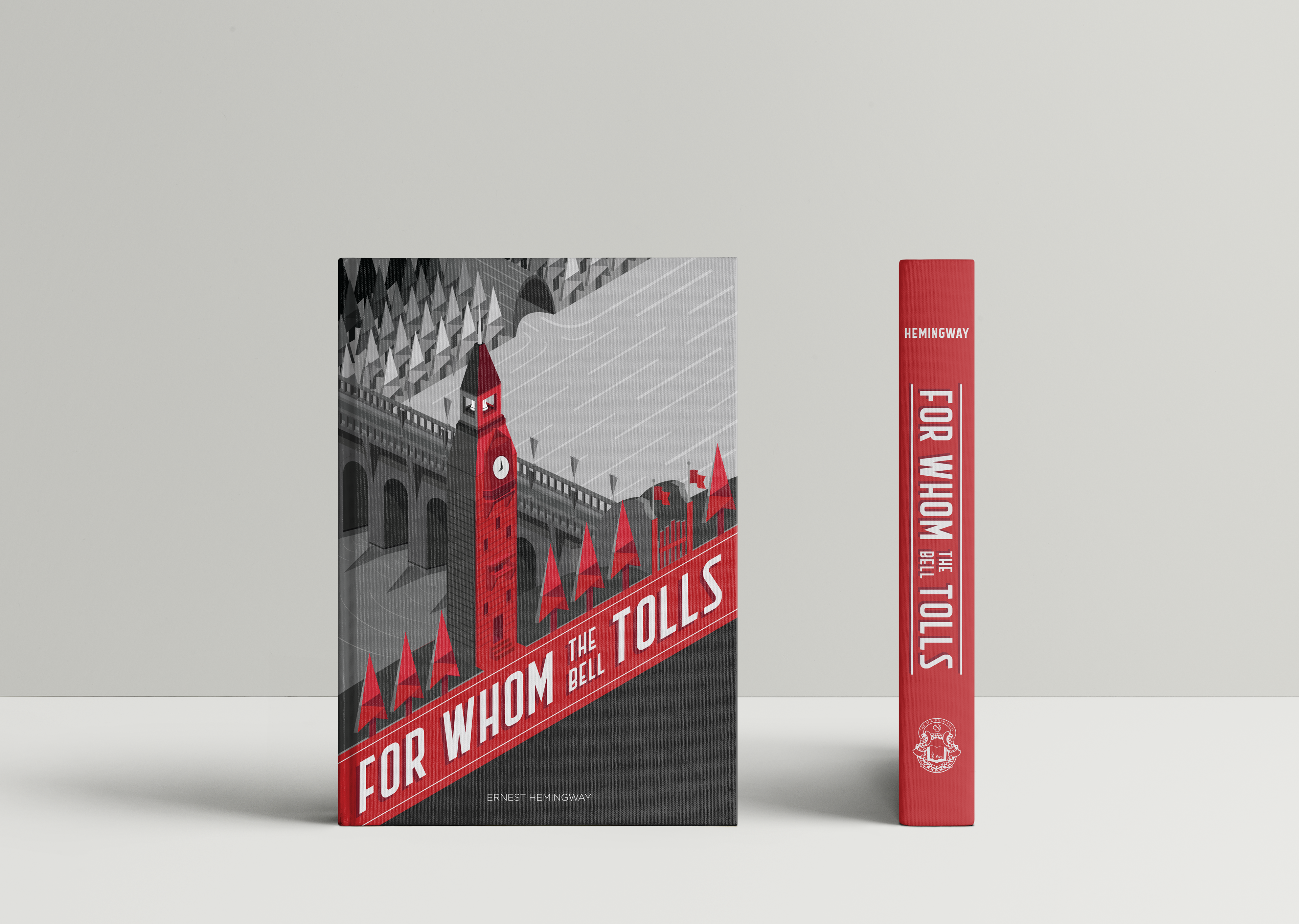
The final illustration aims to portray some of the book's storyline icons through very symmetrical and consistent angles, showing the Republican bridge and the recurring pine tree motif throughout the narrative; as well as direct symbolic references such as the bell tower and the bridge gates. All in a very dramatic, striking and dynamic manner.

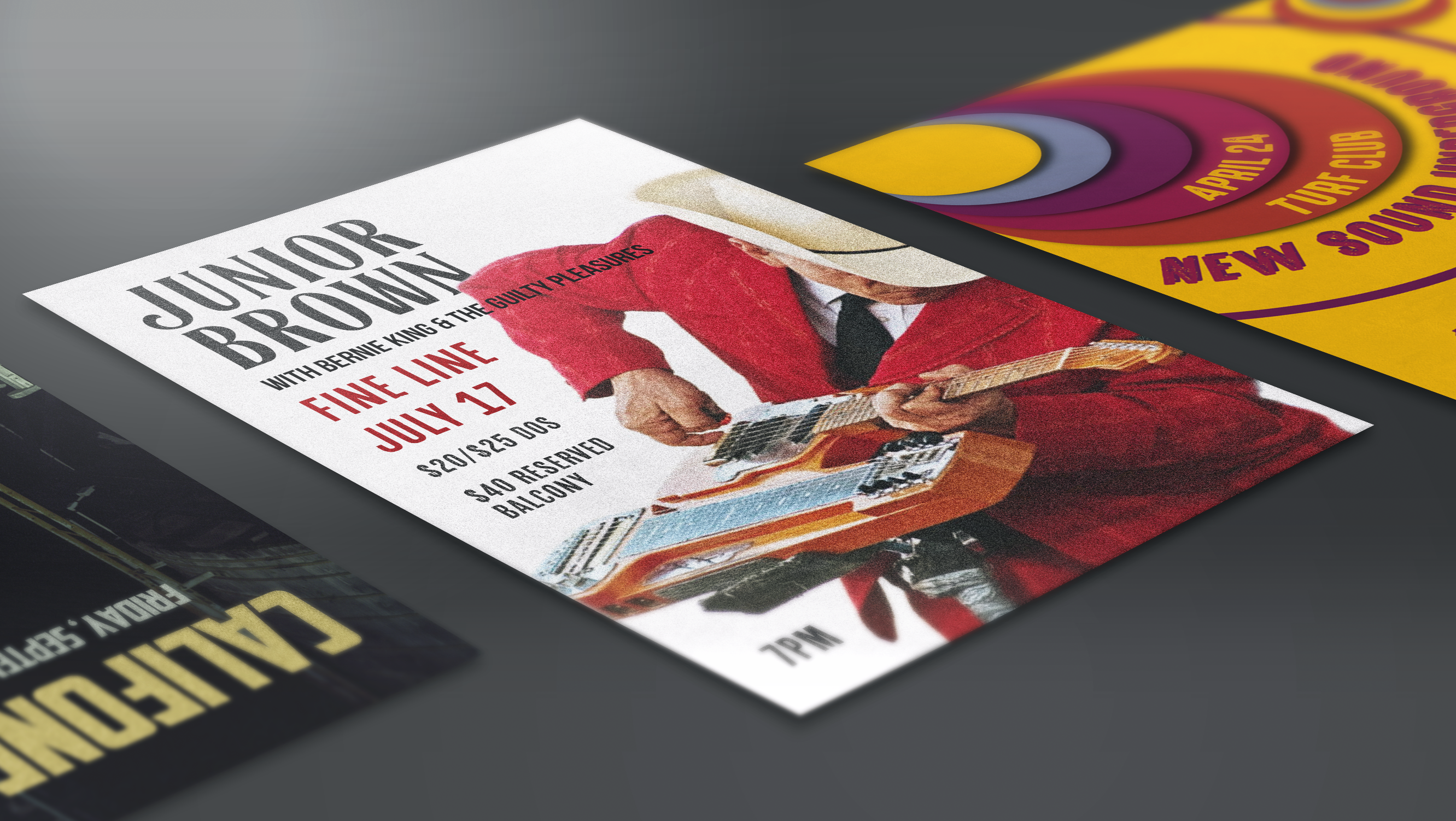
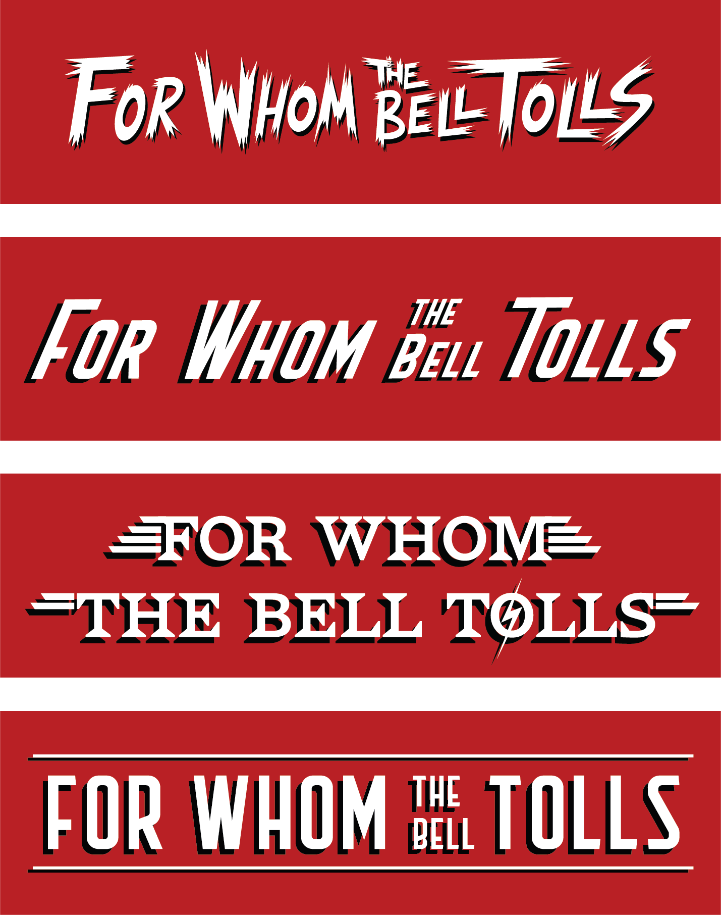
The typography selection process took longer than expected, going through a series of feedback sessions that sent me in various directions before I could decide on a final style. Below you can see some of the early ideas — from original typefaces created with the pen tool to edited versions of the 'Flathead' typeface. The main challenge was to create a font that would be effective both straight for the spine and angled to fit the cover illustration.
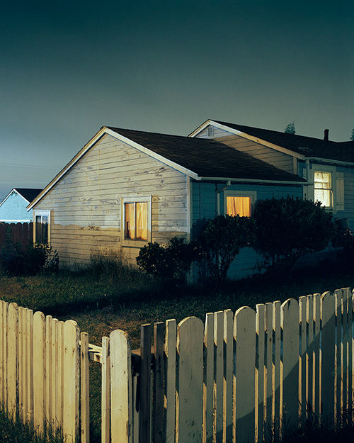
Most of the design process for this project was trial and error, I relied heavily on my peers' perceptions, yet tried my best to remain true to the original concept. Another big inspiration for the illustration was a picture from Minneapolis' photographer Todd Hido, out of his collection 'Houses at Night' — not in a literal manner, but the way the light hits the building giving it emphasis on the right side gave me the idea for this illustration. Arbitrary, I know, but it did.
The color palette was decided from the beginning — it should be simple, contrasting and intense in order to portray the dark and violent setting of the story.