Bradesco Seguros is the fifth-largest insurance company in Brazil, with over 4.5 million insured customers. They offer hundreds of products and solutions for their clients, but their most popular services are the Personal & Professional Life Insurance policies. I was hired by Bradesco in 2021 and my very first project was to reimagine their life insurance showcase website. When I first started, their current showcase had a total of 22 different life insurance products distributed across 8 horizontal carousel components shared between 2 pages (personal and professional insurance product pages). It was very hard for their users to browse and compare different products in the website, so they were looking for a simple and effective solution that could be implemented without taking too much time from their developers, which already had their sprints maxed out with more projects than they could handle.
Challenge
To optimize the life insurance showcase website’s efficiency and conversion rate through improvements on the user’s comprehension of each product’s content and overall navigation.
Project Timeline
The timeline was divided into 5 sprints and 3 points of delivery, giving me about 4 months to complete the project. Time was definitely not a constraint, though I was informed that refinements took a much longer time at Bradesco as I would need approval from all 12 department heads, and that the culture for change was rather conservative, which helped to inform my initial approach and the communication with the stakeholders from the beginning.
Insured customer life cycle stages
To better understand the user's relationship with the product from beginning to end, I created a customer life cycle timeline displaying the points of interaction with the showcase website (in red) in order to assess all of the user's needs through each step of their journey with us. That was critical for pointing out that the Showcase website visit is responsible for all initial interactions with the user, and that it is not a one-time platform for our established persona, as they would return to the page in order to review any future insurance-related planning .

Original Life Insurance showcase website — September 2021
Bradesco’s Life Insurance Showcase website divided all of their products between two main pages: Personal and Business. Their original vision was that they had two main user categories, and that once we guided each of them to their desired group of products they would organically find what they were looking for through browsing each product’s detail page.
Whenever any given lead would arrive to the homepage, they would be automatically directed to the Personal Life Insurance Showcase, and all of their most popular products would be displayed across 4 carousels components with no options for the user to filter or compare their options. None of the cards displayed information regarding costs or coverages, so a manual study of each product was required through the opening of all product’s detail page and further analysis and tab-to-tab comparison in one’s browser.
Another issue was that the only way to get to the Business Life Insurance Showcase would be through the header CTA on the right side under the banner. That logic made sense for Bradesco’s original marketing strategy, as they were pushing their Personal products in a much more aggressive manner through media campaigns and branding, but in 2021 they started a more focused campaign to reach and convert leads that might be interested in their Business products. The current website created a challenging and confusing flow for any user looking for Business products in the main page, especially if they happened to miss the Business Showcase CTA (displayed before the fold with two other first-class CTAs)
There was also an obvious lack of differentiation from Bradesco’s products — no information on why the user should chose these products against the competition’s was offered. That was especially critical when analyzing our benchmarking and seeing how other insurance companies would create comparison components that would automatically offer a side-by-side comparison between their own products and other popular insurance policies from the biggest brands in the industry.
The landing page lead capture component was also not performing nearly as well as it was designed to. It was placed in the very bottom of the page and was averaging 2 clicks per month on a page with over 47000 visits during that same time frame.
100% of users who purchased an insurance policy through the Showcase website did it through the product detail page. Up to this point, in order to make a policy purchase the user would need to input their information on the lead capture component and then wait for a phone call or email from Bradesco. That process was flawed by definition, as ideally the user would start and finish the policy purchase in the website itself, and then would be contacted via email with an order confirmation and to possibly sign any post-completion contract.
The original website had already received a major update a few months before my onboarding. The use of carousels and the placement of the lead capture component were the two main solutions for the real-original page, which displayed all products in a single grid, and placed the lead capture component right under the banner.
Click on the image on the left to zoom into the original website.
Personal Life Insurance showcase Google Analytics website overview — September 2021
Starting with the Personal Life Insurance showcase stats, I found that out of the total number of visits, over 74% did not come back and we had almost 54% of a bounce rate. The average visit time was actually higher than those numbers might indicate, which presented a need for a Hotjar analysis. Also the number of mobile visits was lower than expected by the marketing team (closer to 50/50).
Personal Life Insurance showcase website Hotjar — September 2021
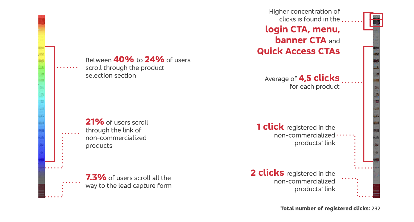
The Hotjar data pointed out that half of our users would only scroll to the life insurance presentation section, and that they would search for information on the menu, banner and quick access links. Most of the product information was placed under the fold, so after a minute and a half the average user would get frustrated and quit.
Professional Life Insurance showcase Google Analytics website overview — September 2021
The Professional life insurance stats showed similar findings, with the exception of a smaller rejection rate and a higher desktop concentration, which makes sense given the context in which the user searches for Bradesco's products.

Professional Life Insurance showcase website Hotjar — September 2021
The Hotjar data also provided similar results to the Personal page, but it pointed out to a more inquisitive usability pattern, where 24—40% of the users would actually scroll through the product selection section.
Original Life Insurance showcase flowchart — September 2021
I created this flowchart to better analyze all interactions in the website (both Personal and Professional), and find where were the breaking points and how we could improve them in a simple yet effective way.

It became very clear that the main issue with the website was the disposition of so many different products in the layout, and the lack of navigability between them within the Showcase. The user's journey was designed to follow a straight line interaction pattern, from the Showcase landing page, to a specific product, and then to the lead capturing form — but that's not how the actual user behaved. They wanted to see all the products in a given category and compare the options before making their decision, and the website was making this process very difficult instead of facilitating the user flow.
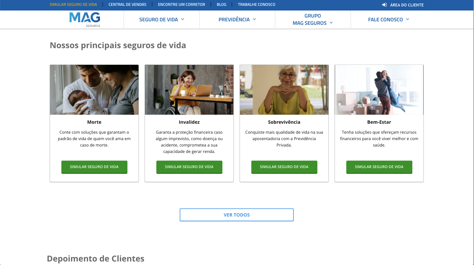
Benchmarking – Brazilian life insurance websites
I conducted a very focused benchmark research looking for common solutions to some of the problems shared by the biggest names in the industry, as well as upcoming companies in the Brazilian life insurance market. Many of these companies had a very concise number of products available, some had only two. This very limited line of offerings made the product research process much easier and efficient for the user. However, Bradesco was not willing to make aggressive changes to their catalog. I scheduled a series of meetings with the business and marketing teams, and we were able to condense the 22 products into 15, pushing 7 of the least popular policies to the non-commercialized group, which had over 30 obsolete or highly specific products. It was a small win, but we were closer to getting a seamless registration process in the website. Here are some of the findings from the benchmark research:


It was clear that Bradesco's user experience and offerings were on the more complex and bureaucratic side of the industry spectrum, where the user had to manually navigate through a very high number of products, while making comparisons and taking notes to figure out what was the best product for them.
While researching other companies I found a few solutions present in many of their websites — comparison tables and simulators were on the top of the list. A fully-online policy purchase was the norm among new companies, but even within the largest names in the industry it was becoming a trend due to the much easier and streamlined process.


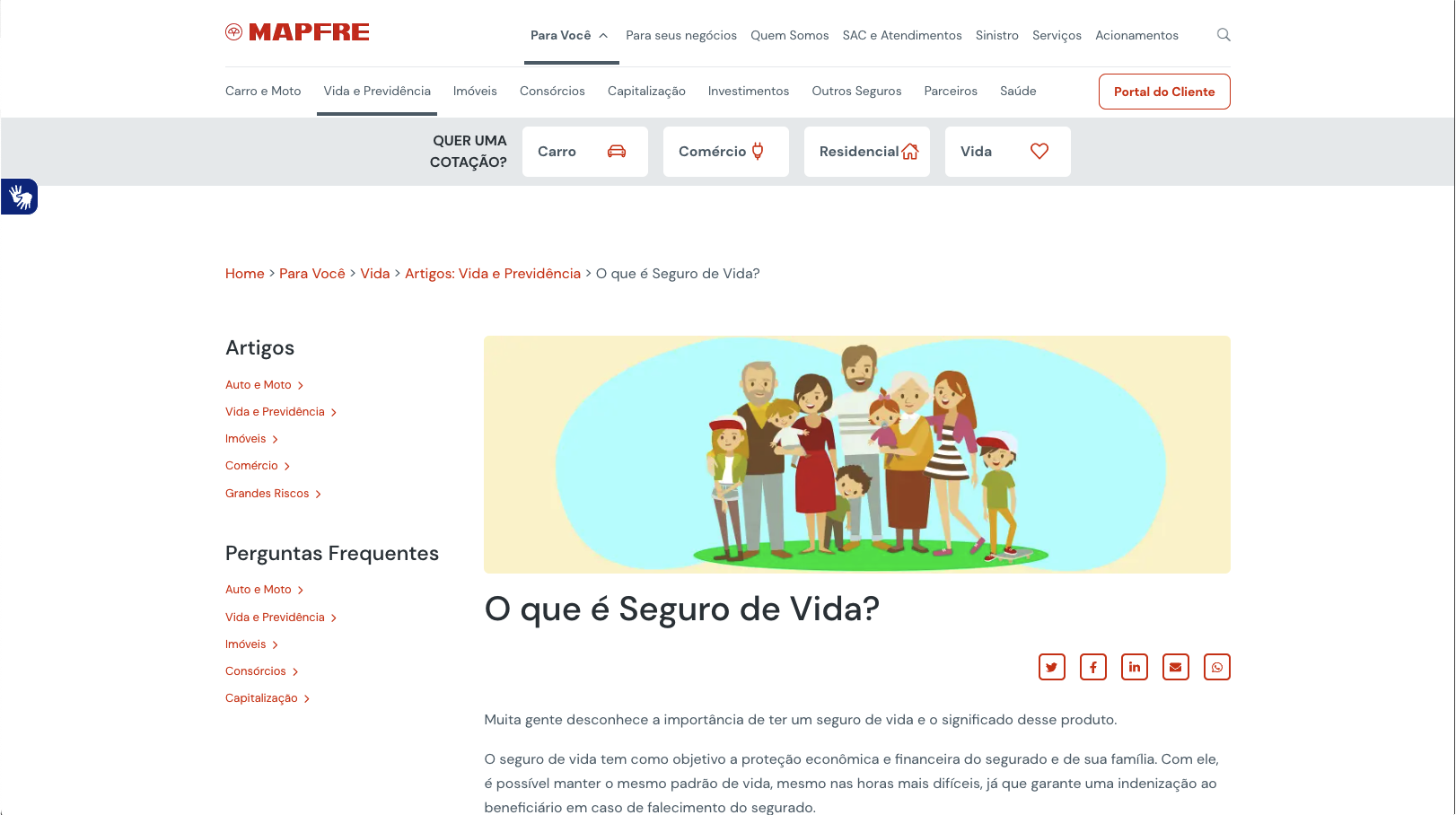
The general page layout was very straight-forward across the board. A standard hierarchy of informative content that helped the user navigate through 5 main groups of questions:
1- What is life insurance? / Why do I need it?
2- Why should I get it from this company?
3- What are the products available? Which one is right for me?
4- How much does it cost? How do I buy it? What is the purchasing/registration process like?
5- How do I manage/maintain my policy? Are there any further steps?

Bradesco had a serious UX/UI debt situation. And while implementing some of the proven solutions from other players would help to remedy the general usability of the website, many of our problems were unique to our business model. Starting by the total number of life insurance products in our portal — it was over 3x the average amount of products from the other main companies. We had specific problems that needed specific solutions.
User interviews for the original website
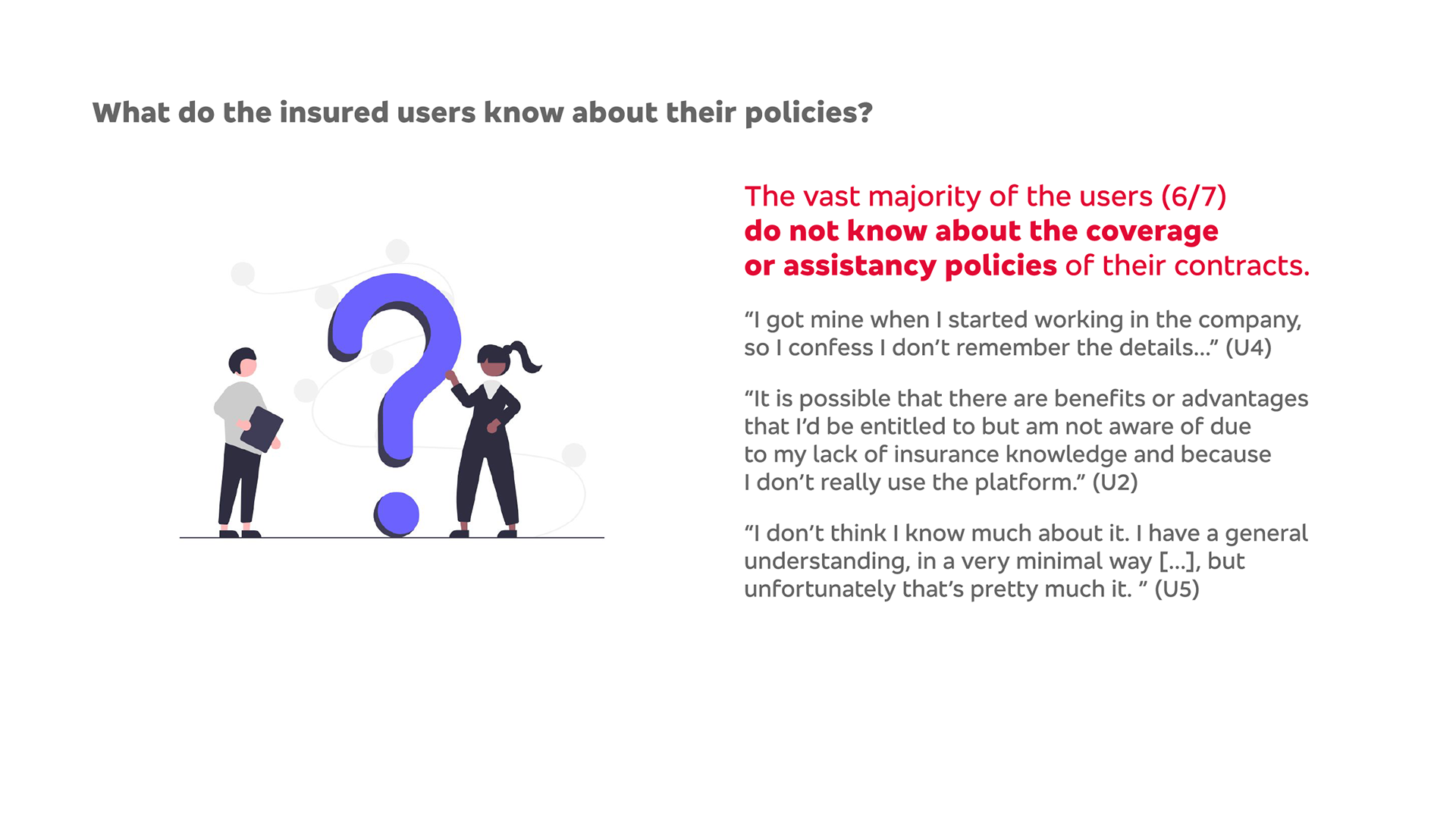
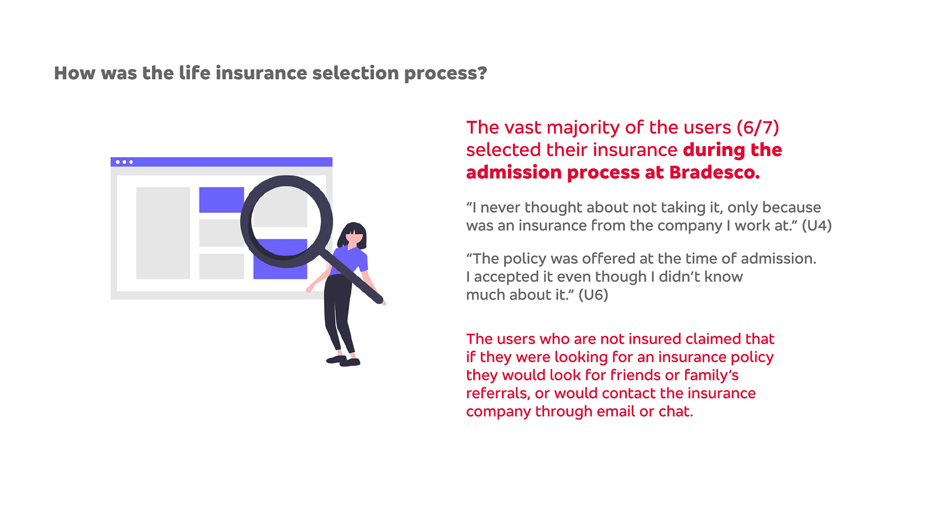
In order to properly assess and validate all of the hypothesis raised this far it was extremely important to hear from the actual users themselves. Unfortunately, Bradesco had a guideline against interviewing, testing, or even contacting the client base for usability or marketing purposes. However I was able to interview Bradesco's employees; some of whom also happened to have a life insurance policy or equivalent. It wasn't ideal, as I wouldn't be able to have insights from a user who would be completely neutral and had an average knowledge on insurance policies, but at least I would get to get valuable interactions from users who understand the logic behind the business and hopefully would help me to better communicate them to our user base.
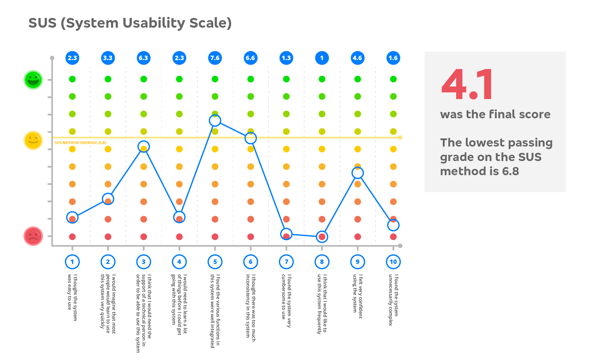
I wanted to establish very defined qualitative and quantitative insights to be presented to the stakeholders, so I interviewed 7 employees who had life insurance and 2 who didn't, so we would have some comparison contrast with users who are not familiar with the online purchasing process. This is the findings presentation from our original website user sessions:

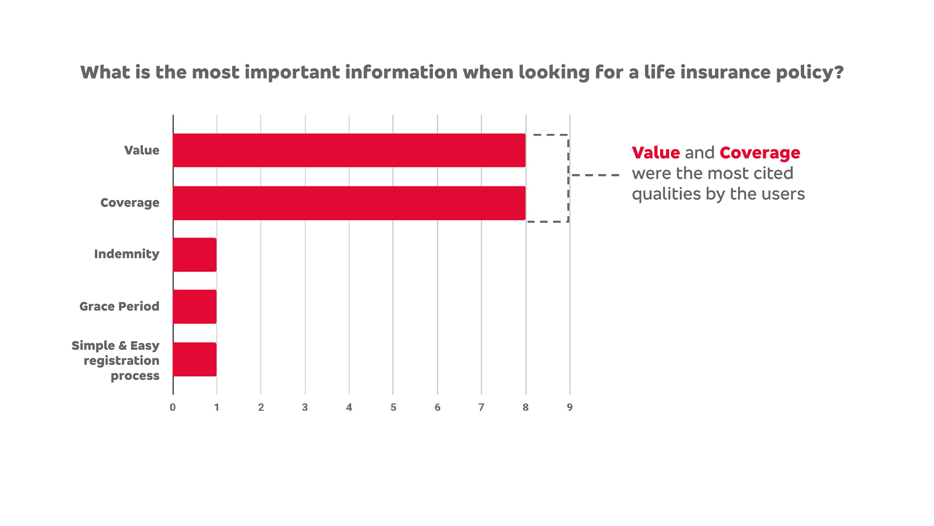
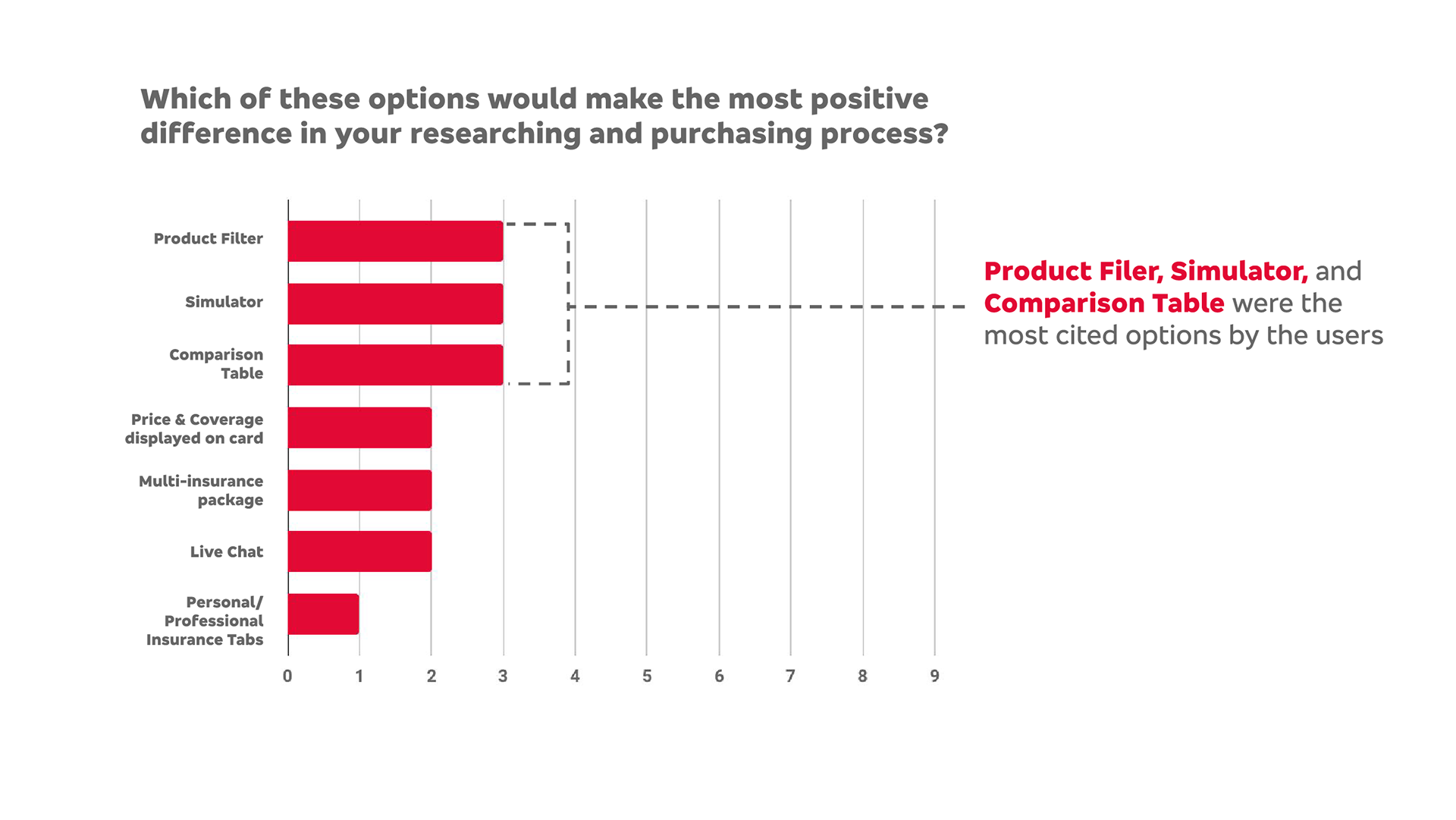
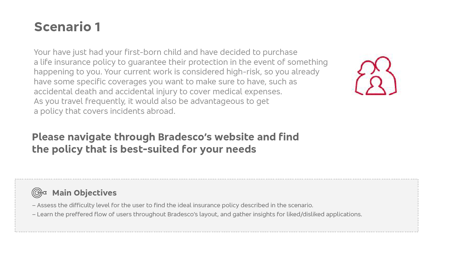
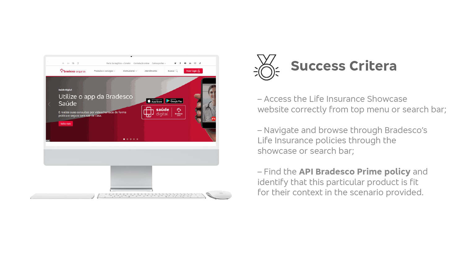
Test 1 — The original life insurance showcase website
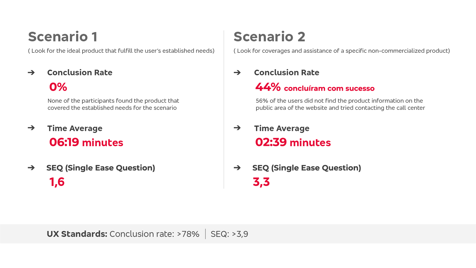
I created a user test to assess the situation of the original website and to have a standard to measure improvements against. The user would simply enter the current website and try to find a specific insurance through a couple of different scenarios. What follows is the results of the first test and all of its insights:
Scenario 1 (click on the images to expand)
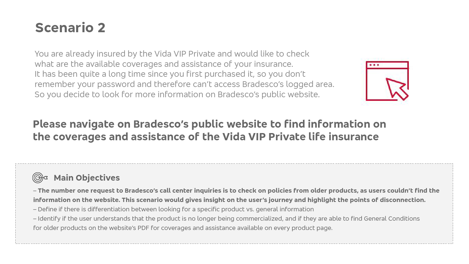
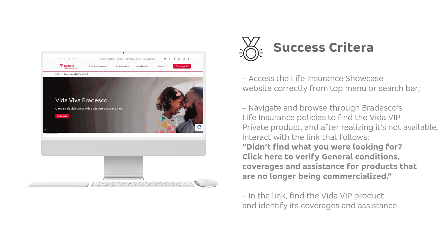
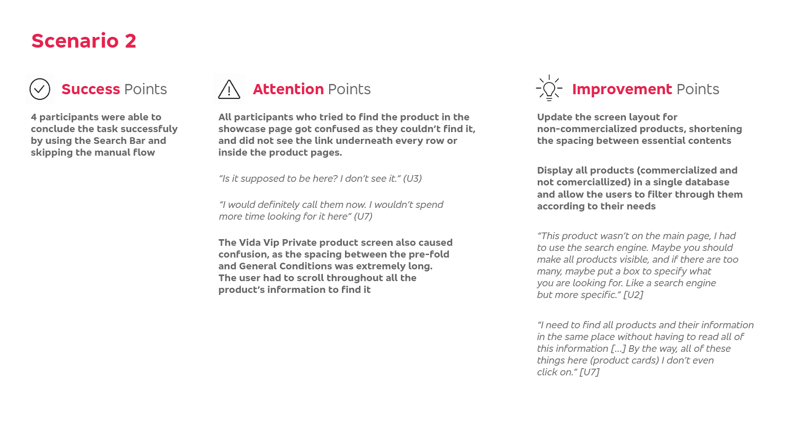
Scenario 2 (click on the images to expand)
Insights (click on the images to expand)

Assessment and Ideation
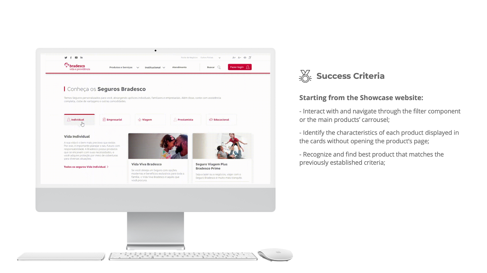
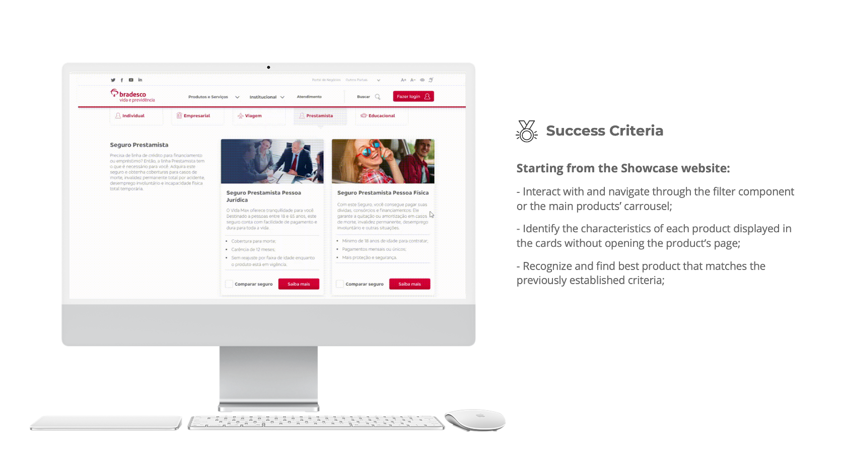
With insightful information from our user tests I was able to set out a strategy to resolve the main issues that were brought to light in the website. We needed a facilitated experience, respecting established criteria for usability and accessibility, allowing product comparison and efficient content information, such as price and coverage — all of it in a simple, quick and trustworthy format.
I specified 9 UX/CX and business requirements for the new website update:
• Product information (price + coverages) must be readily available on the main showcase homepage;
• The average user should be able to find their ideal product in 3 clicks or less through a sequential filter component;
• Comprehensive comparative tool for products with basic information and multi-selection;
• Avoid displaying excessive/non-essential information at once;
• Avoid abbreviation, acronyms, and technical insurance nomenclature that is not familiar to our users. If necessary, make sure to disclose its meaning in clear and simple verbiage;
• The new website format must be adaptable to other insurance programs throughout Bradesco's platform, so all user experiences are streamlined and up to code;
• Clearer visual feedback once lead-capturing form is filled with next steps and time expectation for contact from Bradesco after the contract signing page;
• Highlight our Travel Insurance products, giving them their own section apart from life insurance, which is not an intuitive placement for our users to find them;
• Reorganize the backlog of non-commercialized products allowing for a more concise and simpler layout.
Since we couldn't get a number of products lower than 15, the showcase website had a desperate need for a simple and efficient sequential filter component and overall navigation experience. We tested a number of different solutions for the filter through A/B scenarios, and the most successful in our internal reviews was a button filter in a single-row setting. We had to develop this component as it had never been used in any other application, which wasn't ideal as it would take extra time from developers, but seeing the results from the original website's test it was an unanimous decision that more resources should be assigned to this project in order to solve the largest usability issue in Bradesco's life insurance platform.
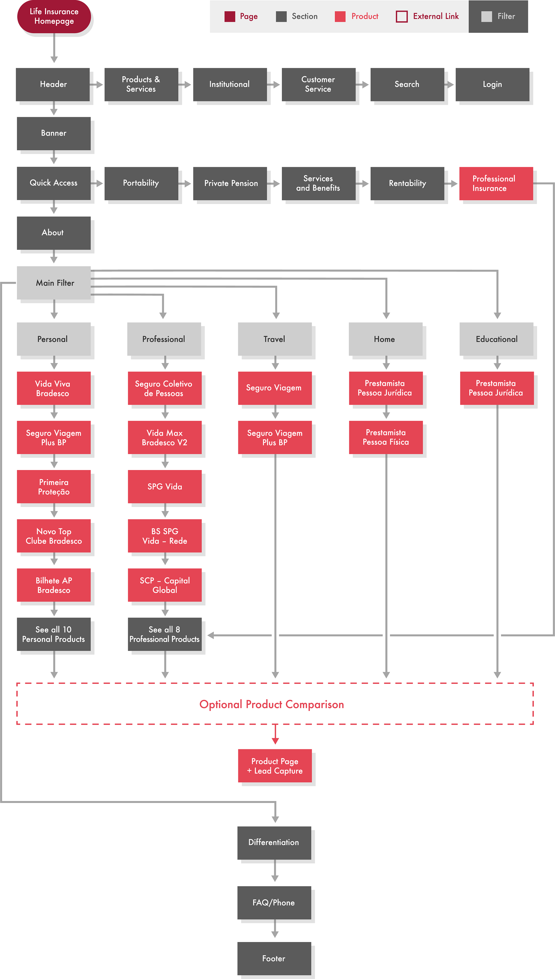
Once I had a rough wireframe of the sequential filter application, the main challenge became defining the organization and logistics behind Bradesco's product grouping. After numerous meetings with stakeholders and PMs, we reached the following structure and flowchart:
New Life Insurance showcase flowchart
Due to the project's length and complexity, I will only share the layouts and insights for the Showcase website's Desktop version.
The Sequential Filter, Cards, and Comparison tools
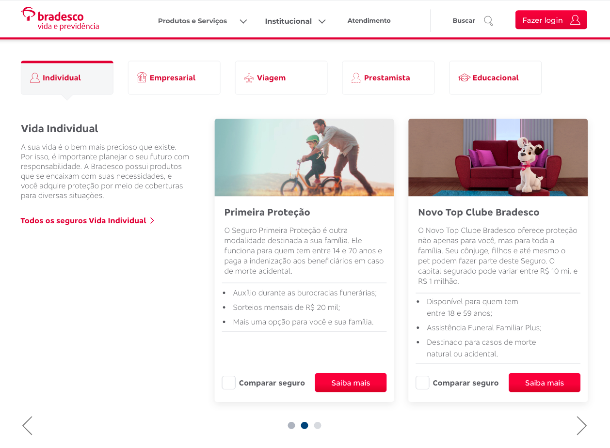
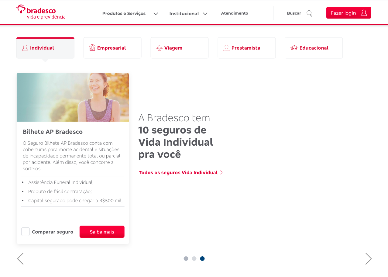
The filter component was the catalyst of all further updates on the showcase website. It would be the first point of interaction with our users and it should simplify their journey immensely, highlighting the ideal product in under 3 clicks. We defined 5 main product groups: Individual, Professional, Travel (created for this update), Home, and Educational. The UI was defined by preexisting Bradesco Guidelines of colors, sizing, padding, icons and border styles.

Once the user selected their preferred group, they would initially see a description of the selected group followed by the 2 most popular products of that category, and then the option to scroll to the right with 2 more row groups with 3 cards in each row. If there are more than 3 groups, the user would be prompted to a link with a full page of available products that meet their criteria.
Should the user choose to not interact with the filter, the best selling products would be displayed on the main page underneath it.
Here is the flow of a user that is browsing through Individual life insurance product, from the main Individual page all the way through the full page of available Individual products, where they will perform a product comparison:
1. Individual Products Carrousel – Row 1

2. Individual Products Carrousel – Row 2
3. Individual Products Carrousel – Row 3 (last row)
The screen below shows the 5th most popular Individual product and a text indicating how many total products Bradesco has available for that specific category, followed by a link to access the full products page. In this scenario, the user will interact with the link.
4. Full Individual Life Insurance Products Page
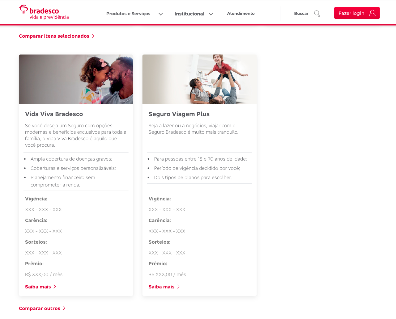
All products are displayed in a 3-card-per-row layout, with the first spacing being used for a brief description of the category. In this scenario, the user was interested on the 1st and 2nd products (Vida Viva Bradesco and Seguro Viagem Plus Bradesco Prime), so they selected both for a product comparison and interacted with the red link in the end of the gallery to start the comparison (the link is fixed to the bottom of the users' screen once at least one product has been selected for comparison).

5. Comparative tool
Once the user has selected the products they want to compare, they click on the comparative tool link and the product's cards appear in a detailed format on the bottom of the screen, and the view is anchored to display the tool. The user will have access to information such as coverage, validity, grace periods, drawings, and price per month. As many as 4 products can be compared each time
Layout Proportions and Content
I maintained the first 3 layout sections' order as they are part of the whole website's branding. But I decreased the banner in over 30% in order to decrease the fold size and push the filter closer to the top, as the original banner did not make an efficient use of space in relationship to its content, and so the users would have a clearer view and quicker access to it.
The filter, as mentioned before, would be the ideal first point of interaction with the user who doesn't know exactly the product they are looking for. Under the filter, its results show up in a carrousel component, a component that needs 60% more space than the filter itself to allow for readability and interactivity. In order to account for users who do not want to use the filter or want to do their own research manually, I placed the top 5 most popular products underneath it, and a link to the main catalog with all products at the end of the carrousel. The full catalog displayed anchor points that would serve as a tool to take the user directly to their section of interest.
I suggested the "Bradesco's Differentials" section due to the lack of specification on the website about Bradesco's advantages over the competition. I focused on their life insurance package perks and variety of products to fulfill the specific needs of their many customers. You can browse through it on the prototype link or on the actual website as well.
The FAQ and Footer maintained their position for the same reason as the top 3, but I edited and rearranged some of the FAQ in order for it to apply to possible questions or concern that could come with the website updates, especially for senior costumers that were used to the old layout and were not tech-savvy.

The default cards display a picture related to the product's coverage, the product's title, a brief summary of the product and who it is for, its coverages, price, a checkbox that allows for comparison between different products, and a 'Learn More' button that directs the user to the selected product's page.
In this format we are able to provide the user with the most vital information about the product without overwhelming them with too much technical information or secondary content, which can be found in the product's page by clicking on 'Learn More'.
This prototype is not fully interactive, but displays the Showcase homepage's design as it is in its final version.
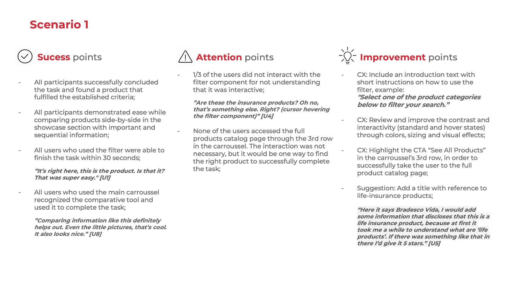
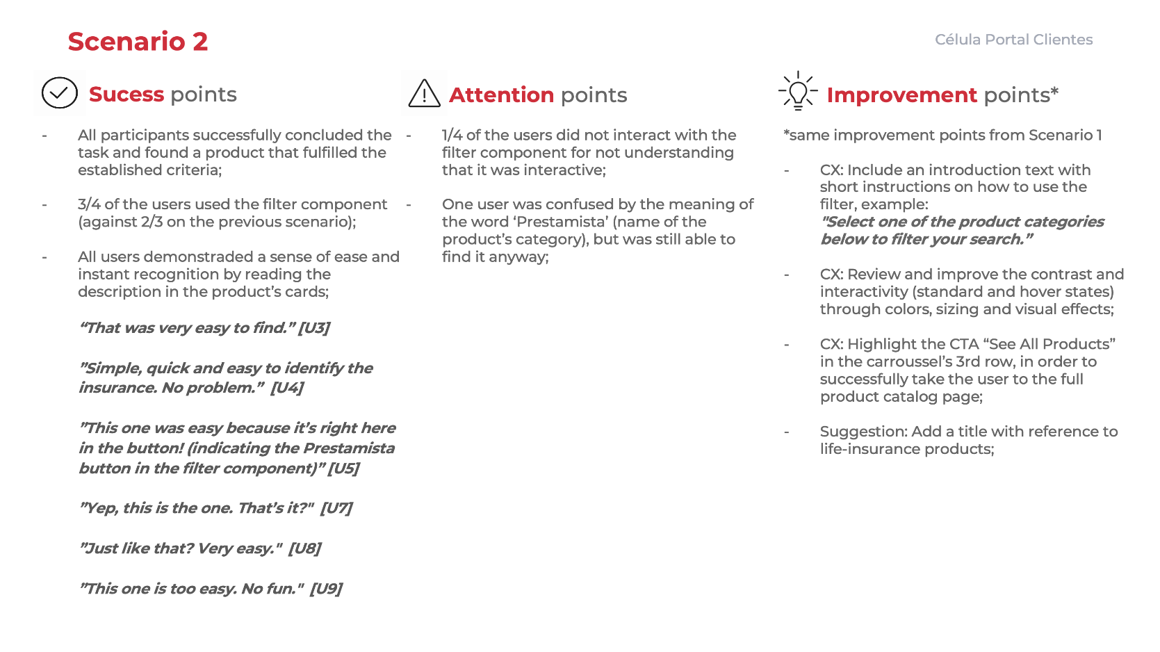
Test 2 — The new life insurance showcase website
I applied the same two scenarios for the new life insurance showcase website test in order to get the most valid and coherent result in contrast with the findings shown previously. However, the success criteria changed, as I wanted the users to use the improvements on the website (more specifically the filter component and main carrousel) to complete their task in a faster and easier way.
Scenario 1 (click on the images to expand)

Scenario 2 (click on the images to expand)

Insights (click on the images to expand)
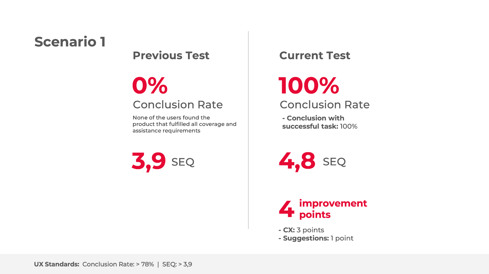
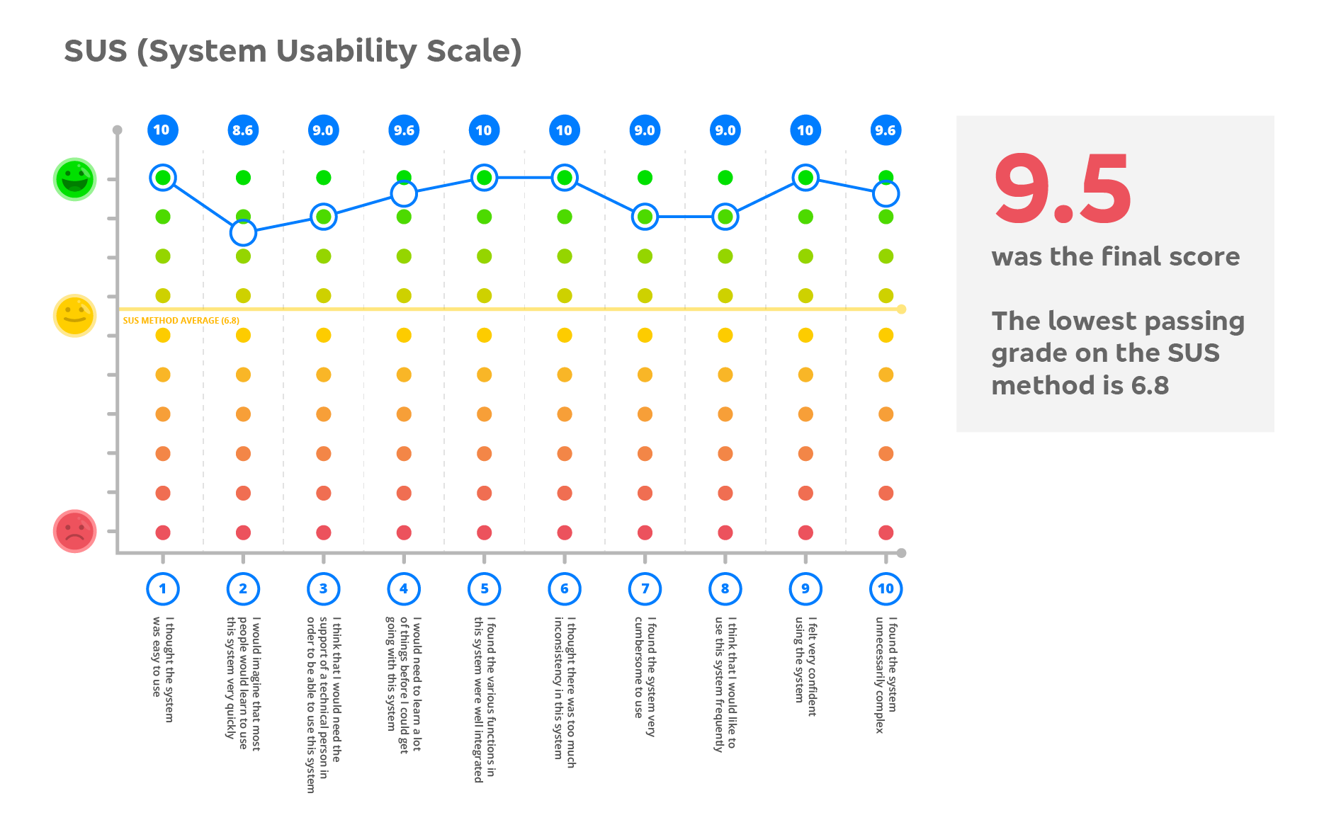
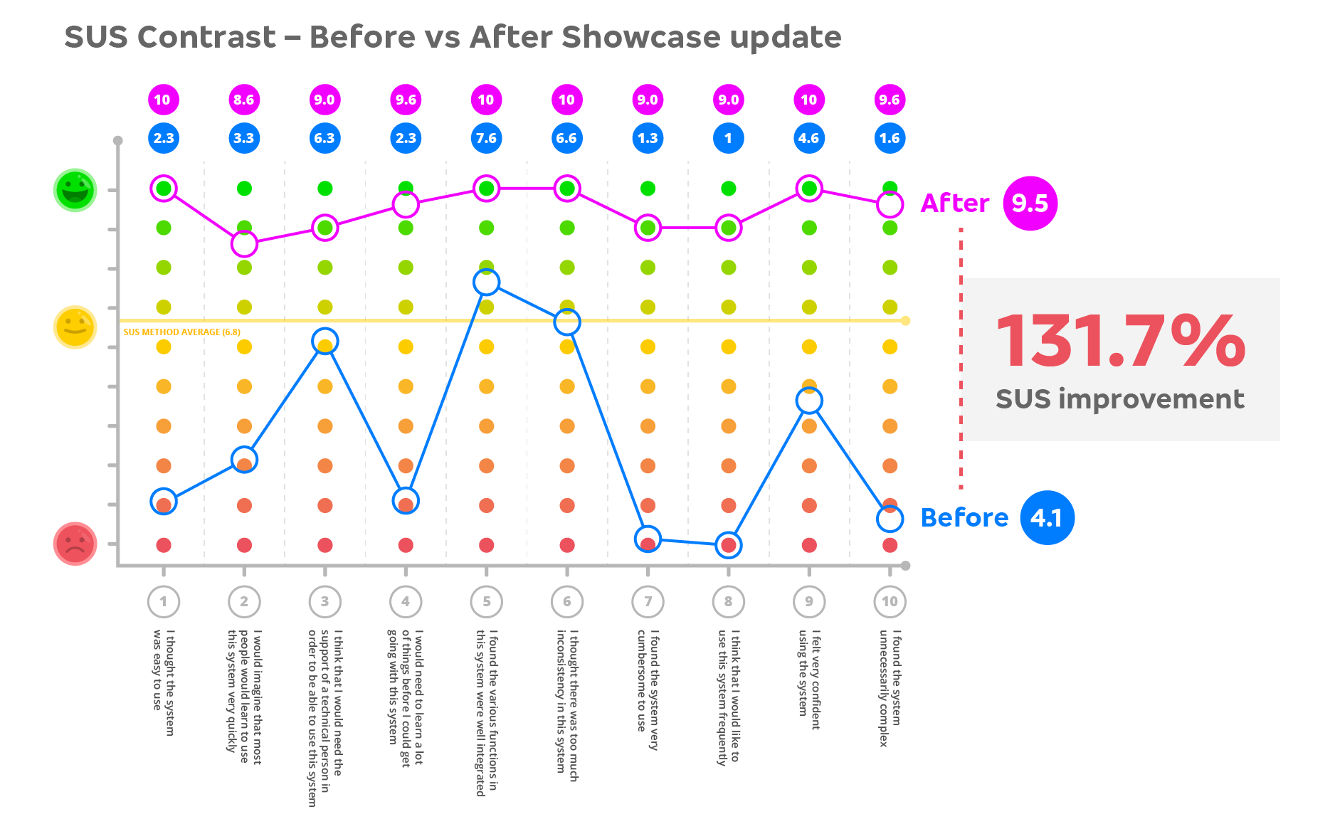
The results were even better than expected. Our users demonstrated ease and quick response while interacting with the new tools, and we went from having 0 successful tests to 100%. All users found the right product using either the filter tool or the carrousel. All users who used the filter finished the task in under 30 seconds. It was really an amazing result for the whole team.
Conclusion and Next Steps
While the improvements and their respective testings were a success, there are further changes that need to be made to the showcase and adjustments to our improvements as well. The next big project would be to implement the brand new e-commerce department into the insurance prospects, adding a checkout tool to our flow. This way, the user would be able to browse through the products, find the ideal one, and purchase the policy on the spot without having to be contacted by the business department — the way many other successful companies already do, and how it is supposed to be done.
Also, the sequential filter component still needs to perform better. Further UI improvements to highlight it would be ideal, so that we get closer to the 100% mark of users who interact with it and get a much better experience in the website overall. As well as facilitating the navigation through the full product catalog, but we would still need further research to justify adding this project to the treadmill, as we are not sure if there are many users who prefer to research each product manually.
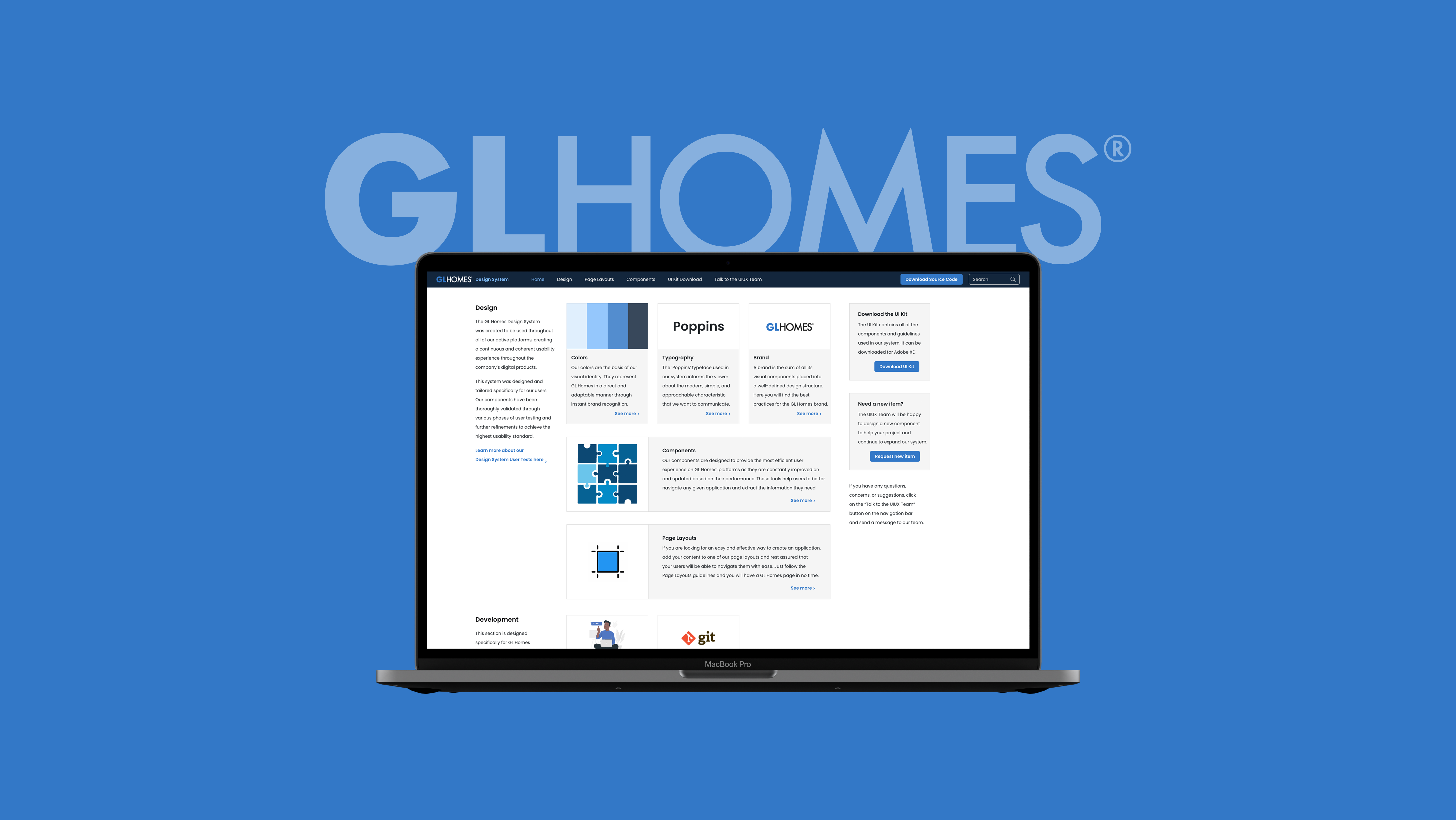
I got to work a little bit on the e-commerce merge a few months before I left Bradesco in 2022 to lead the UX/UI team at GL Homes in Florida. I am confident they will continue to do a great work with it and create an amazing product, as they do throughout the company in general. This was an amazing project to be part of, and the lessons I learned during the process will forever be cherished and applied in my future endeavors.