


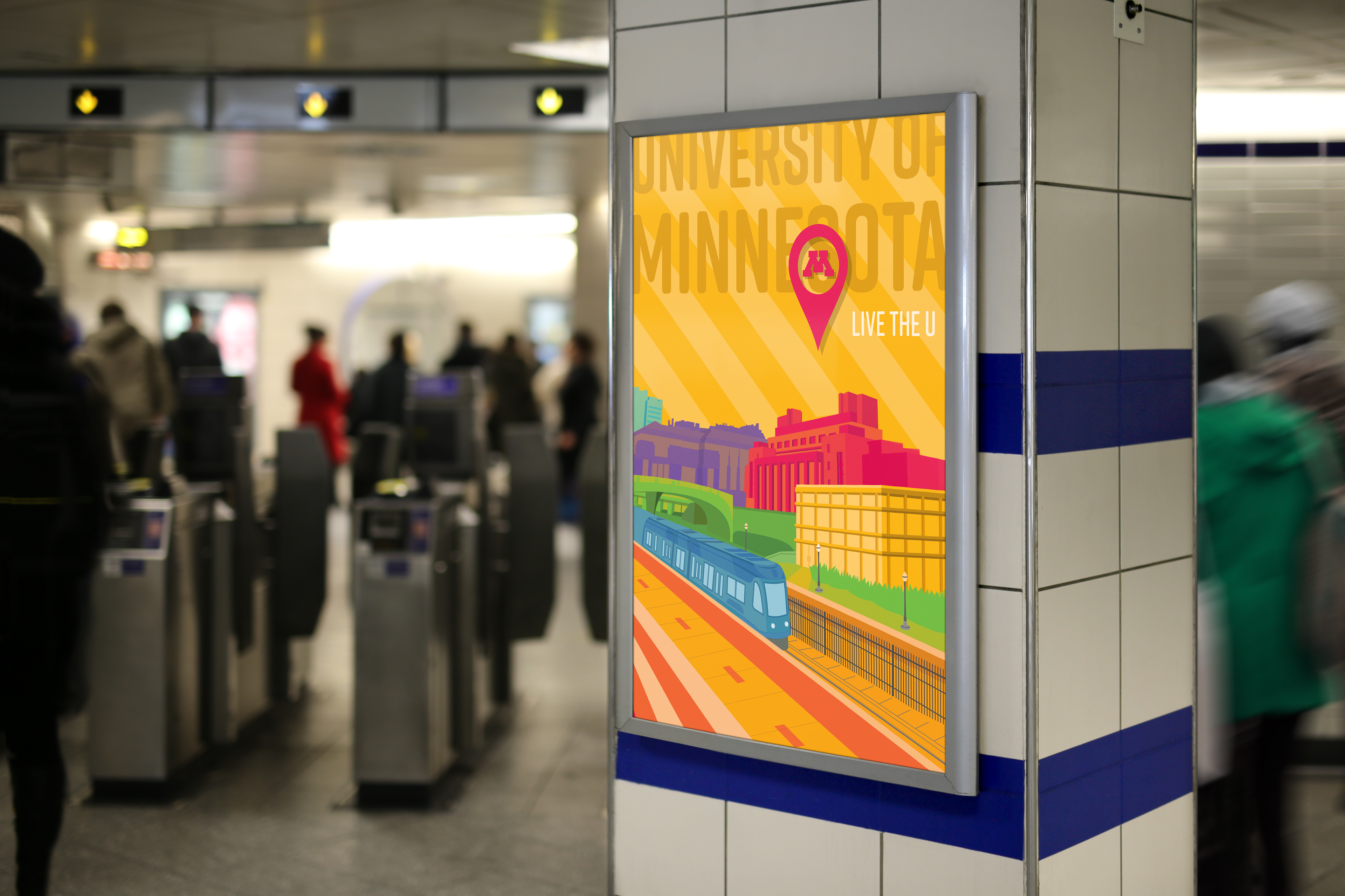
In the Summer of 2018 I had the honor of designing 3 posters and 4 illustrative tags for the University of Minnesota anual marketing campaign for new and transfer students.
I wanted these materials to be more engaging and dynamic than the usual official university advertising with the maroon and gold colors, better adapting to their young audience. The Weisman Museum (left), the Coffman Union (center), and the downtown view from the University bridge (right) are some of the most characteristics spots on campus and display the U of M life and vibrancy on campus, so I decided to use them as models for these illustrations.

I have also created illustrative tags and headers for flyers that were used during Welcome Week and Commencement days. They follow the same style of the posters, showcasing some of the beautiful buildings we see on campus, such as Northrop, the sculpture gardens, the entry gates, and the Goldy Gopher statue.

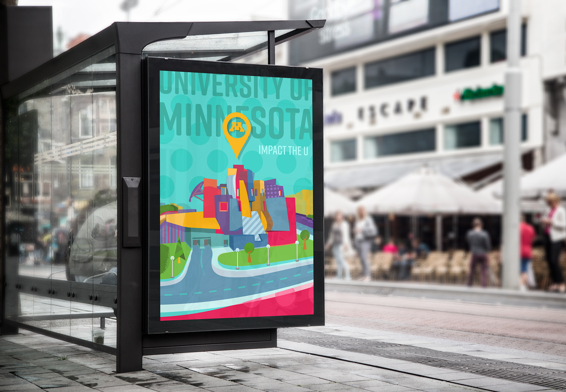
The ad posters are usually placed in highly populated areas, such as train stations, bus stops, and throughout the campus itself; so the use of a vivid color palette with dynamic movement and a sense of the depth of field help to catch the viewer's attention and guide their eye through the piece.
The informational booklets help students better adapt to their new life at the university in three different areas: Exploring the city, taking advantage of university-hosted events, and navigating campus between classes and housing safely and effectively.

The main design process I used for this project was the tracing of a picture from the desired location, then coloring it with the color palette I assembled in order to achieve the young dynamic style. The palette consists of six colors used in a variety of different opacities, juxtapositions and overlapping over each other creating some alternative results seen in the background.