From 2019 through 2021 I worked as UX/UI, CRO and brand designer for Clube do Valor, the largest independent financial management company and financial education platform in Brazil. I created their new brand from scratch, logo, websites (for all products, services and events), all social media posts (Instagram, Facebook and LinkedIn), Youtube video thumbnails, and all advertisements based on CRO studies of our audience and their behaviors for Google Ads, social media and AdSense.
Generally speaking, I created virtually all of the visual materials that are actively used in the company, and I'll share a tiny fraction of it here, but you can find most of the work through the company's website + social media, which I will share below.
Let's start with the brand's visual identity, as it explains some of the choices I made afterwards for UI, CRO, and even UX. When I first started working at Clube do Valor in 2019 we had a very outdated logo, it held no meaning and did not connect to the company's culture or values at all. Clube do Valor was founded in 2016, so we were early enough in the game to change it drastically without affecting too many long-term materials or losing their audience's brand recognition.
We decided to start from scratch, and after many weeks of back & forth, brainstorming sessions, and refinements based on diverging opinions from management, we finally got to a result everyone was happy with and where all teams felt represented.
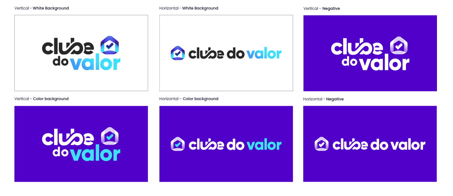
Allow me to briefly explain the thinking process and logic behind the new logo:
The translucent tape around the central icon represents a home (a symbol of union that translates the meaning of the world "Club" in a literal way — Clube do Valor = Value Club) and a Northern compass, symbolising the company's ever growing determination in achieving new heights and our main goal to help people reach their financial freedom through education. The checkmark represents the multitude and scale of all meanings the word 'Value' holds. Not only for representing the "V" letter in the alphabet, but also for symbolising experience, success, and completion.
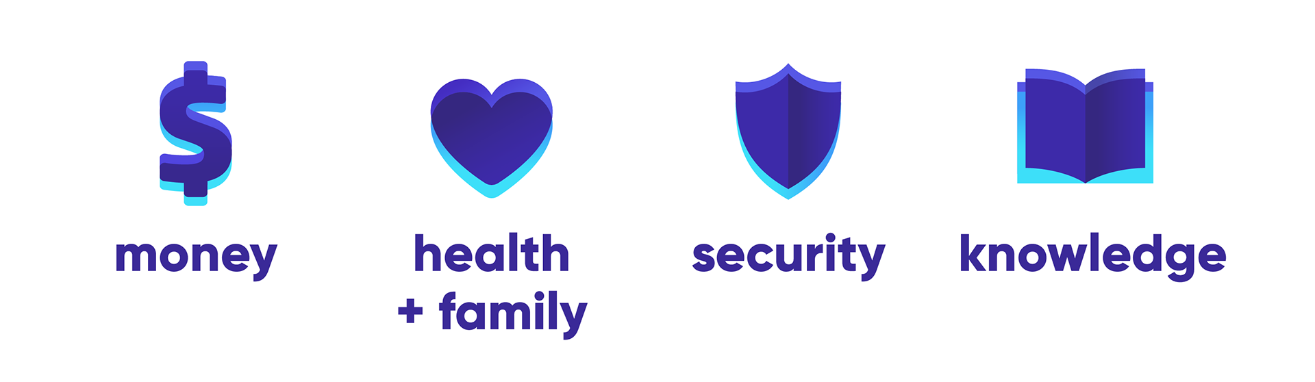
As a good portion of the company's content is developed through video, I felt it was extremely important that our logo received an animated iteration, and that it should be used in all videos and standard ads for our brand. This version of the logo displayed 4 other central icons: Money (dollar sign), which is the bridge between the audience and their goals; Knowledge (book), which is the product we sell, and ultimately the key for the audience's success; Health and Family (heart), representing the most important values and purpose for which the money can be a catalyst for wellness; and Security (shield), symbolising the safety protocols and transparent methodology the company uses both in education and financial management outlets.
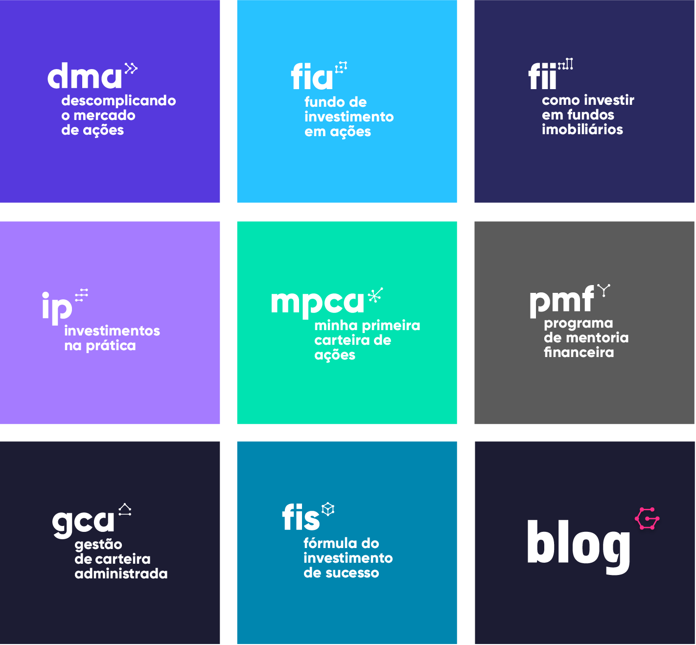
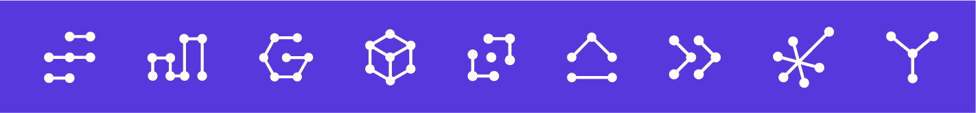
Next up are the courses + services branding, which are the face of our products. For each of them I also design a website, multiple advertisements, and branding. And all of these are reviewed and adapted every launch cycle (usually 3 or 4 months). I created a cohesive linear visual identity that represented each product in a literal way — for example, the DMA course is an intensive program that takes the user from a complete beginner all the way to a prepared and resourceful investor in a matter of months, therefore the icon symbolises a "fast-forward" sign.
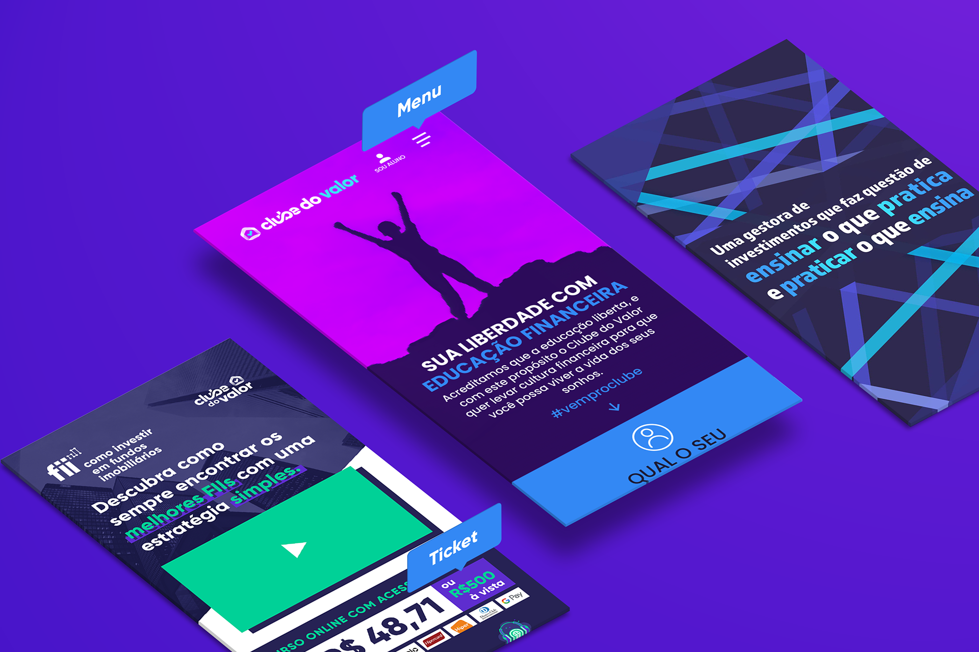
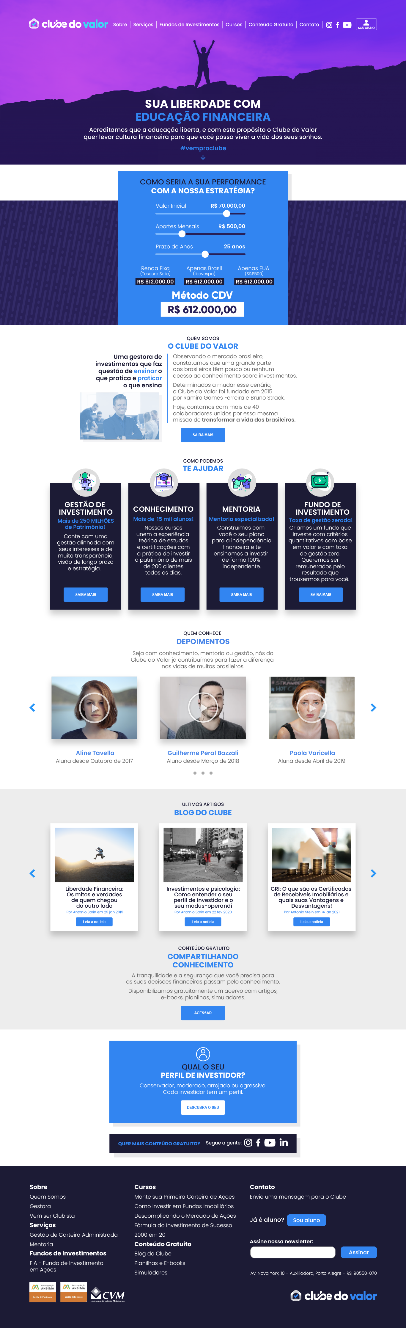
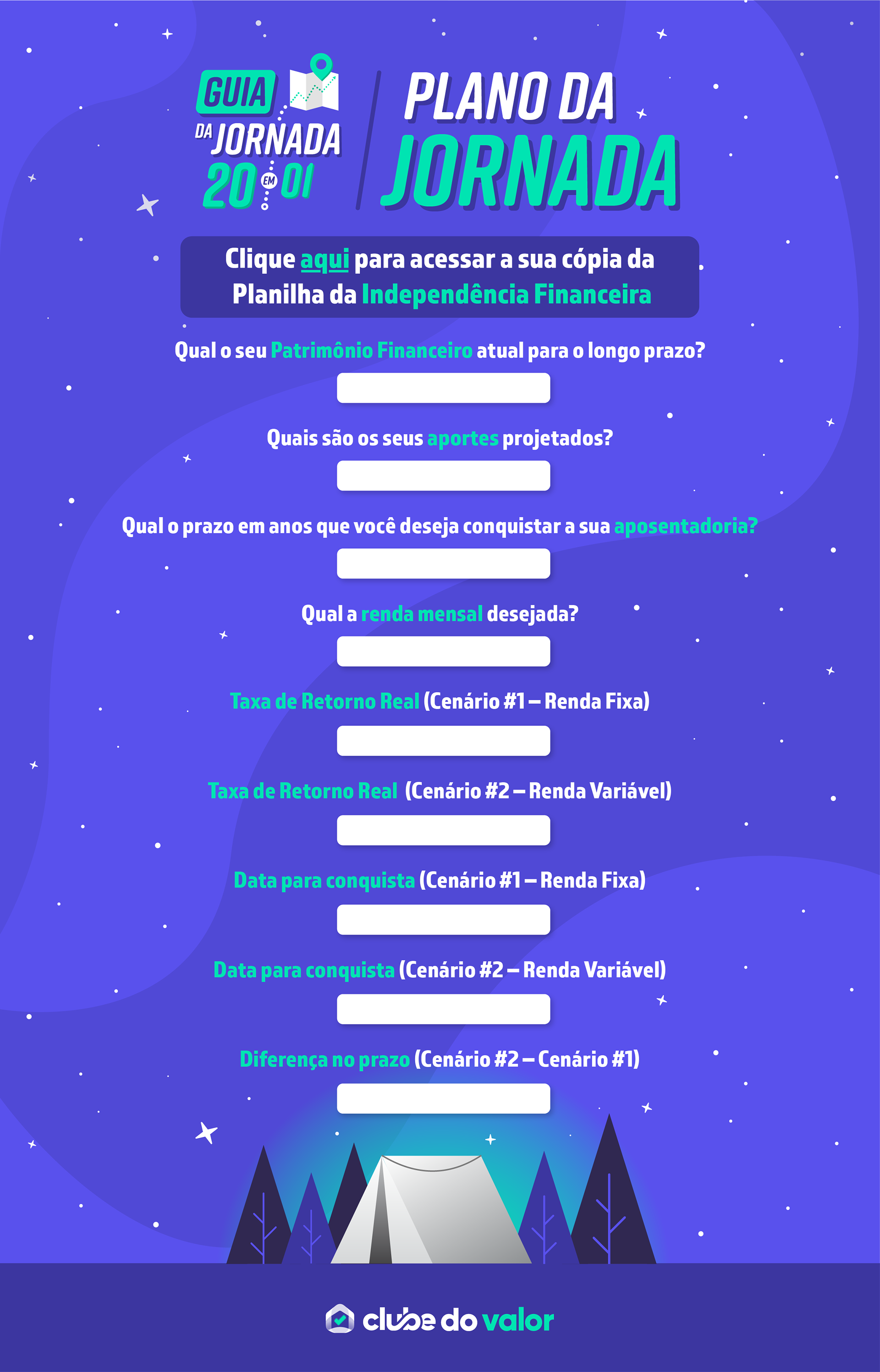
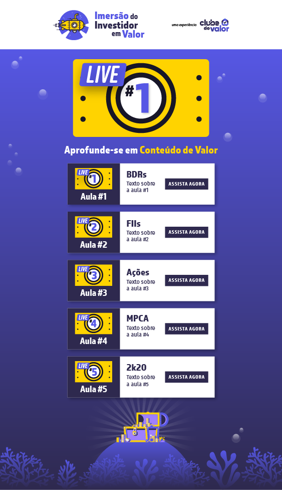
Now let's get into the UI/UX projects. I have designed over 30 websites for Clube do Valor, from landing pages, product launch pages, webinars, catalogs, and every section of our official corporative website. The main goal of all of our pages are to convert potential leads, and we do so by testing multiple visual assets (and copy) multiple times. Through a series of A/B tests, trial and error, and CRO methodology, I was able to define visual guidelines based on our audience's behaviour that prompted our campaigns to perform with exponentially higher conversion rates from 2019—2021.
Over 72% of our audience use a mobile device to access our content, so I optimize all visual elements and plugins for the mobile version before translating the layout for desktop use. Through testing, we found out that a color palette of 3 hues works best for conversion, using 2 main colors through the layout and 1 for the CTA. Also, we learned that the use of our CEO image in the header and "about us" sections tend to increase the conversion rate (people connect with people). And, to my surprise, an impressively long and visually clean product launch page converts much more than a UI-forward, concise one (for our audience, of course), and people do scroll all the way through, clicking more often than not on the very last CTA.
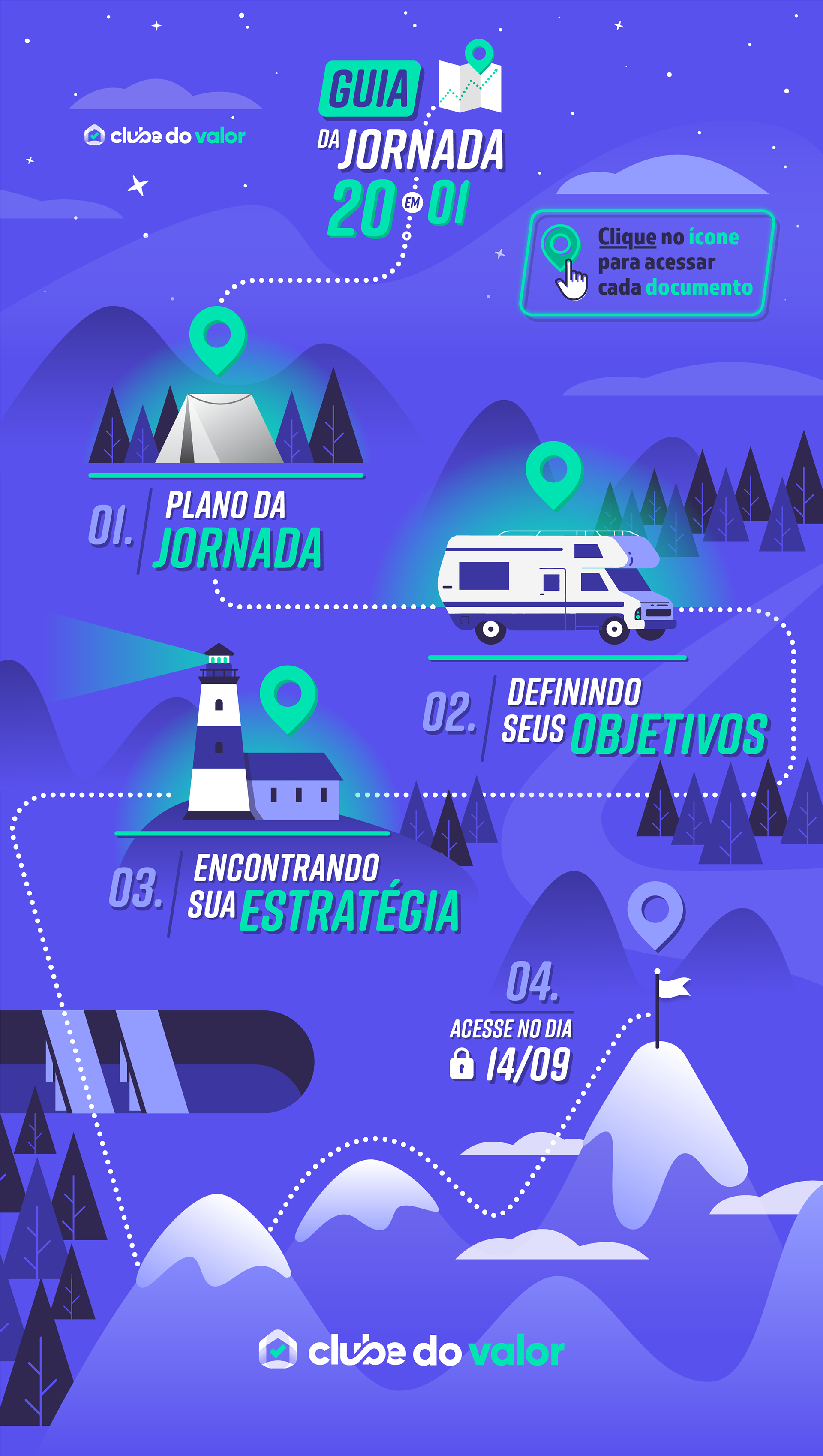
Here are some of the websites I created before, during, and after collecting some of these insights (and many, many more), they are presented in desktop + mobile formats: (click on each of them to open + zoom in the image to expand)


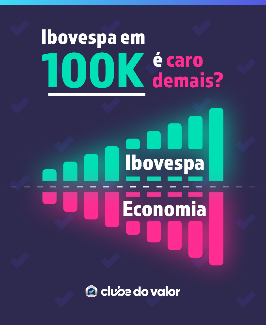
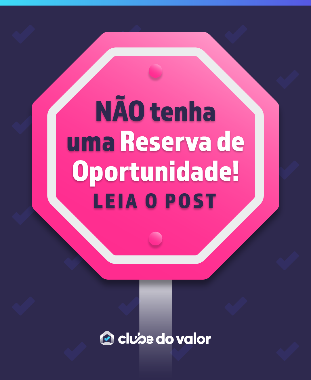
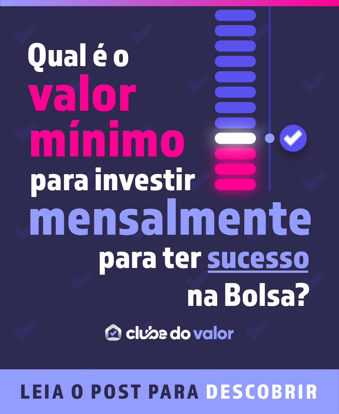
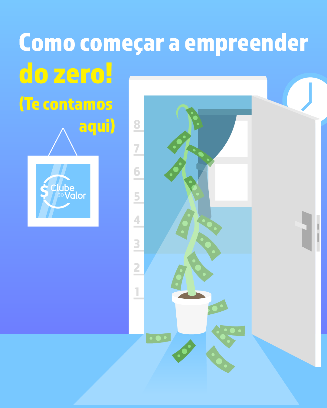
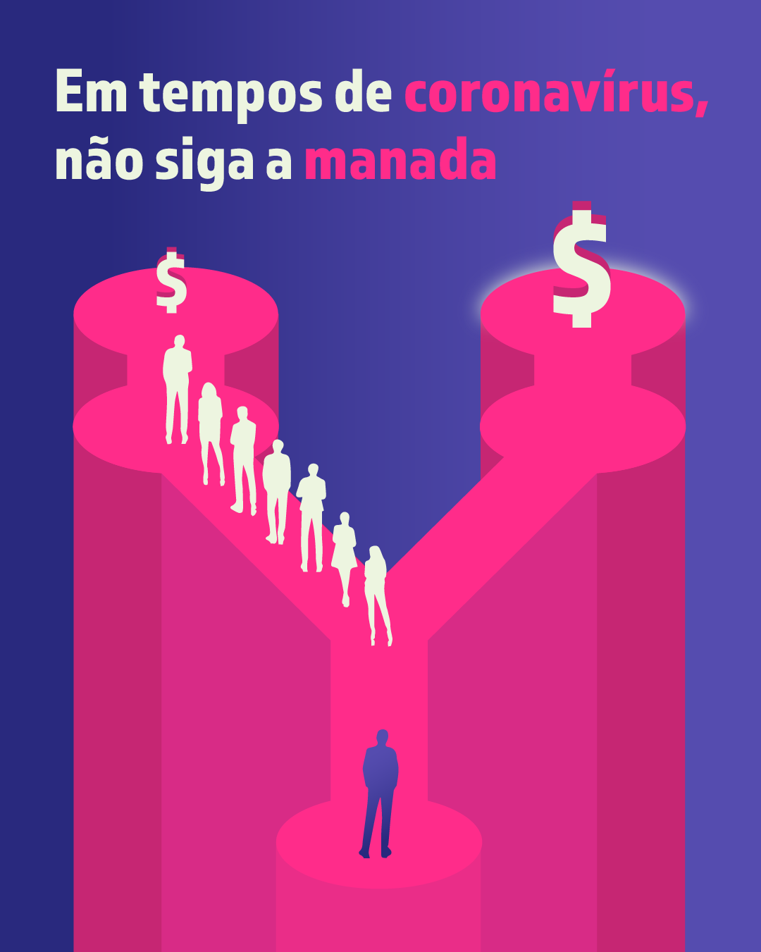
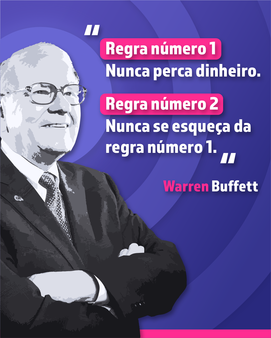
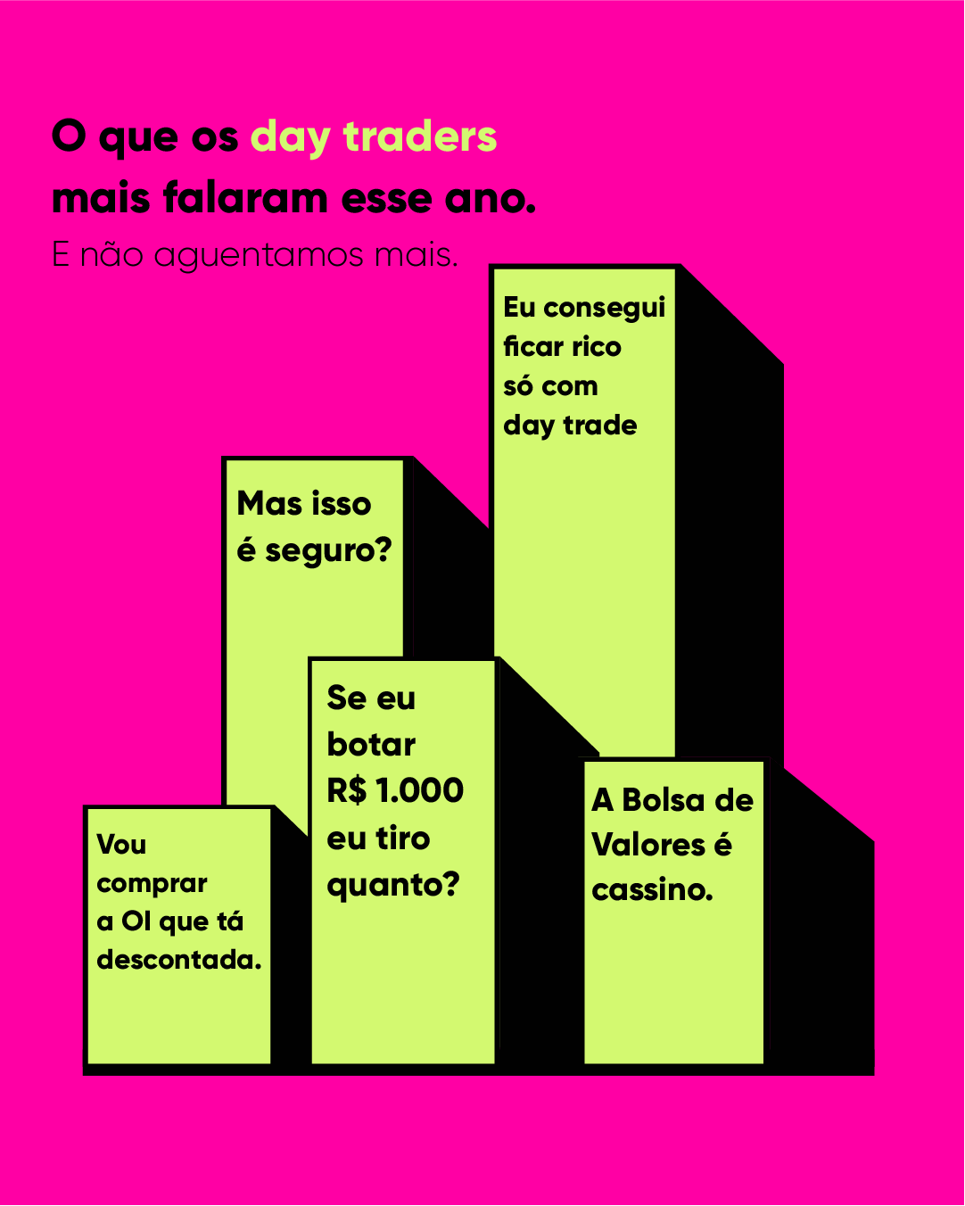
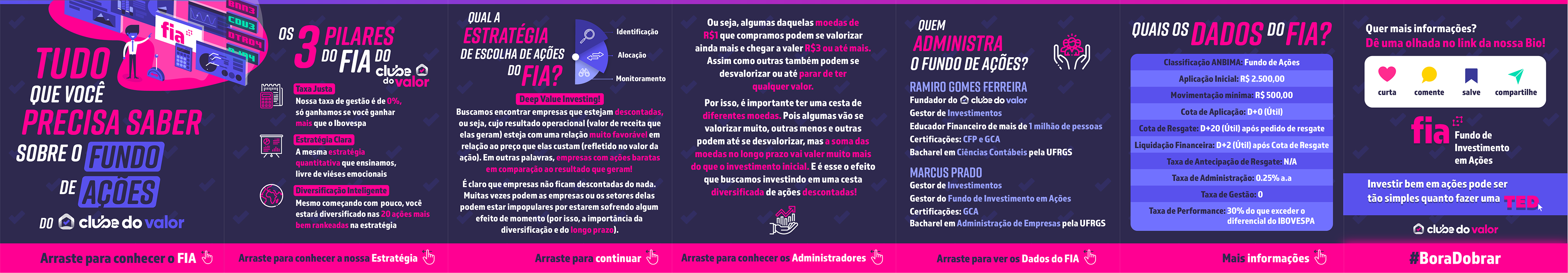
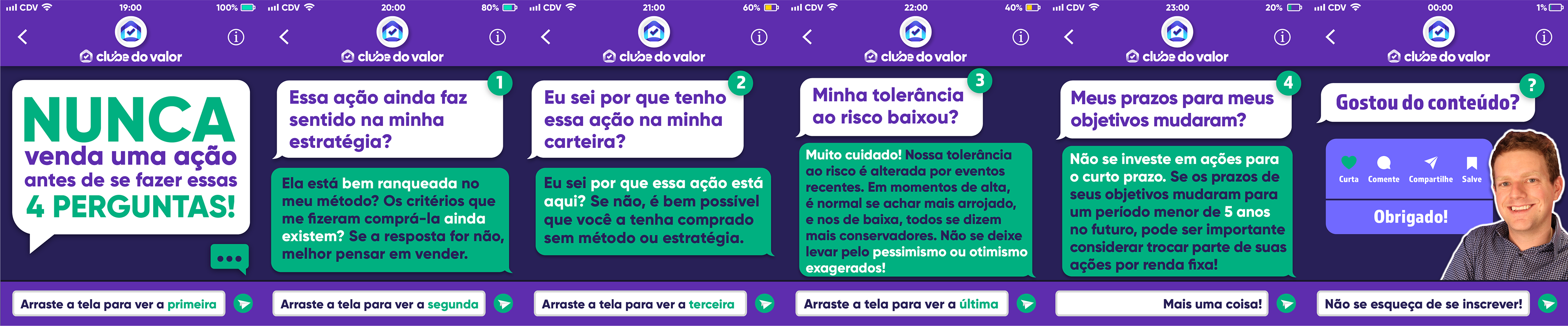
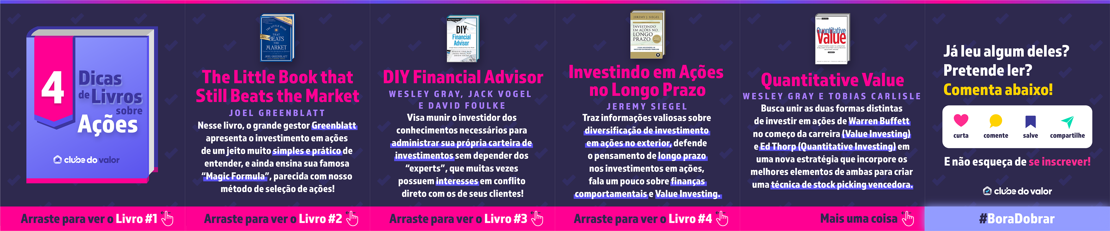
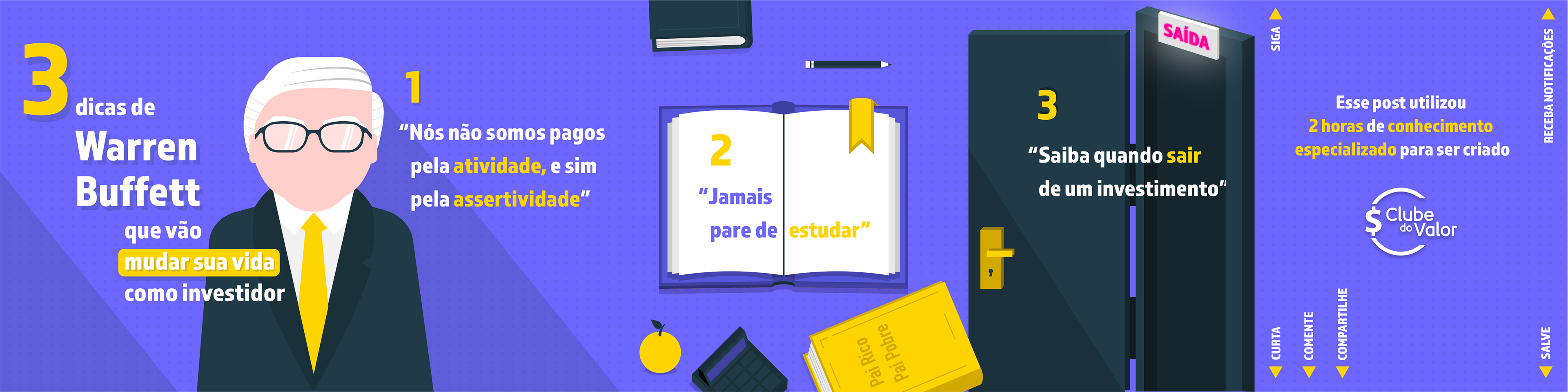
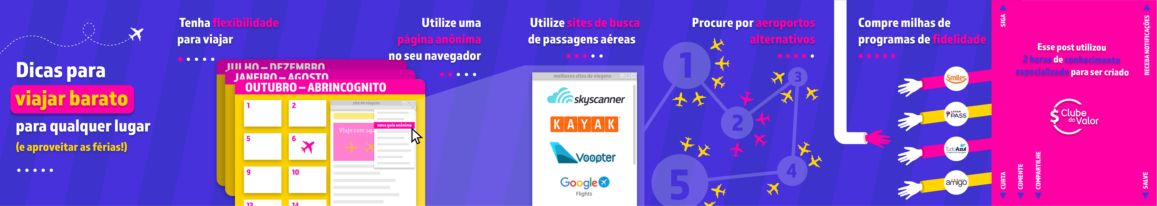
I wore many different hats as a designer at Clube do Valor, but my work in the social media department was certainly the most consistent. I created 2 posts + 1 IGTV for Instagram every single day (+ all Youtube video thumbnails, banners and Facebook / LinkedIn posts), which after 18 months leaves me with over 1.020 IG posts made. When I started at the company we had 28K followers, and we reached the 124K mark the day I uploaded my last post, 18 months later.
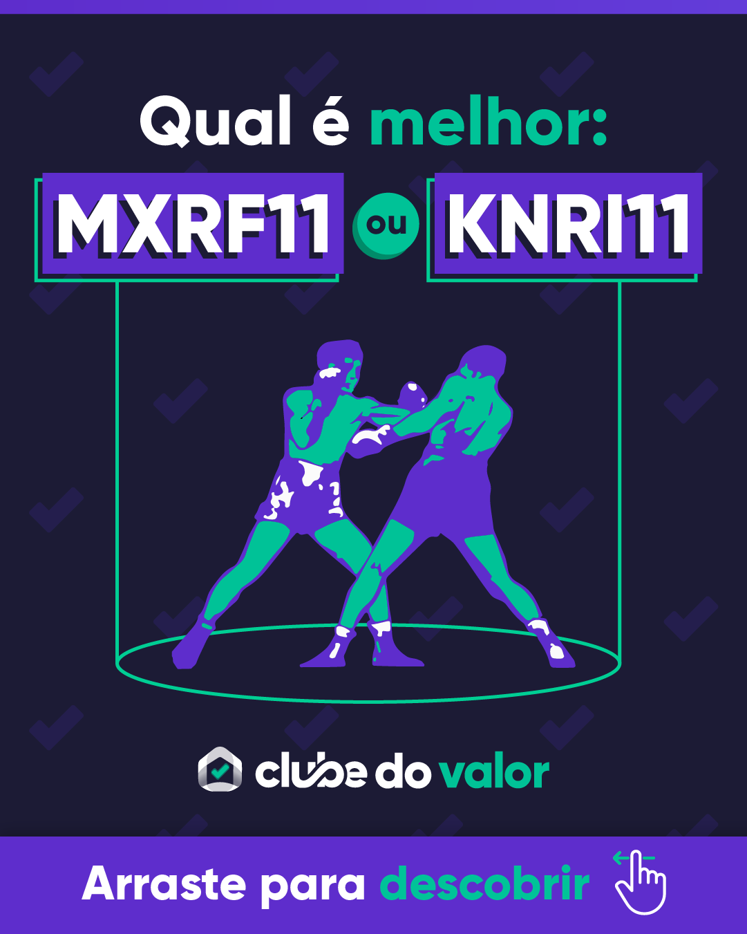
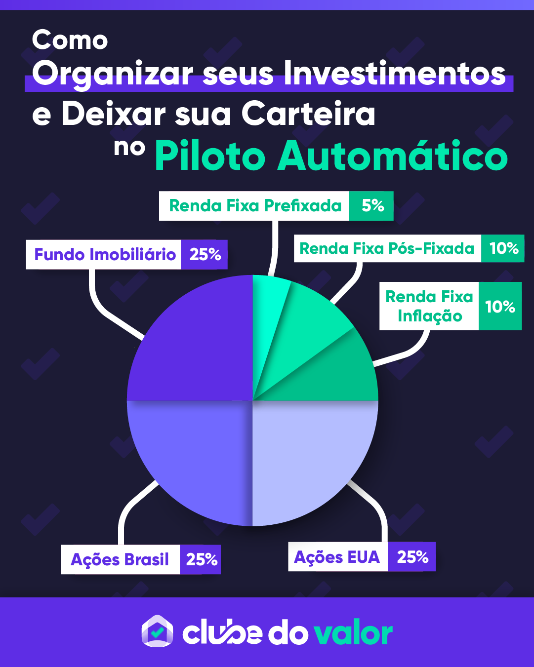
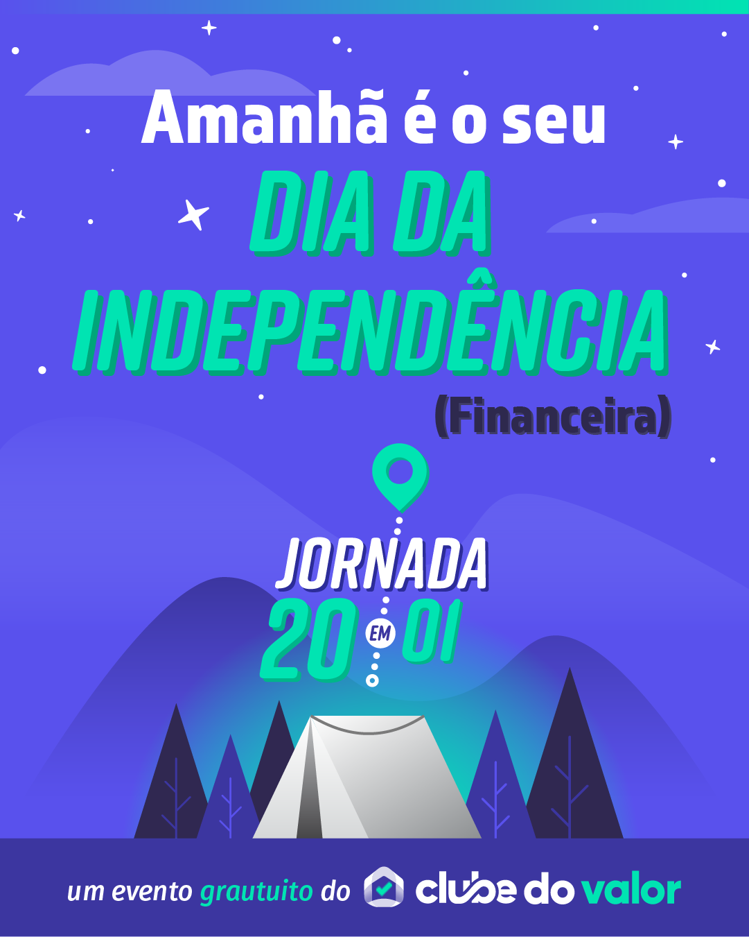
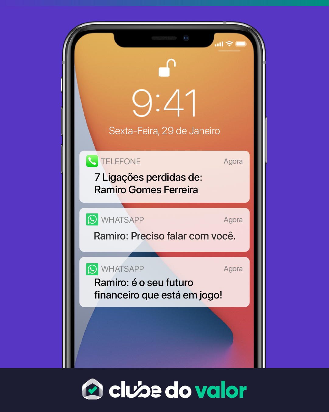
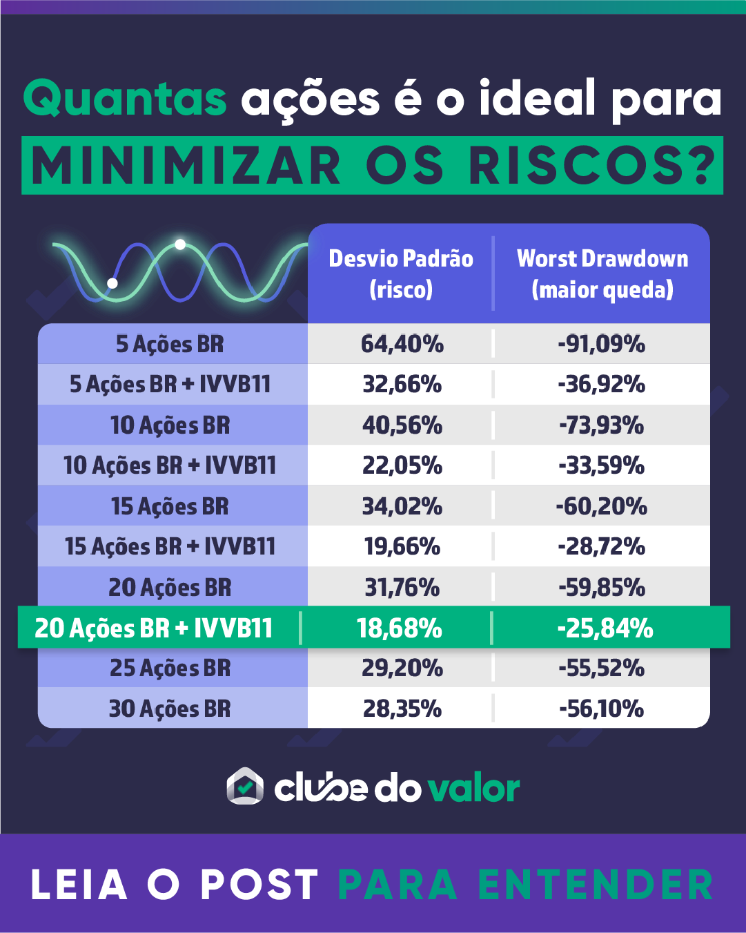
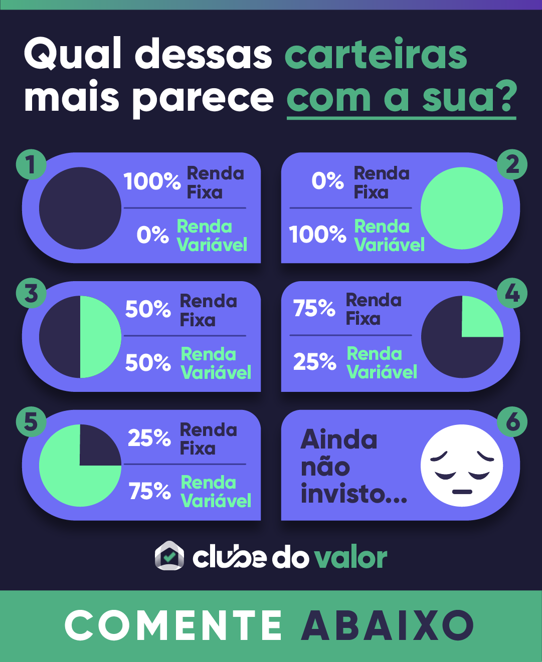
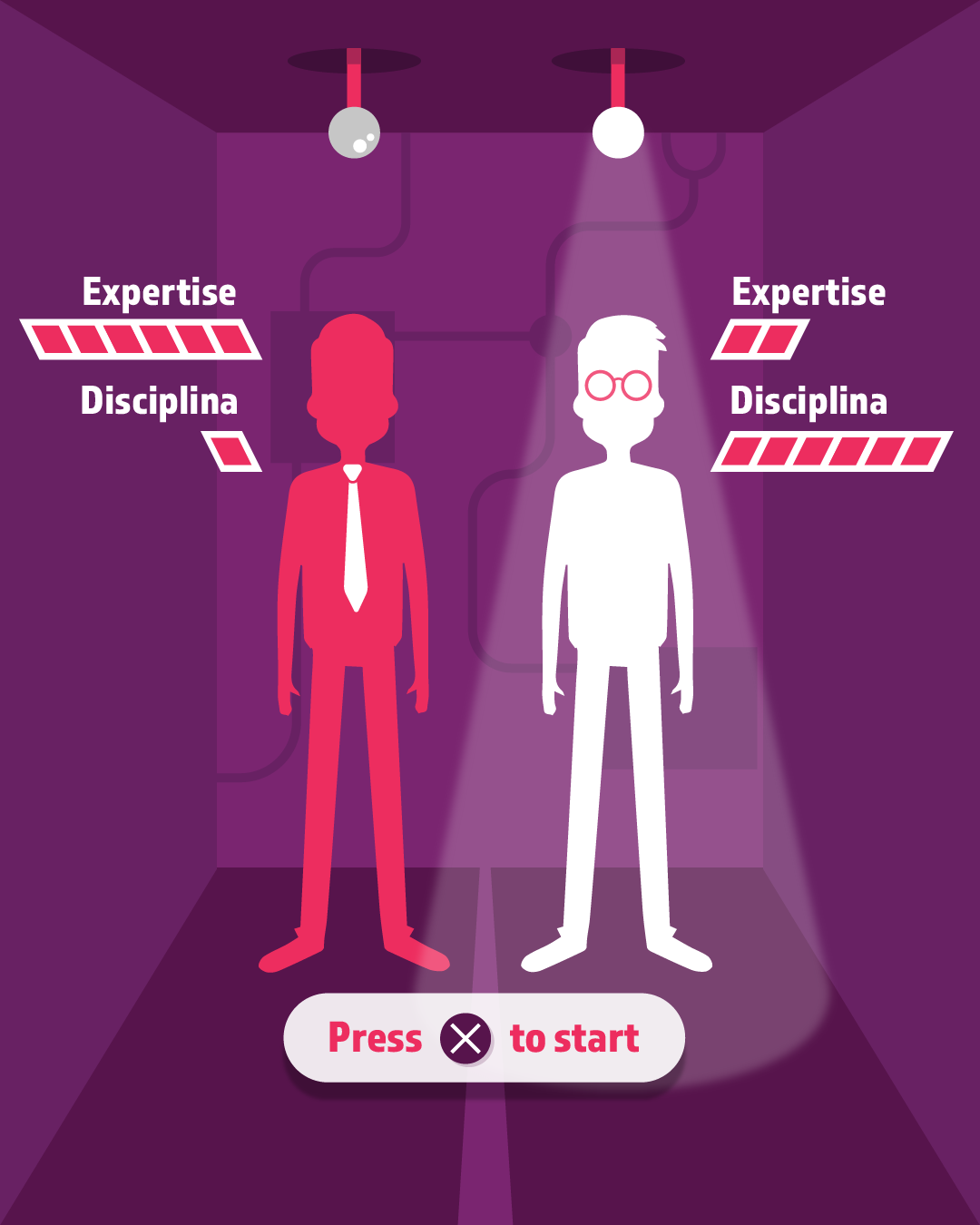
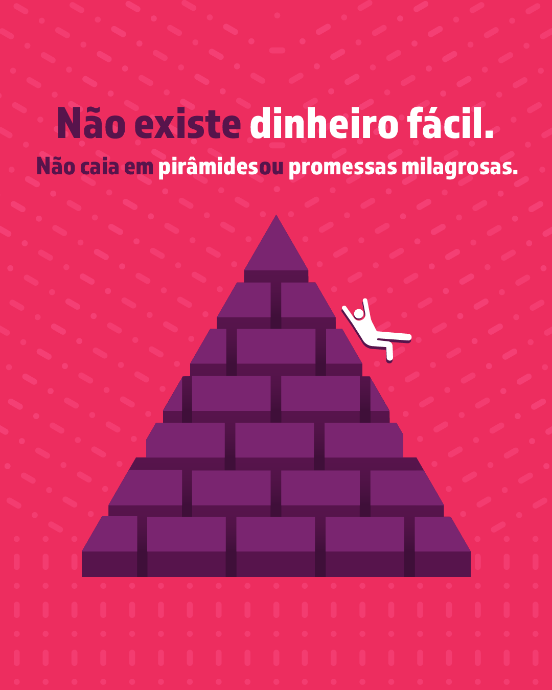
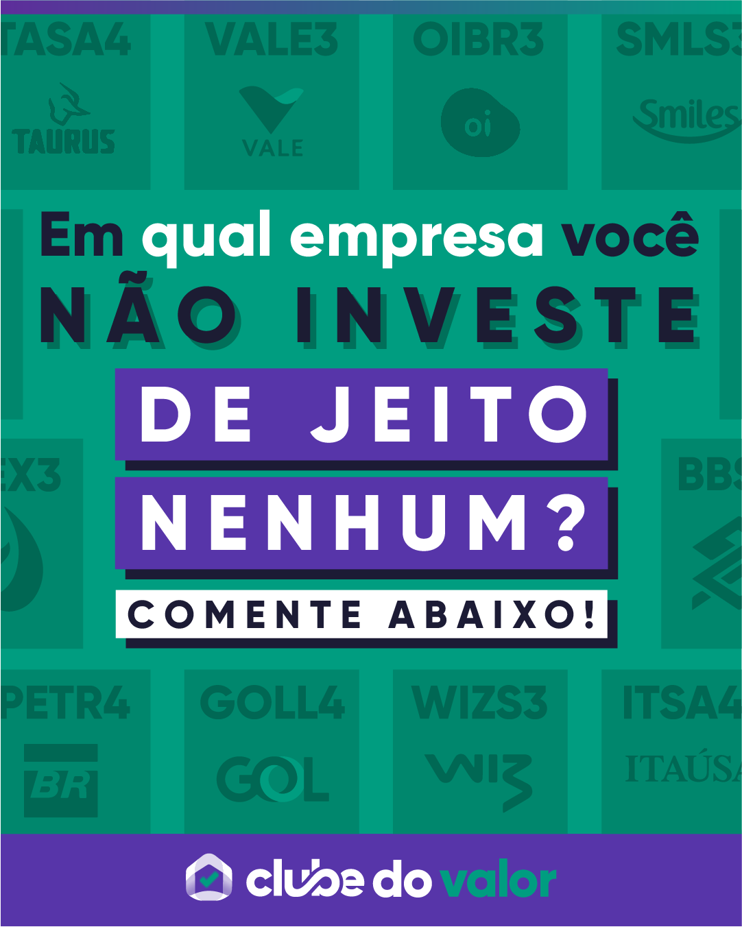
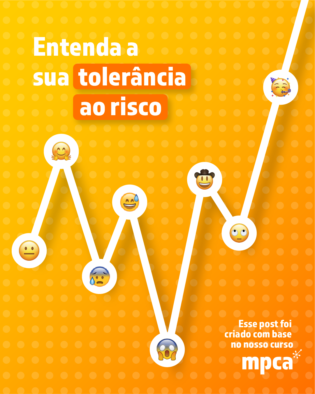
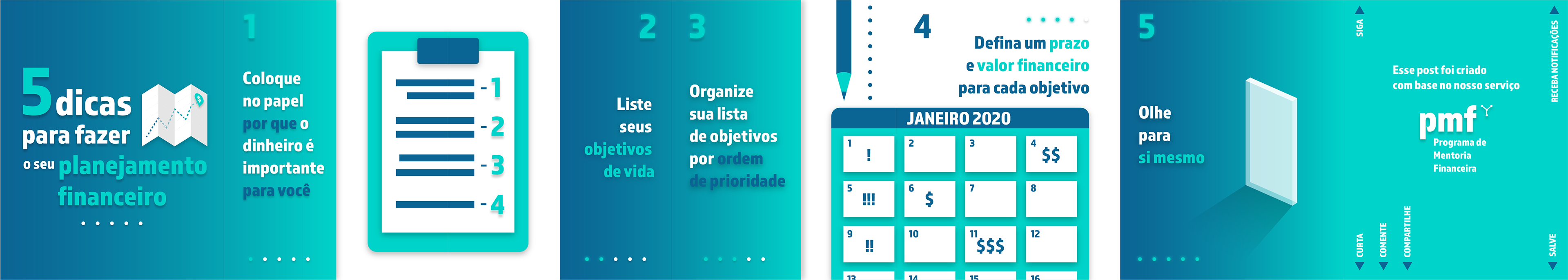
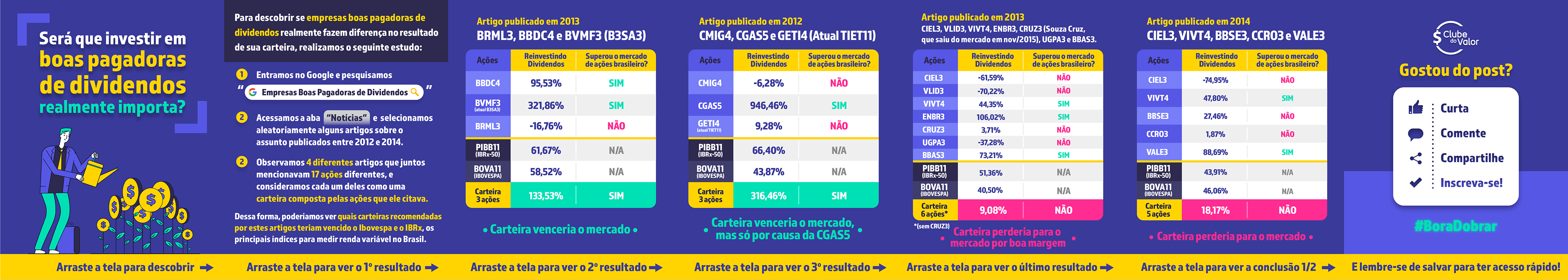
Our Instagram posts were an important test tool to see what colors, layouts and copy style worked best for our audience. Before I created the brand identity, the company had no official colors or defined style, so I decided to try out different options and compare the results in duplicate posts with minor different visual elements. Here are some of the posts I designed:


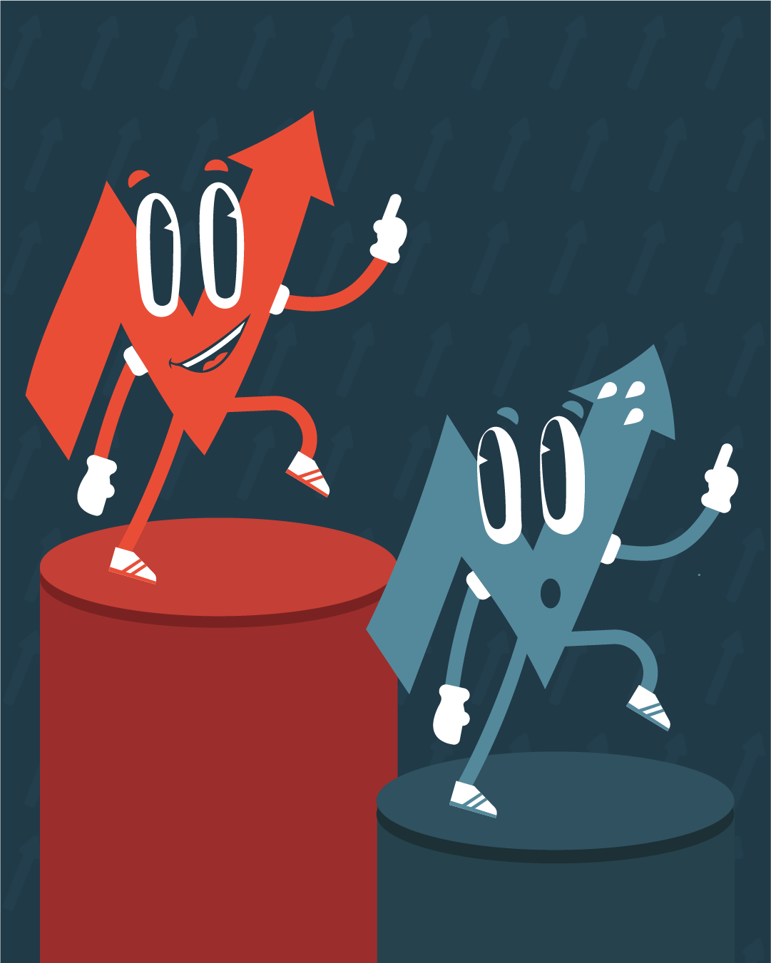
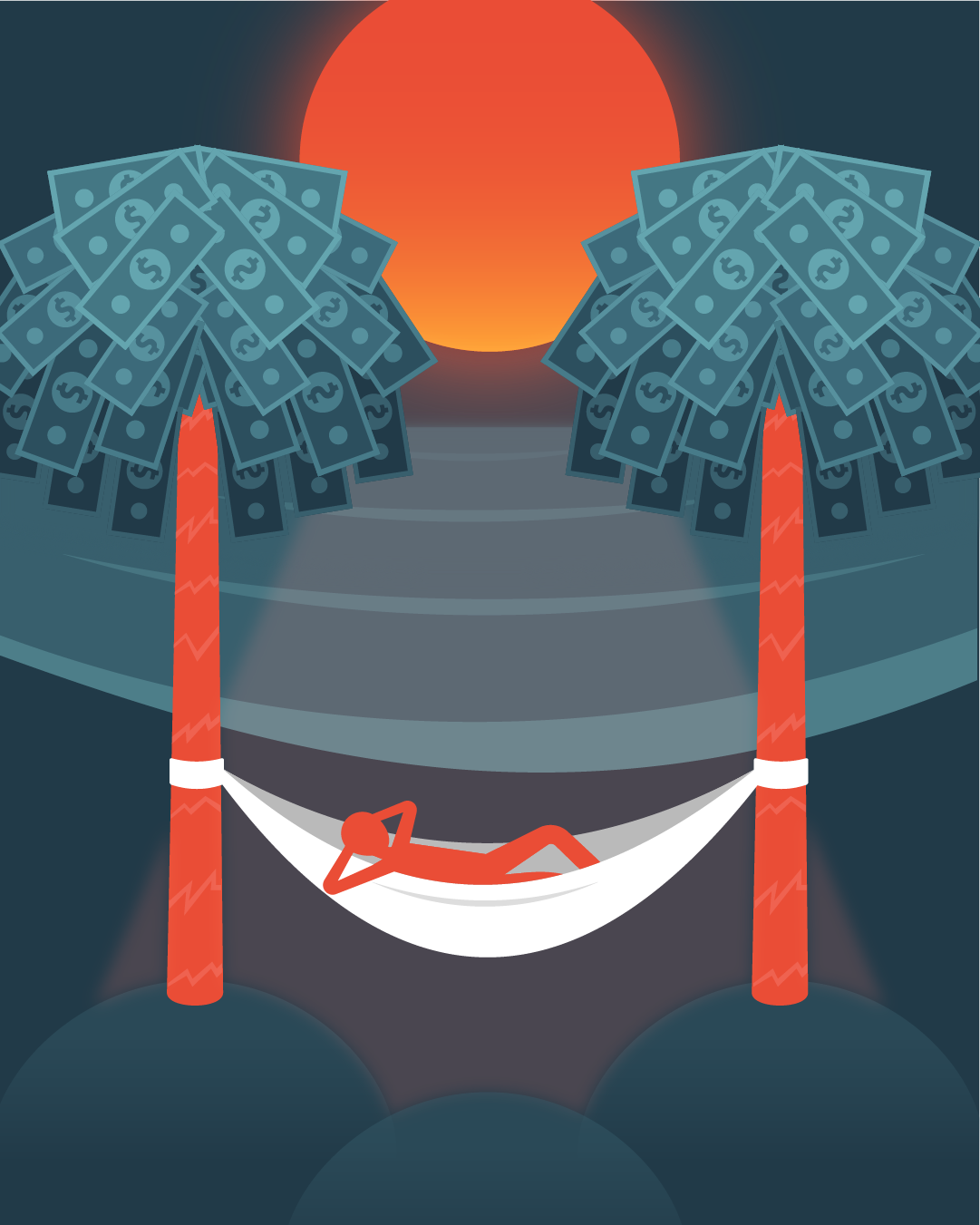

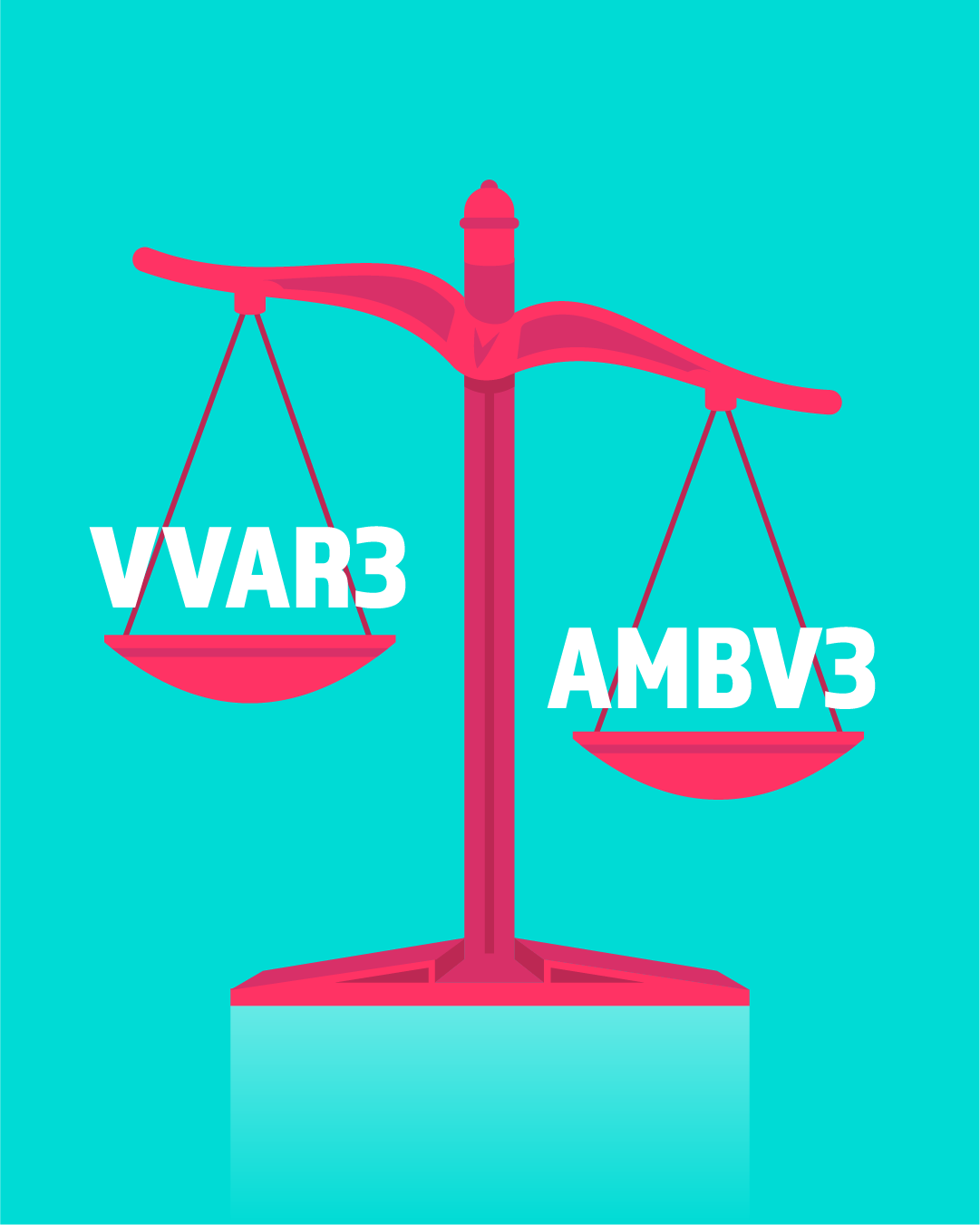


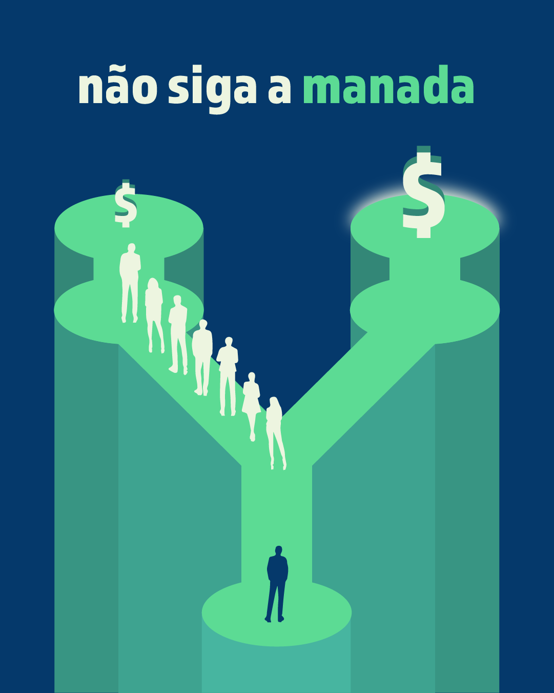
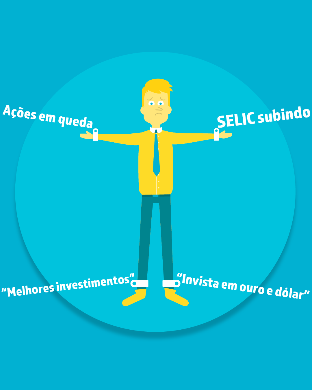
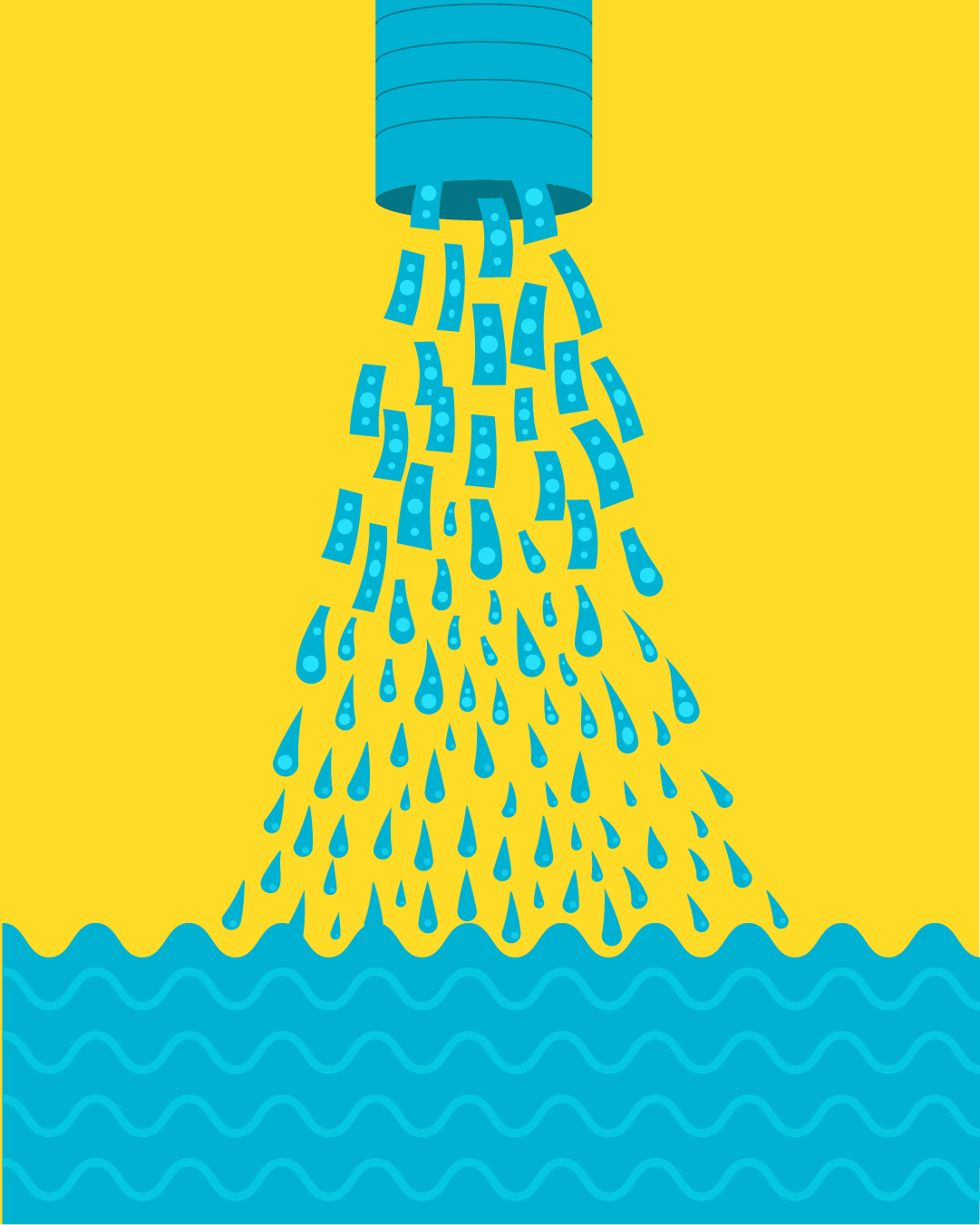
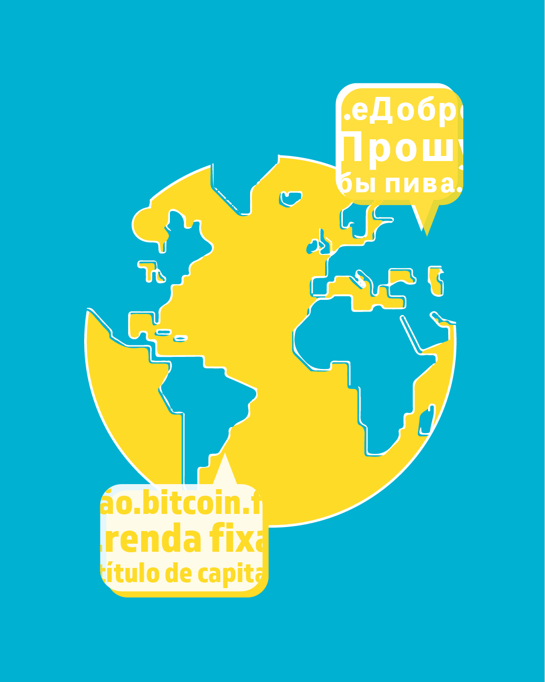
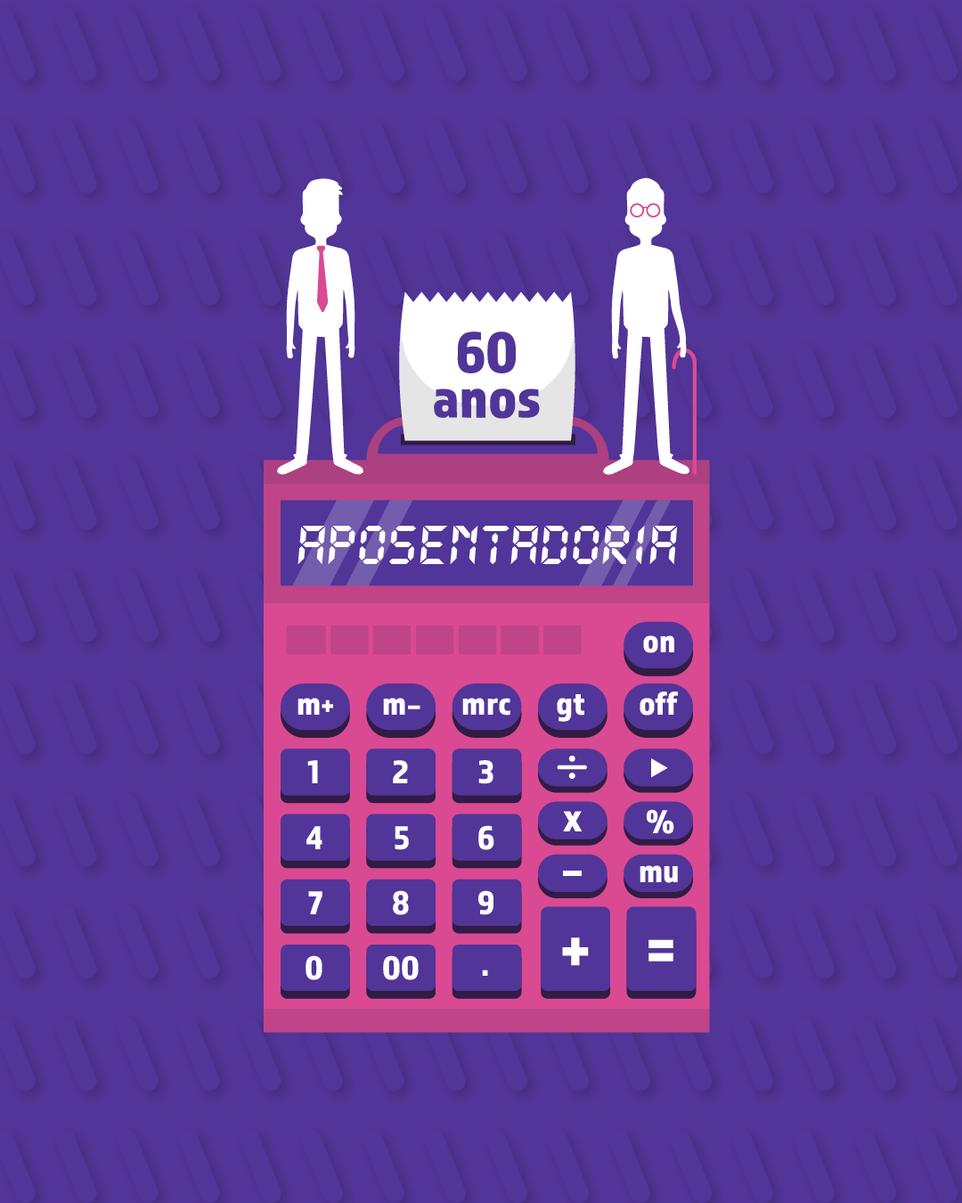
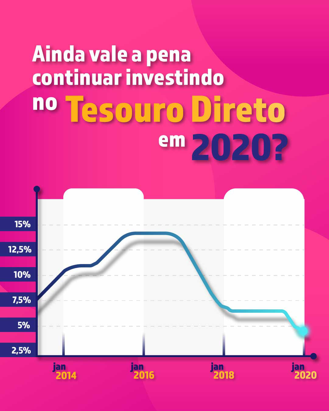
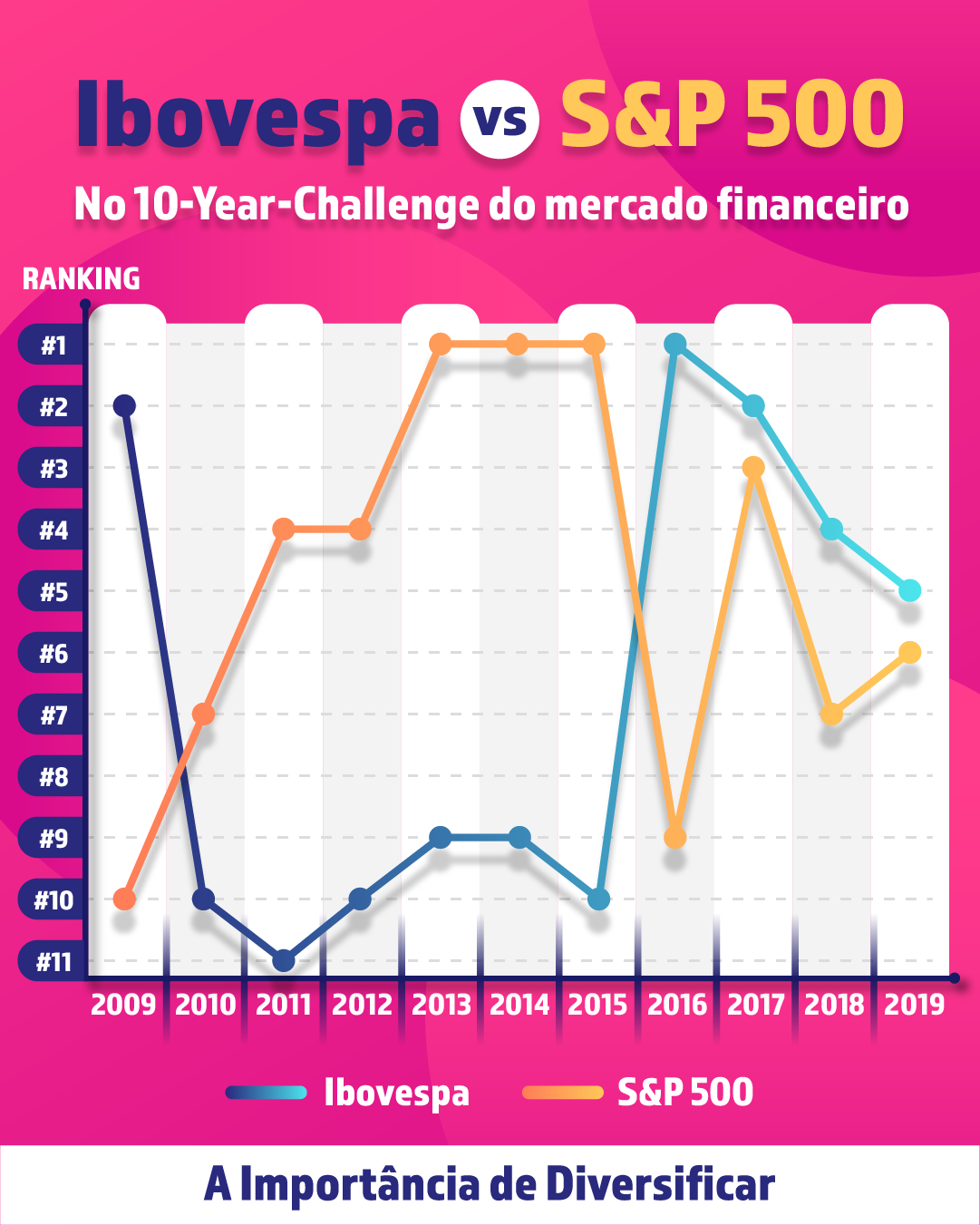

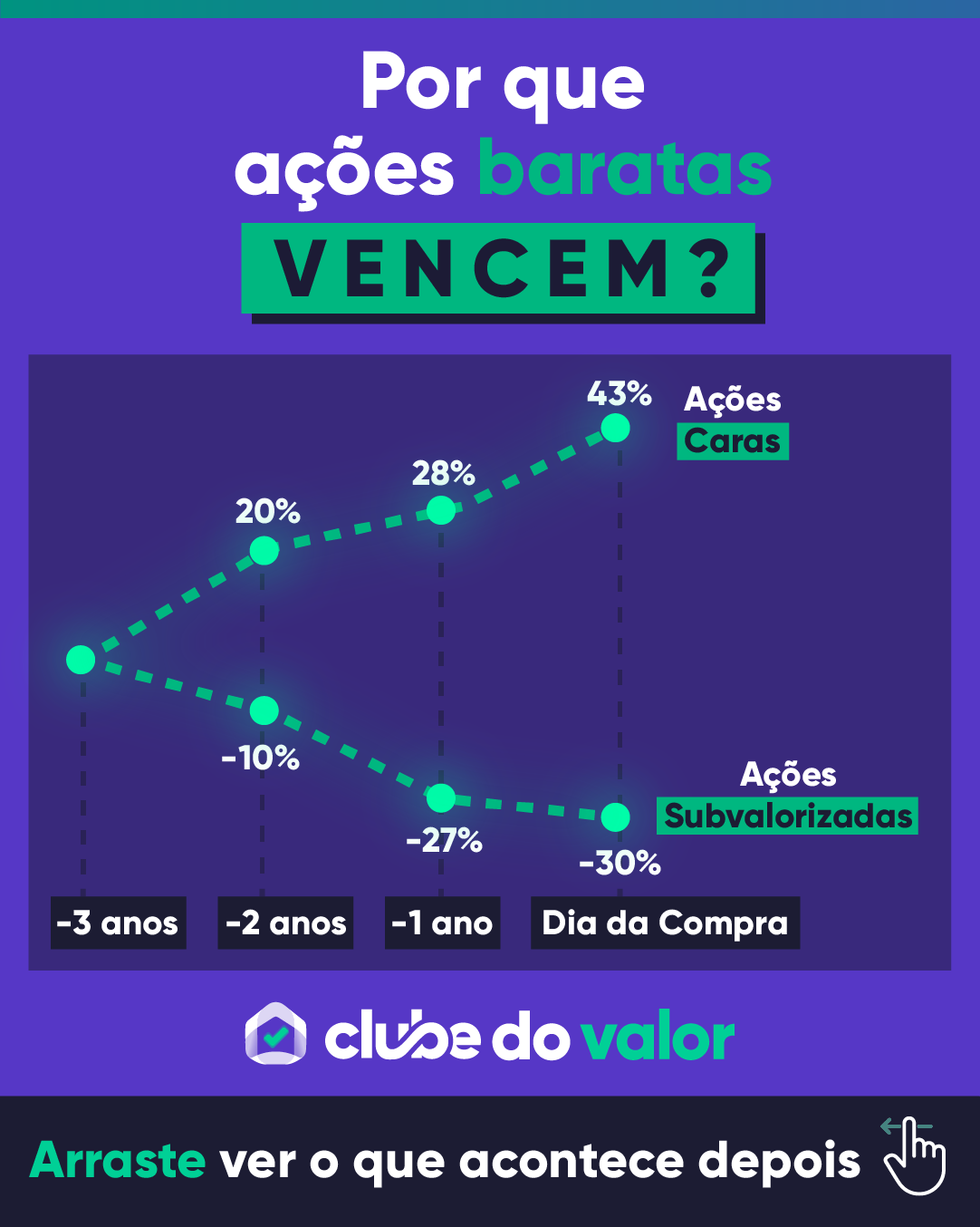
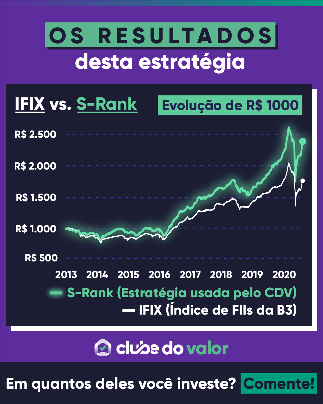

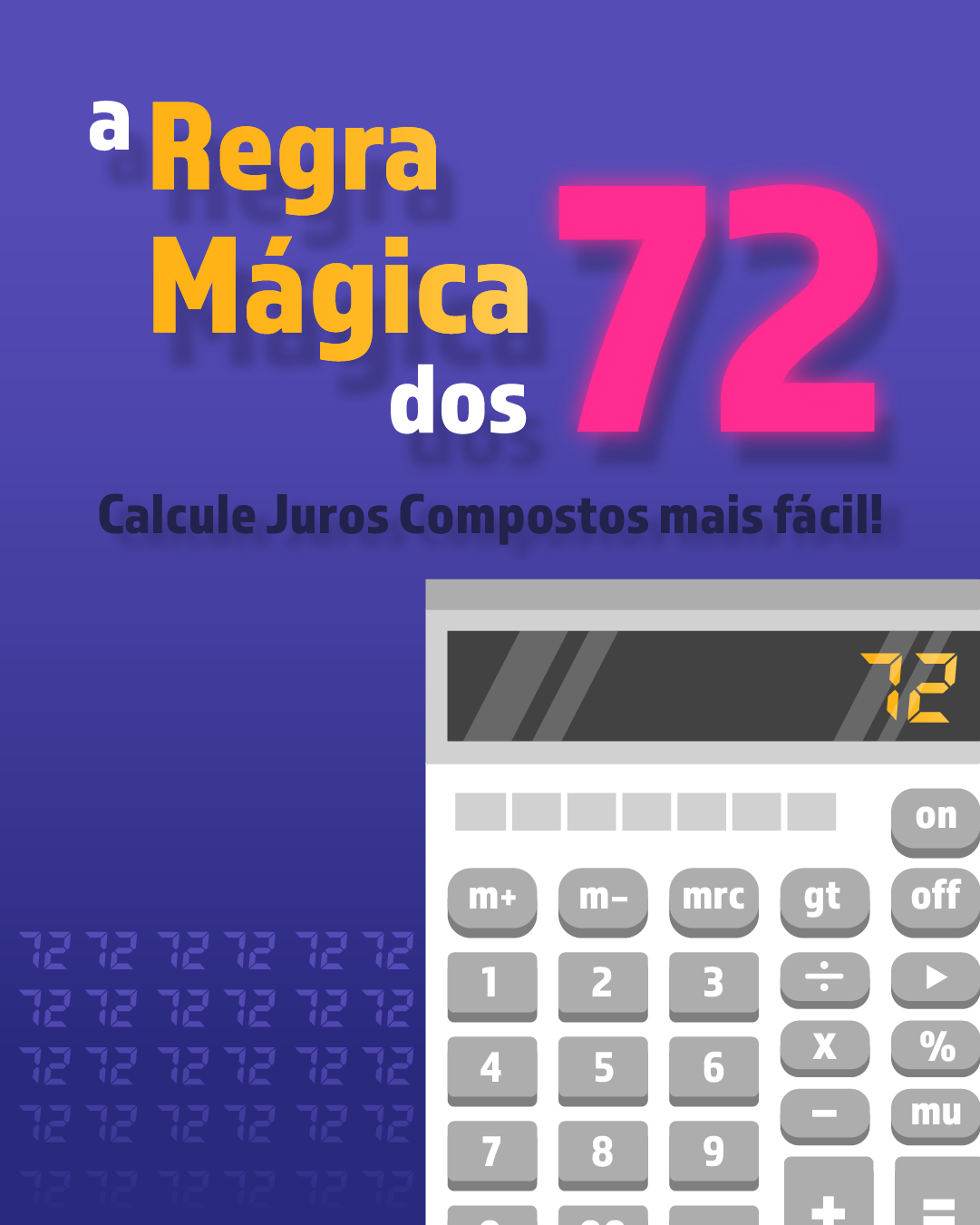


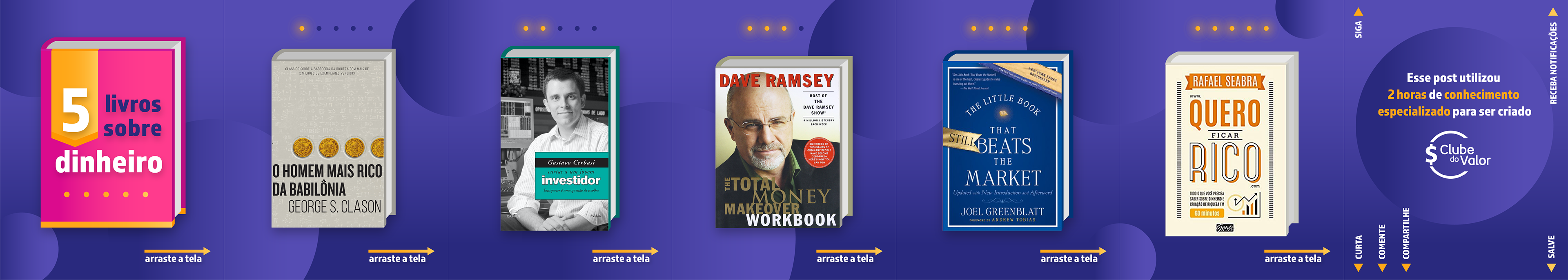


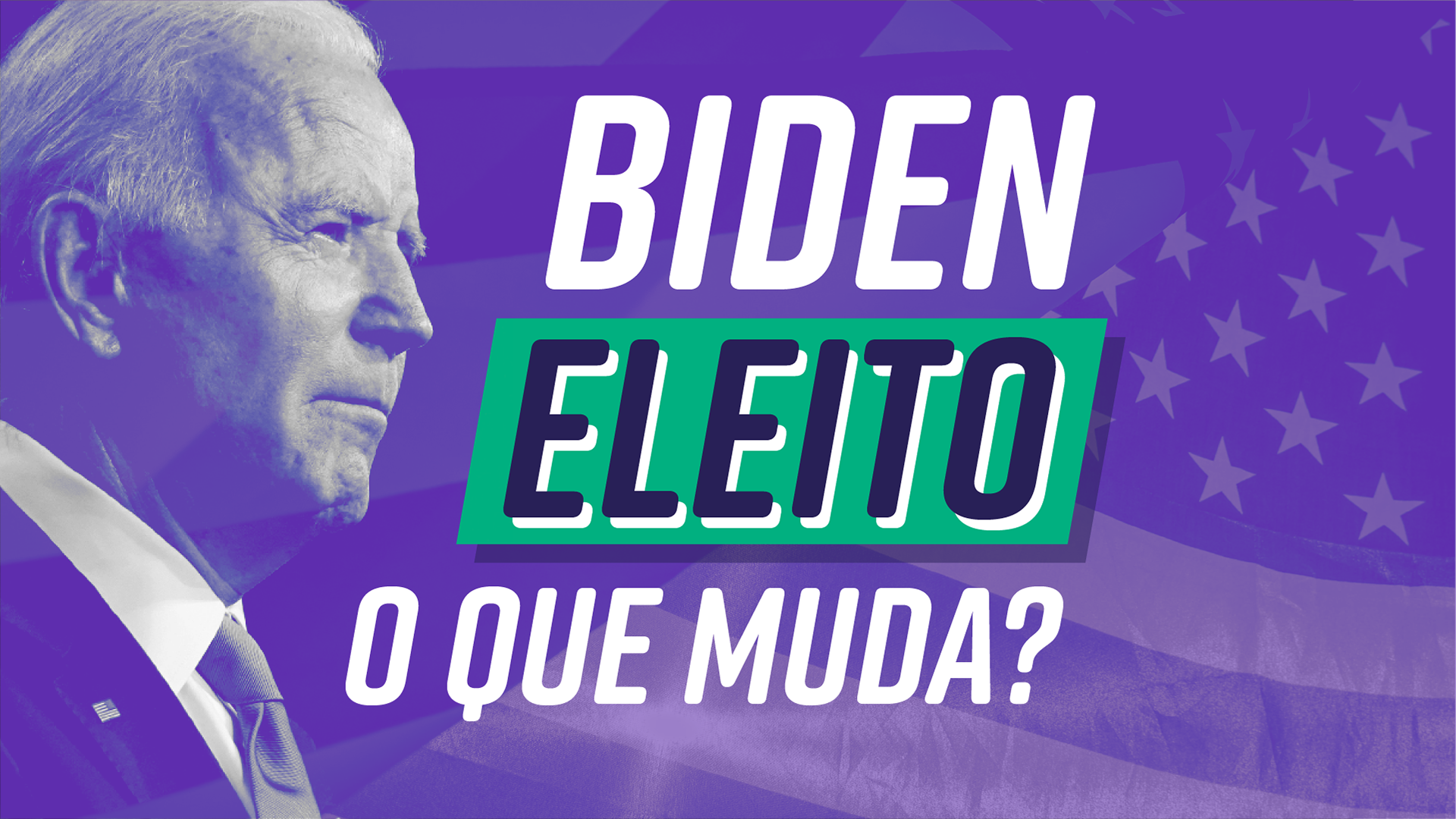
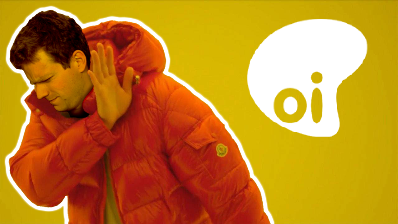
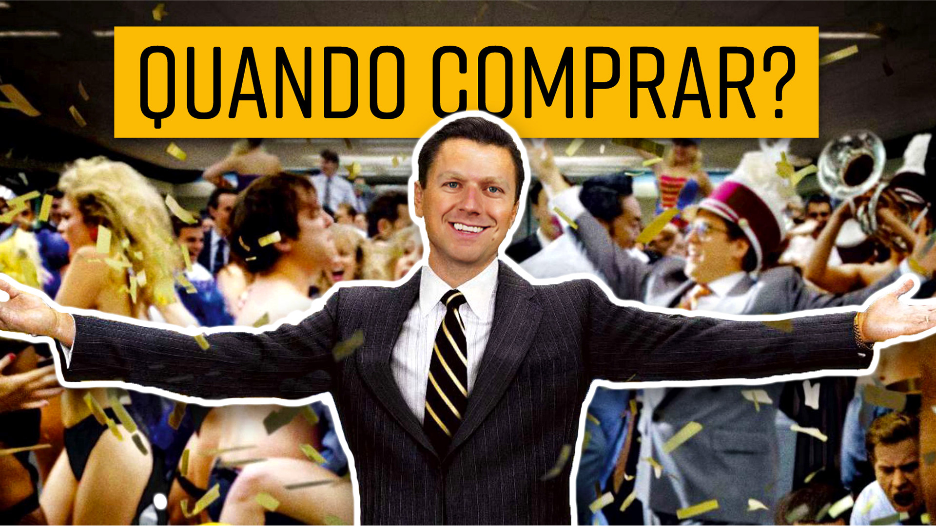
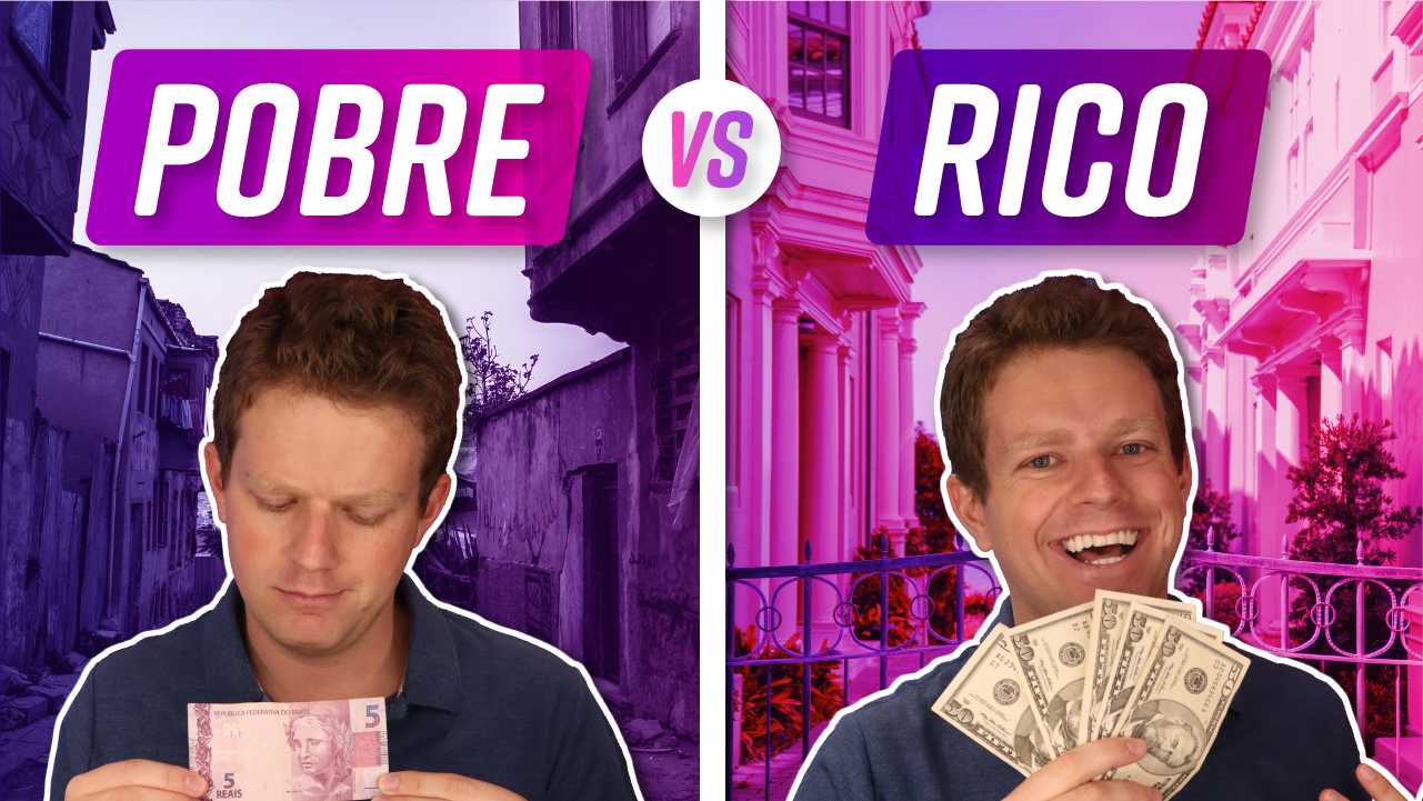
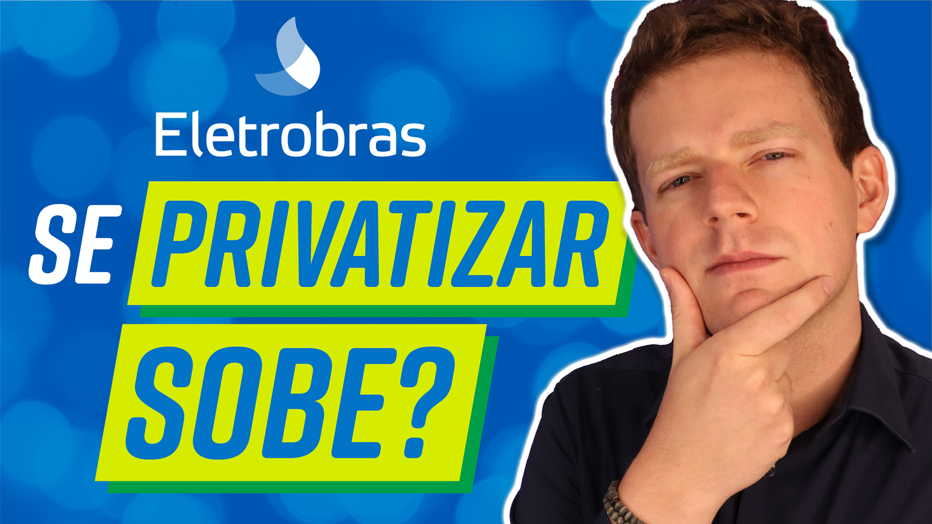
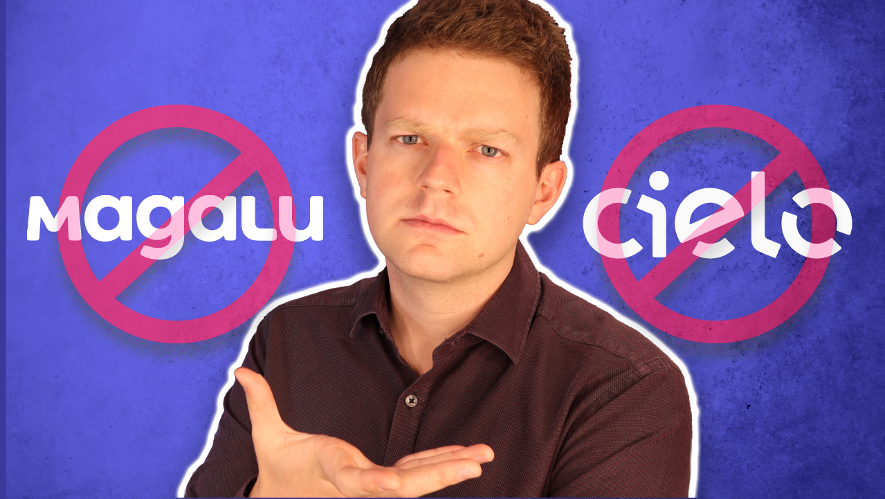
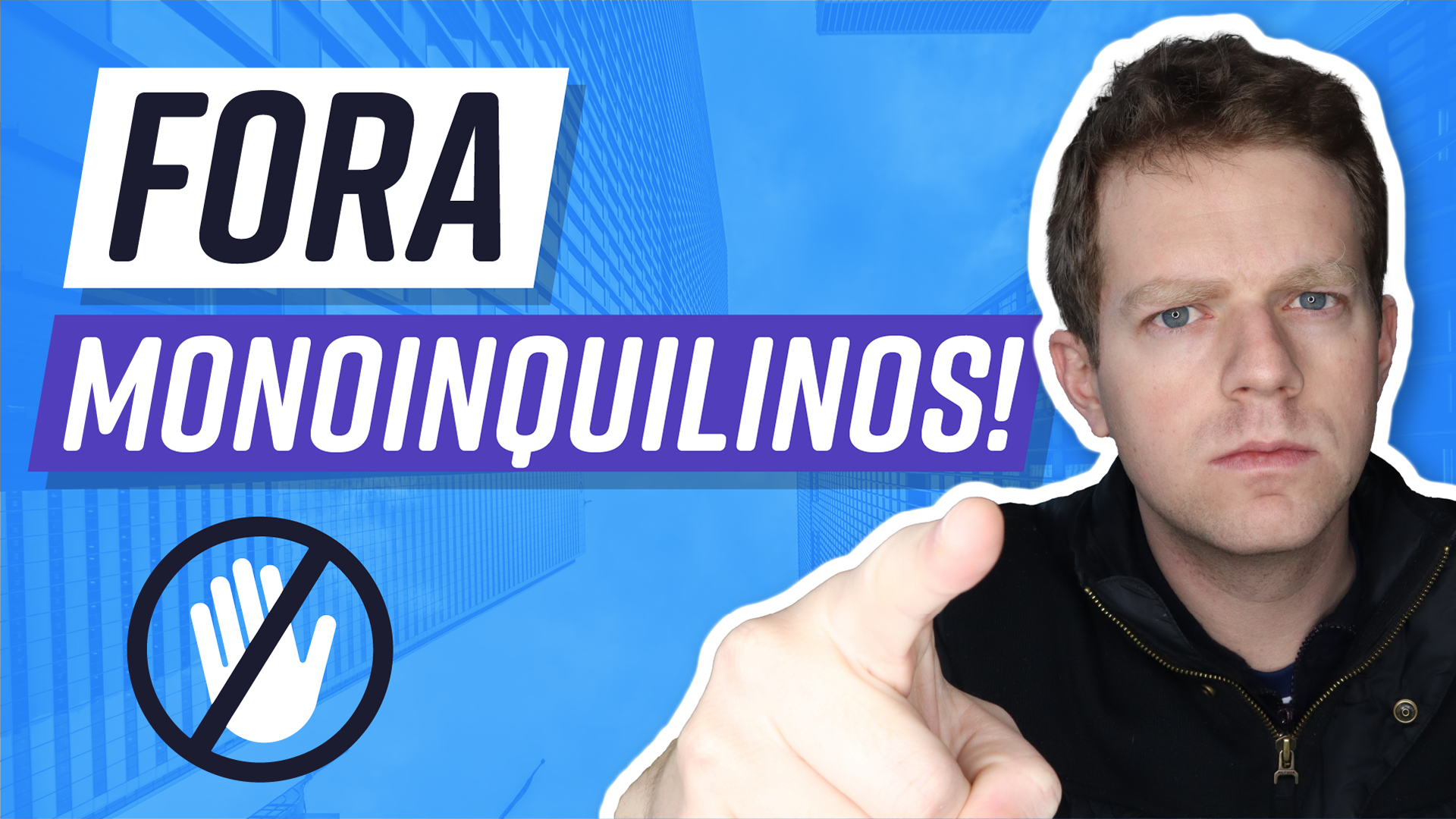
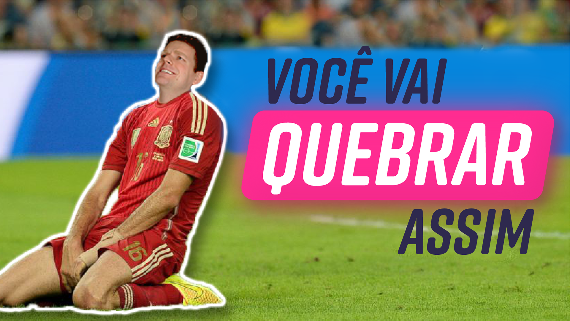
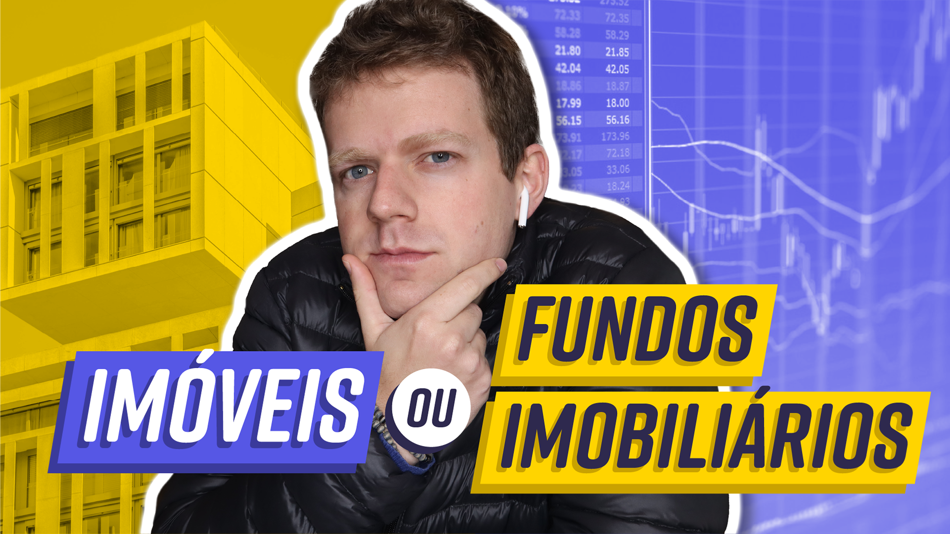
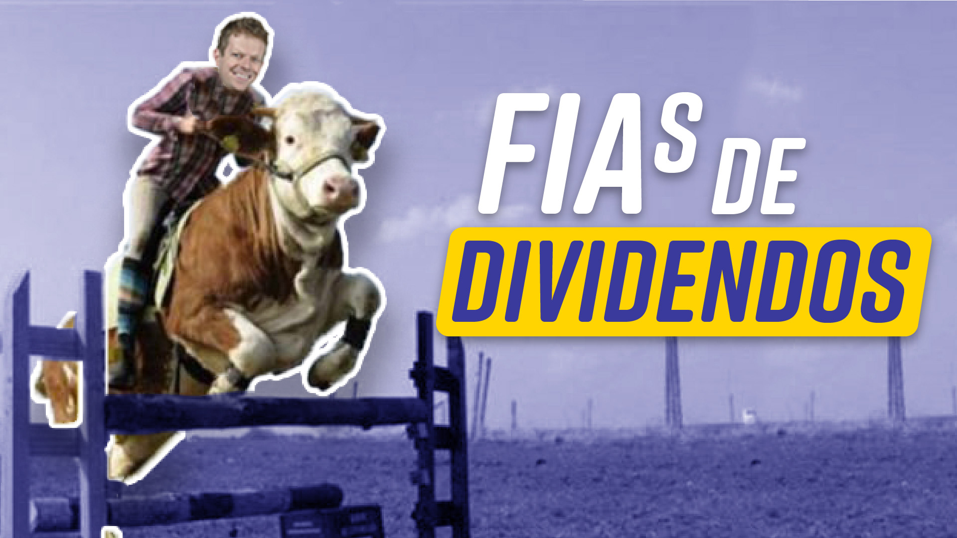
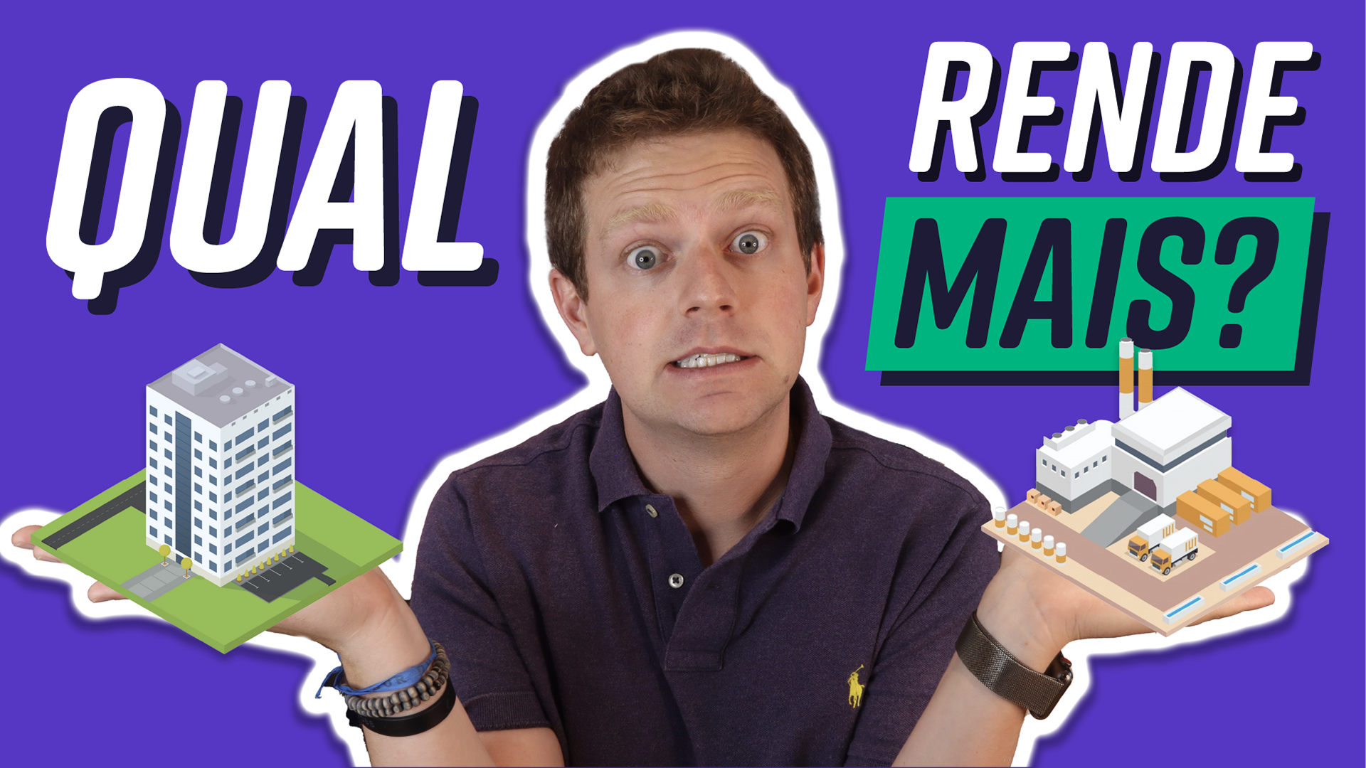
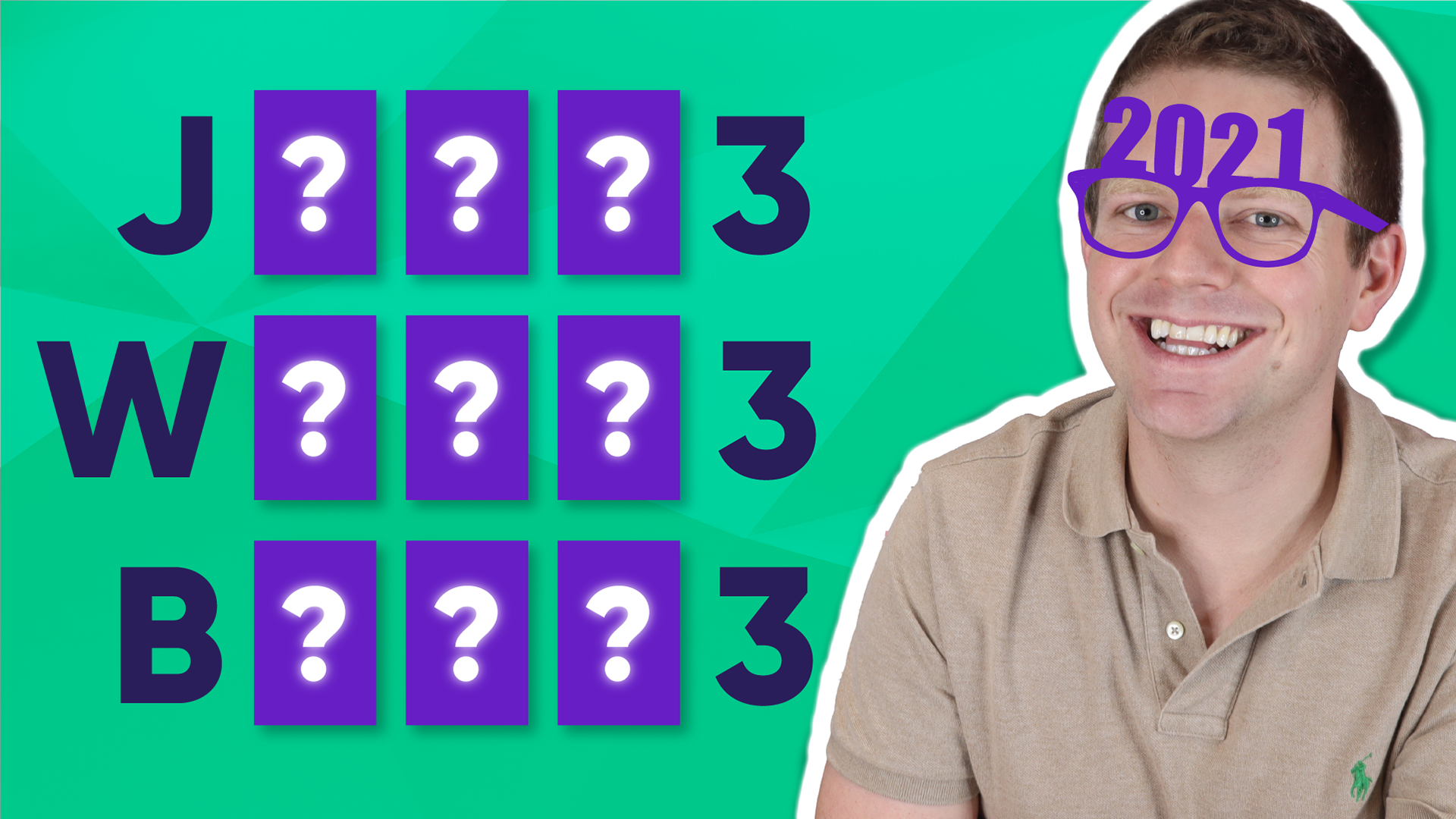
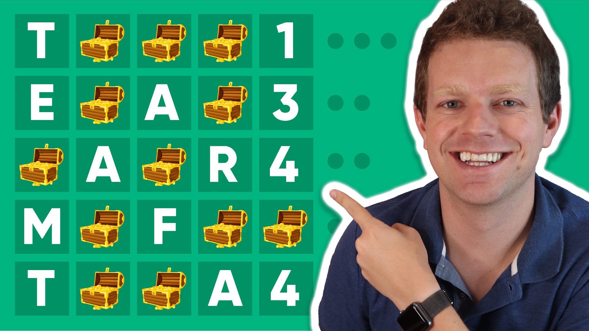
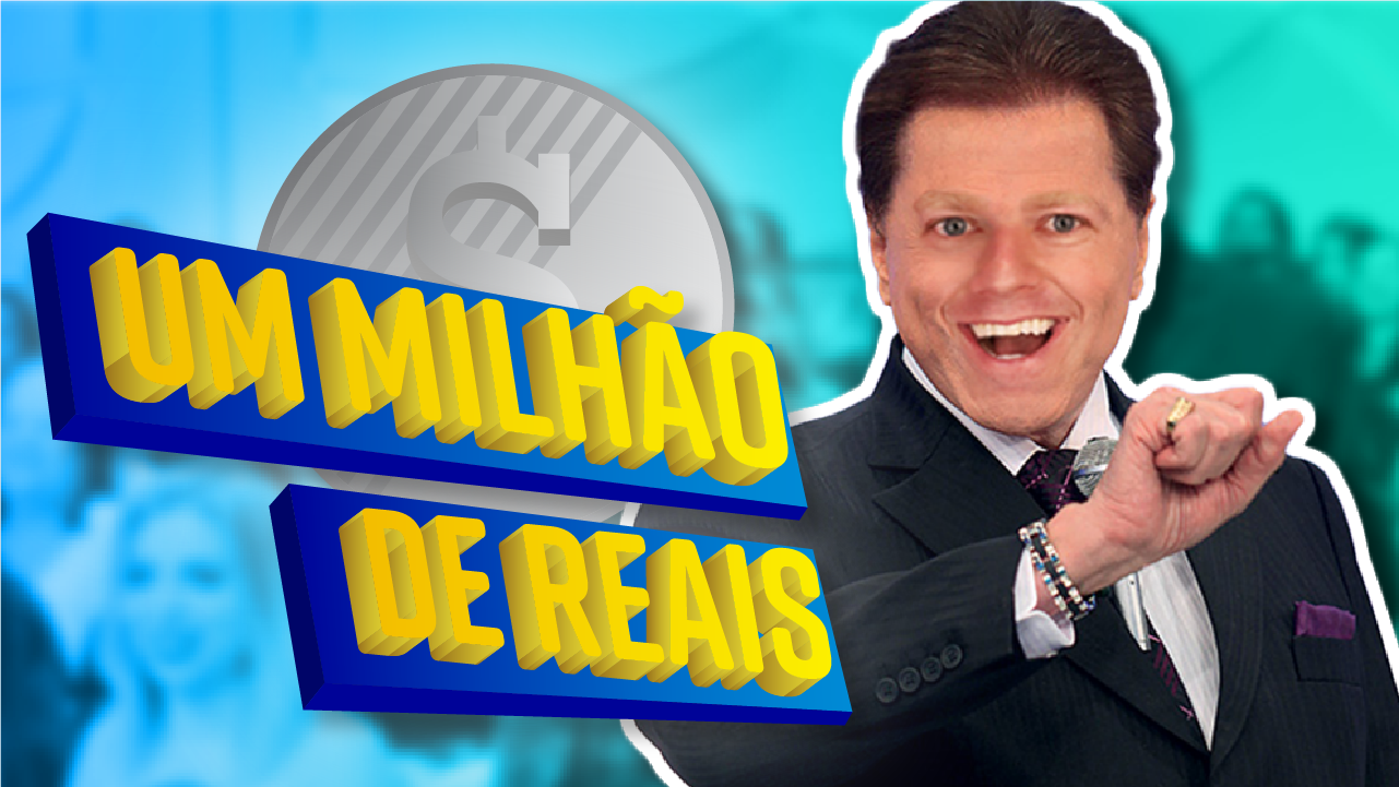
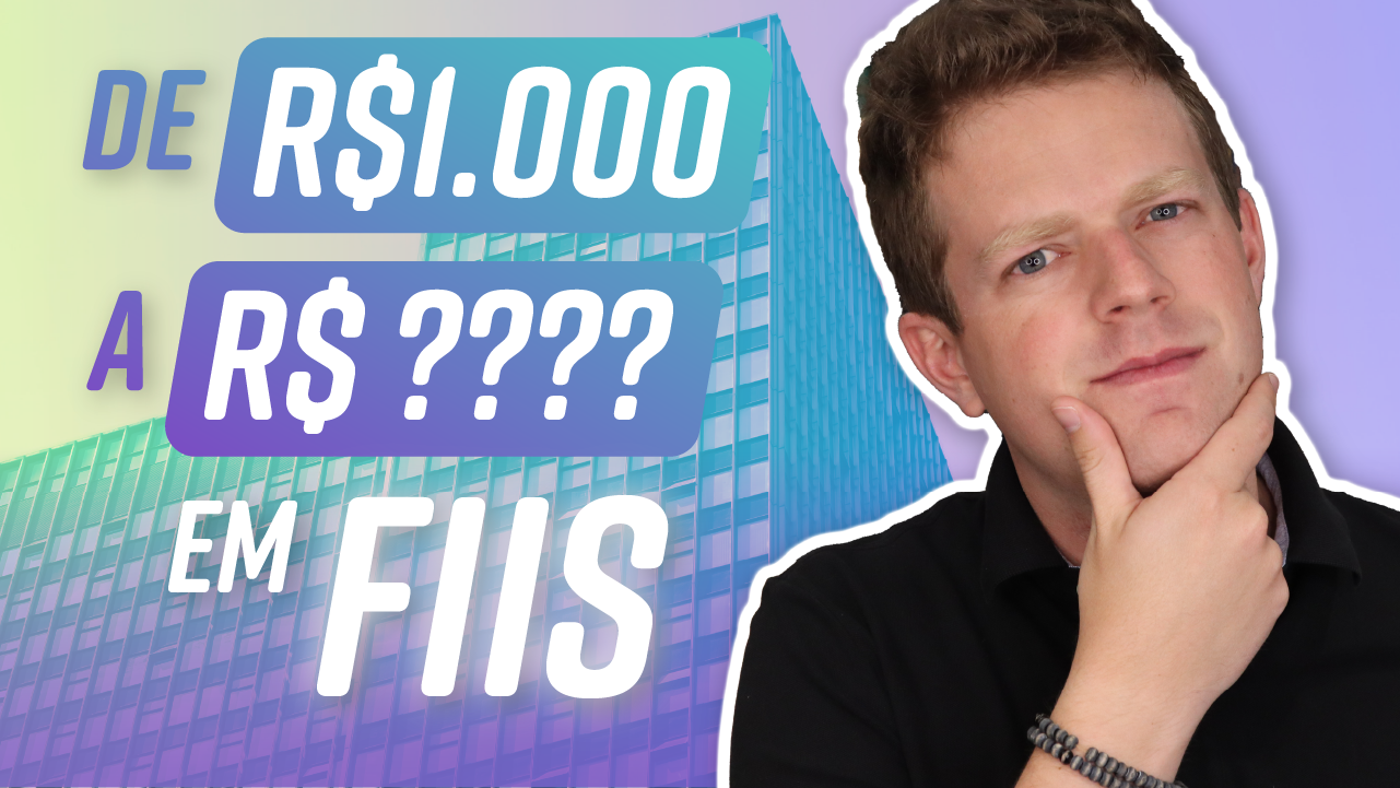
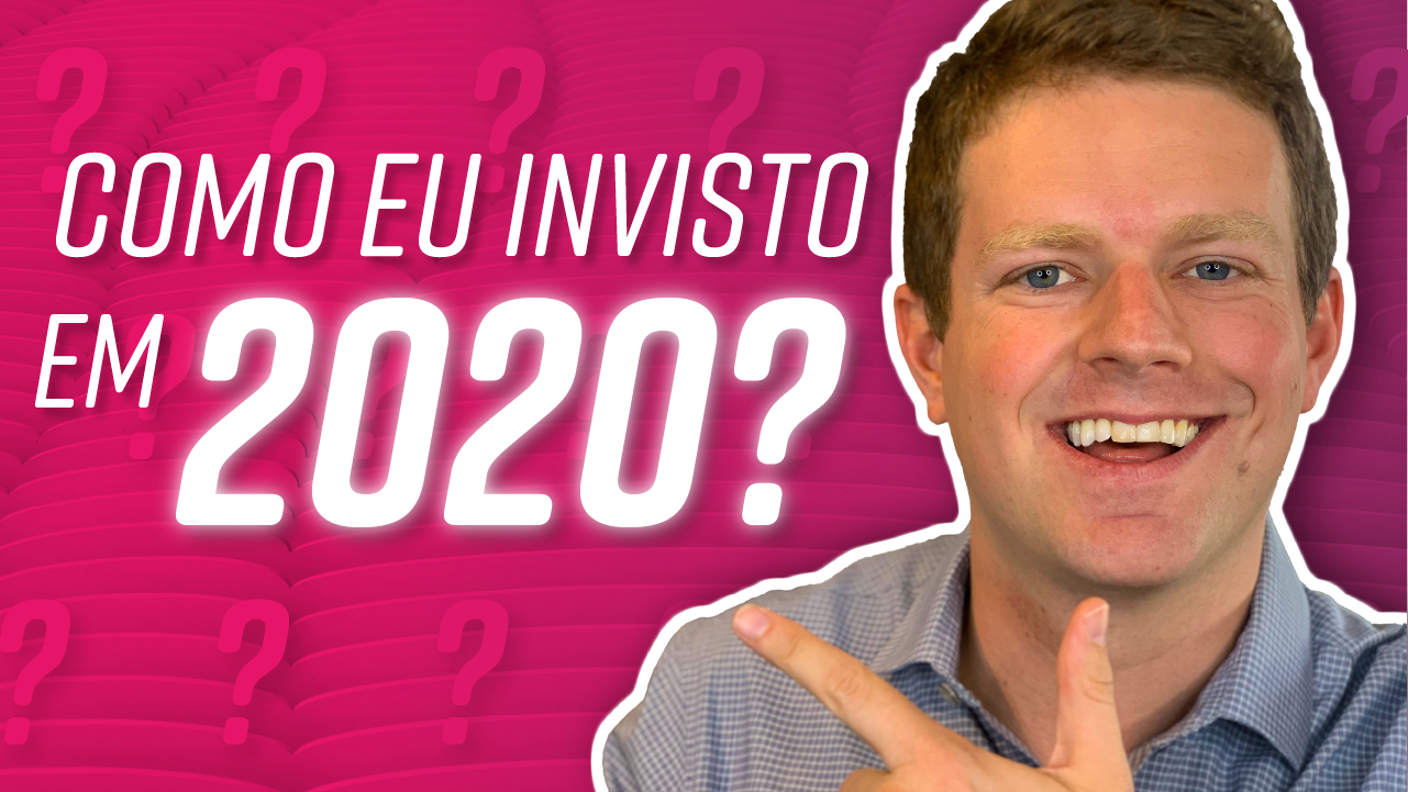
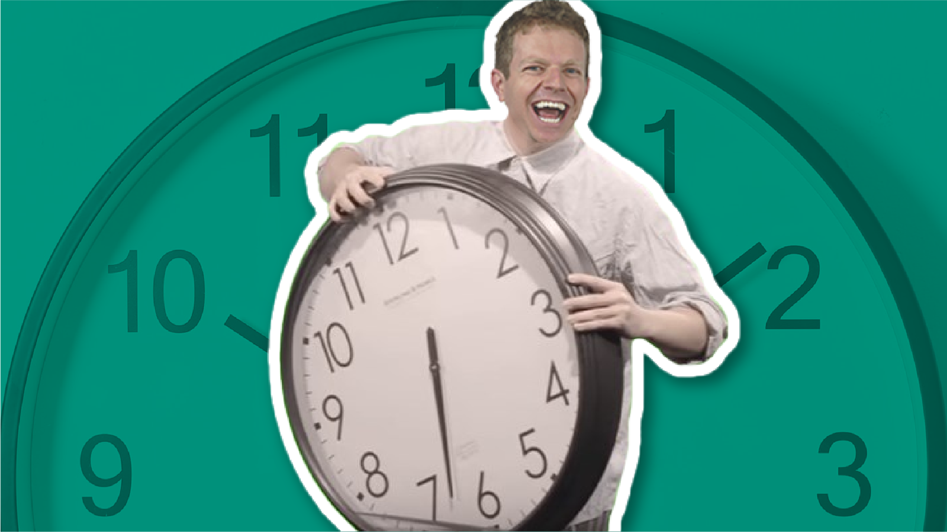
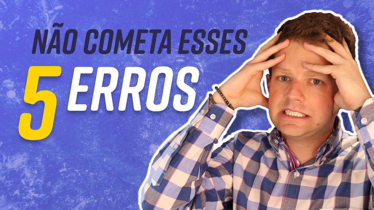
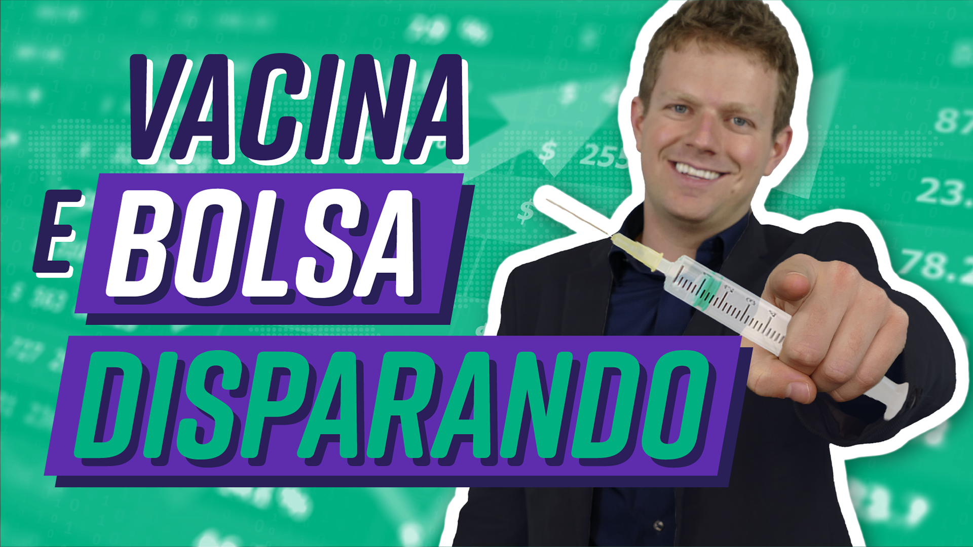
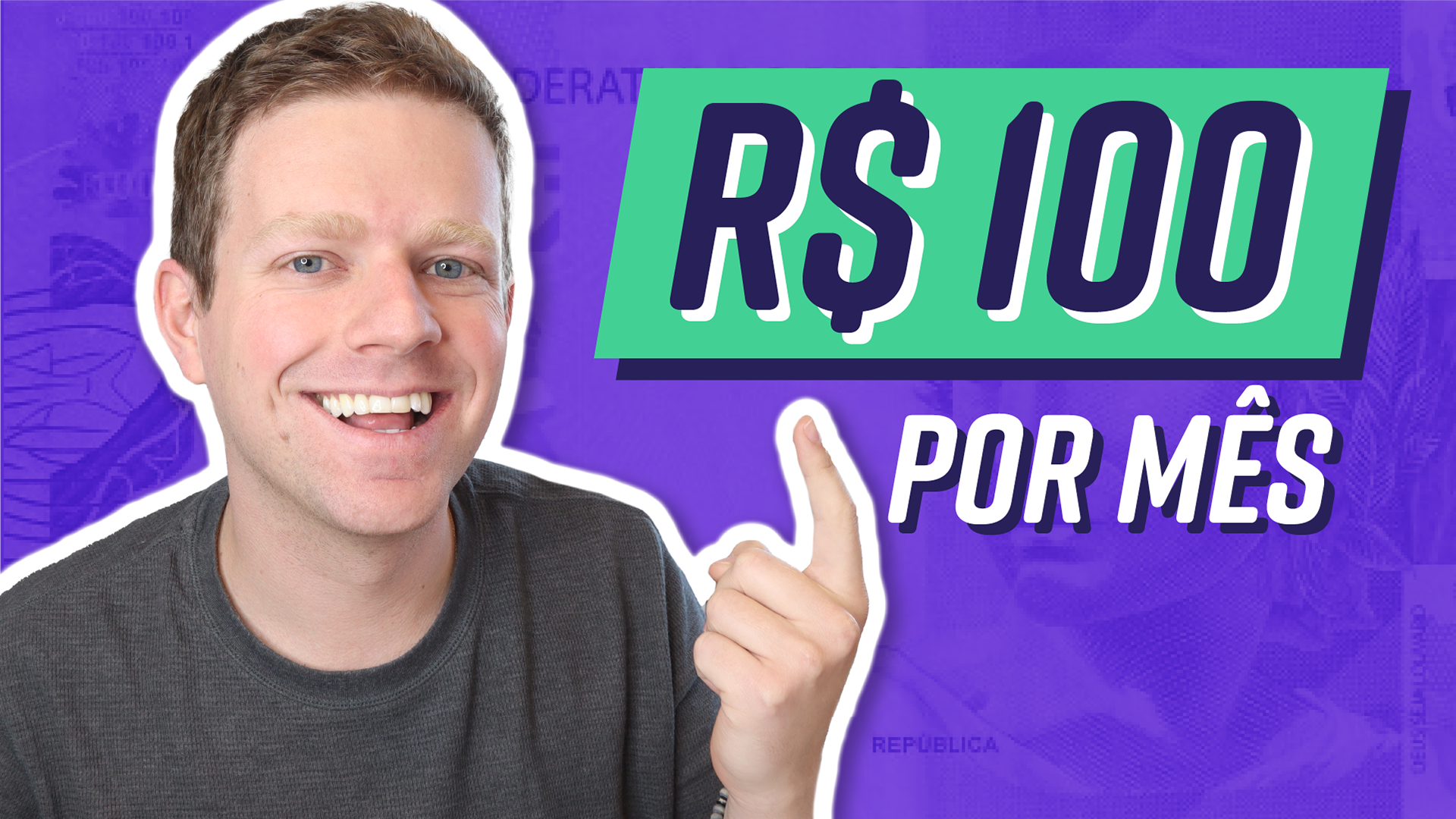
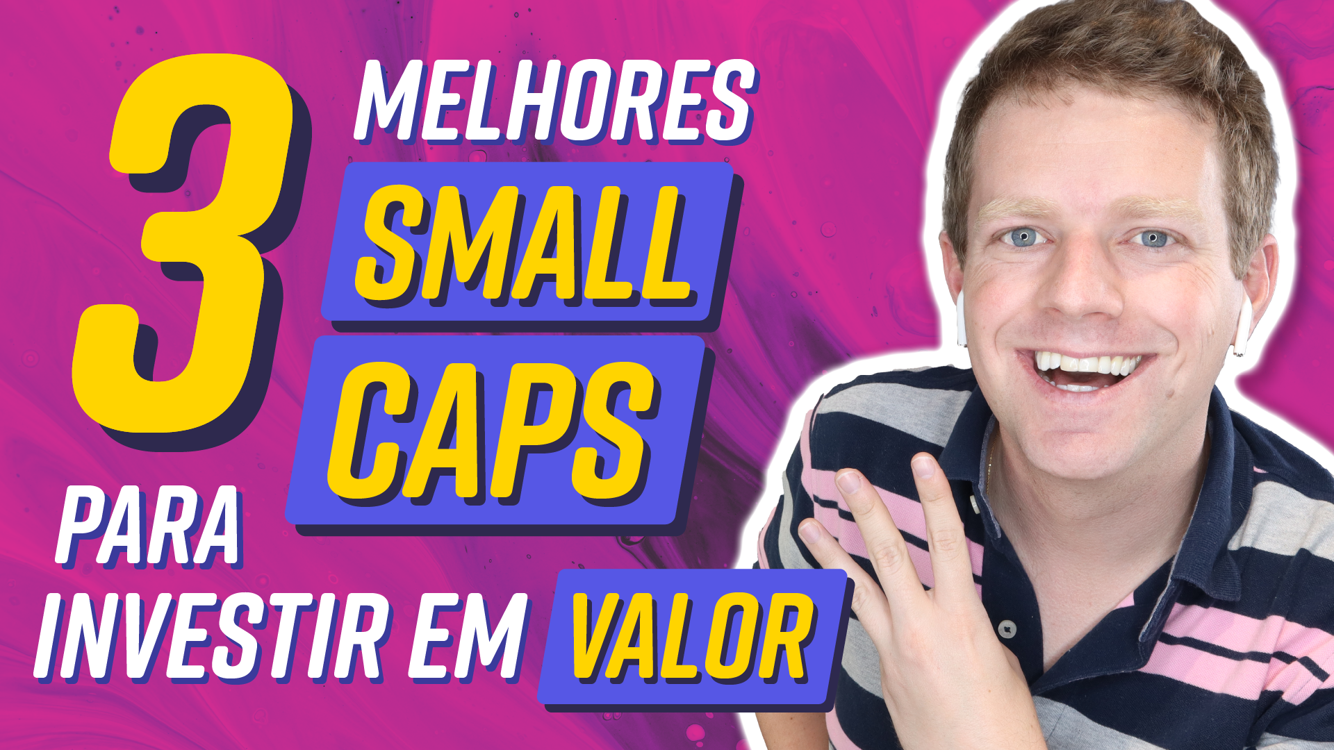
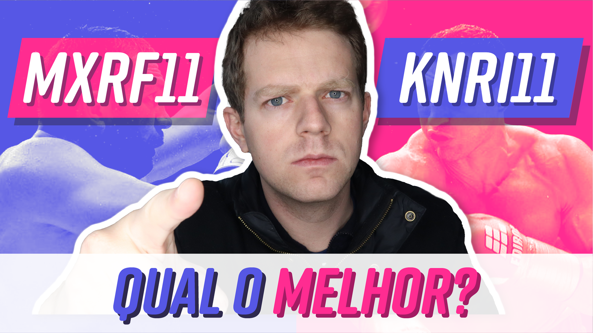
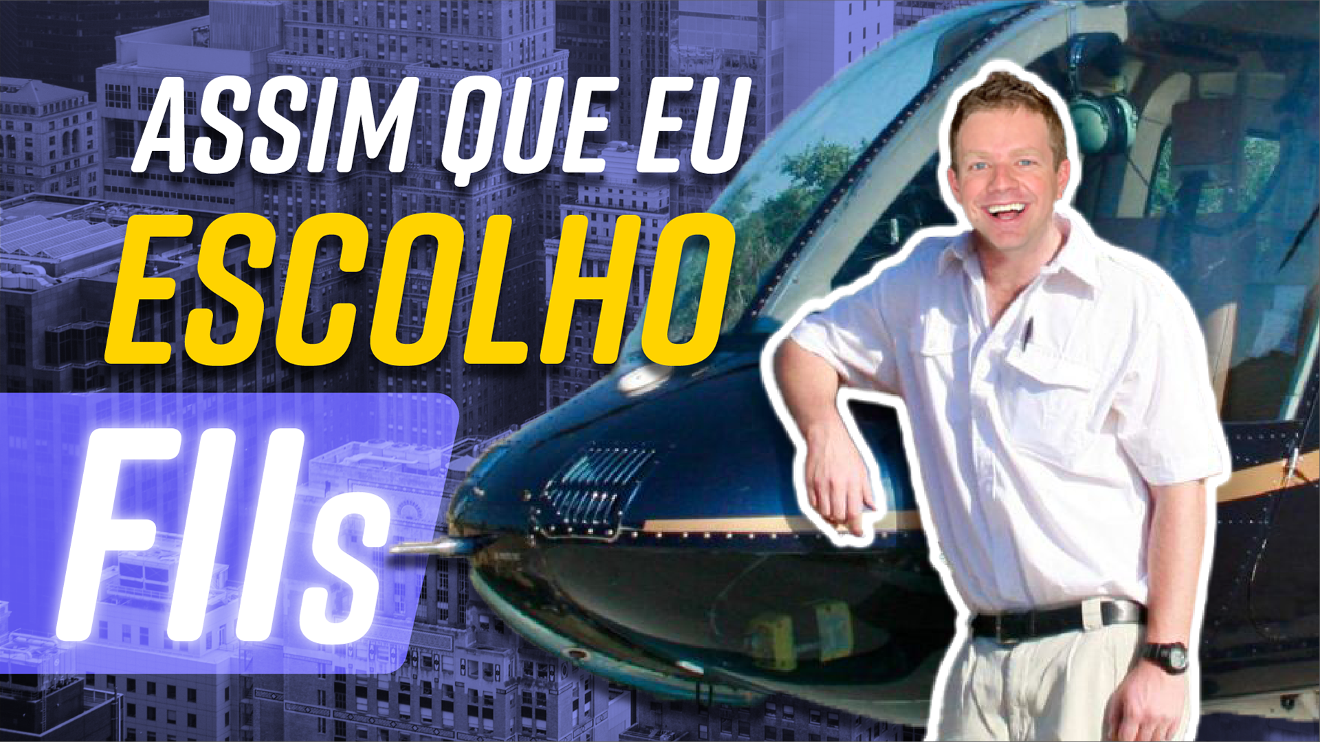
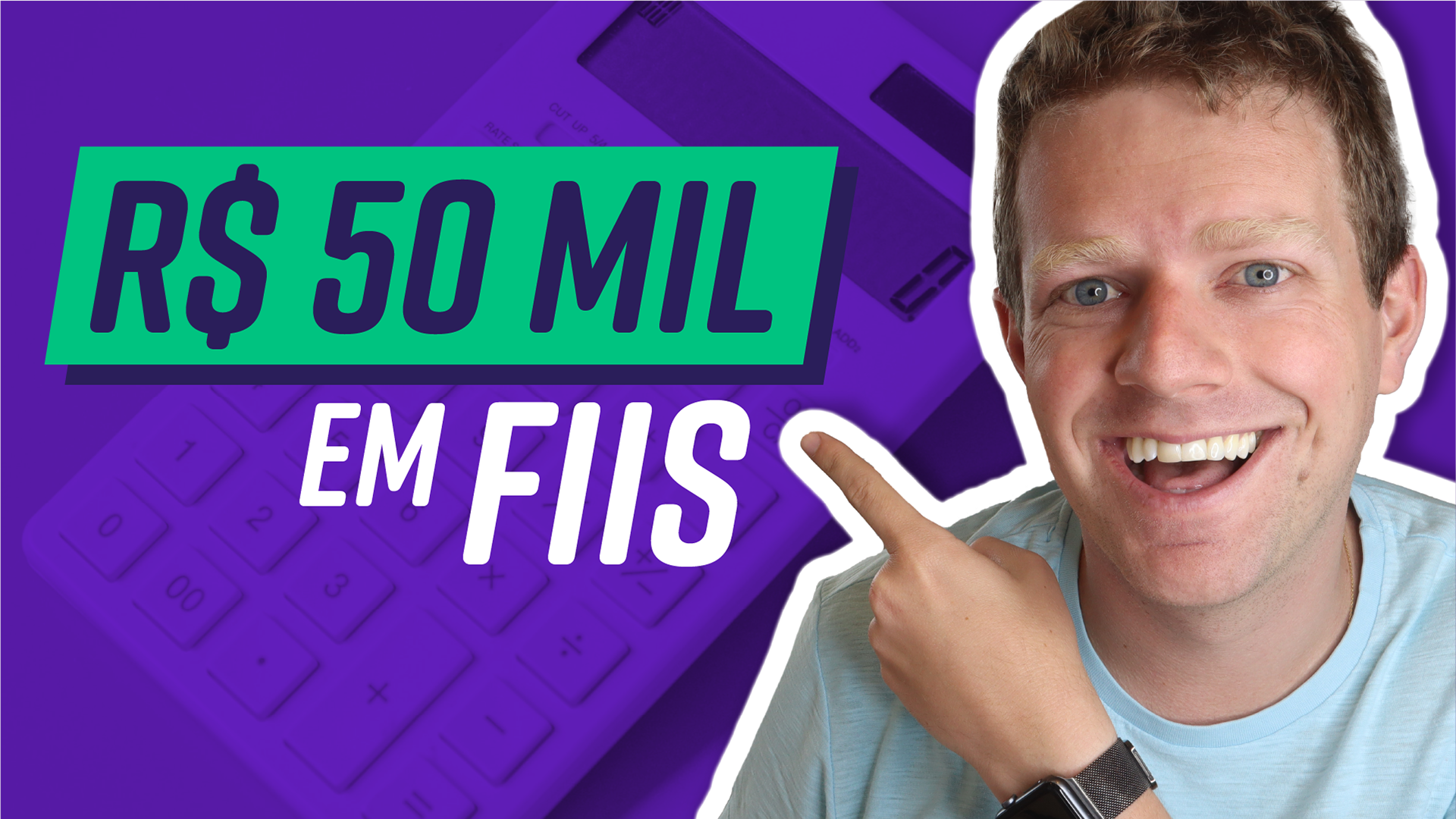
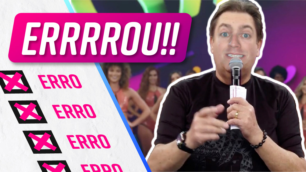
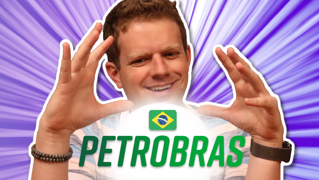
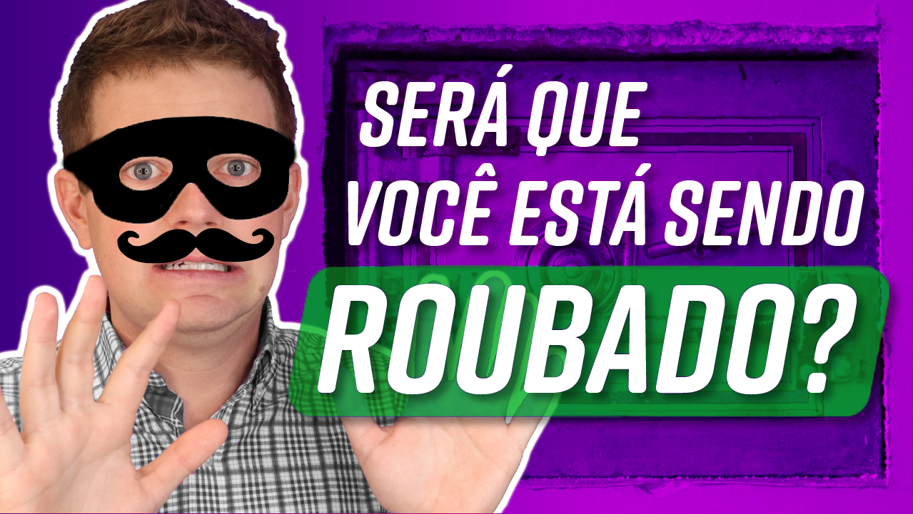
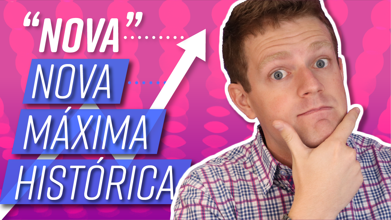
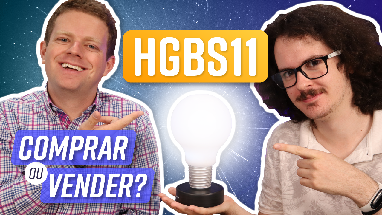
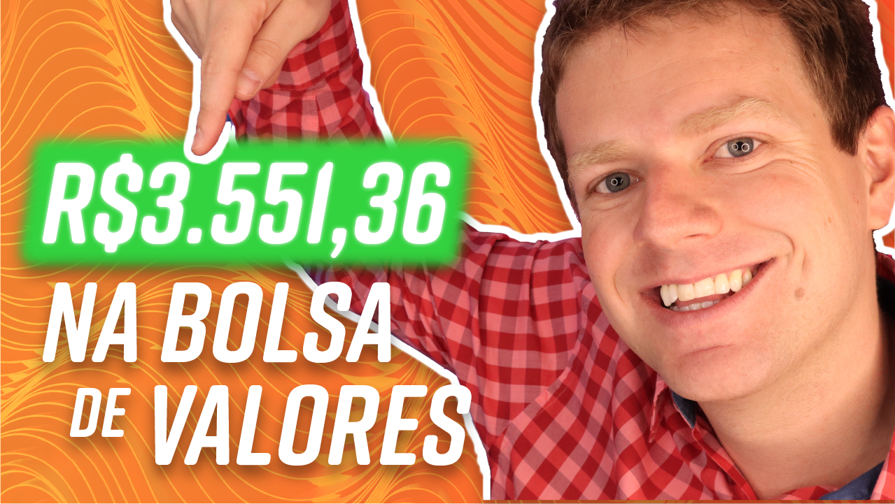
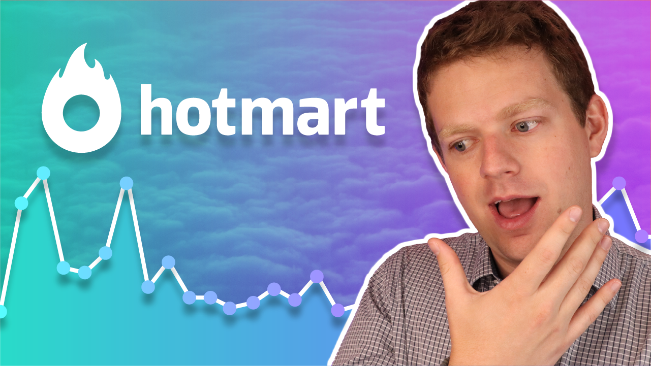
Another weekly task was the creation of thumbnails for our Youtube channel. We released 3 videos each week, and grew over 6x in 18 months, going from virtually 100K subscribers in the Fall of 2019 to 685K in 2021. The thumbnails, as well as the video title, are the main motivators for the video click, and therefore the CTR (click through rate). So it was my task to make the thumbnail as engaging and flashy (as well as informative) as possible. Lots of testing and metrification were involved, and after each video lessons were learned and applied in future thumbnails. Here are just a few of them:


You can see all of my IG posts at the @Clube.do.Valor Instagram account. Also, be sure to check out Clube do Valor's live homepage here, and their Youtube channel here.
If you do take a look at these pages, I'm sure you'll also get to see some of the ads I have created for Clube in your preferred platforms 😄