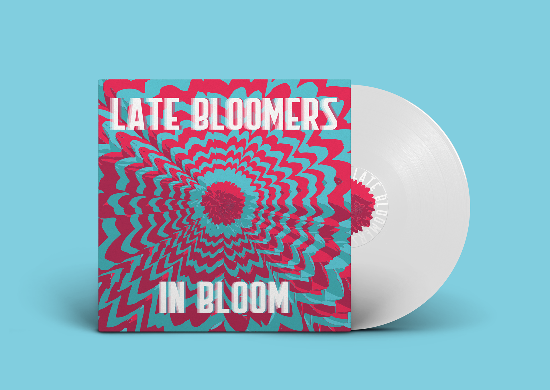
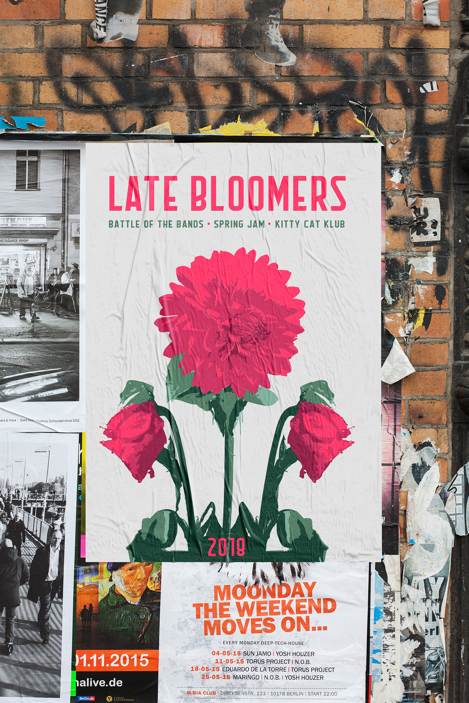
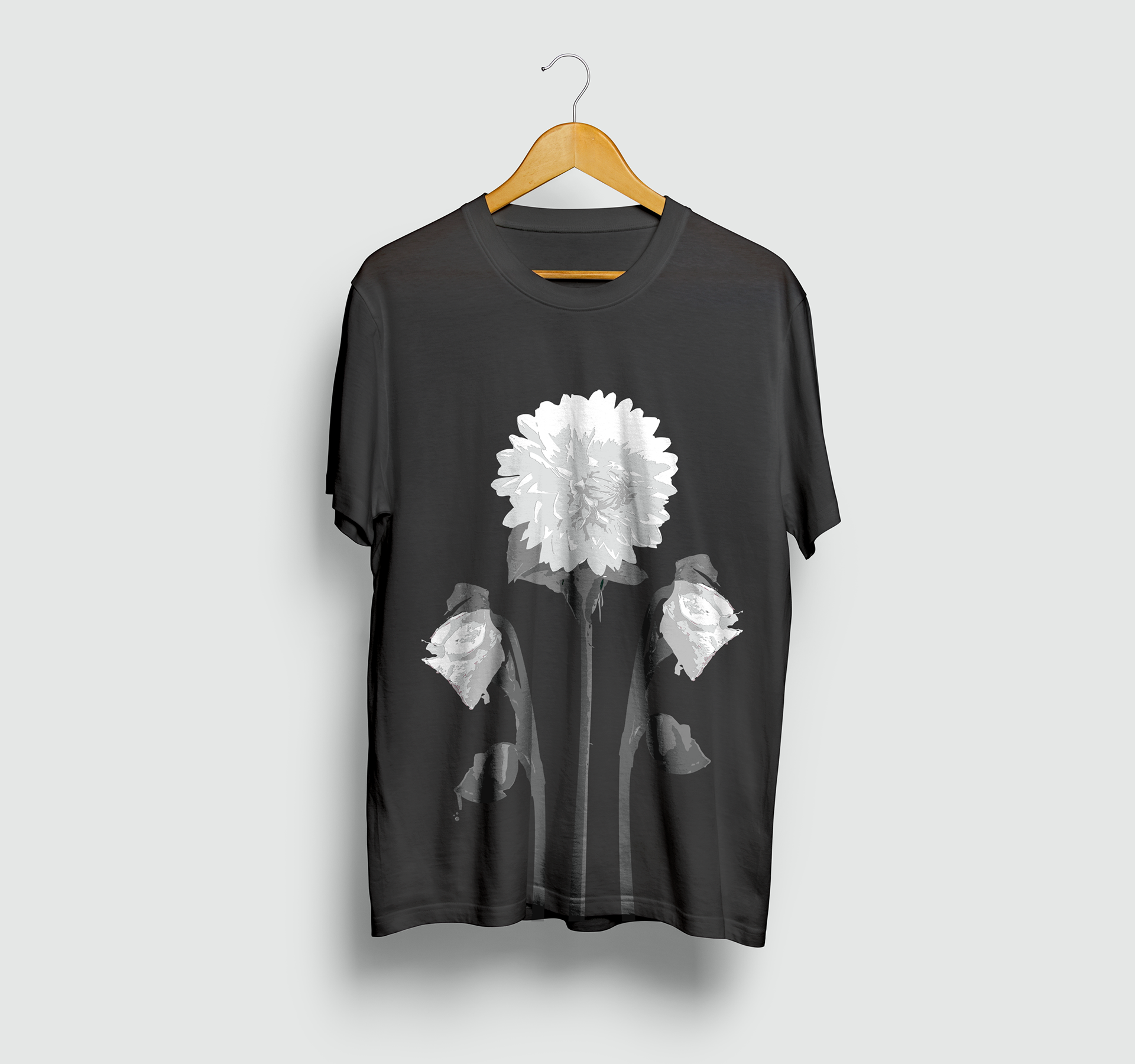
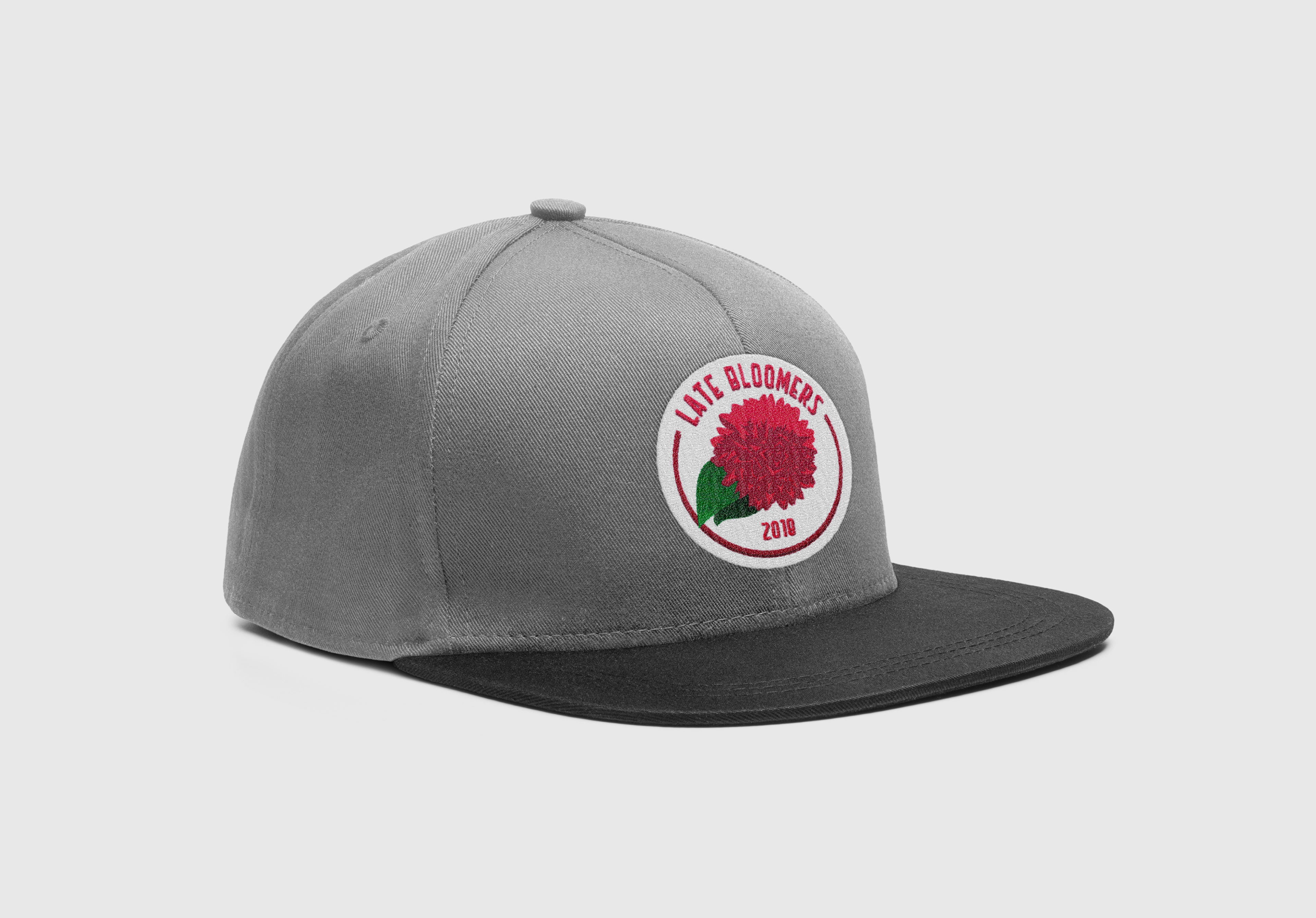
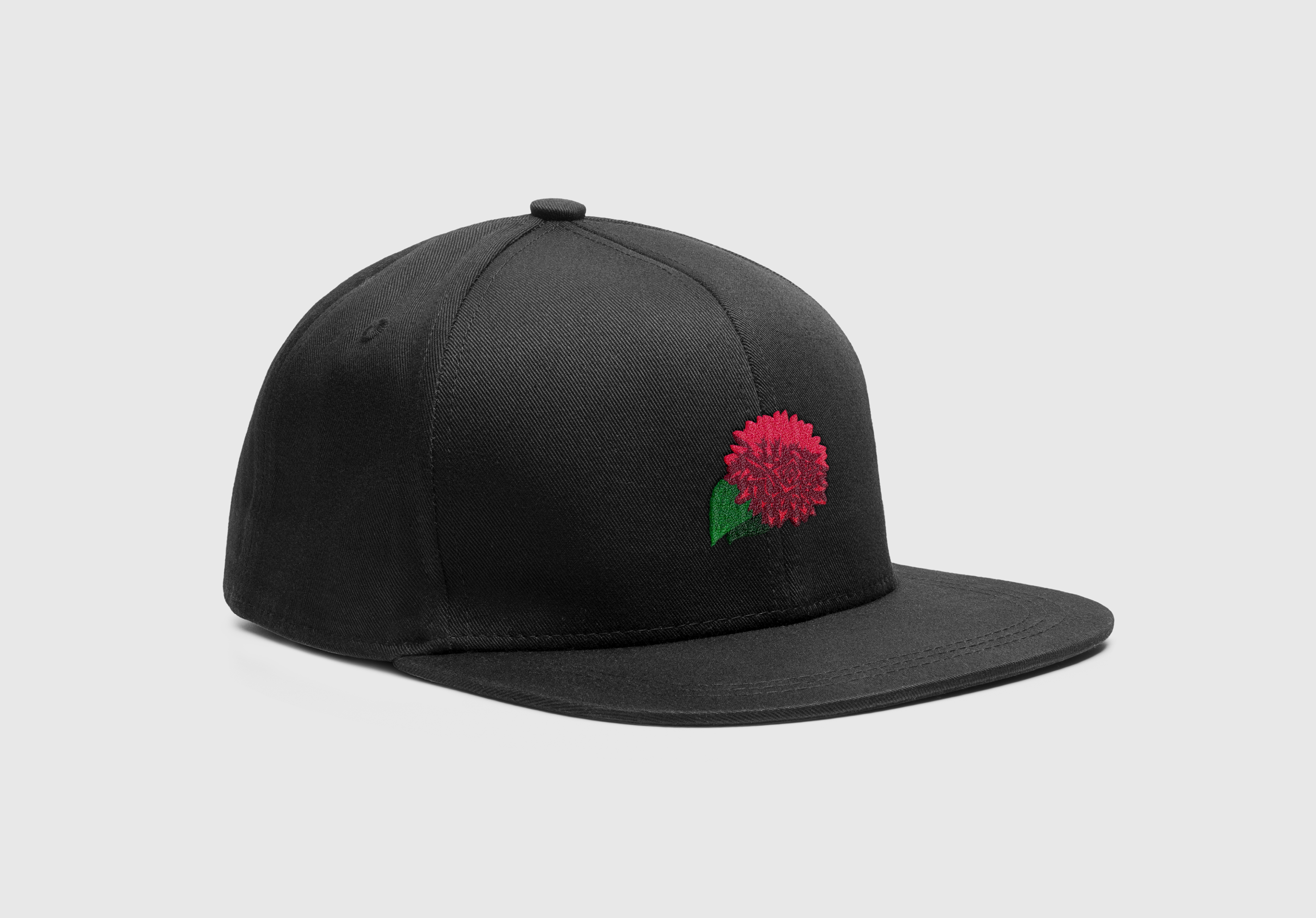
What started as a screen-print project at CIEE became the branding for the Minneapolis-based rock band 'Late Bloomers'. I traced a flower in Illustrator for a bitmap poster and decided to use it for the band's upcoming concerts, and it eventually became our permanent logo.
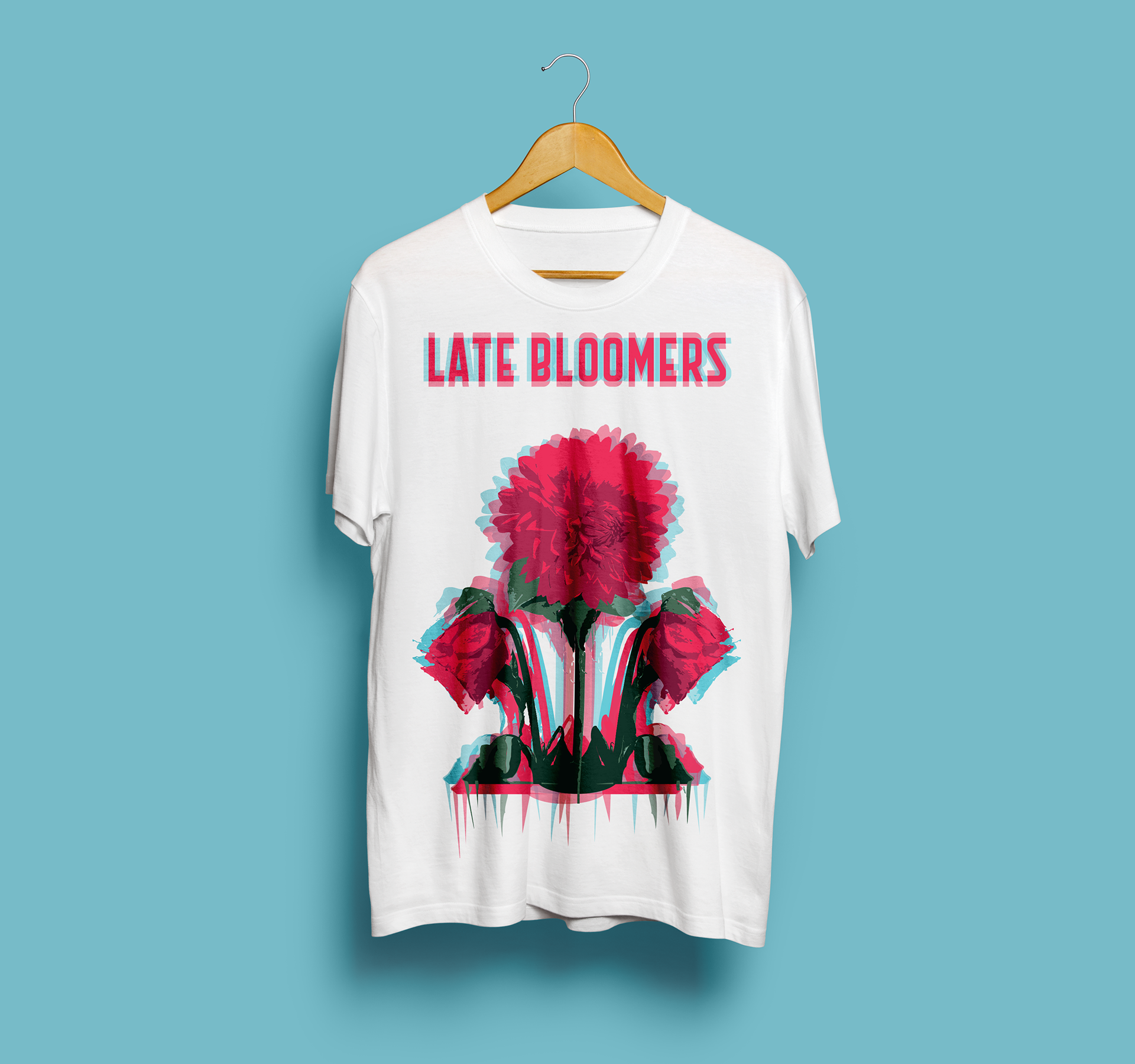
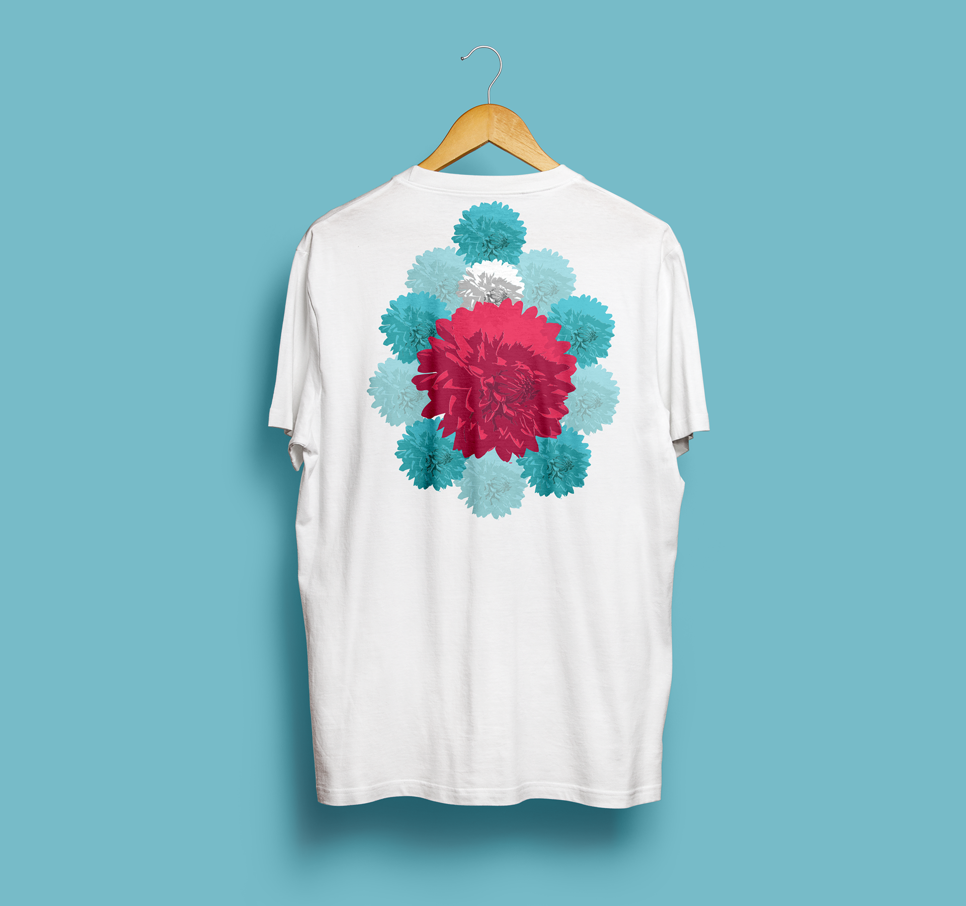
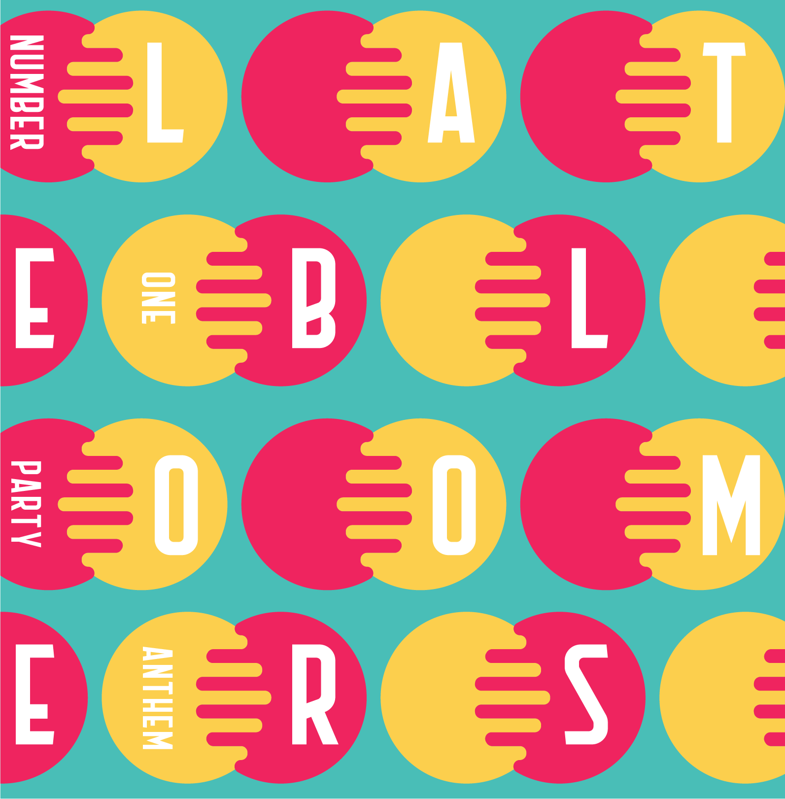
The band merchandising offers two different designs for t-shirts and hats. Since the setting of most show venues are very dark, I decided to design two contrasting types of t-shirt: one very vibrant & dynamic and the other a bit more low key & discrete — but both in line with the band's brand and message — so that we could cater to a wider variety of tastes and personalities.


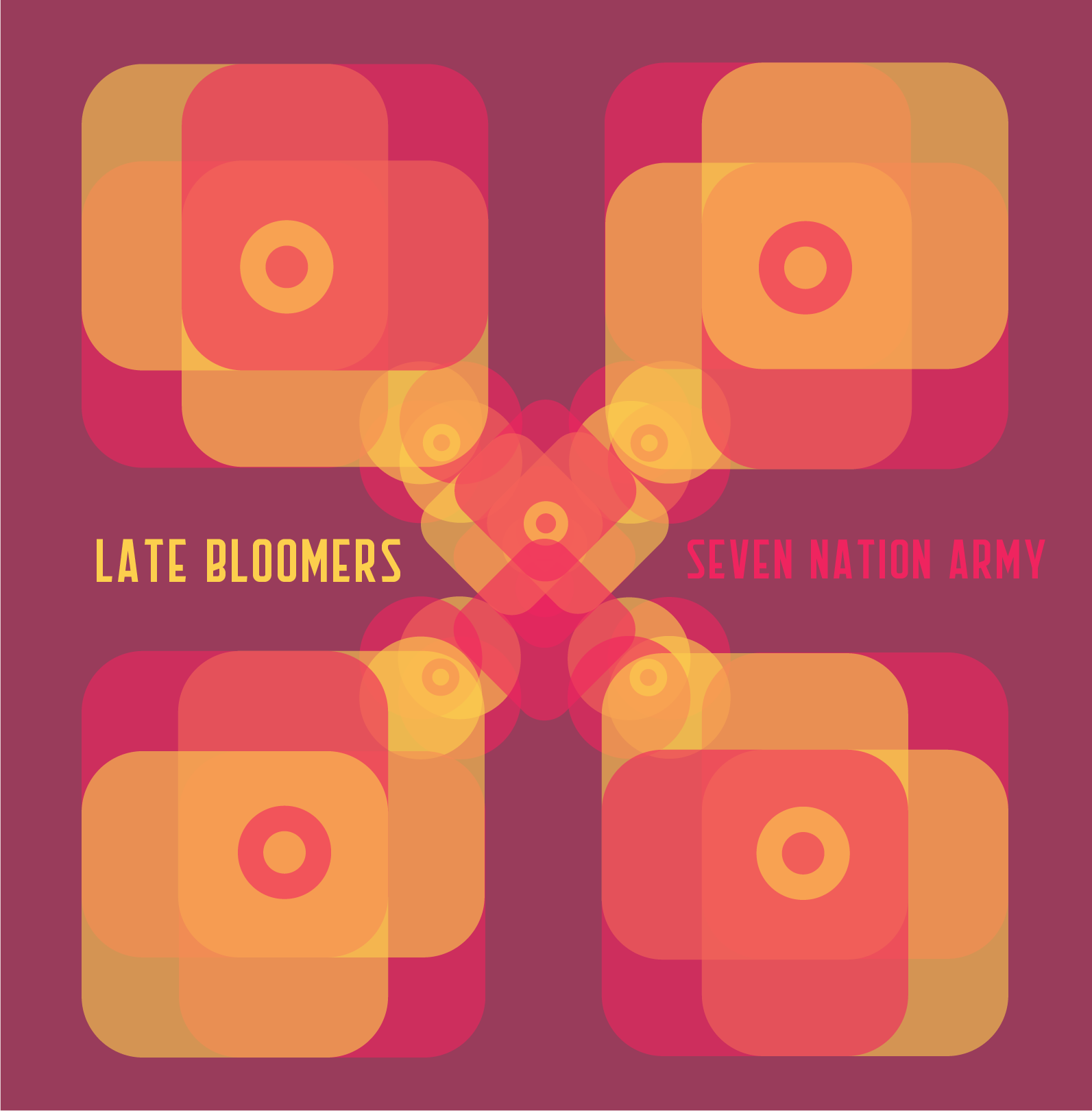
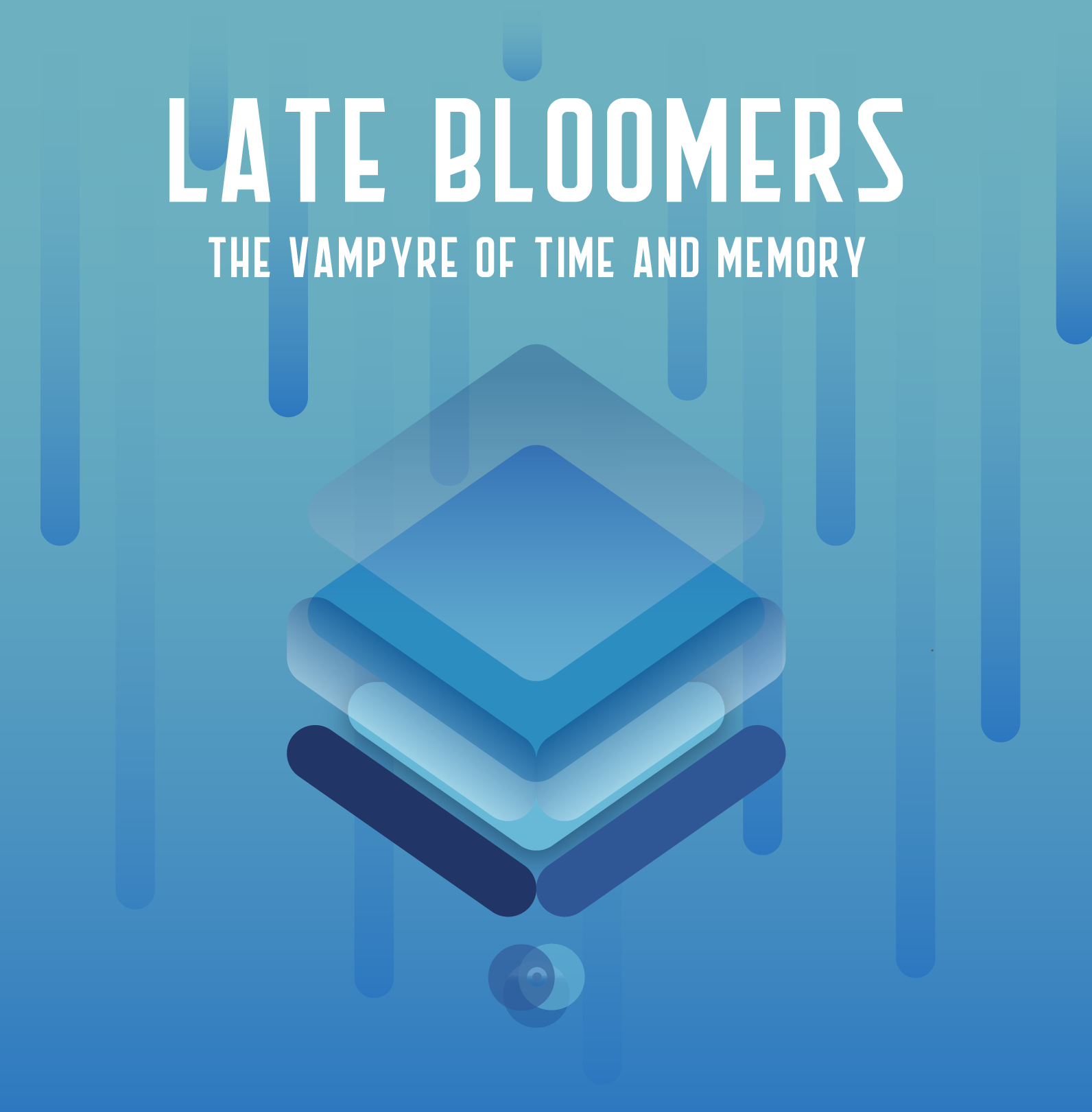
The band had three singles, which I designed a cover for with a different feel that would better represent the contrasting songs and feel. The motifs and shapes I used were leftovers from past projects, little ideas I scribbled next to the main layout as a distraction, which I thought was ideologically a good fit for this band and what it represented.
The original project was created through a screenprint, which is a printing technique that consists of adding layers of ink to a piece of paper through a mesh screen with the imprinted design. For the first poster I had six layers of color, and the process is exemplified as follows:
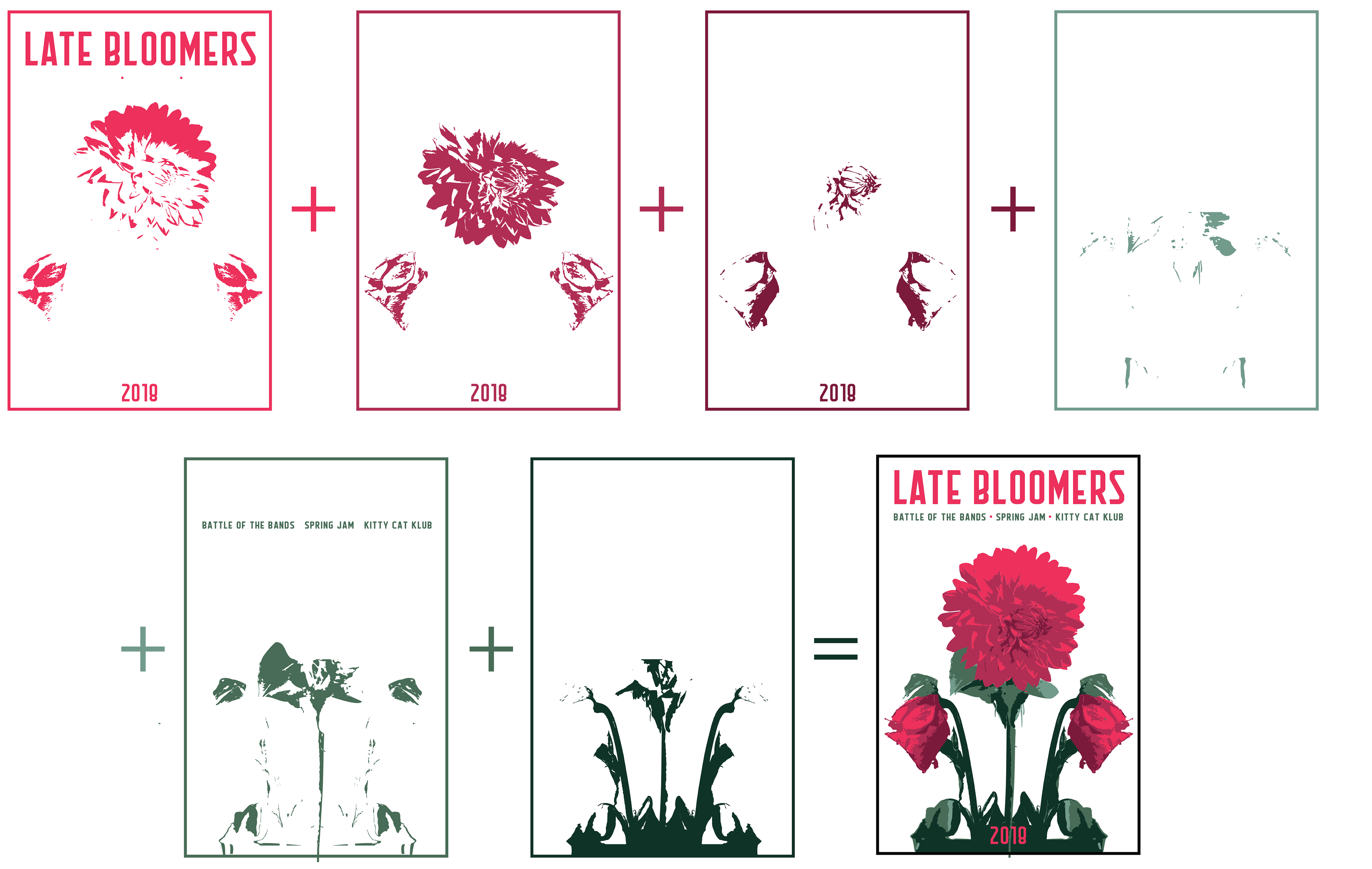
The color palette was based on complementary colors for the main two hues, and analogous colors for the secondary ones.