
I worked at the Federal Reserve bank of Minneapolis as a graphic designer for a year, starting right after my graduation in the Summer of 2018. I have created quite a lot of design content for the bank, but my favorite projects are the illustrations and animations for their research digest articles and conference presentations.
I decided to give them a similar style and feel to achieve a sense of unity throughout the bank's website and social media. Some of them became GIFs for Twitter as well, using After Effects and Photoshop. These illustrations often are created in a relatively short period, since there is a lot of back and forth about the initial concept, and also many feedback sessions until we get to the final image.
Here are some of my favorite illustrations:
Climbing Ladders
I was asked to create an image and GIF for the research digest article 'Climbing Ladders', which discussed the discrepancies in the amount of work that people with different backgrounds had to put in to achieve the same professional level. You can view the bank website article here.
I wanted to be very literal and a little 'tongue in cheek' with this illustration. The title 'Climbing Ladders' already gives us a clear image of the whole concept — so I wanted to expand on that and add pieces of storytelling with visual tools based on pattern, continuation and texture. The original vertical illustration (picture 1) was cropped into the key image (picture 2), and the GIF was created as a continuous vertical pan. To view the original vertical illustration please click and expand the left image below.


trading places
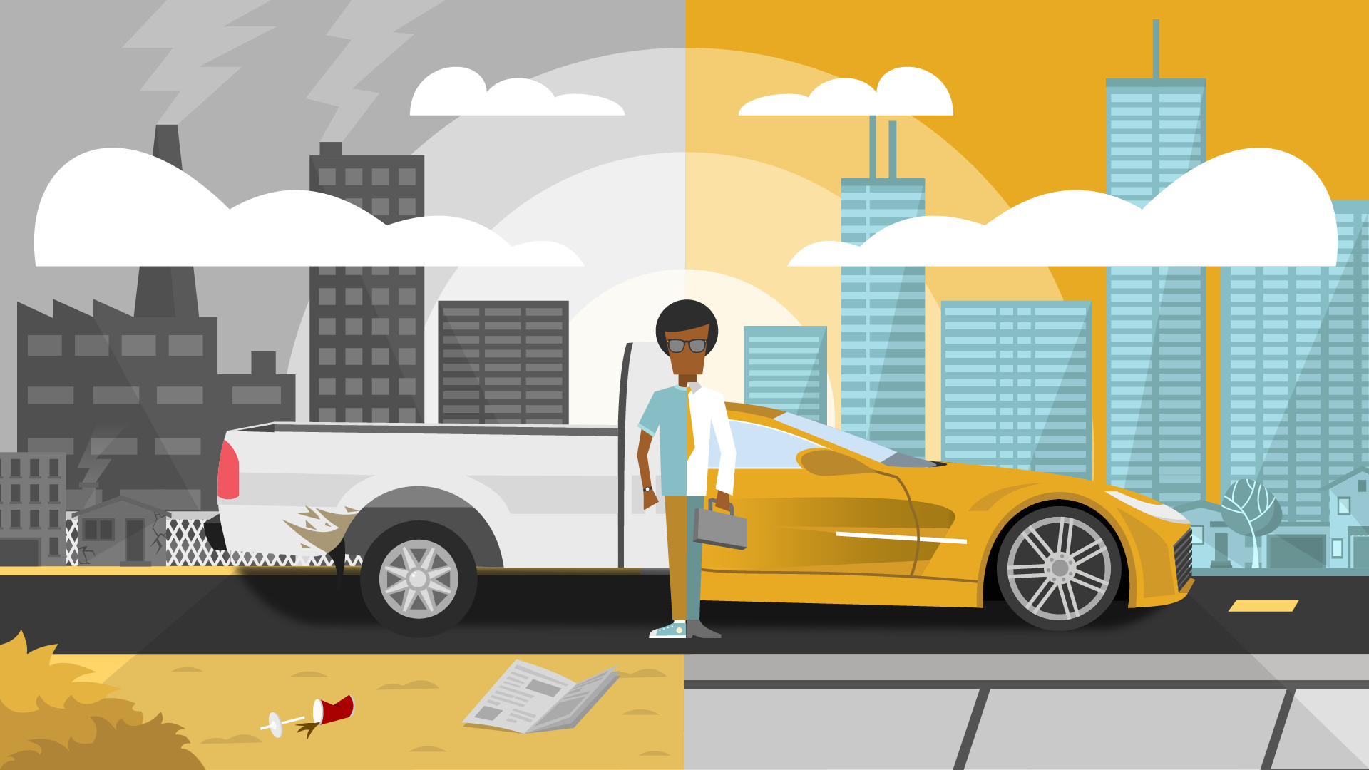
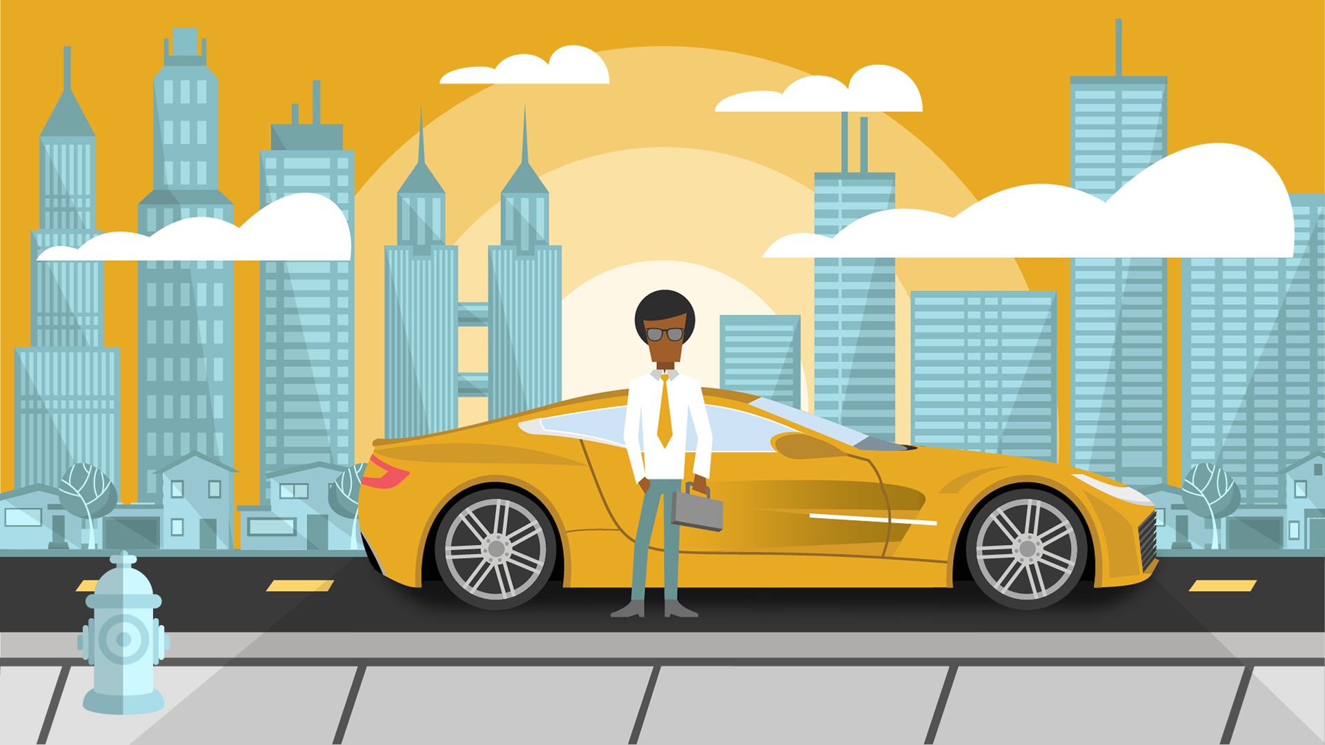
Next are the key image and GIF for the Trading Places article, which you can find here. The idea behind this one was to illustrate how inherently important is the location factor in one's life. It dictates where you will work, who you will meet, and every single action throughout your daily life, which would be completely different living somewhere else.
My original idea was to show a contrast between a rural and an urban city, though both would be put in a positive light (picture 1). I was then asked to create a contrast between a positive and a negative environment in order to show some of the consequences of placement as well (picture 2). Pictures 3 and 4 are the full images for both cities, as used on the final GIF.


Sweat Equity
The following was created for the 'Sweat Equity' research digest article, which you can check out here. I wanted to illustrate the fundamental idea behind this topic, which basically states that you may earn financial profit by investing time and effort through your business.
The concept was well-received, but I was asked to implement a sense of uncertainty on the final image, which you can see through the addition of the safe and trash can on the right side of the image.


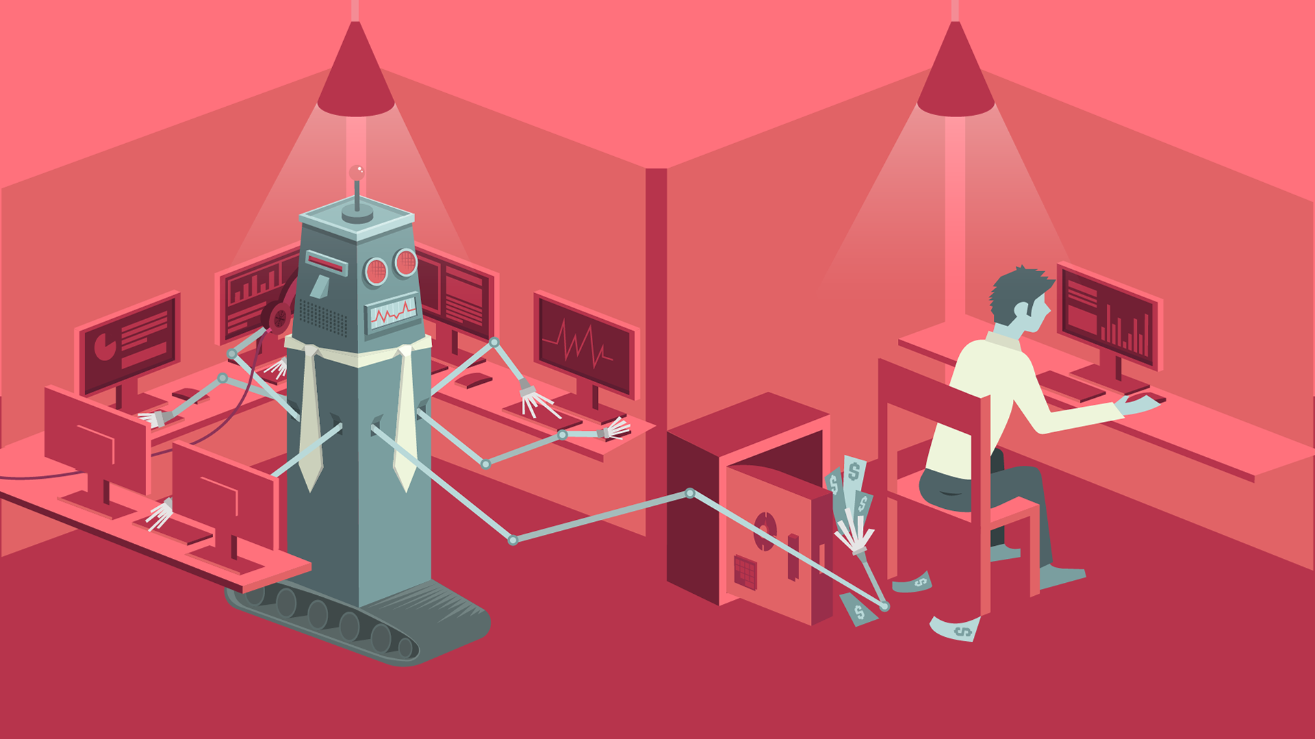
killer robots? not so much
The research digest 'Killer robots? Not so much' went over the fact that technology is not necessarily taking jobs away from humans — rather than shifting job purposes and creating a need for robot maintenance work — but it is certainly decreasing pay rates for lower rank employees and increasing earnings for the higher-ups. You can find the article here.
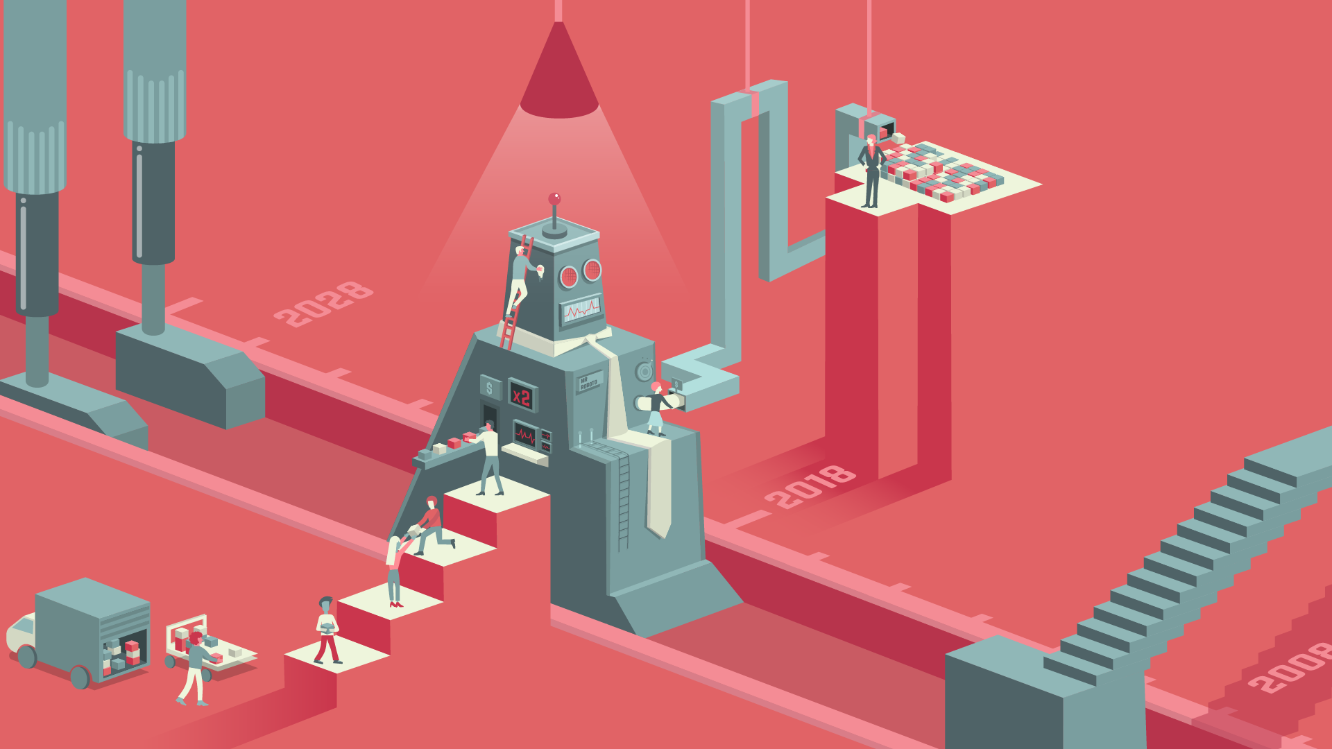
Even though this was one of my favorite illustrations for the bank, this project received a lot of mixed reviews from different feedback sessions. My original idea (not completed; above) was to show a timeline of robots being implemented into the work routine. It shows workers carrying boxes from a truck, through the robot (formerly a stair, and in the future a bigger robot) until it reaches the owner. There is a sense of hierarchy through height; employees working on the robot itself instead of carrying boxes (illustrating the shift of workload), and it would be a very fun GIF for social media with the objects in the timeline moving forward.
This concept was considered too complicated and it was decided that the key image should display only one robot and one person, with the robot working on multiple tasks and stealing money from the human employee. Unfortunately, I only had about 4 hours to work on the final key image before it was uploaded to the website, so I couldn't add much more detail or texture to it – but it allowed the geometric background to pop out a little more and settle a visually satisfying layout to the image (below).

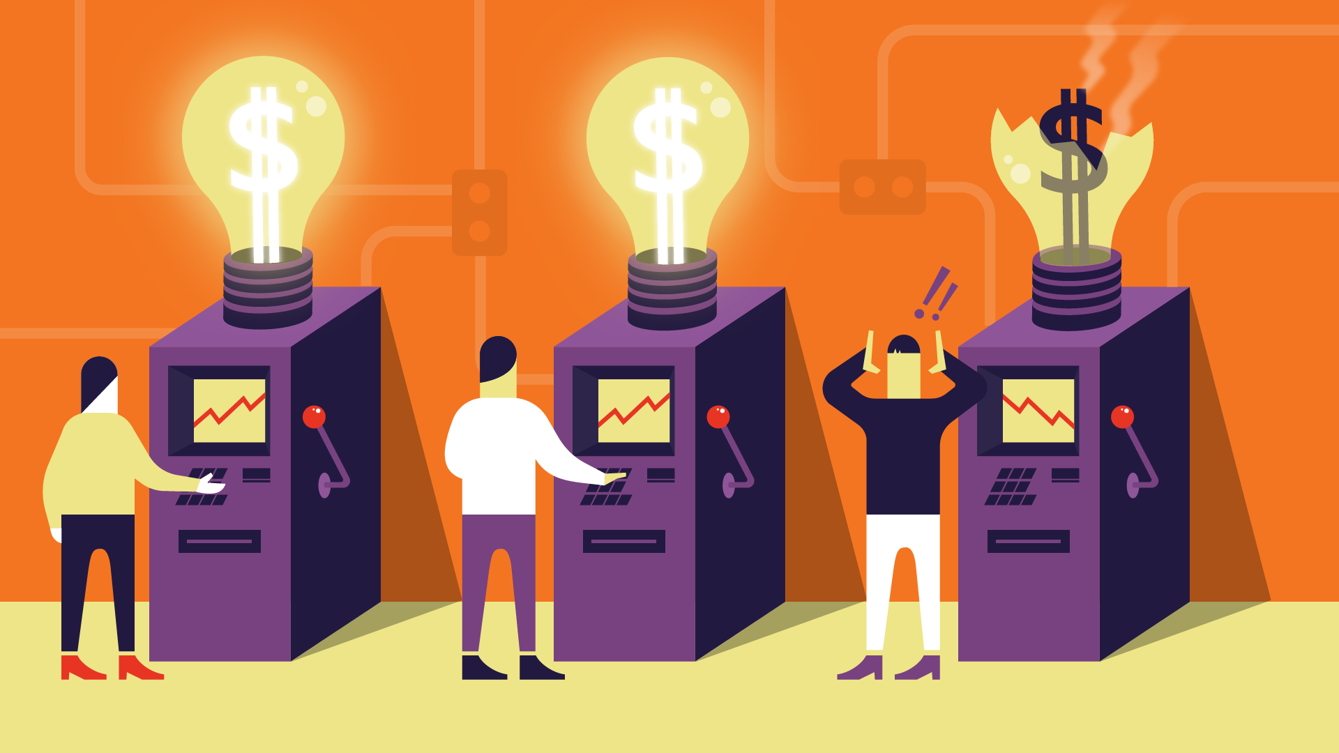
INNOVATION
A request for the 'Innovation' key image came in with a side note asking for something similar in feel and concept to my previous work on the 'Sweat Equity' illustration, where a machine symbolizes investment and also introduces a sense of risk or uncertainty; the finalized 'Investing in Innovation' article can be found here. The idea was to explain that businesses that invest in innovation not always get a financial return from it, even though it's an important and sensate form of investment.
The final illustration and GIF came together very quickly and there were no changes requested during the feedback session. I started with the simple idea that innovation is best represented by a flashing lightbulb (idea symbol) and went from there. At first, I drew the machines to look like ATM's taking and giving cash away, but then I modified it further to look more like slot machines to better implement the idea of risk and uncertainty.

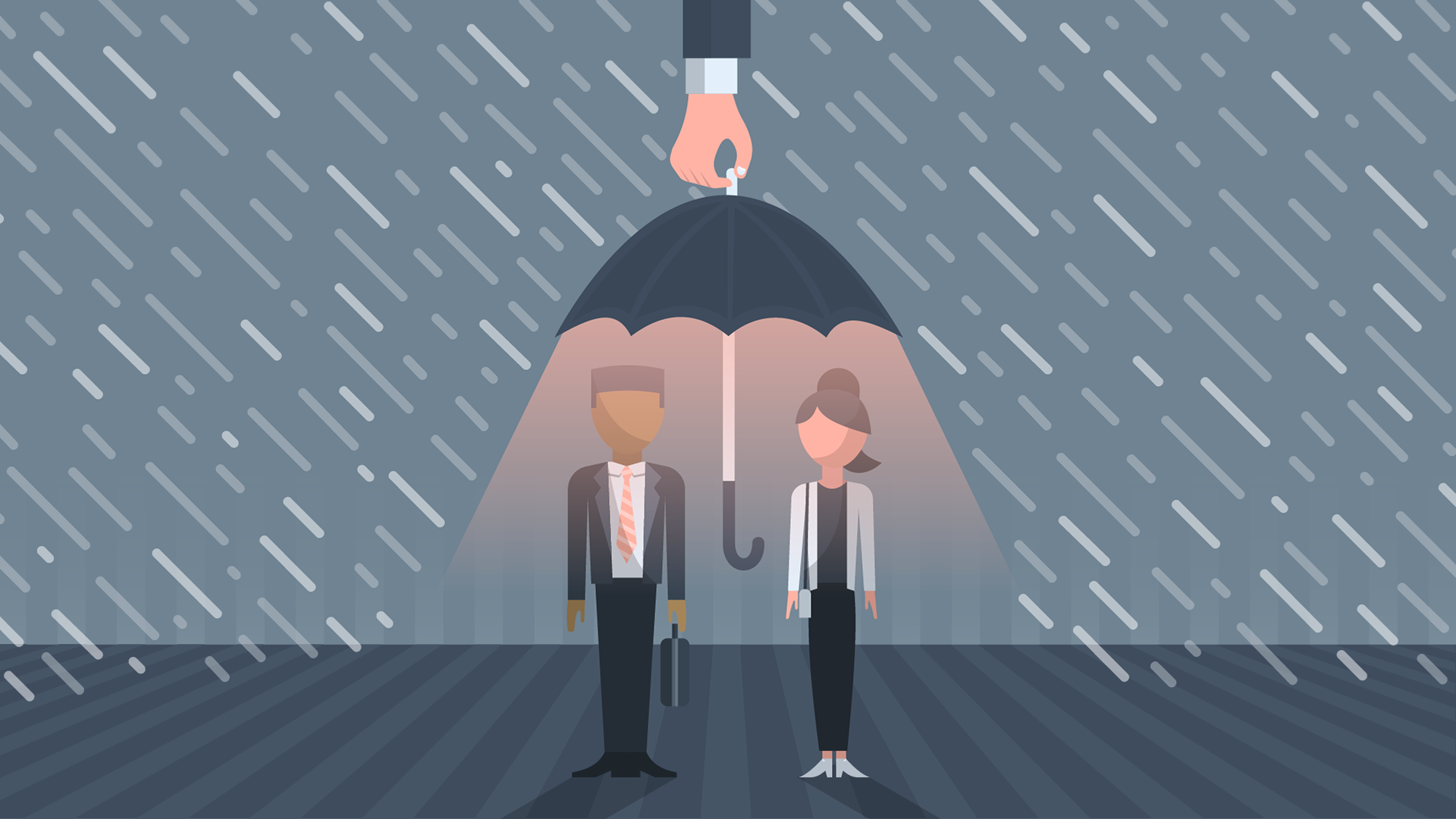
Coping with risky labor markets
This research digest analyzed the high costs that the government has to pay when it doesn't help people cope with rising job instability, so it makes financial sense for the government to help them out when times are bad. You can find the full article here.
I made the GIF and key image based on the idea that the government needs to take care of the people in times of need, by using the known idea of the umbrella under the rain in a not so common visual way. The conception and execution were pretty quick, with very little alterations, such as the government's hand, which originally performed a 'pinch' gesture over the umbrella, but was considered too 'sneaky', as if it was taking the umbrella away from the people instead of providing shelter.

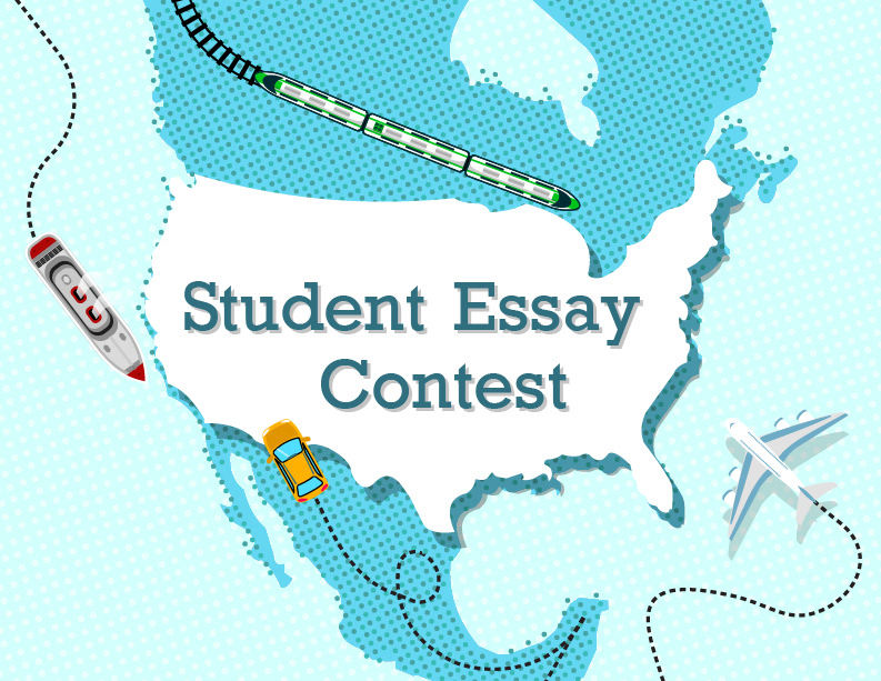
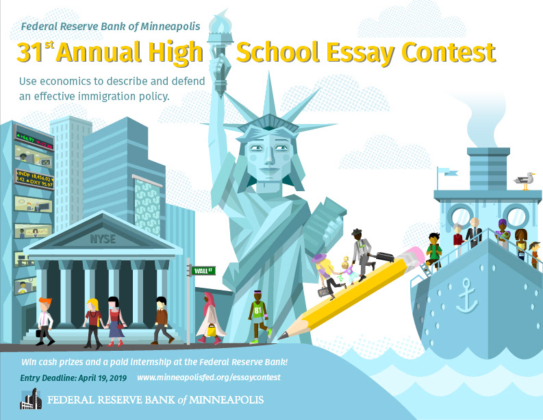
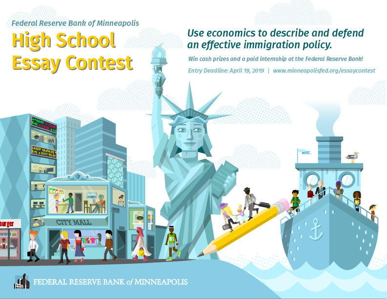
High School Essay
The High School Essay key image was created to promote a writing contest for high school students of Minnesota and Wisconsin, where they would write about the economic aspects of immigration in the US.
I decided to illustrate an immigrant ship coming to NYC, connected by a pencil that represents the student's writing, and the immigrants reaching the city through the path created by the pencil. The key image was turned into a flyer that was sent to every High School in the states of Minnesota and Wisconsin.

This image was certainly the one with the most changes throughout its making. At first, I was instructed to come up with a quick, mostly typographic replacement to the then-current key image, so I created a simple map with different vehicles arriving in the US (picture 1). Then we got some more time to work on this project and I was asked to come up with a more elaborate concept, which came to be the immigrant ship idea.
Through feedback sessions, it was decided that I should add Wall Street to the side of the image (picture 2). Later, it was decided to get rid of the more apparent Wall Street references and add a retail context instead, which is how I got to the final version (picture 3). *typefaces were used according to the Bank's branding guidelines

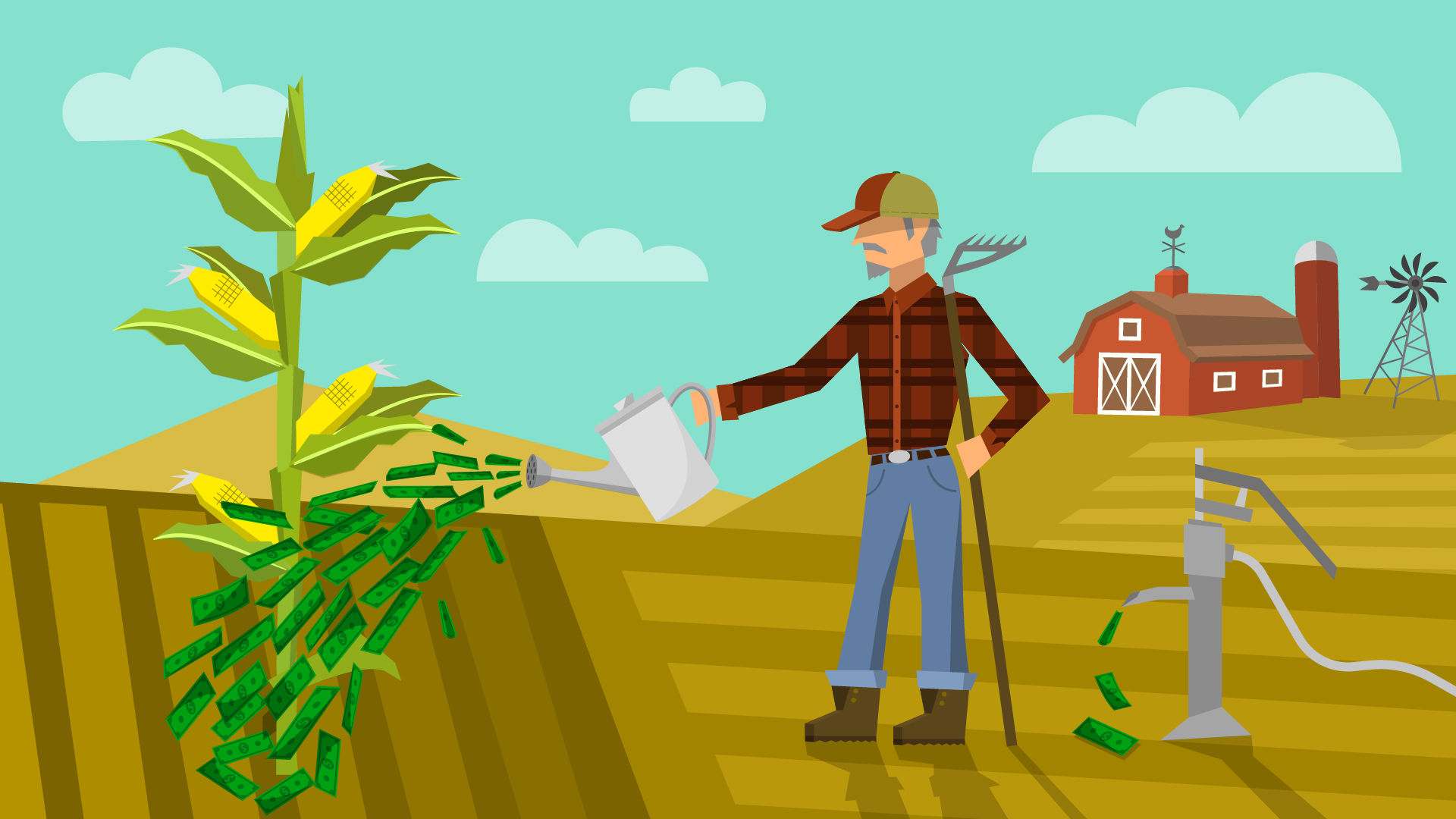
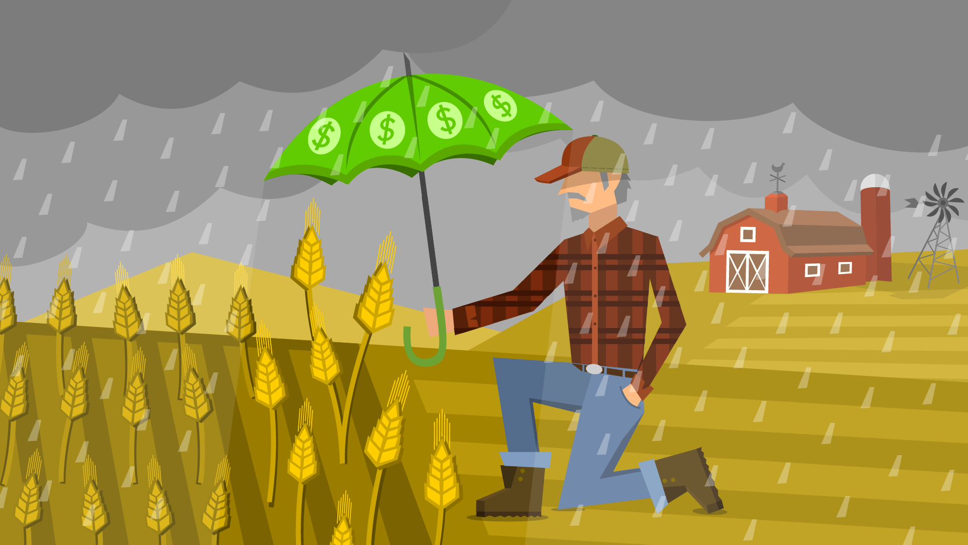
Crop Insurance
The Crop Insurance article discussed the costs of insurance for farmers and the taxpayer through a change in policy and coverage in recent years; it can be found here. My original concept (image 1) showed a farmer watering a maize crop with cash, in order to illustrate the relationship between the insurance and the efficiency of the farm through the payment of the policy. I was asked to update the image with a focus on the protective side of the insurance, using money as a tool instead of a spendable asset (image 2).