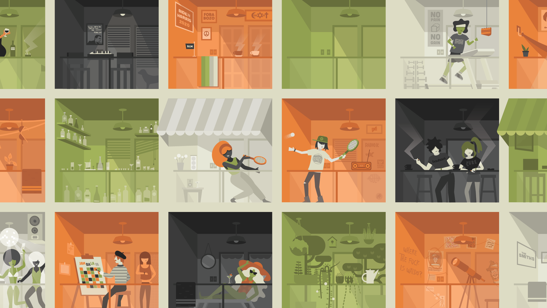
Here are some of the illustrations I did either for companies, events or personal work.
I will update this page continuously with new material and also delete some past work in order to always display 3 or 4 projects. Unfortunately, I won't be able to share some of my favorites from Fox and the Federal Reserve Bank of Minneapolis due to their confidentiality policies.
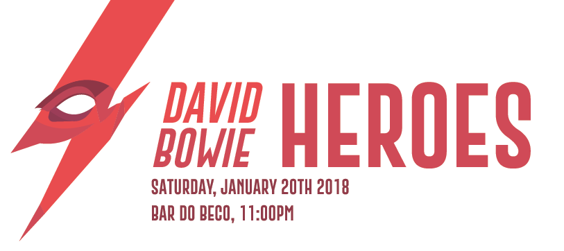
DAVID BOWIE — HEROES
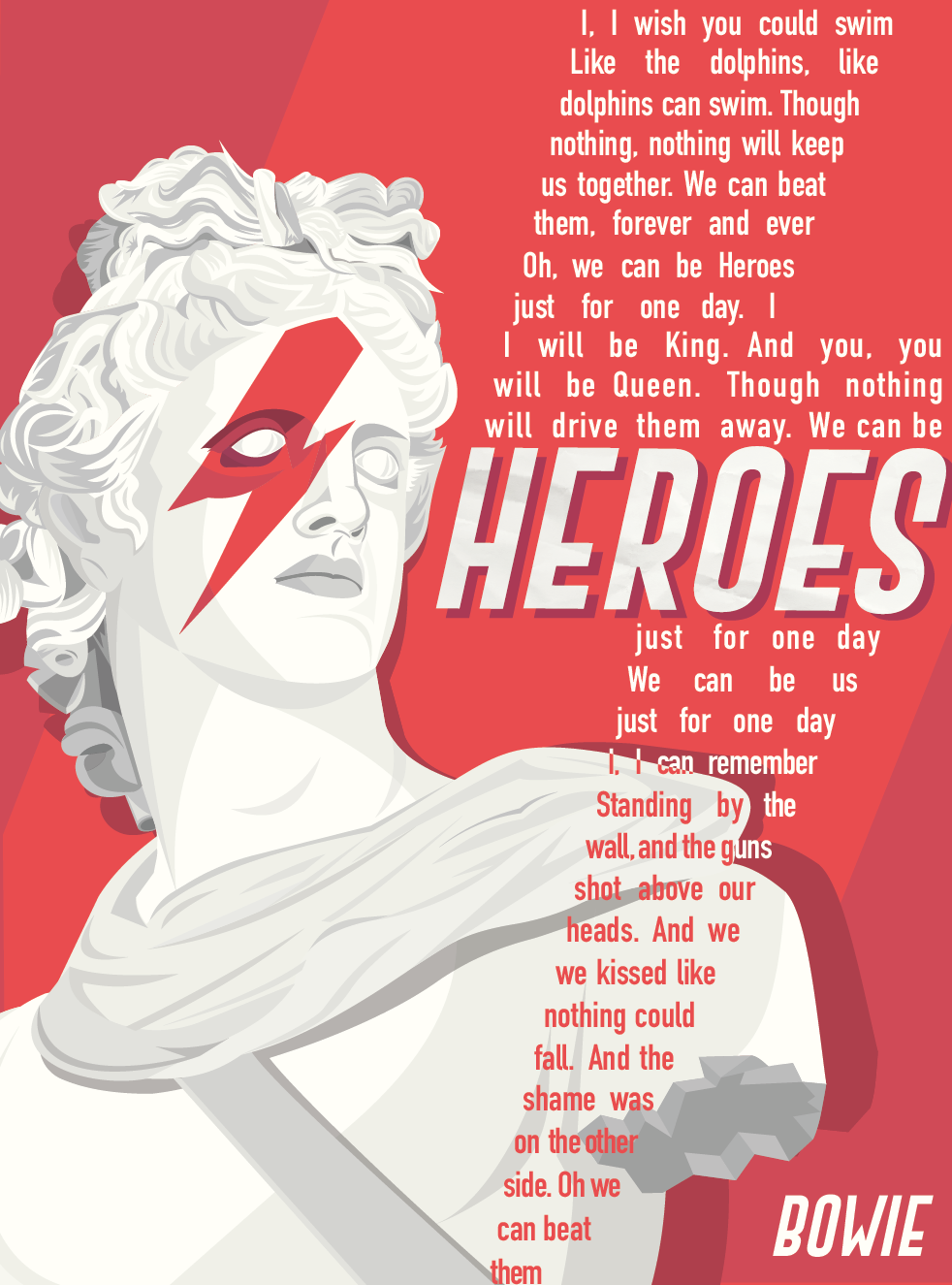
"Heroes" was a dance party celebrating the life and music of David Bowie, who is one of my all-time favorite artists. This Illustration and tag with event information were based on his 'Ziggy Stardust' era look on the cover of the album 'Aladdin Sane', with the red thunder painted across his face. I added the lyrics for the song 'Heroes' as a typographic element that repeated the thunder motif on the foreground.
The idea of adding a bust sculpture came from the message that these representations of humans are semi-divine, something to be venerated. And that's how I feel about the vast majority of Bowie's music catalog.
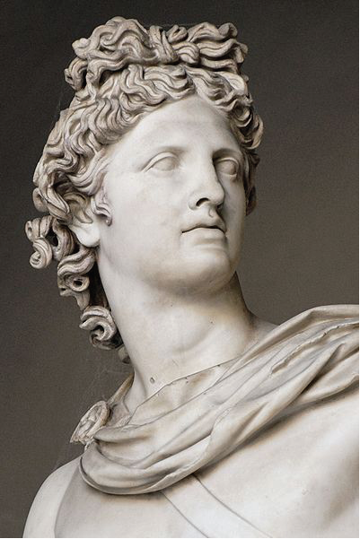
I traced the following image with the pen tool in order to create the bust illustration and added the David Bowie characteristic imagery afterward.
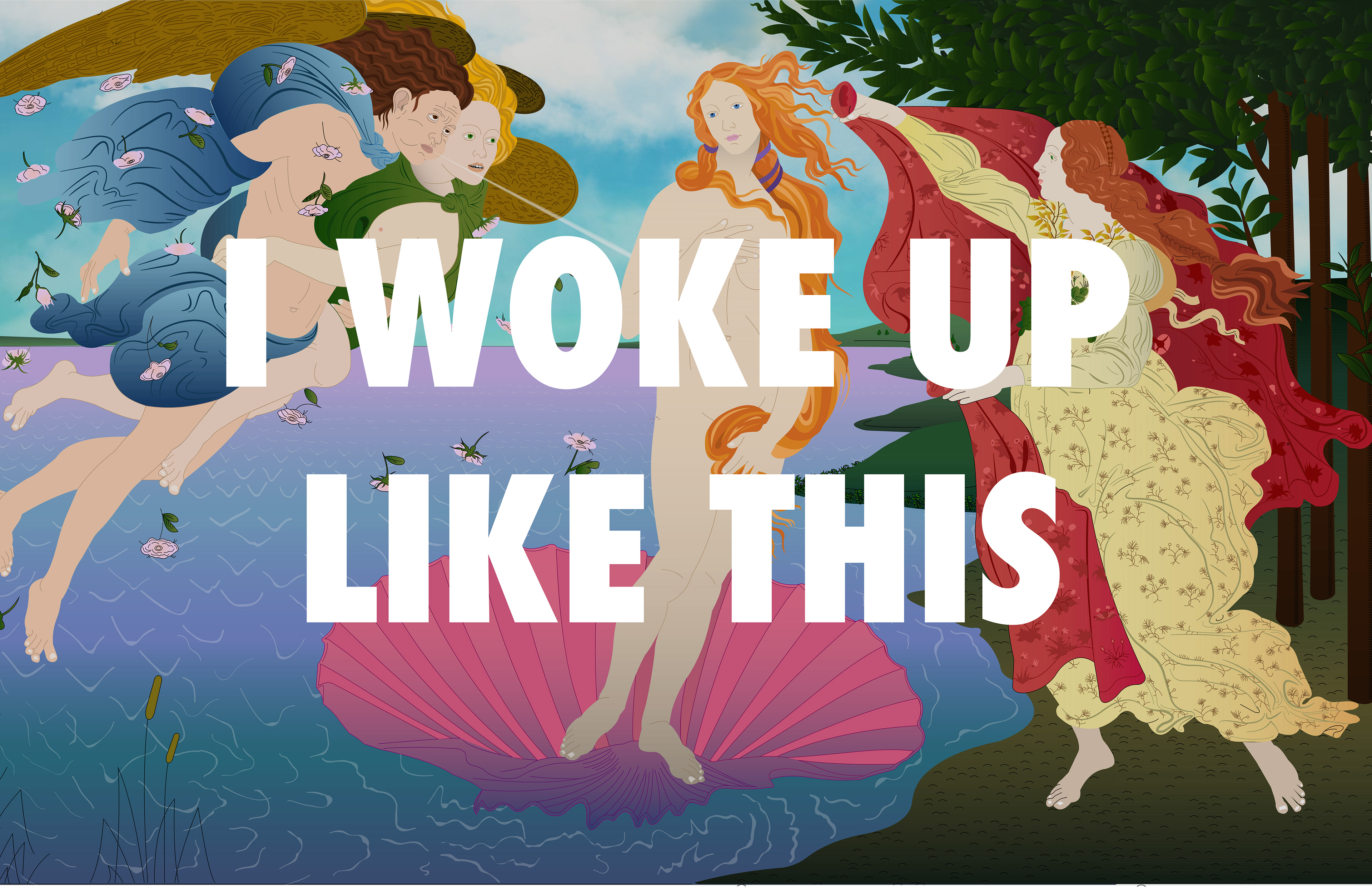
THE BIRTH OF VENUS ILLUSTRATION
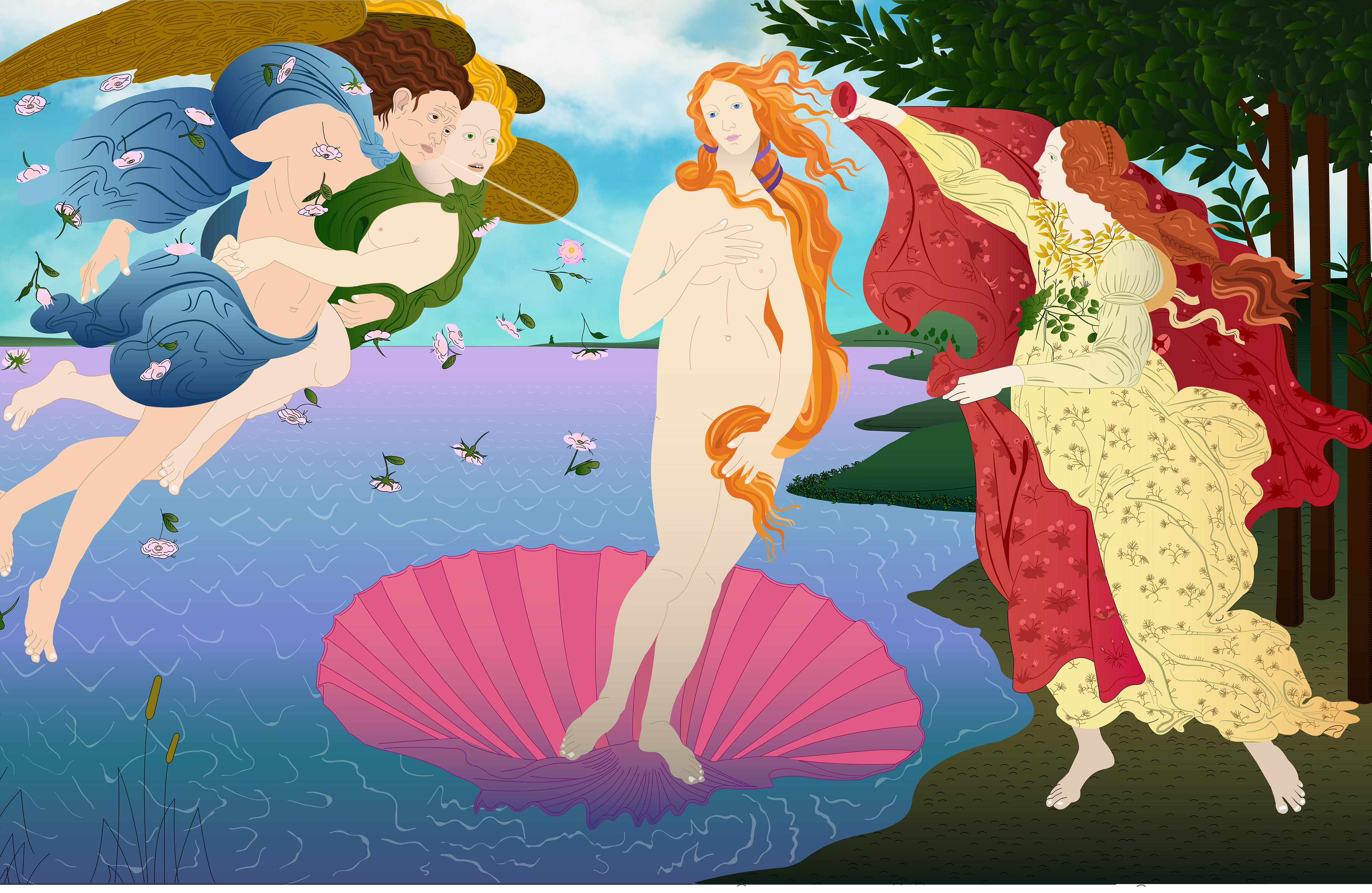
'The Birth of Venus' was my first ever large-scale illustration project. I created it in order to enter a design scholarship contest for the Elisava School of Design in Barcelona. Fortunately, my design was awarded a full-time scholarship and I was able to study in Spain for a semester in the Spring of 2017.
The design was created almost exclusively through tracing on Illustrator with the pen tool, having only the leaves on the top right portion replicated from one original vector, altering size and orientation, and the background sky placed as a previously existing photo.
I wanted to create a two-dimensional, whimsical, and somewhat 'cheesy' feeling, so I decided to use gradient colors for many of the vectors and maintain a simple approach to the line treatment, giving the design a cartoonish characteristic – yet maintaining a very detailed finish.
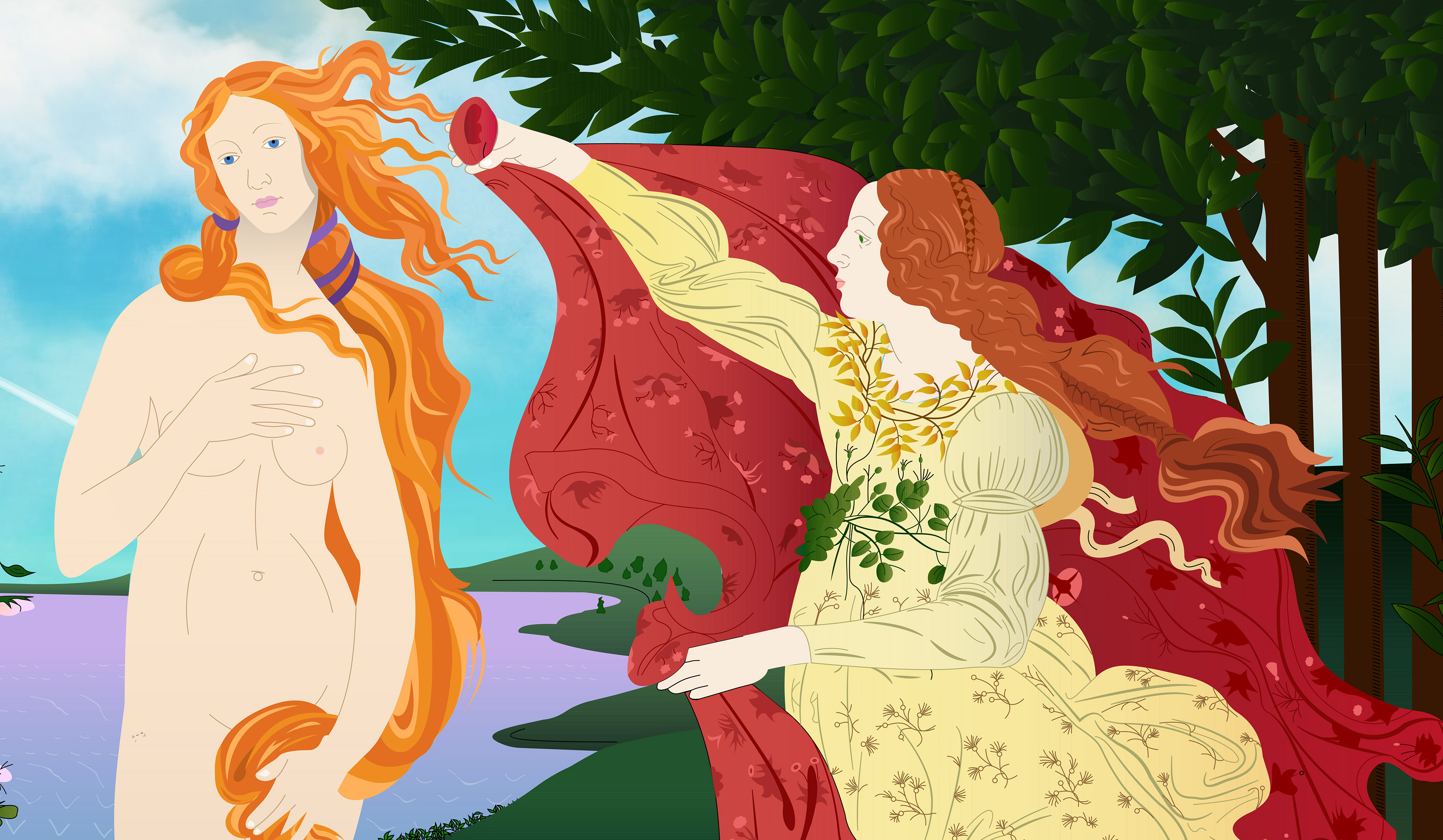
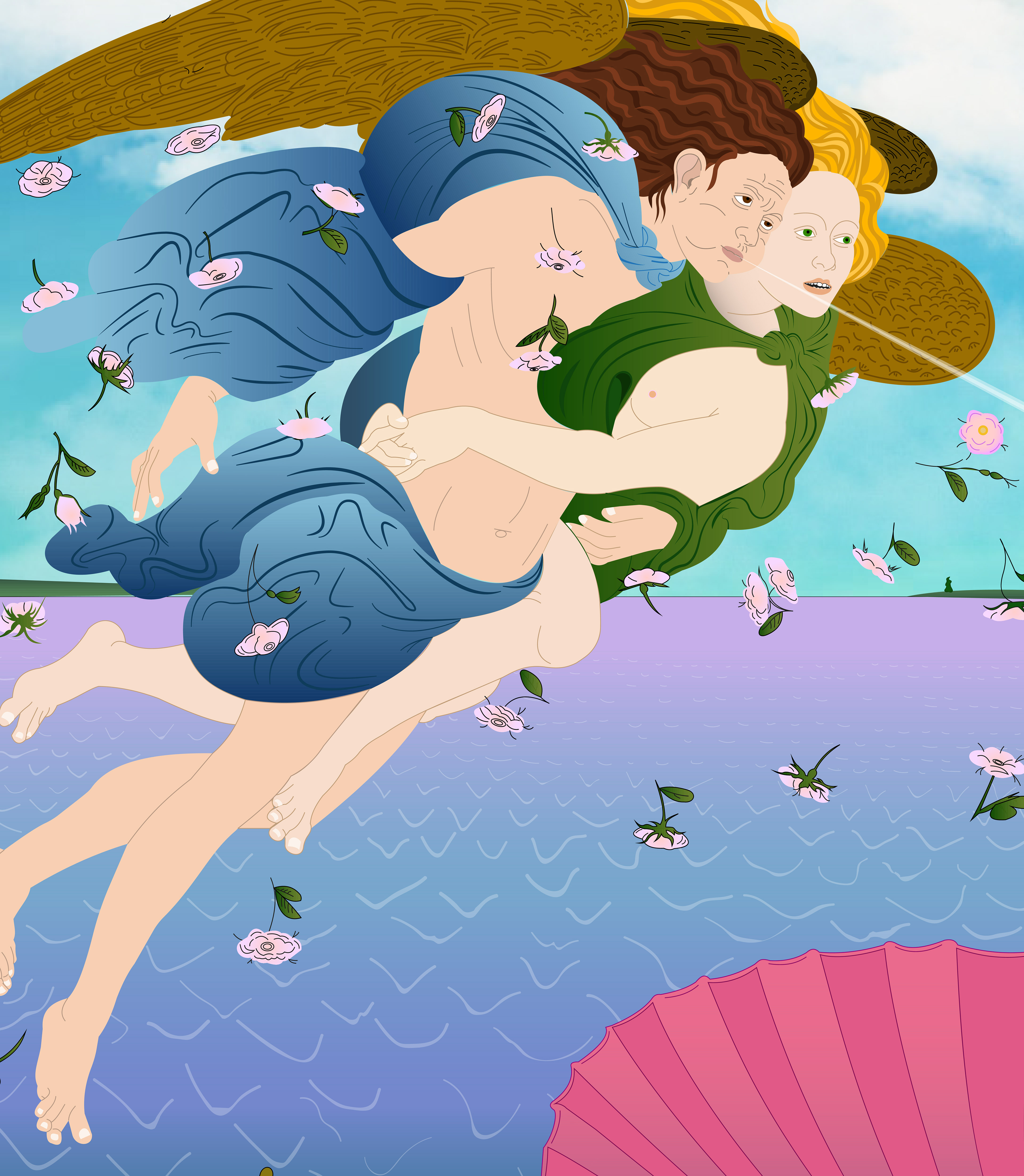
I did my best to be as accurate as possible considering the original painting, tracing over the exact same adorns on The Hora of Spring's dress and veil (right), lake ripples, and wing details on Zephyr and his companion (left).
I have many variations of this project, but the original concept is probably my second-favorite. In it, I kept the outlines for every vector, which helps to visualize the gradient objects against the light background; but it lacks color interaction and is missing the flow that we get with the final concept.
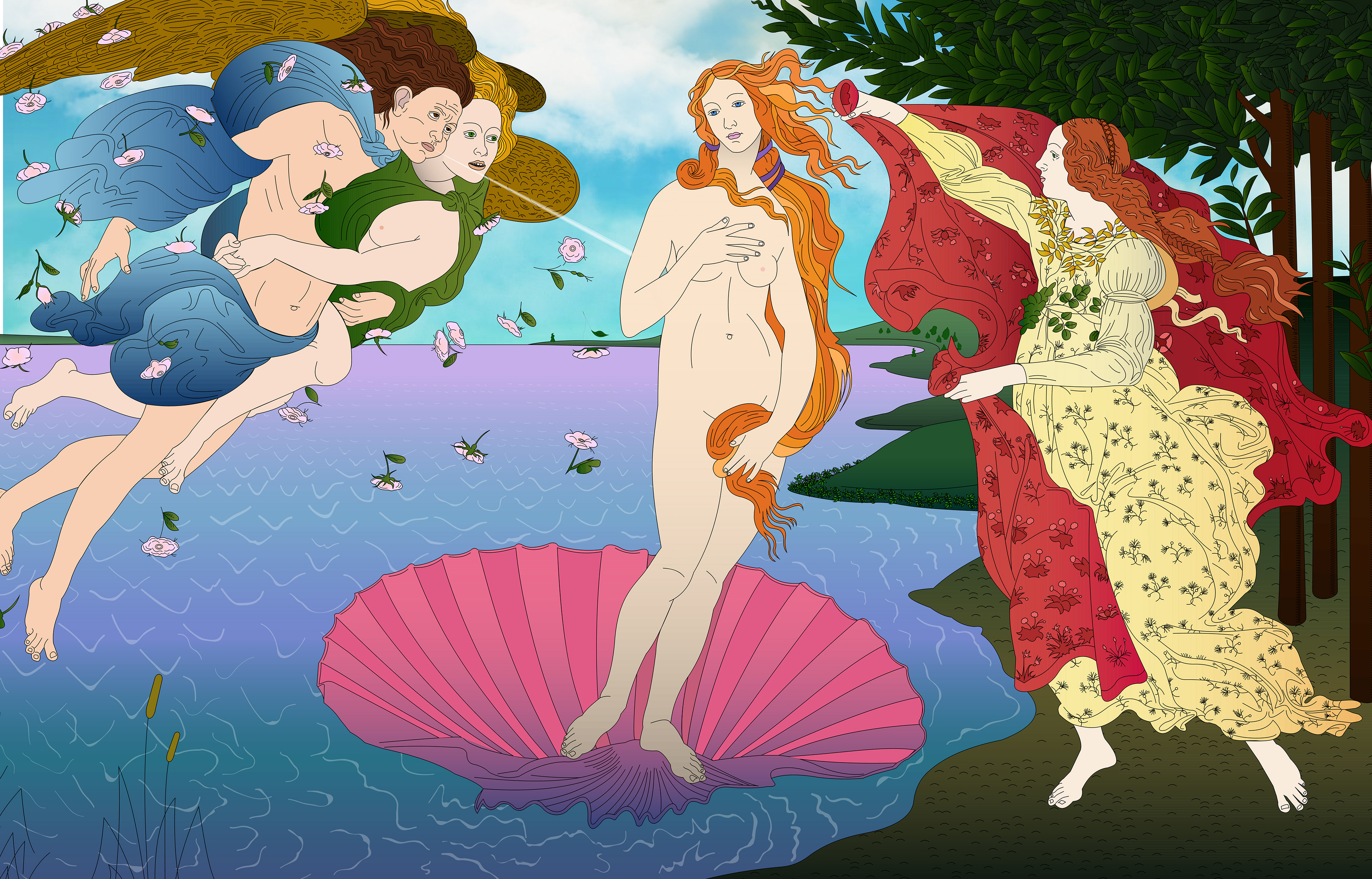
Next, you can see the vector lines created after tracing the painting. The leaves and flowers have striking lines through them due to the gradient effect over a small object.
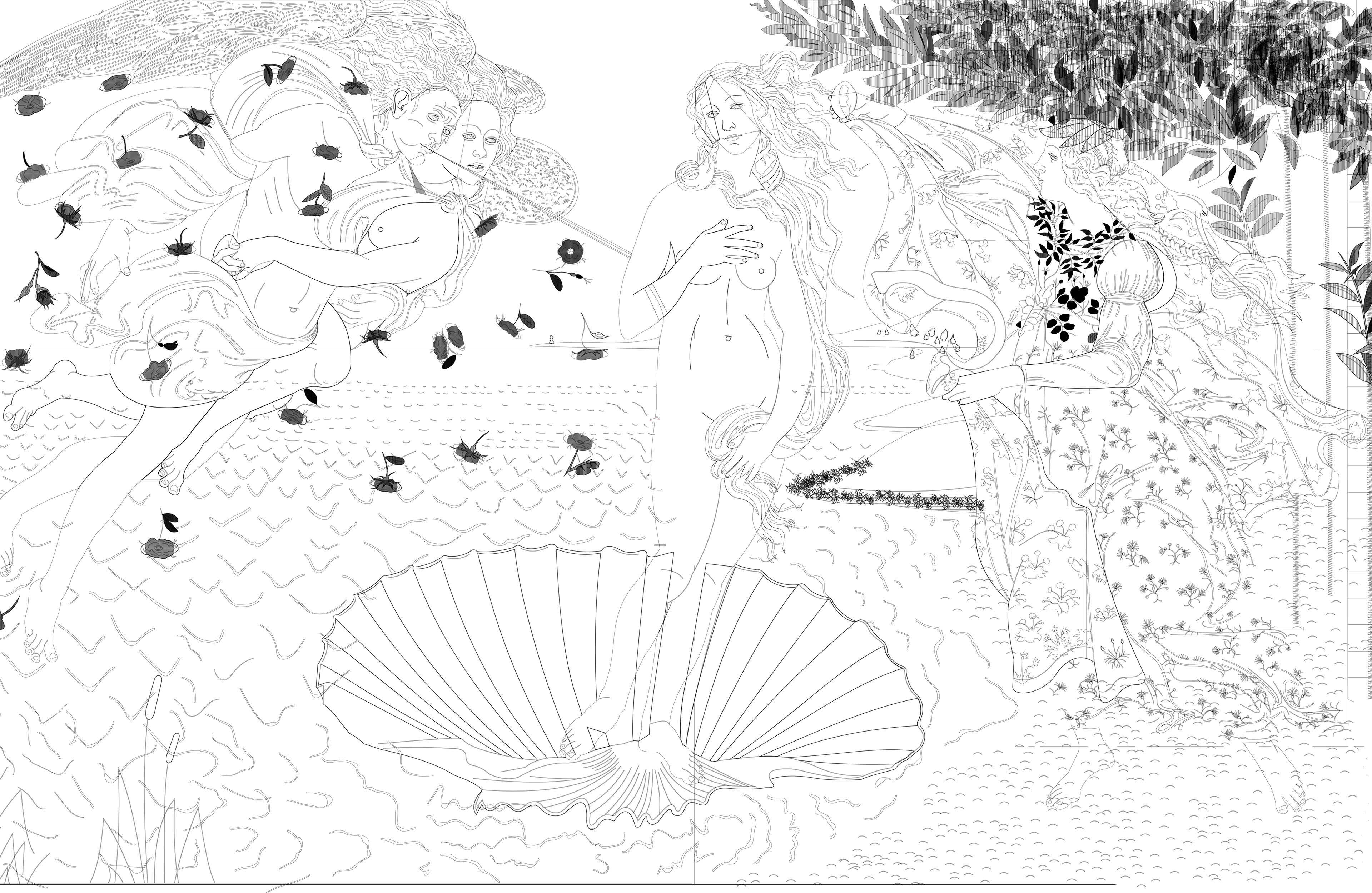
This project was traced over a digital copy of the original painting 'The Birth of Venus' by Sandro Botticelli, created in 1484.

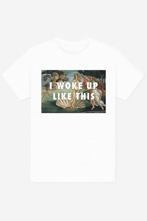
What inspired me to choose this particular painting was my favorite t-shirt at the time which had the line "I woke up like this" over the original painting. My t-shirt was getting really old and I wanted to buy a new one, but the manufacturer 'Rad' had gone out of business. So I decided to create one myself and print it out. Turns out that self-made t-shirts also don't last too long if you don't use high-quality products on their manufacturing, but at least I still have the design.
GUNS N' ROSES — NIGHTRAIN
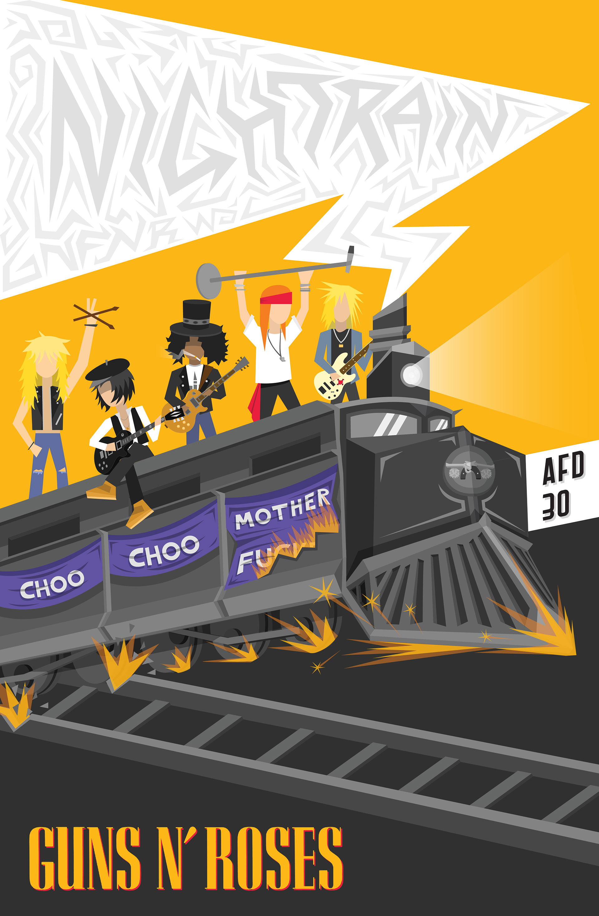
This illustration was submitted as an entry to Guns N' Roses' poster contest for the 'Not in this Lifetime' tour. Contestants should create an original illustration depicting the band's original lineup in the 'Appetite For Destruction' album 30th-anniversary context and add the Guns N' Roses logo. I chose to illustrate the song 'Nightrain' in a very cartoonish and minimalistic way, which may not have been the best choice for a band such as Guns N' Roses but it was the imagery I was seeing in my head when I listened to the song for the thousandth time. I have done countless GNR posters through the years, so I decided to change the style of this one a bit, making it less predictable and less in line with the style that's expected from the band.