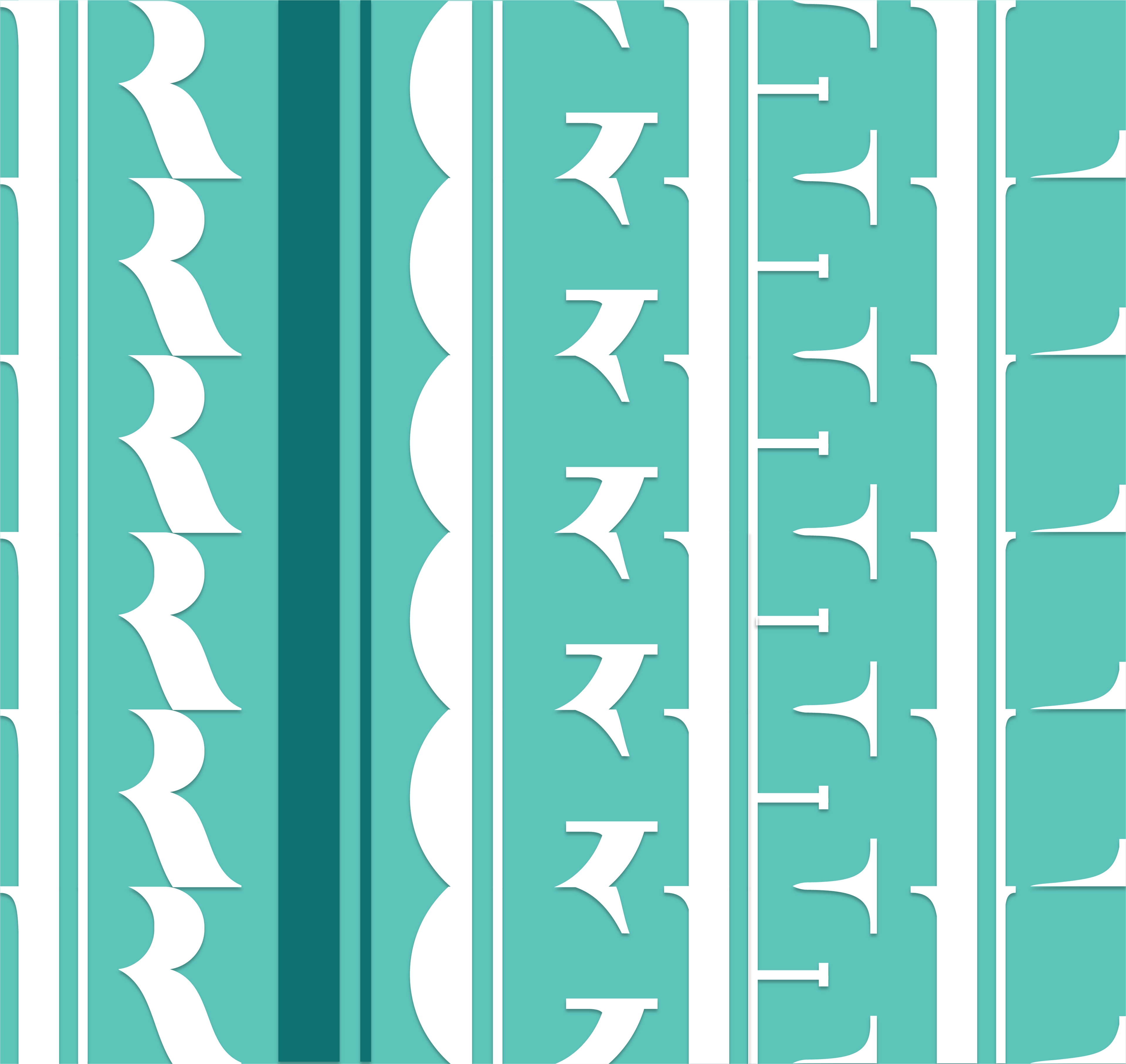
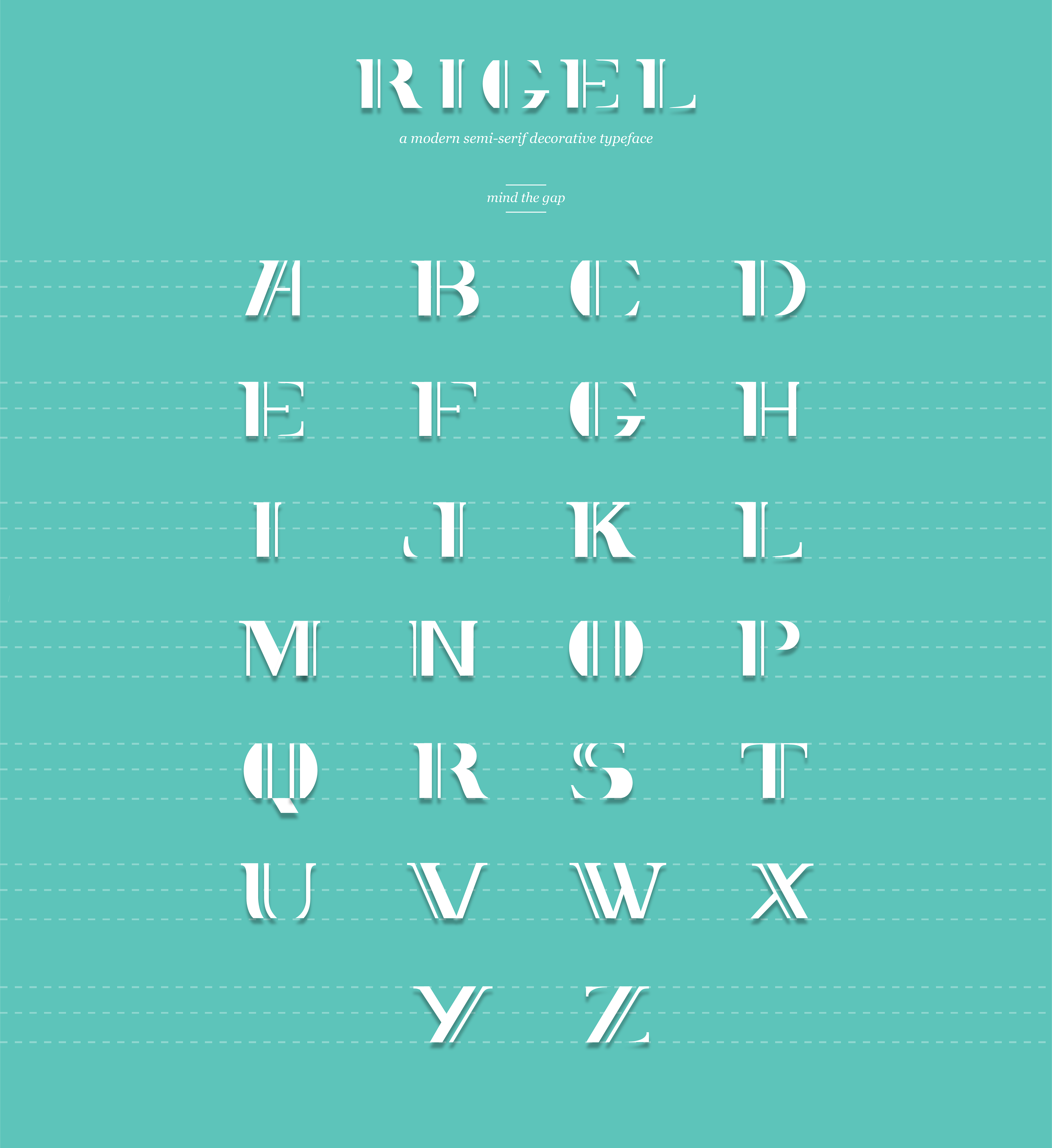
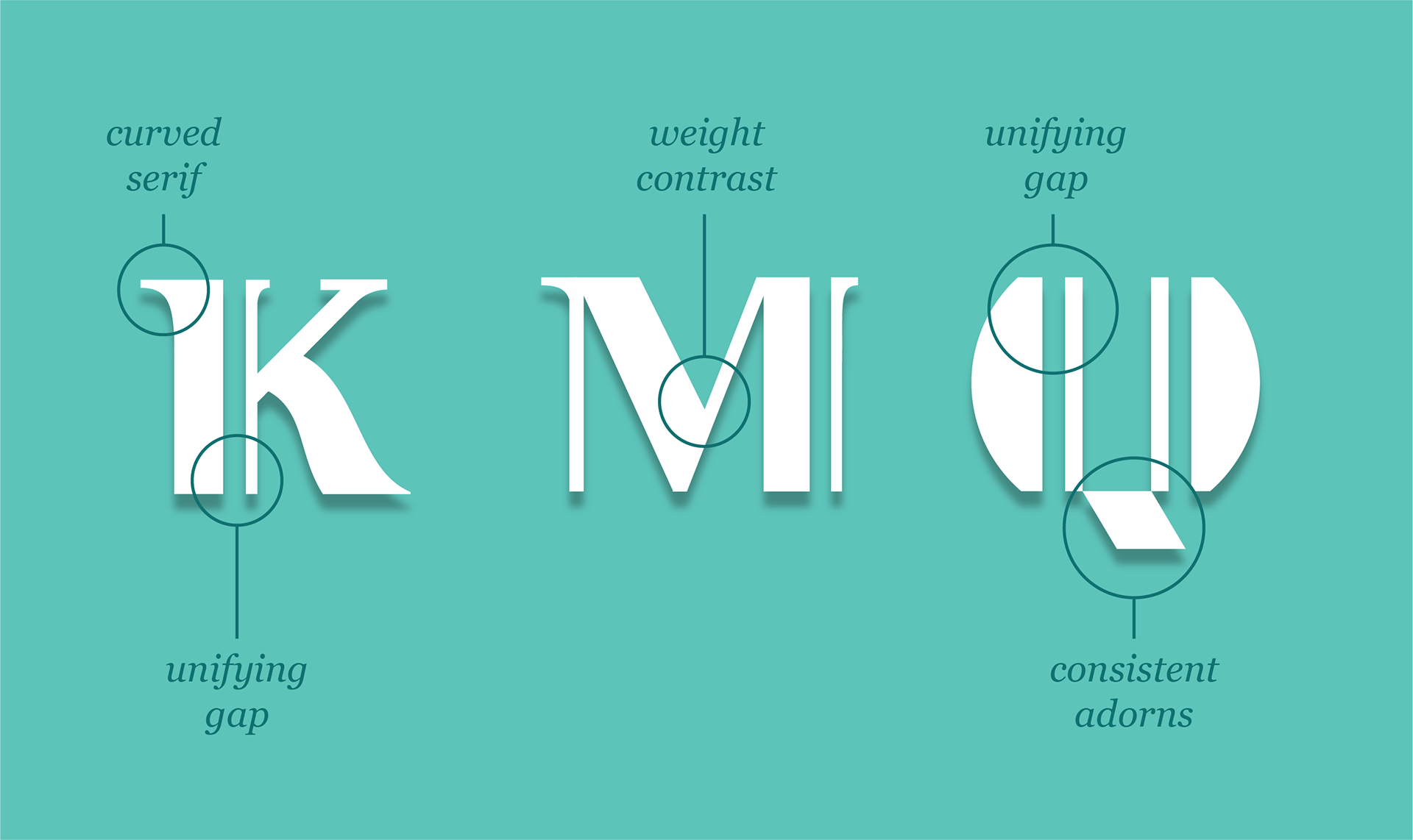
Rigel is a modern-semi serif decorative typeface, inspired on the 1930's New York City art-deco style and its 'Gatsby-era' retro feel. It also includes modern elements like the unifying gap in most letters and a cropped perspective that provides dynamic movement to the typeface.
The design of the font family display serif and sans-serif variations as well as different weights in order to create visual interest and provide a contemporary quality to the typeface.
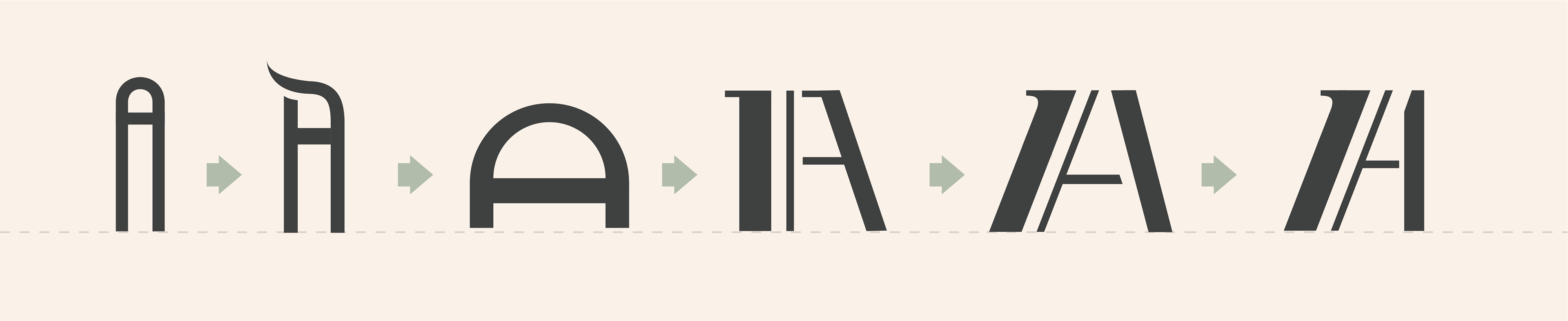
When I first started designing Rigel I wanted to create a very modern, quirky and playful tall font that could have a wide range of creative use. It turned out looking aesthetically pleasing but did not have any striking characteristic that would make it memorable enough for a unique display font. So I decided to play with some adorns and whimsical shapes in order to achieve a solid visual identity for the typeface, and the most successful addition was the strikethrough line.

The strikethrough line provided a classy golden era feel to the font. I thought about refining it and releasing it as a variation to the original concept and end the project there, but as much as I loved the result it was still not original enough since there are so many similar typefaces geometrically out there.
I decided to start over and tried to come up with different ideas that could implement the vintage feel of the strikethrough concept and still have a modern look.
The final concept was inspired by the beautiful Lago restaurant logo at the Bellagio in Las Vegas.
I had seen it about eight months before creating Rigel — so my visual memory of it was very distorted — but I remembered it for seeming like a modern take on an art-deco font, and that was partially the feeling I intended to create with Rigel.

I decided to draw it on Illustrator without checking the original one for guidance. After finishing my sketch, I compared it with the Lago font and they looked completely different. It is possible to identify some references in letters such as the continuous line running across the ‘O’ and the ‘A’, but other than that they are completely different typefaces.
The color palette for this project had to represent the vintage concept in a modern setting, and also had to work with a clear background in order to properly present the typeface for the standard readability over white, but at the same time light enough so that it could be used over dark backgrounds. For my portfolio, I chose to add a drop shadow behind the typeface as it adds depth and visual interest.