Federal Reserve Bank of Minneapolis logo
Working as a graphic designer at the Fed allowed me to add some logo concepts into the mix when the bank was starting to go through its complete rebranding process. The final logo has not been selected yet, as the bank is considering concepts from in-house designers and from a Minneapolis-based creative agency. The full rebrand should be launched in September 2019 with a new logo and website.
phase 1
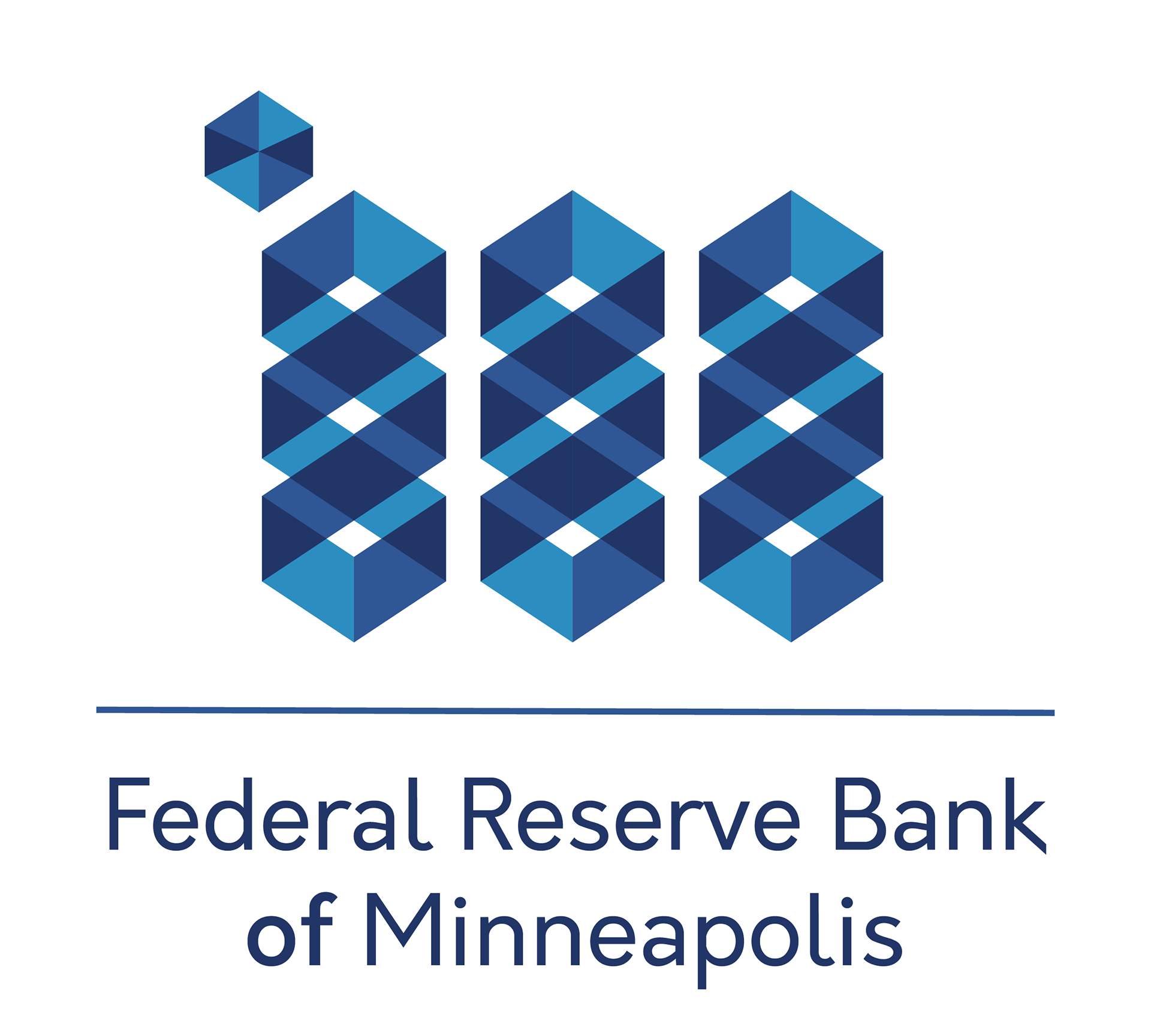
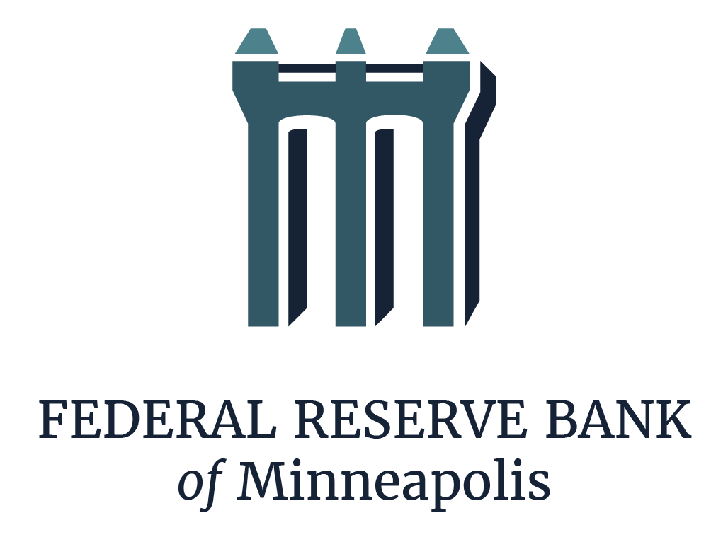
The first iteration of logos I created for the Fed was based on their request for 'M' shaped mockups that showed 'strength and transparency'.
The Bridge concept represented the idea that the Fed is a connection between financial institutions and the people, with a solid and stable foundation, yet transparent to the general public.

The intertwined 'M' concept showed a see-through box pattern with different shades of blue in each wall. It symbolizes transparency, organization, and process.
The next one is my 'Ms. B. Haven' logo, I showed it just to see how 'modern' of a concept the bank was willing to consider. It was never actually supposed to be considered for the final logo or any latest iteration; but it turns out there is quite a lot of symbolism in it that could tie it to the bank, depending on how much you are willing to ignore some faulty details.
The 9th district of the Federal Reserve Bank (the Minneapolis branch) watches over 6 states and has two headquarter locations: Minneapolis, MN, and Helena, MT.

This one is a long shot, but if you *really* want to see 'FED' spelled in the logo, there's a pretty unconventional way it could be interpreted and spelled — again, this logo was never supposed to move forward in the process.
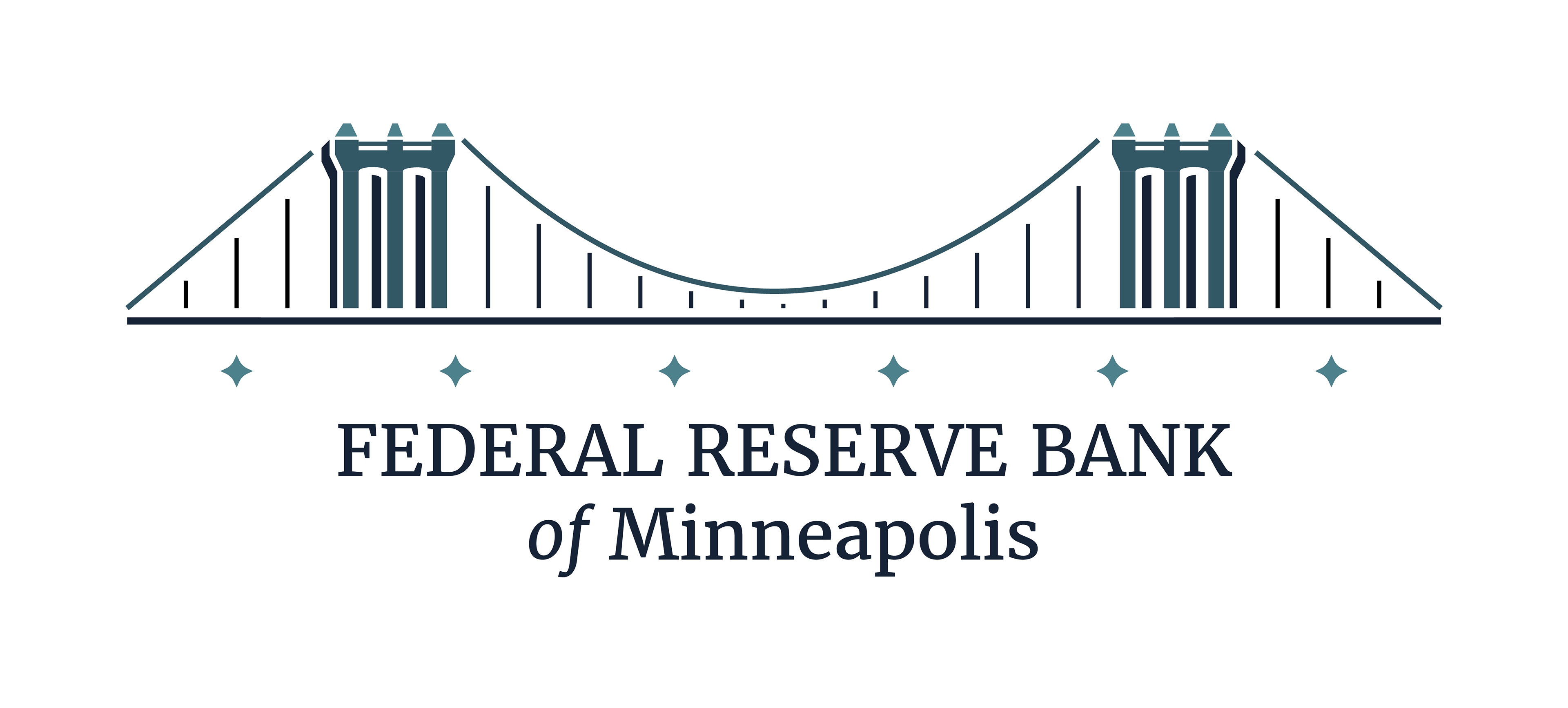
phase 2
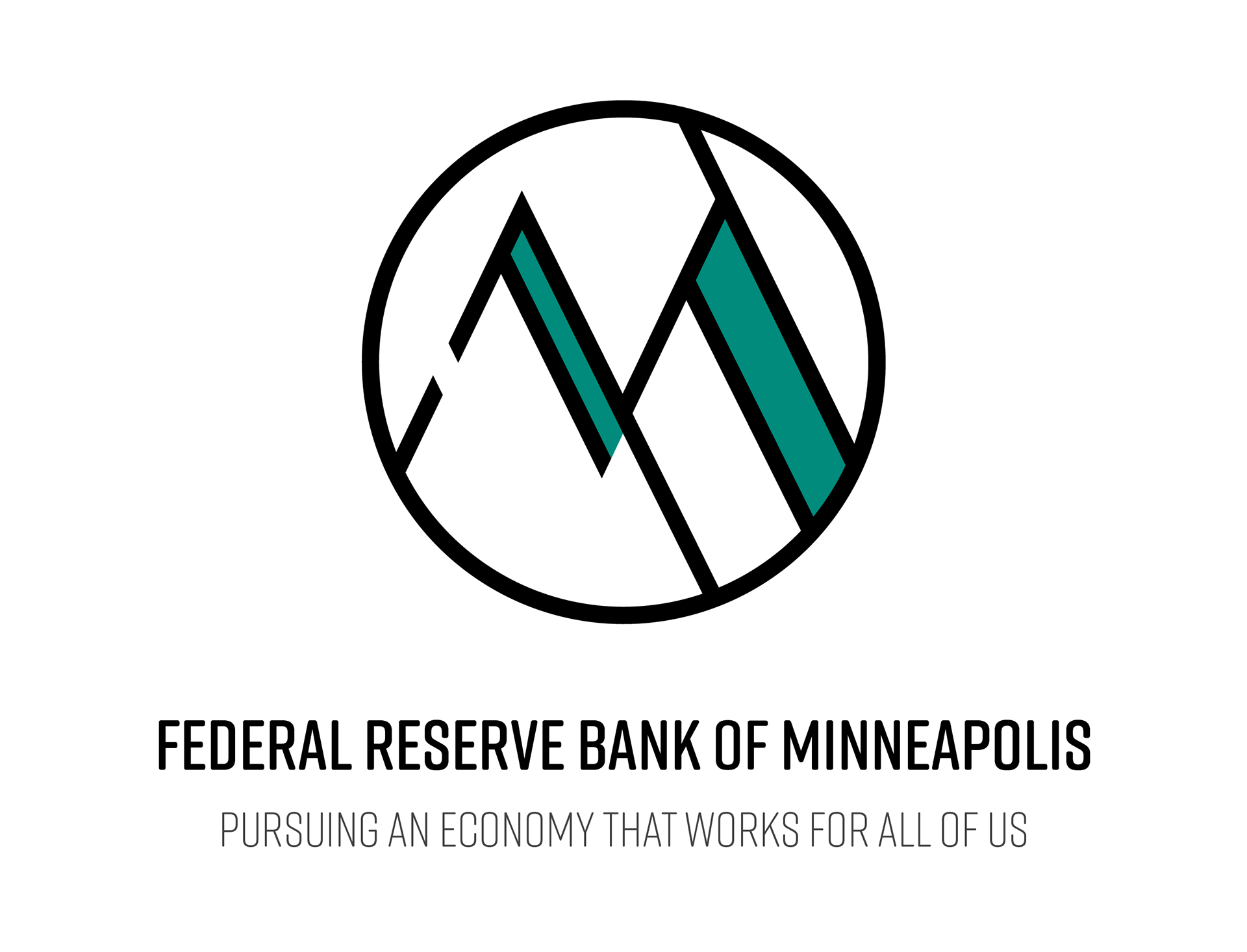
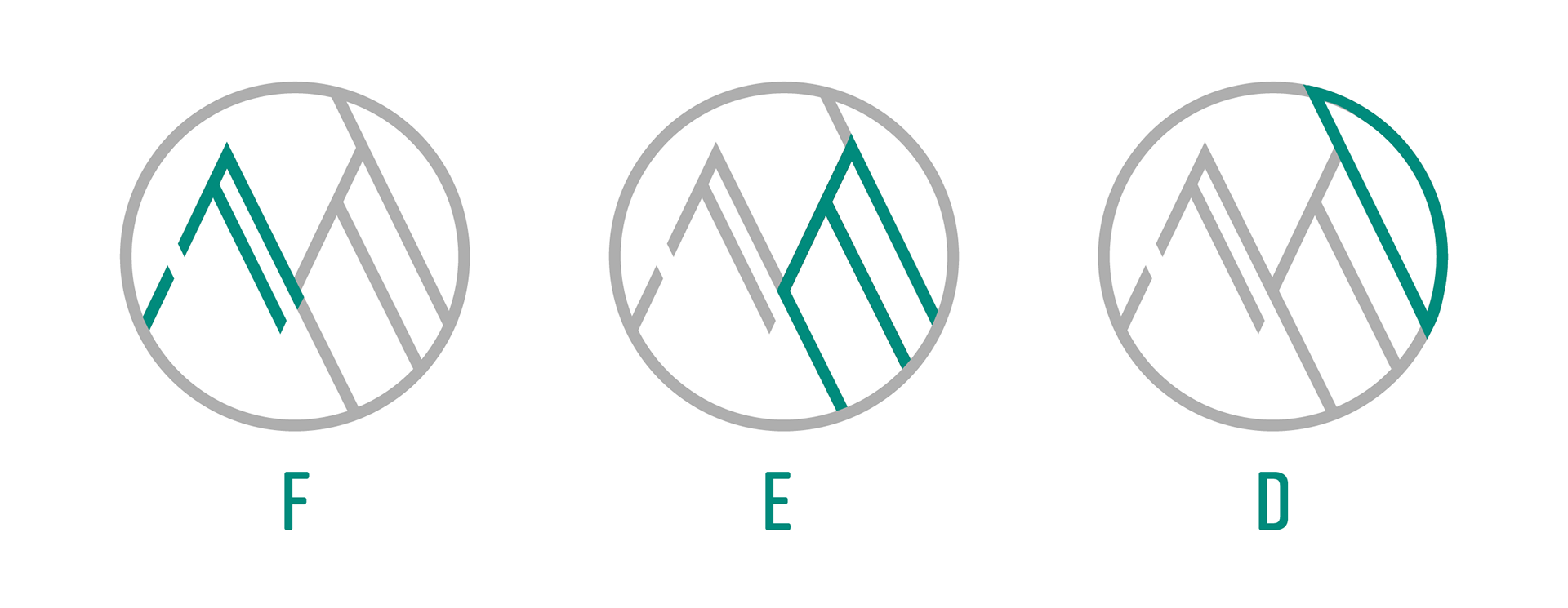
After many meetings with management, the board of directors decided to cross out the 'M' idea since it was too Minneapolis-focused and didn't represent the other states in the district. So the new logo should have one or more of the following elements: eagle, bridge, mountains and the representation of the number 6 (for each state in the district).
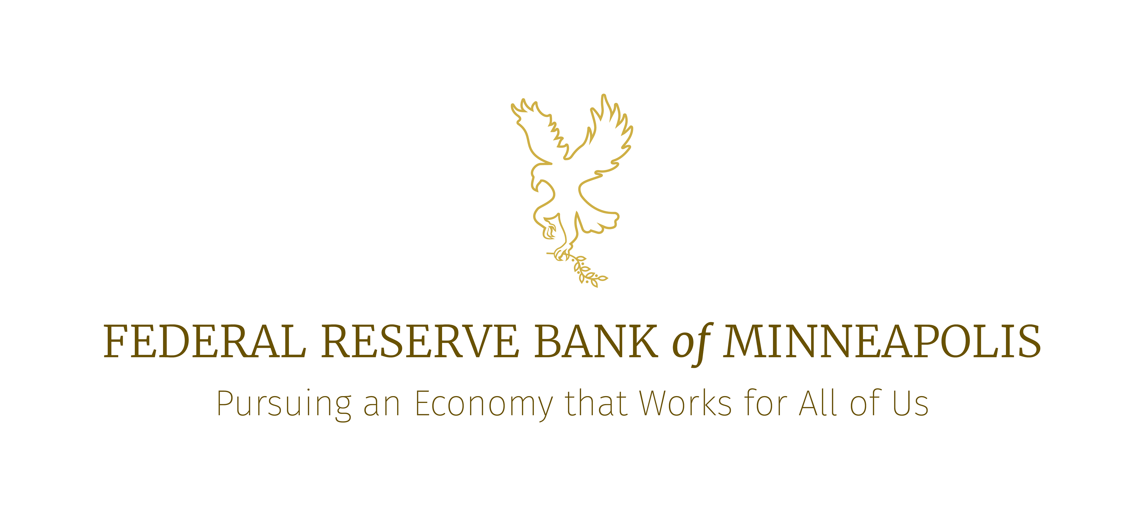
This first concept is a minimalistic line drawing of an eagle carrying an olive branch, with a focus on the typography. I decided not to bring the commonly used arrows in the left claw as the bank was looking for a softer, gentler feel.
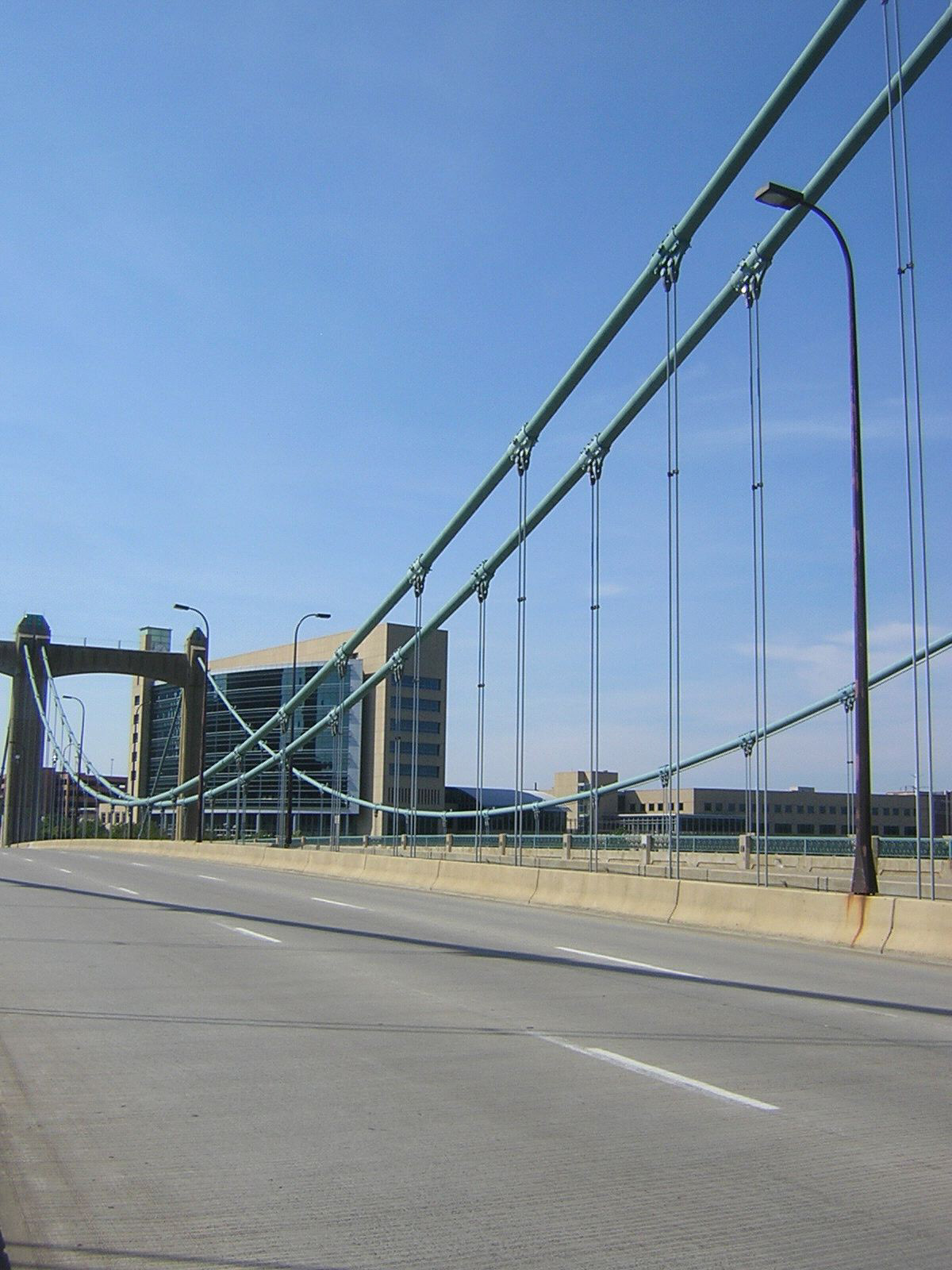
The bridge concept depicts the Hennepin bridge in Minneapolis, right across the street from the Federal Reserve Bank. I never understood why we didn't use the bridge as a symbol for the brand since it's such a complementing element to the architecture of the bank's building as well as its proximity to it.
Here's a picture of the Fed's building behind the Hennepin bridge, for reference:
I also experimented with the arches of the bridge, which have an 'M' shape and the representation of the 6 states by each element in the columns.
final concept
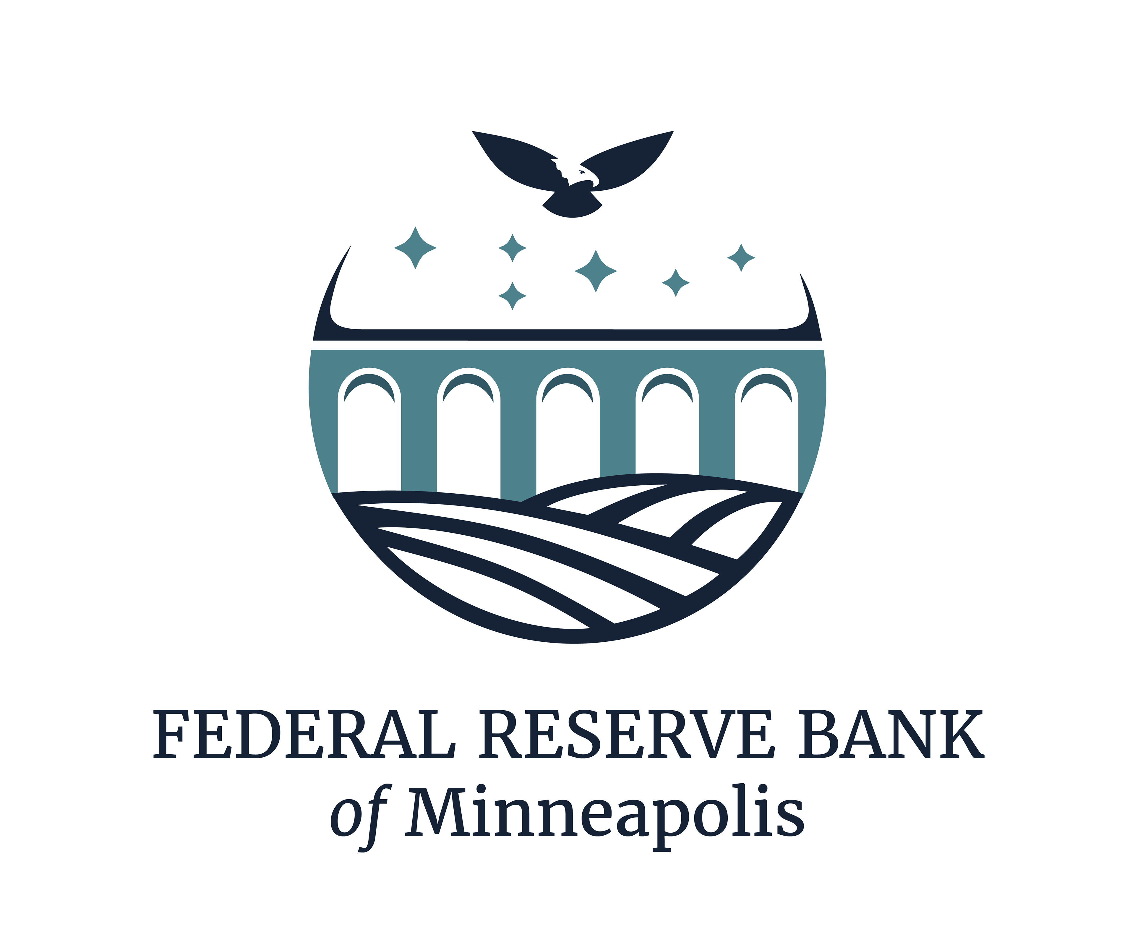
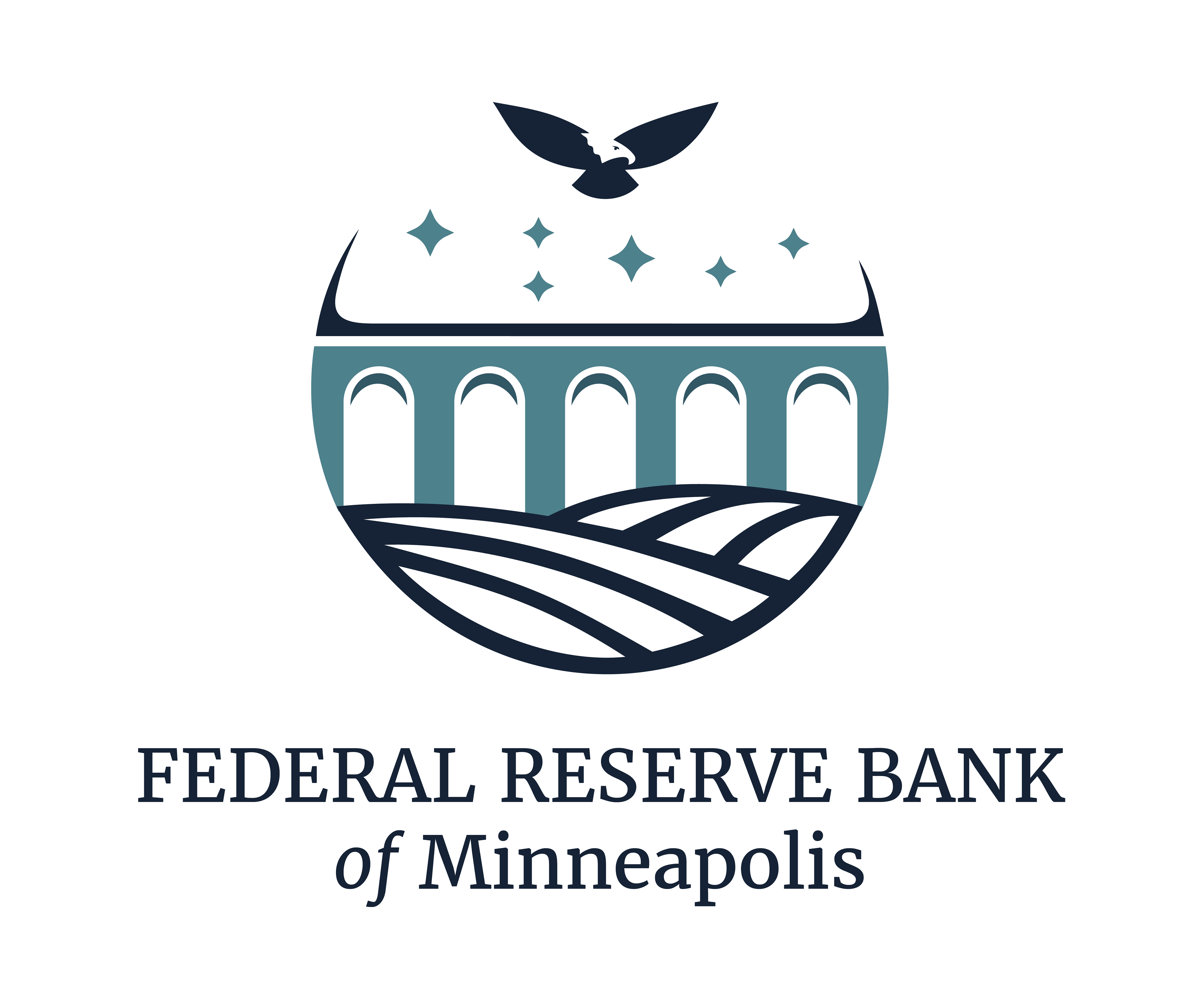
For the final round of iterations, the board of directors decided that the logo should encompass at least 3 elements: water or fields, a bridge, and an eagle — and if possible, to implement the idea of the number 6 in the logo as well. So I assembled those elements plus 6 starts in the location of each state in the 9th district as showed on a map, with the 2 biggest stars being Minnesota and Montana. The number 6 can be seen in the water/fields shape as either 6 crops or 6 streams of water, there are 6 columns under the bridge, and, of course, the 6 stars being watched over by the eagle.
In the end, my logo was not chosen as the official mark for the bank, but I am very pleased with the work I have done, and the variety of styles that I was able to present in each round of ideas.
The new official mark for the Federal Reserve Bank of Minneapolis can be found at the bank's website, here.
TECH CAFÉ LOGO
Tech Café is an in-house IT service offered in all Federal Reserve Bank branches. They have a lounge where you can meet with a specialist and, of course, get some coffee while you're at it.
PHASE 1
The Tech Café team was looking for a modern, fun logo that could be used on their main panel, t-shirts, and keychain. They wanted a vibrant hue icon in order to match their living room color scheme. They also wanted me to come up with a Grayscale logo that could also live up to the modern & fun request somehow.
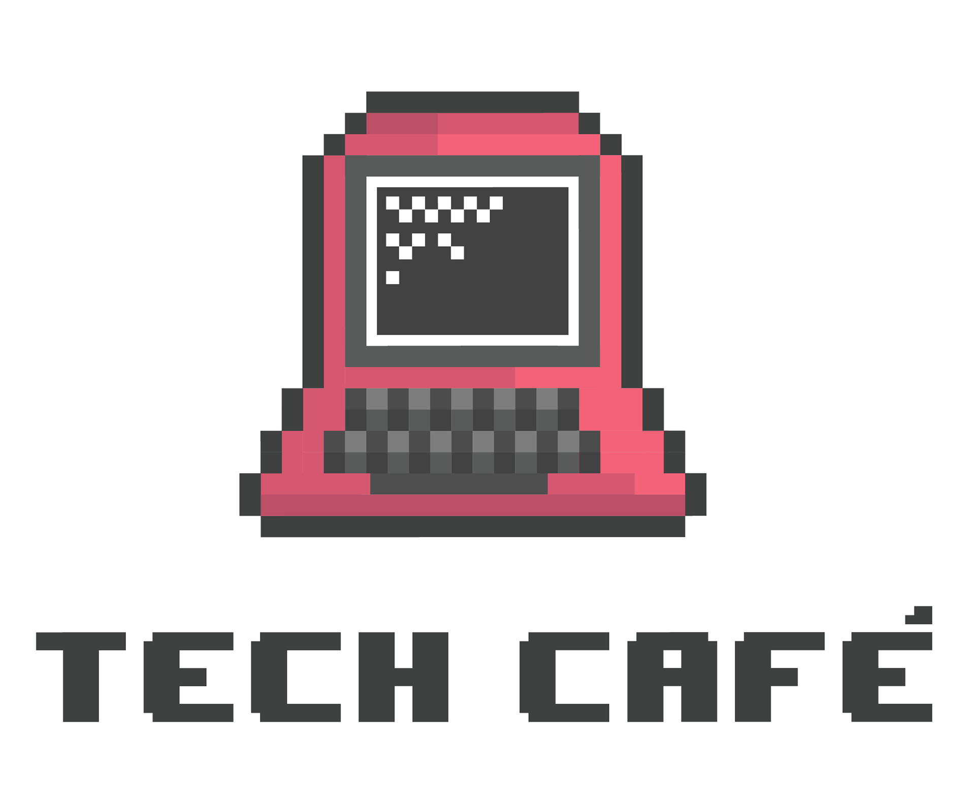
This first concept was based on the many logos they liked and wanted to use as a reference; it's an illustrated rendition of what they told me they do at Tech Café, serving employees with IT and coffee needs.

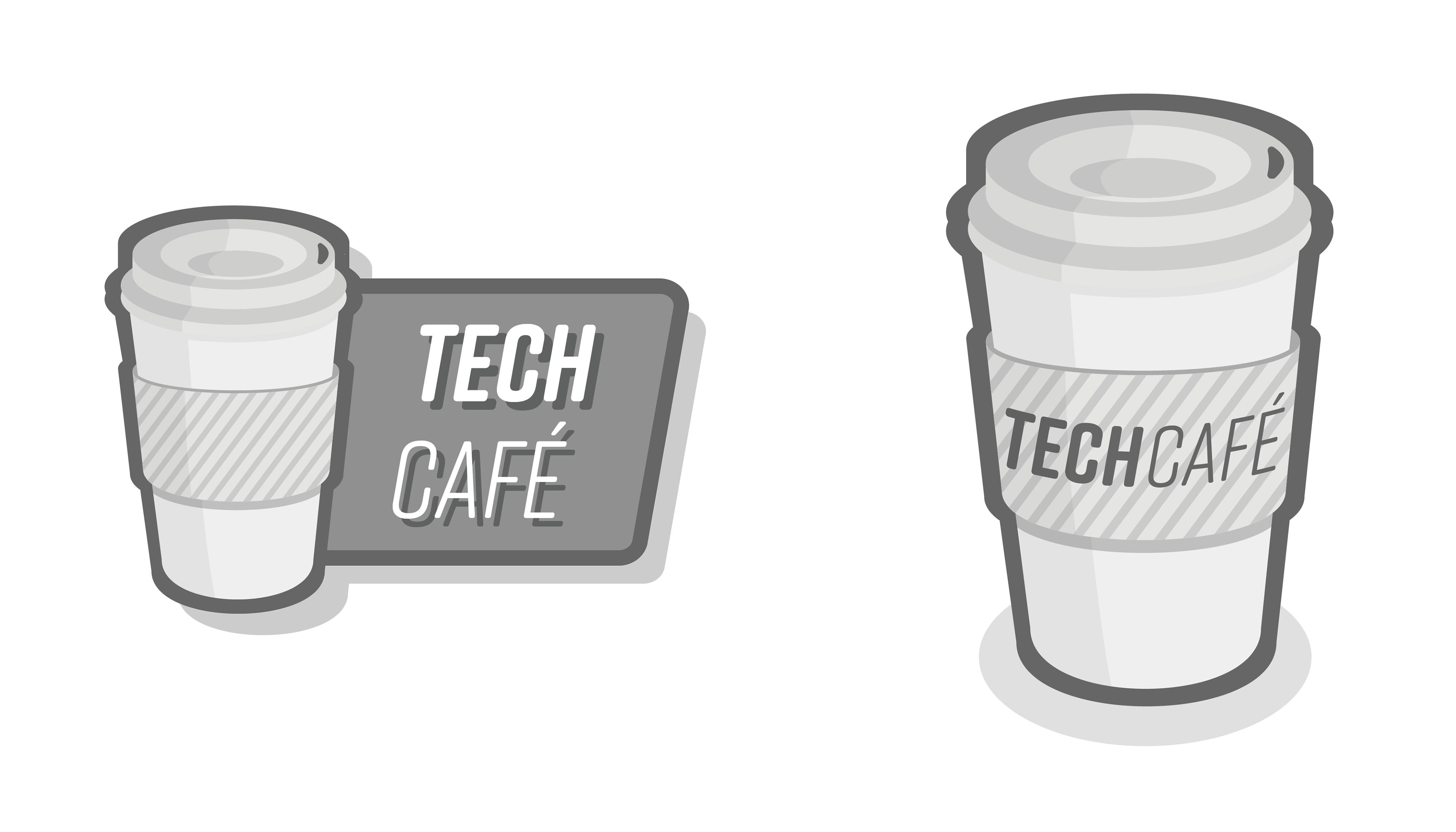
The Grayscale concept is a cartoonish version of a to-go coffee cup and would look great as a pin as well.
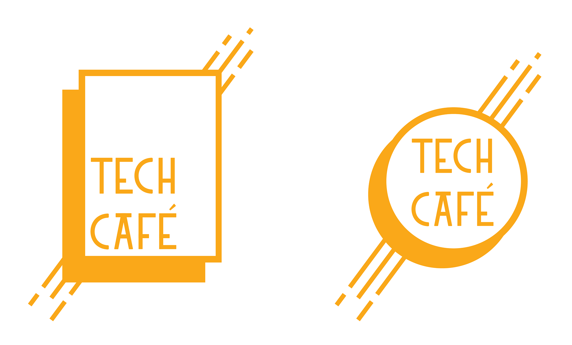
The Stool concept is very simple and straight-forward, and it shows a little stool as the letter 'A' in 'Café'. They liked this version and wanted me to expand on it a little, using contrasting fonts and a solid background.
The retro computer was also very popular, but they wanted a three-icon mockup of this concept, which I advised against as it would become a little too busy, but I decided to give it a shot.
PHASE 2
The second phase was more focused and quicker, as the Tech Café team was more aware of their preferences for the logo. They wanted something with fewer illustrations and more typography-focused, but they also wanted to see some of the previous logos with the changes they requested.
As predicted, the retro logo became a little too busy for a mark, but it would look nice as a greeting sign on their wall.

The contrasting font logo with a solid background worked better in this iteration, and they were ready to make it their official mark, but I wanted to show a few new options before making it a final decision.

FINAL CONCEPTS
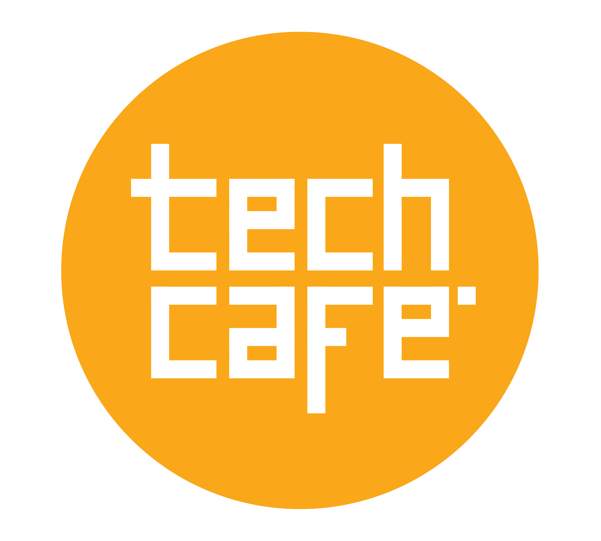
The final concept was a designed blocky typography logo simply made with rectangles and a circle. I made three versions of it, one sans-serif and two with variations of indentations through the logo. They picked the first version.

FLOATING ISLAND MARK
The restaurant Floating Island submitted a request for an icon that could represent their brand in a fun way. I decided to give it a try with a quite literal approach (1st image), as well as give them an idea for their menu icons (2nd image) which could be used in burgers as depicted, as well as beers, chicken wings, etc...

CÍTRICA MARK
The Brazilian women's clothing store Cítrica requested a mark for their brand and a Facebook banner that could be later adapted into a general-purpose pattern. They didn't want any typography, just the mark.
I made a vibrant, cartoonish rendition of a lime slice, slightly tilted and with a discrete drop shadow. It is simple and unique, giving it a refreshed new look for the brand.

The pattern was added to shopping bags, business cards, and wallpaper, while the logo will be designed into a wall sign.