GL Homes is a luxury real estate builder in South Florida, established in 1976. I was hired in February 2022 to be their first UX/UI Design Lead on a brand new UI/UX team. We would be focused on creating a new design system that would then be used to redesign all of their internal platforms, which were outdated and quite massive. We also worked on multiple teams projects creating prototypes and screens for the existing platforms with UX improvements and user tests. In short, there are three main internal platforms: Traffic (a system where potential homebuyers are registered, categorized, and assigned to project administrators), Options (a printed catalog where homebuyers can preview photos of materials and furniture to be used in their home and buy upgrades), and Warranty (an application where existing GL Homes homeowners can contact the company in case they have any problems in their home, and request a visit from a subcontractor). The first task was to create a full, detailed, and user-tested design system that could initially replace the UI for all three platforms, and then rethink the flows + interactivity for each one of them.
My team is composed by three extremely talented UX/UI designers and front-end developers, Chelee Batchanoo (Project Manager), Guillermo Paez (UX/UI Designer), Matheus Riboli (Front-end Developer).
Challenge
To create a single comprehensive design system for all internal platforms with ADA compliant components validated by user tests, that evolves from the current UI and layout styles so that current users are able to use it seamlessly and new users can learn it intuitively. Plus, a detailed, thorough, and instructive UI Kit for both designers and developers.
The Original Internal Platforms
• Traffic
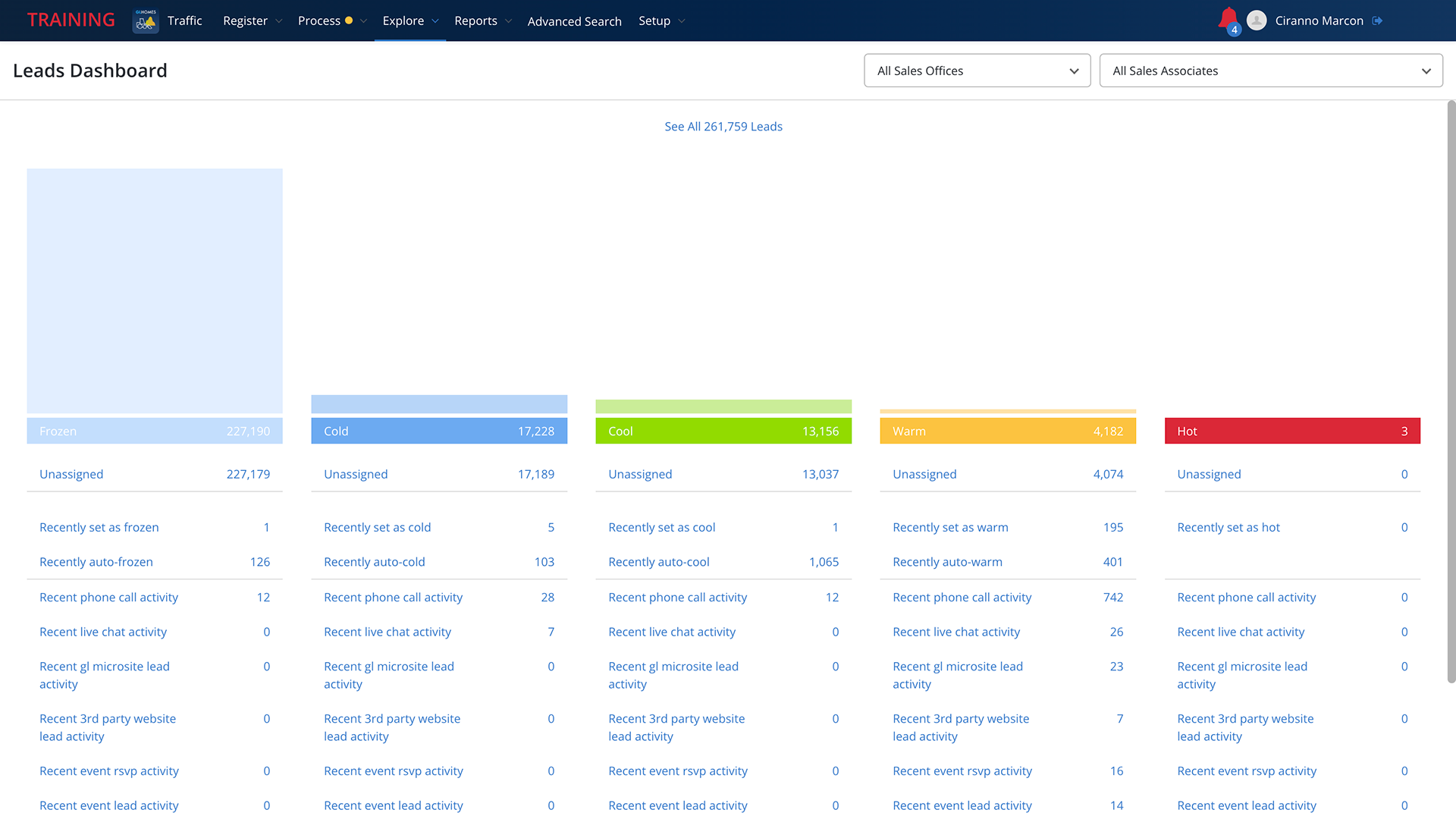
Traffic was the first platform I had direct contact with, and its problems were clear from the get-go. Its homepage was a blank screen where the only visible component was the system's top navigation bar. The first time I opened it I was waiting for over a minute for something to load. The system also had tons of visual variations for the same action, such as Save buttons in classic CTA shape, checkmark icons, right-facing arrow buttons with no text, and different verbiage CTA links — all serving the exact same purpose throughout the site, and many of them not ADA compliant. This problem happened with most visual assets, and it became clear that many designers were involved in the creation of that product while having no defined guidelines or a design system they could populate and reapply throughout all systems, which made large-scale edits almost impossible for developers, not to mention the inconsistent and arbitrary communication with the users. Another huge issue were the component's logic throughout the flows and the non-intuitive actions users would have to learn to fulfill very basic tasks within the system. This version of Traffic had been running for over 3 years once I got to GL Homes, but even though the employees were somewhat used to the hoops they had to jump in order to do their work, they were definitely aware and weary about it.
Here are some screenshots from the system (all personal information was redacted for privacy):
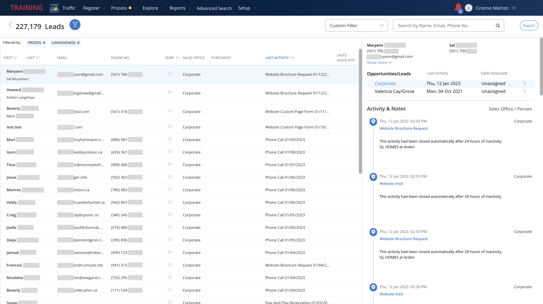
• Warranty
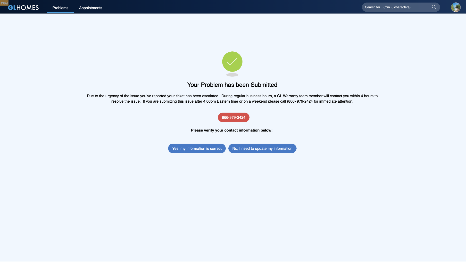
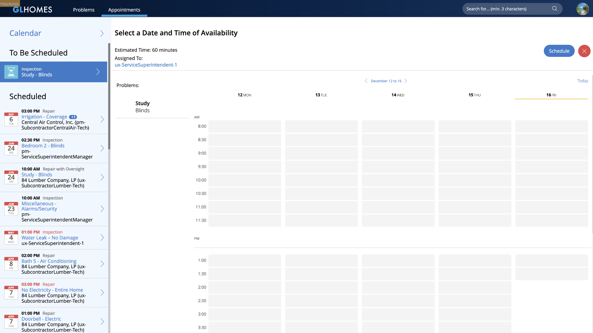
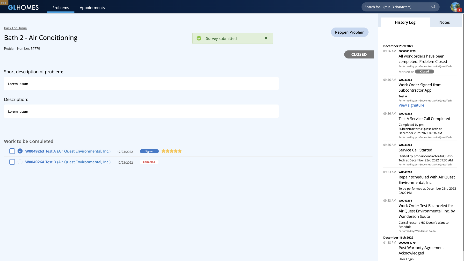
Warranty is the biggest GL Homes system. For this showcase's purposes, I'll focus on the Homeowner's Portal, which is a massive platform by itself, and is both and internal and external application as our homeowners would have direct access to it. This platform had a massive issue which was the mirroring of internal actions to the external application, meaning that many CTAs and flows were only interactive within the internal logged field, but the homeowners were able to see them even though these same links were not active (or had any purpose) on the external logged field. Many other logistical errors, dead-end flows, and layout incoherences were a consistent part of every page throughout the system. The project manager pointed out that developers had to design the system themselves, hence many of the issues mentioned. This version of Warranty had been live for about 4 years before I arrived at GL Homes, and the complaints from both internal and external users were a constant issue.
• Options
There is no digital platform for Options, as it was a printed catalog that was given to homebuyers once their contract had been signed. But GL Homes was looking into creating a digital application for it so that the whole process could be modernized and expedited. I was very excited about the opportunity of reinventing such an amazing process, and suggested the application of AI overlay interactions, where the user would be able to try on different materials and furniture on their digital home, and then add them to a cart and checkout right from their mobile device. The AI proposal was declined due to the lack of 3D mockups from contractors, but I was able to pass a 2D overlayed proposal which was already an amazing upgrade from their current format. This application, as all future versions of GL Homes' platforms, would be created through our new proposed design system.
Accessibility (WCAG + ADA Compliance)
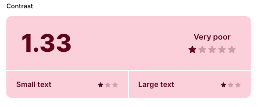
I apply appropriate accessibility guidelines to all of my UX/UI projects by default, but after assessing all of GL Homes' platforms it became clear that they had an enormous WCAG and ADA compliance debt in virtually every screen in some manner. Icons and secondary text with extremely low contrast (with background/foreground relationships rating as low as 1.33 out of 21 on their contrast ratio), inexistent or misconfigured keyboard navigation, no image script whatsoever, text sizes under 12px for AA fonts (Open Sans), amongst many other problems made it clear that I would need to advocate the importance of an accessible system to the stakeholders and make accessibility a pillar of our new design system. Accessibility should be a default and mandatory part of any design system, but GL Homes' employees (our main users) were in average 50+ years old, so it was extremely important for us to provide the most comprehensive, intuitive and user-friendly system possible.
Task-Based UI
All GL Homes systems are CRUD based (a classic format where users interact with the system through creating, reading, updating, and deleting information), as it is more simple format to create and direct to populate. But we wanted to apply a Task-Based UI mindset on some specific components. Task-Based UI is an approach that is centered around tasks that a user needs to accomplish, allowing users to interact with components that offer them solutions, rather than editing data in order to mold the system through indirect actions. It is rather confusing to explain it, but quite simple when you see it. A good example would be the internal product information page of an online retail store (illustrative example below). Let's say a manager wants to change the price of a given product from $150 to $125 for a specific sales event. On a CRUD format, the user would click on the price input field and change it manually from $150 to $125, which is simple and straight-forward, but it doesn't allow for strategic chain-action events, nor gives the system any refined data regarding the user's task. On Task-Based UI, the user would find a dropdown button for "Change Price", and would select "Decrease Price" on the dropdown. They would then set the new price ($125), and click on Update info (verbiage is also adjusted to match exactly the users' intent). Since the system understands that the price has gone down, an email could automatically be sent alerting all users who saved that product on their wishlist that it's on sale. It could also alert the sales team that X% of products have had a price decrease in the last month, and show the average amount of price fluctuation within the system.
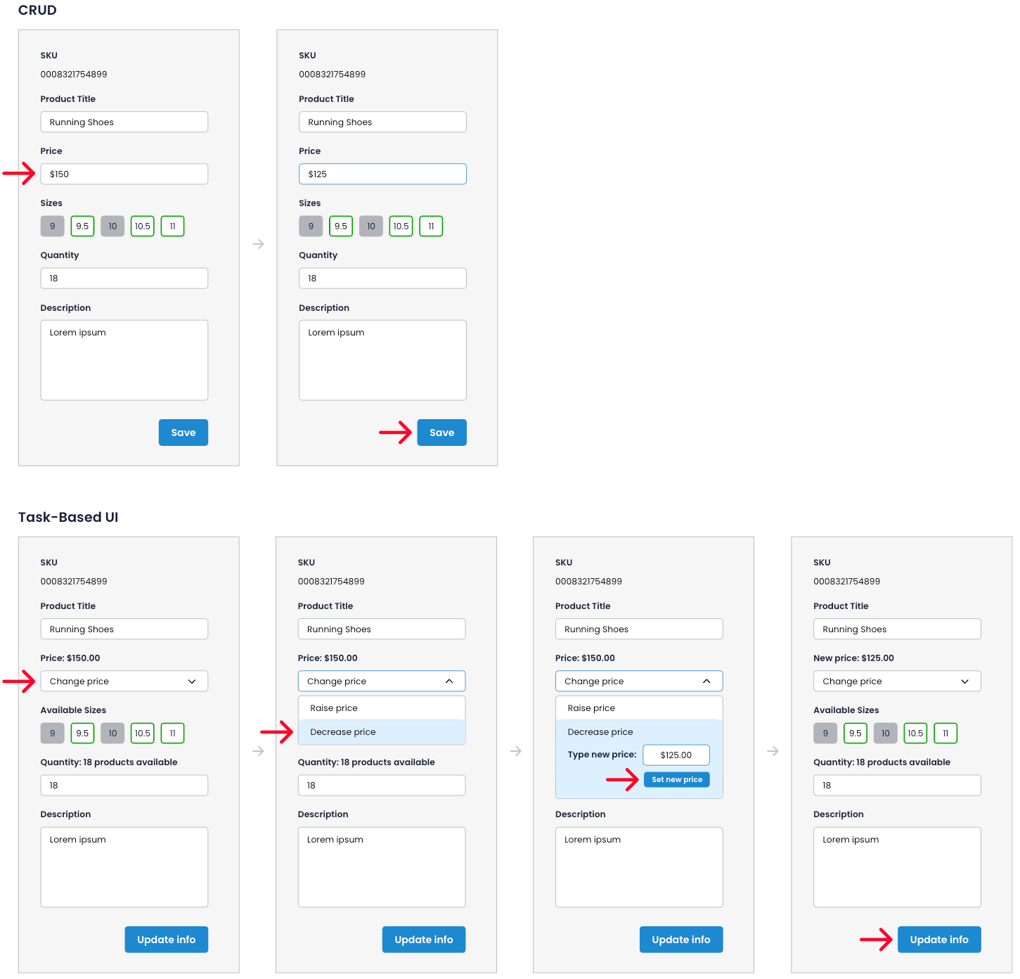
This is just one simple way how Task-Based UI can improve the process of a company with just two extra clicks from the user, as opposed to CRUD, Task-Based UI components' efficiency does not necessarily consider the subtraction of clicks as a positive indication. Of course this is not a solution for all problems, as CRUD is still the mainstream format for most systems, but it is important to always think about the possible applications where Task-Based UI could potentially bring amazing results through higher efficiency and data collection.
Context & Requirements
Most GL Homes employees have been in the company for 10+ years. They have created a workflow that works for them and that they have grown to use despite the system's flaws, so it was very important that we kept some of the basic grids and layout styles so that they wouldn't have to deal with a learning curve, we rather want them to feel like the new design system offers a much needed update that improves their usability and makes their work far easier. However, it is also paramount that new employees feel that the system is intuitive and easy to learn, following usability guidelines and best practices — which does not happen currently. The main goal was to find a good balance between these two users and create a solution that would be pleasant and efficient for all.
As all internal platforms are desktop-first, the UI Kit phase #1 would be for desktop use only. We would then create mobile iterations for every component as well as layout styles and adaptive behaviors on phase #2.
Another important requirement from PMs and stakeholders was that the new design system should be extremely clean and simple in order to be as flexible as possible throughout all current and future systems — no UI stylizations or visual overlays. Just a skin and bones design system (in terms of aesthetics) that would be able to translate the current system into a user-friendly version of itself.
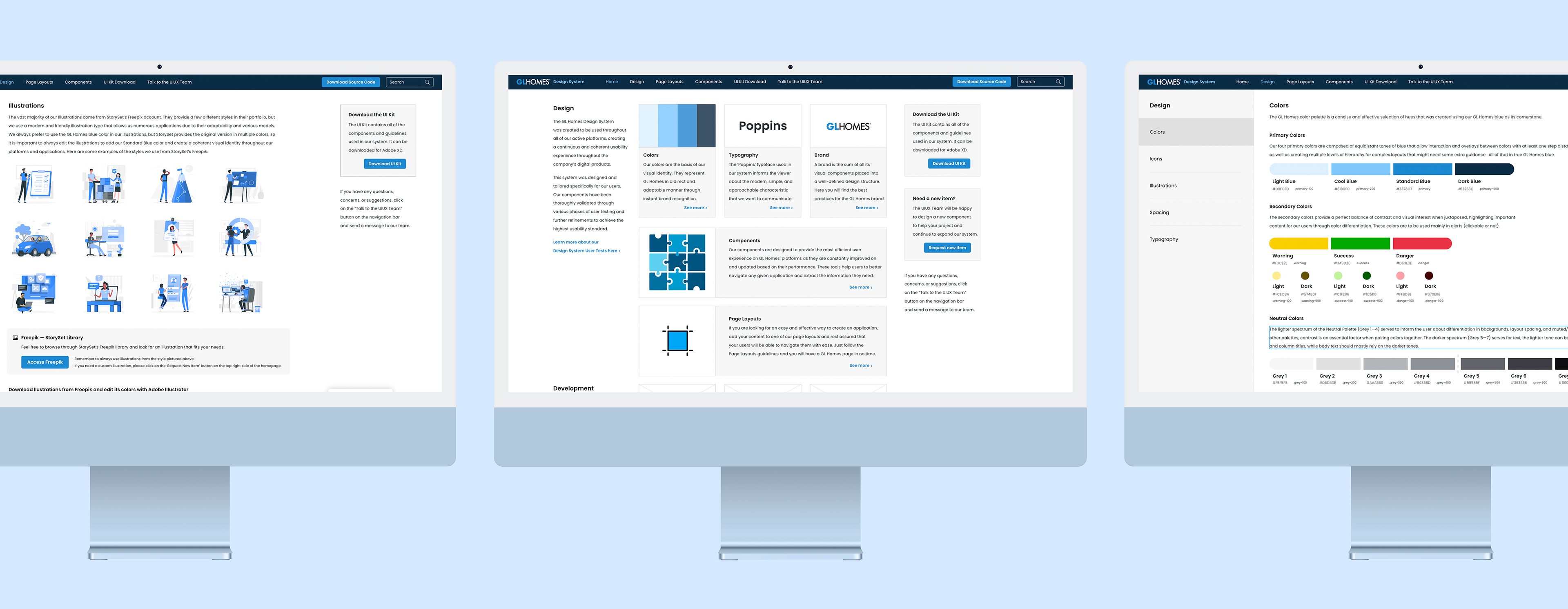
UI Kit
We are going to jump a few months ahead in time to show the final version of our UI Kit phase #1. The creation and validation process was quite challenging as we were requested to allow for direct input from team leaders of all systems, so there were many different iterations for every component before we arrived at a solution that was satisfactory to all. User tests would only start once we got a complete and detailed UI Kit, as we needed to translate all existing components in order to create complete and coherent prototypes for the users to test and give us refinements for phase #2 of components that did not achieve the passing grade in the first test round.
This UI Kit is by far the most complete and detailed repository file I have ever created, so I won't post it all in here as it would turn into an overwhelming scrolling endeavor for the viewer, so I will only address key assets of it and small portions of larger component families (and it will probably be quite extensive already). However, you can access the full version in the button bellow:
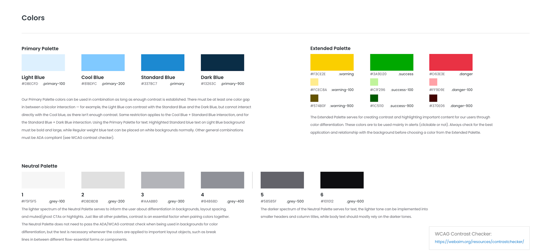
The company's main color is blue, as in its logo. Through a deep assessment of the current systems, we realized that 4 color tones would be sufficient to cover all overlays and hierarchy compositions needed for highlighted elements. The same number of tones would be ideal for the gray scale, with and extra 2 darker tones for text applied over a white or light background, allowing for different states within ADA compliance.
All of the colors passed through an extensive accessibility test both for light and dark backgrounds, and every second-step of the blue scale can be overlayed as background/foreground and be ADA compliant. We also added a WCAG contrast checker in the UI Kit panels so that future designers and developers use it as reference to their designs and project assignments.
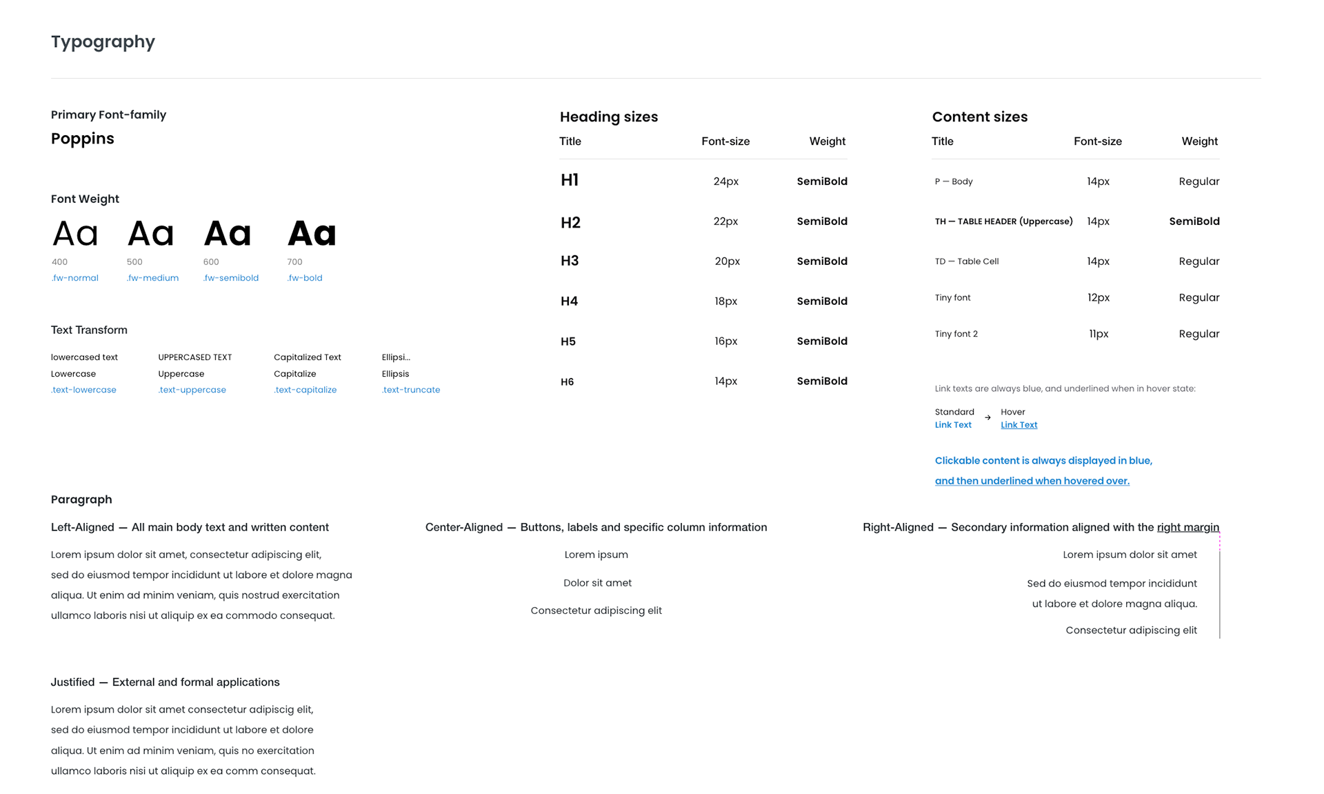
In the early stages of our UI Kit, it was defined by the IT director that we should base our style on Metronic (a Bootstrap Admin Theme) as they had recreated many components from Metronic's library. However that changed a few months into the workflow, as it was decided that all components should be also recreated in Outsystems. The Poppins typeface was one of the elements we liked from Metronic, as it was readable (ADA compliant in both AA and AAA formats for all styles), modern, and approachable. This was the only visual asset we maintained from Metronic and it went very well with the subtle, simple and friendly style of our new design system. We only applied the use of the Normal (400) and SemiBold (600) fonts in our design system, but to allow for future or unforeseen applications, we also added Medium (500) and Bold (700) variations.
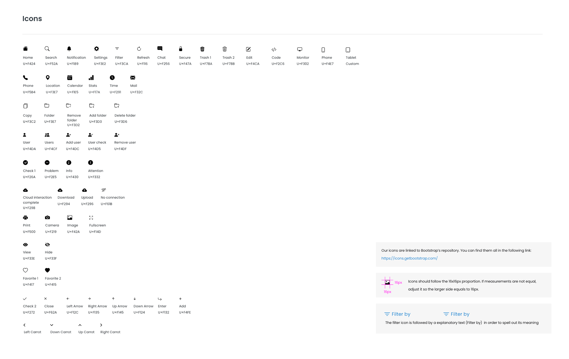
All of our icons are either extracted directly from Bootstrap or customized versions of their icon library to fit our needs. In order to maintain a clean and concise selection, we only add icons to our library once there is evidence for their need in one of our systems.
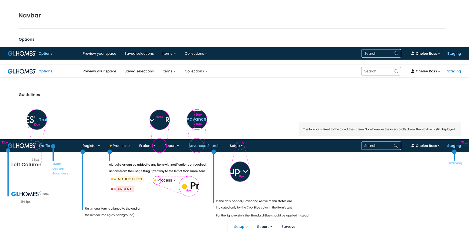
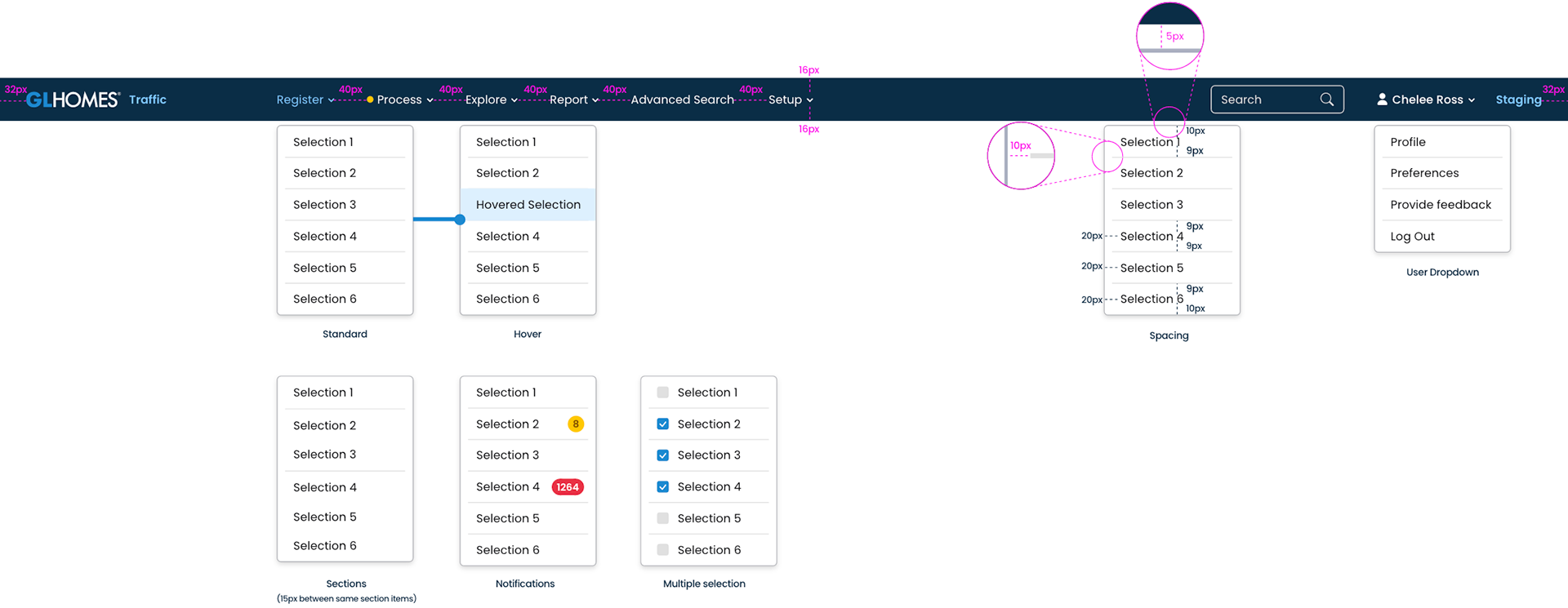
The GL Homes Navbar provides the users a sense of instant-recognition of our platforms. We defined flexible yet specific guidelines to allow for a wide range of applications and secondary component interactions, making it possible for it to sit atop of every current system and others to come.
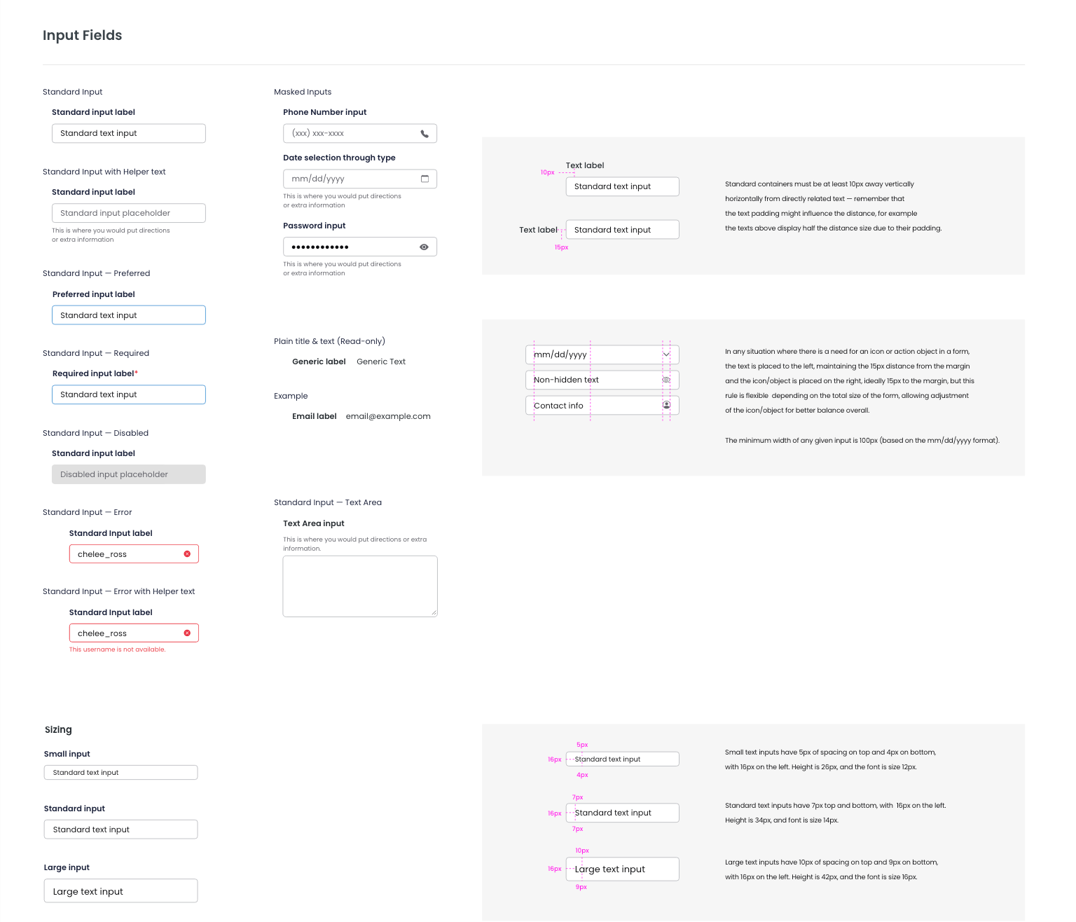
Our input fields follow the simple and accessible guidelines applied throughout our design system, but here is where the detail of tailoring components for specific scenarios start to become more apparent. Every single content of the UI Kit phase #1 serve to replace any existing component or visual asset that exists in one or more platforms currently, that is why we had to create many custom components that aren't usually found in most design systems.
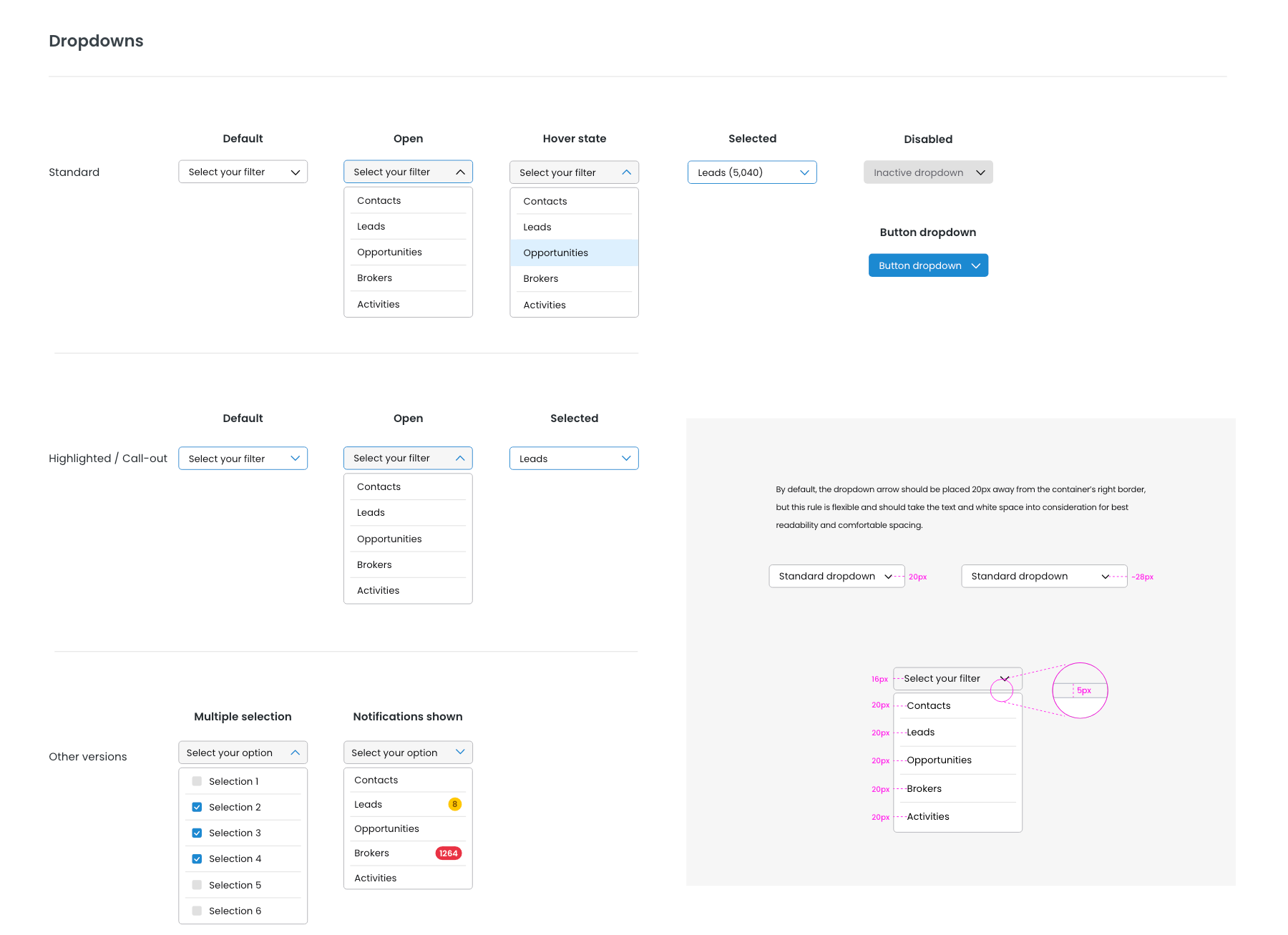
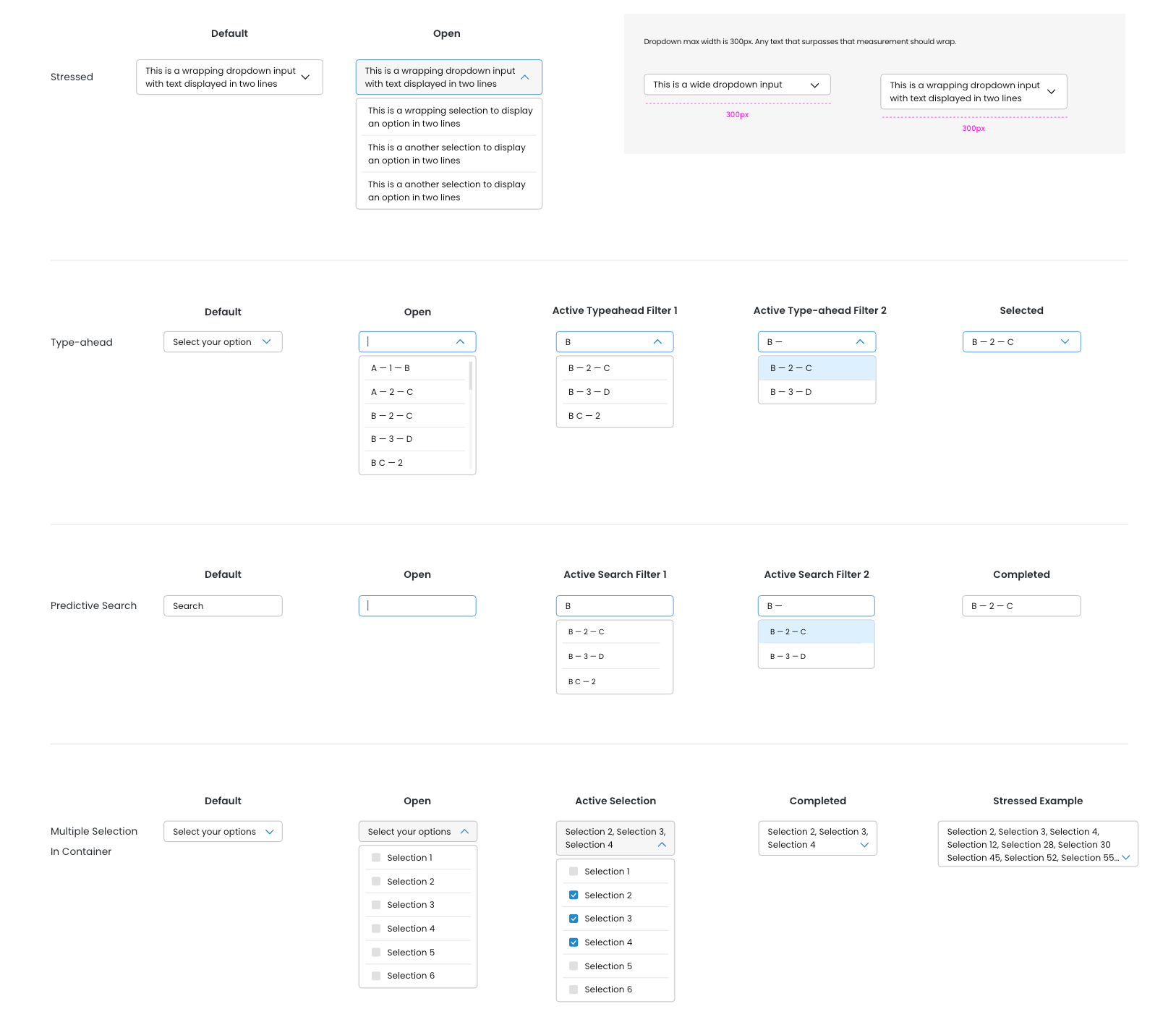
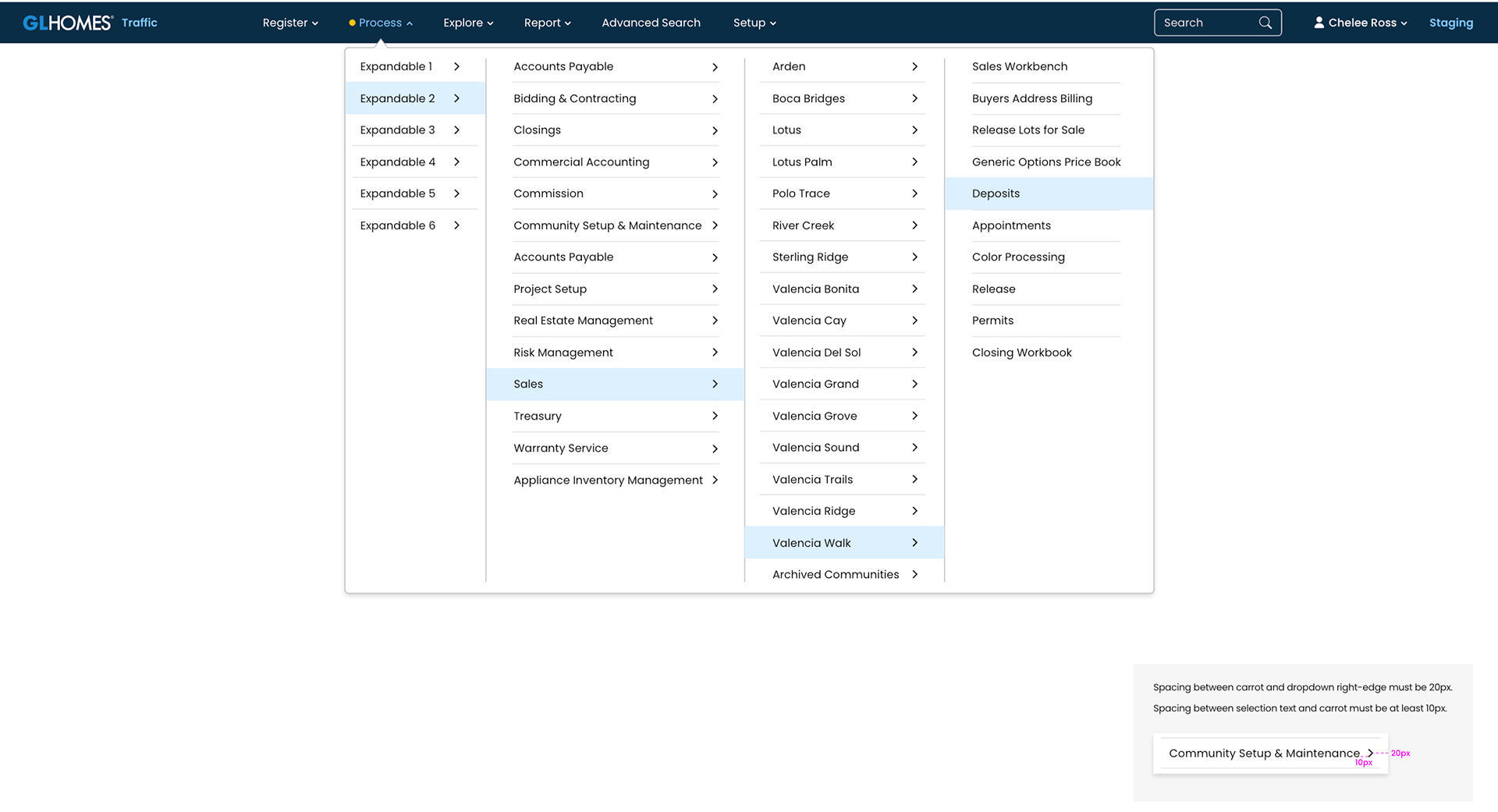
Dropdowns are another great example of taking the specifications of our current platforms and elevating them into a user-friendly and intuitive format. Our users make use of extensive dropdowns, especially to find and assign a specific office for a given lead. That is why we implemented predictive searches and typeaheads into the first phase of our UI Kit, allowing them to complete that very same task in a fraction of the time it took them to do so in the current system.
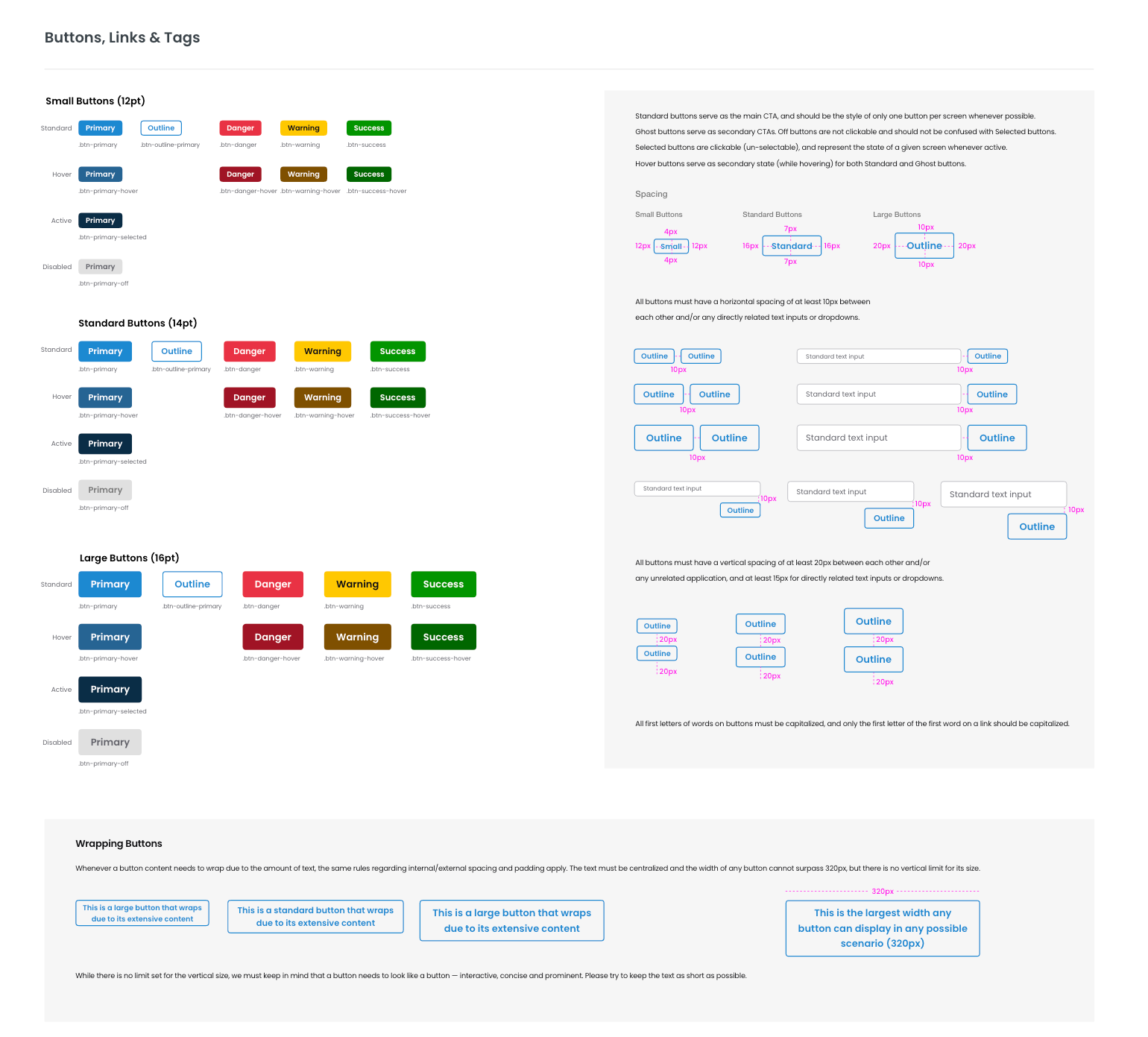
Our buttons were designed to streamline the user's interactive experience throughout the platforms. Currently there are numerous shapes, verbiage, and signage for any given action. This is a first step towards a coherent visual system that allows users to comprehend their options and conclude their tasks successfully with confidence. We still have to assess all verbiage used throughout all platforms to establish key words and guidelines through UX writing and task-based UI, and that will happen on phase #2.
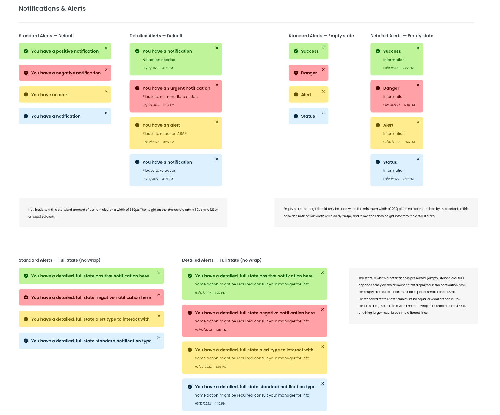
Notifications, alerts, and toasts will provide real-time feedback to our users throughout our system. Every completed or interrupted flow triggers a corresponding notification, so that our users can view what information is being processed and be confident that their task was successfully completed, or understand the reason why it was not.
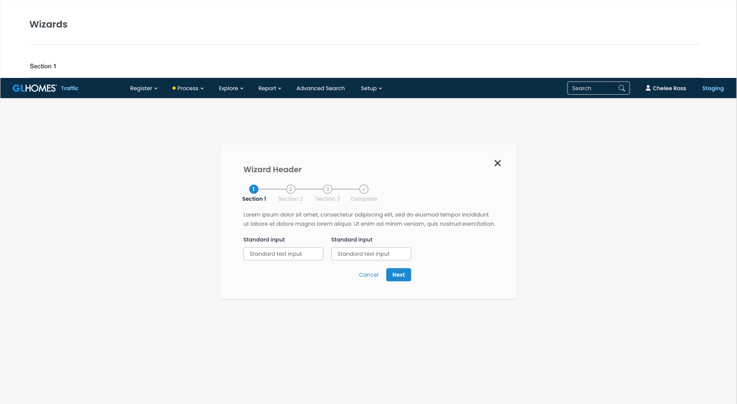
Wizards are basically a combination of a few different feedback tools and task-based components inside a large popup, so it is a nice setup to display and test a few of our designs at once. The current system took many different approaches to this component, so this is also a good example of how a flexible component could still do a variety of different tasks in any given platform while being compliant to the design system's guidelines.
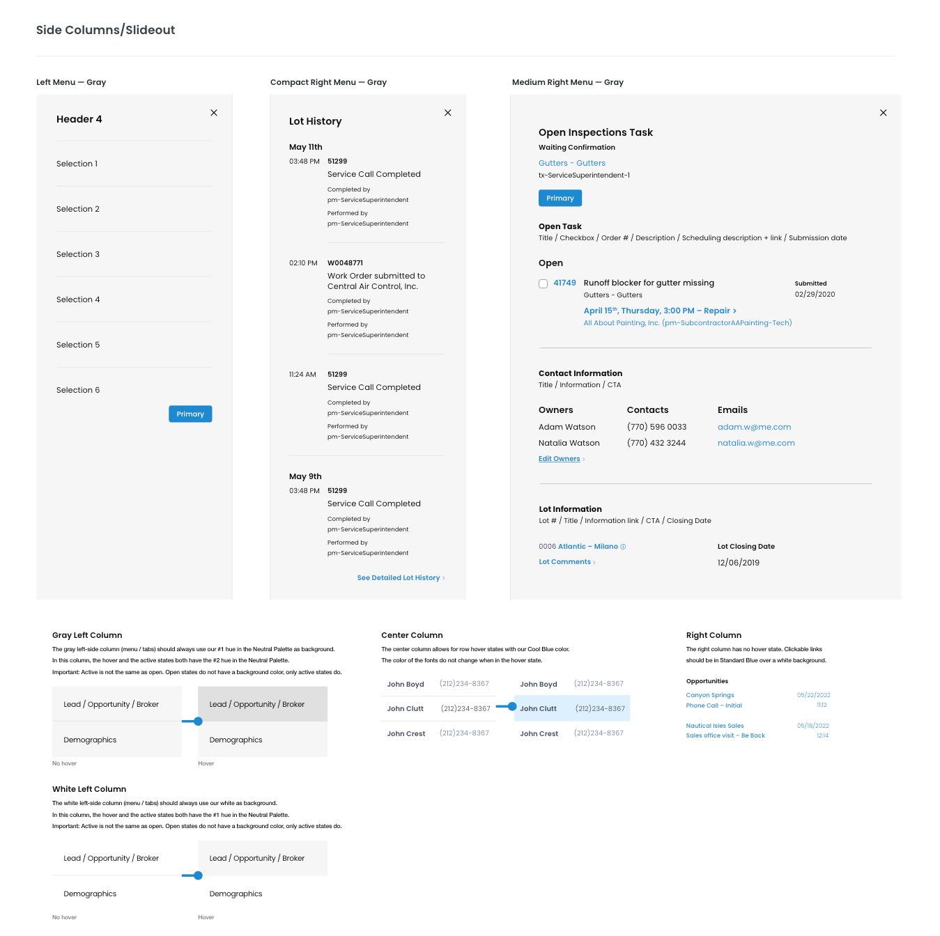
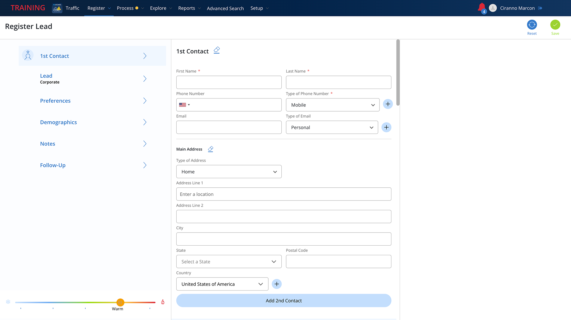
The 3-step side column is one of the many efforts (and probably the easiest to see externally) from our team to maintain the layout that GL Homes employees are used to working with, while expressively elevating its usability, accessibility, and overall efficiency. All of the current systems follow the same layout pattern where filter and grouping are nested on the right menu, actionable items and input fields are placed on the center column, and details or secondary actions are kept in the right column.
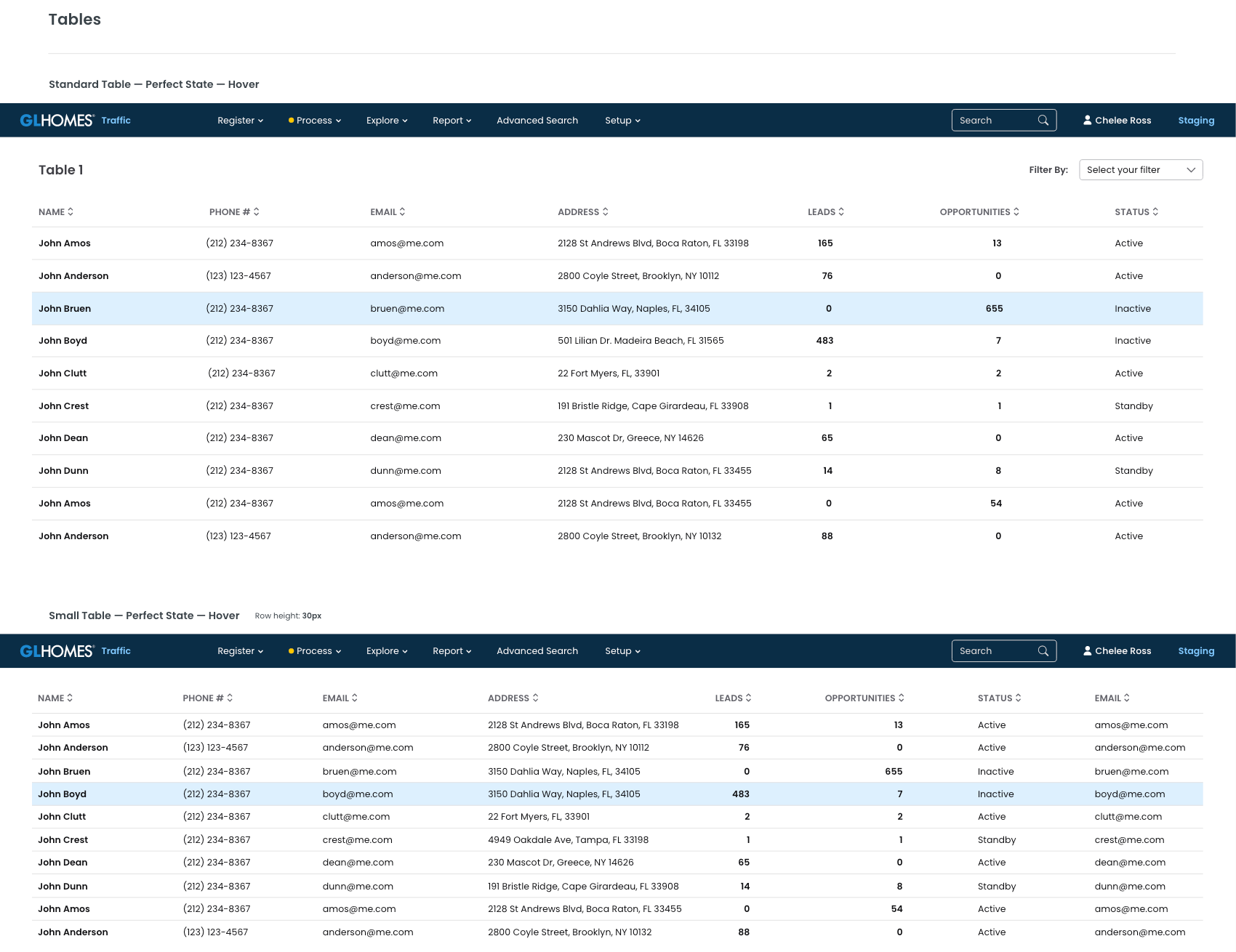
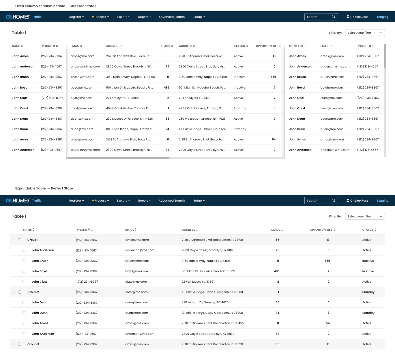
Tables are the most used component in the current GL Homes platforms. Therefore it is, by far, the most detailed and customized component in our design system. We have gone through numerous rounds of internal troubleshooting and user interviews to get to the amount of applications and states we have for tables in our UI Kit phase #1. Please check the UI Kit button up top to see all of the variations created for this specific component.Currently we have a couple dozens of applications, and we keep on adding to them currently on phase #2, as this portfolio page is being created.
Tables and Filters are the two most important components to be redesigned because:
1- They are the most replicated assets in throughout the whole platform, as they are the most used;
2- They are edited in Outsystems by PMs and developers without guidelines and then replicated into the repository, so errors and bad designs are perpetuated throughout all platforms;
3- Users get random table formats from the repository and try to adapt them to their needs, creating a Frankenstein's Monster-like component that, again, is repopulated, replicated, and reedited throughout the system;
4- Consequently, these are the components with the most negative reviews and highest amount of complaints and breaks in flows throughout GL Homes.
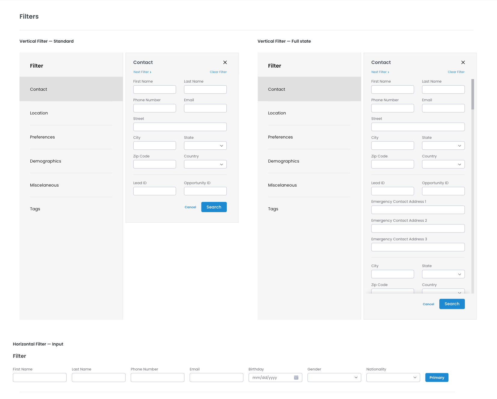
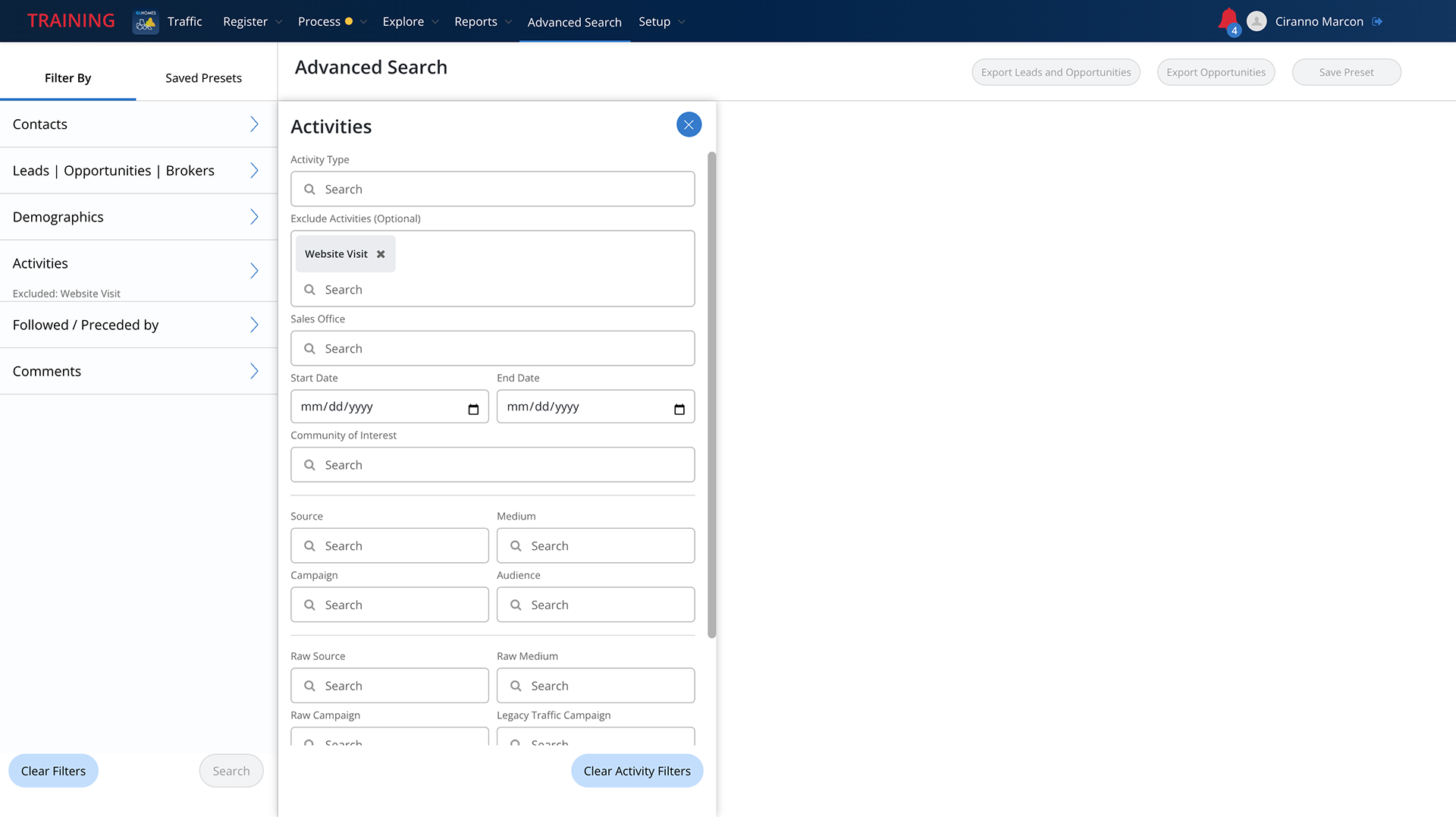
While filters are just as widely used as tables throughout the system, they can be much more complex and confusing. It is imperative that our users are able to interact with the filter as much or as little as they wish; and that their navigation throughout their journey is as simple and easy as filling out input fields and selecting through efficient dropdowns. That is the reason why we created expansive multi-level automated prototypes that allowed users to interact with filters as they would in the real world, and gave us the chance to understand the user's behaviors and to refine the design system to cater to their preferences.